You don’t really think about what keeps the internet standing. Not until it wobbles. Behind every “Oops, something went wrong” is a vast underworld of servers, cables, cooled rooms, blinking panels, and systems talking to systems. That’s where EternaCloud lives.
They orchestrate infrastructure for hyperscalers. Not the shiny parts—just the parts that actually matter. Data centers, critical equipment, high-stakes environments where one misstep means hours of downtime and millions lost.
So when they came to Tubik, it wasn’t to make noise. It was to build something certain. Translate complexity into simplicity. Make it feel light, even when it isn’t. Build something that looks like it knows what it’s doing.
And that’s exactly what we did.
The Challenge
EternaCloud builds tools for people and companies who make things run. They analyze pain points inside corporations (big ones—Fortune 10 big), build custom software to untangle those knots, then stay on to keep everything humming.
Their audience is complex. Engineers. Suppliers. Procurement teams. C-suite. The folks buying the solution and the folks knee-deep in cables. So, they needed a brand identity that could do the same thing their platform does: scale, adapt, and simplify.
The ask was clear: something serious but not stiff. Flexible but not generic. A website that functions as a single point of truth—for teams with hundreds of moving parts.
Clarity, cohesion, trust. In that order.
The Team
Art direction: Anastasiia Kutnia, Vlad Radionov
Web design: Anastasiia Kutnia, Oksana Lashko, Artem Meshkov
Motion design: Andriy Drobovych, Kyrylo Yerokhin, Ladamyra Kunytsia
Brand strategy: Olya Zakharyan
Web development: Olha Krasnokutska
Graphic design: Arthur Avakyan, Roma Chornyi, Mykyta Litinskyi
Illustration: Maryna Solomennykova, Yaroslava Yatsuba
Project management: Nick Zhuravlov
Research & Strategy
We started with a landscape audit. Infrastructure services are a bit like uniforms—everyone wears navy blue. Cold themes, generic grids, 3D swirls, recycled buzzwords like “synergy” and “ecosystem.” The question was, what’s the visual equivalent of technical clarity? What does reliability really look like?
EternaCloud came prepared, with 2+ years of internal research. They knew their audience, their positioning, even their visual preferences. Our brand strategist, Olya Zakharyan, filtered all of that into a core brand model.
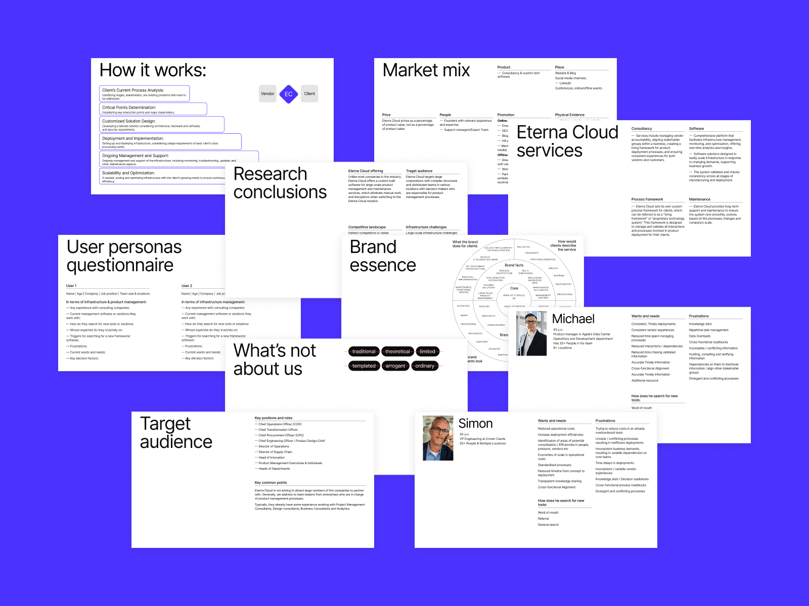
The main insight? EternaCloud does what most teams dream about: making the impossible feel obvious. Like someone walked in, waved their hand, and everything suddenly worked. That sense of magic—but grounded.
So that became our North Star: Functional. Special. Not corporate. Not sterile. Design that knows what it’s doing, and doesn’t feel the need to prove it.
Visual Identity: Calm, Not Cold
The first versions looked good. Too good, maybe. Polished, airy, even beautiful—but they didn’t feel like EternaCloud. Not yet.
The client sent over purple palettes. References to the Fibonacci spiral. Even ideas around mycelium and organic networks. The project kept pointing us toward softness—circles, rings, flow. The circle was in the center of it all—not just a shape, but a system. An eternal one.
The visual language was poetic, thoughtful, deeply interconnected. But also… a little hard to pin down. From the start, we felt the system needed to be clearer. More structured. Something you could understand at a glance, not after a think-piece. That tension turned out to be a good thing.
We built the brand around deep purples and near-black tones—a palette that feels rooted and composed, without falling into the dark-mode void. And no black—intentionally. Nothing absolute. Nothing empty. We wanted darkness with depth, not erasure.
It gave us room to play with gradients without losing seriousness. We paired the palette with a modern sans-serif typeface that reads effortlessly at every scale. Something that could live inside a dashboard, a datasheet, or a pitch deck and still feel natural.
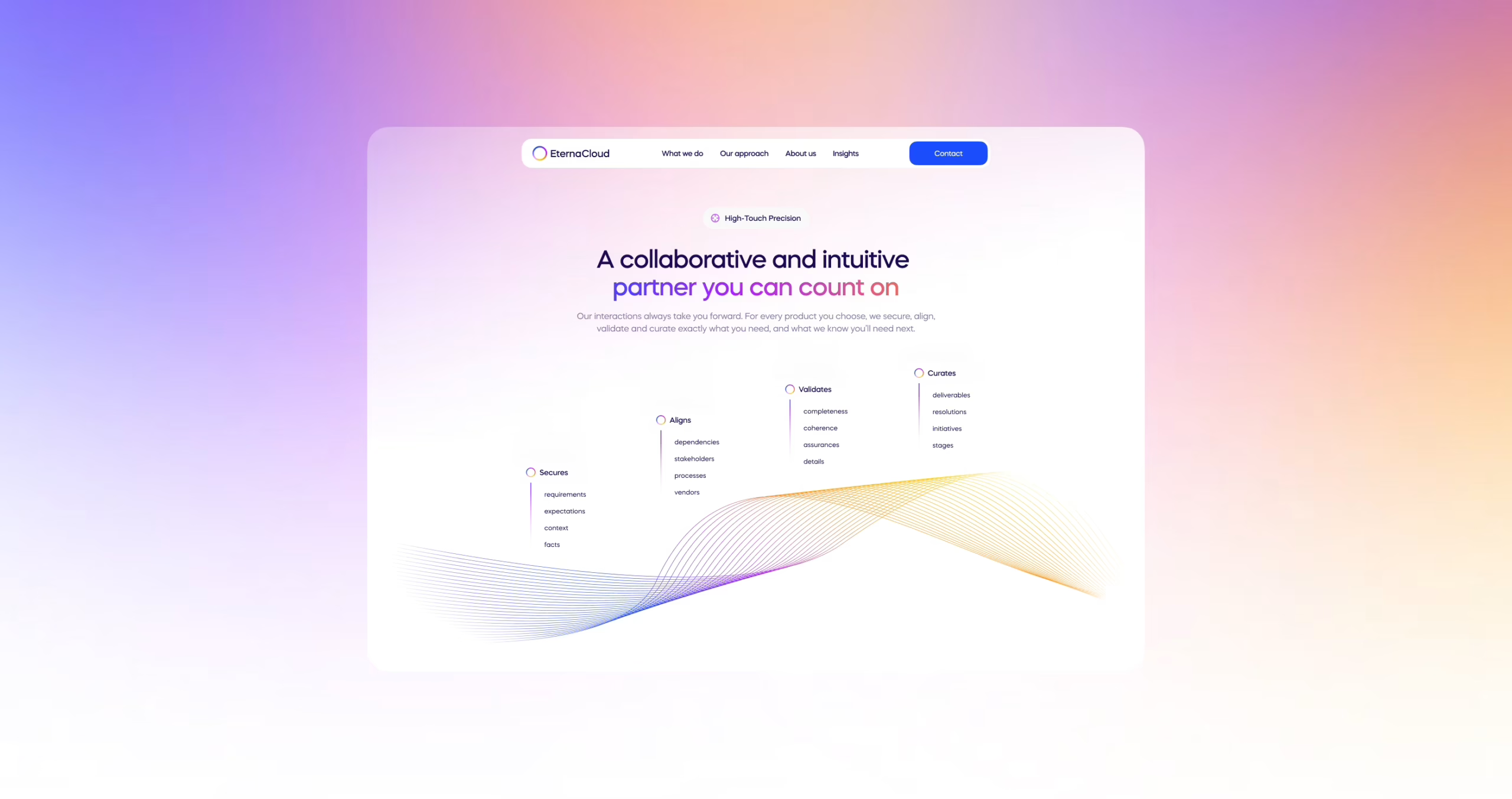
Web Design & UI System
The layout didn’t start from a wireframe. It started from a feeling. A doc, written by Anastasiia after her first deep dive into EternaCloud. Pages of notes trying to translate the intangible into something you could design against. Because EternaCloud didn’t come in saying “we need a landing page.” They came in with concepts—big ones. Circles. Flow. Unity. It was on us to take that cloud of insight and build something structured enough to hold it.
This wasn’t “just a few sections and a contact form.” It was intentionally dense. The wireframe had to do a lot of the explaining—like: here’s where this animation fits, here’s how that transition reinforces your value, here’s why this layout matters.
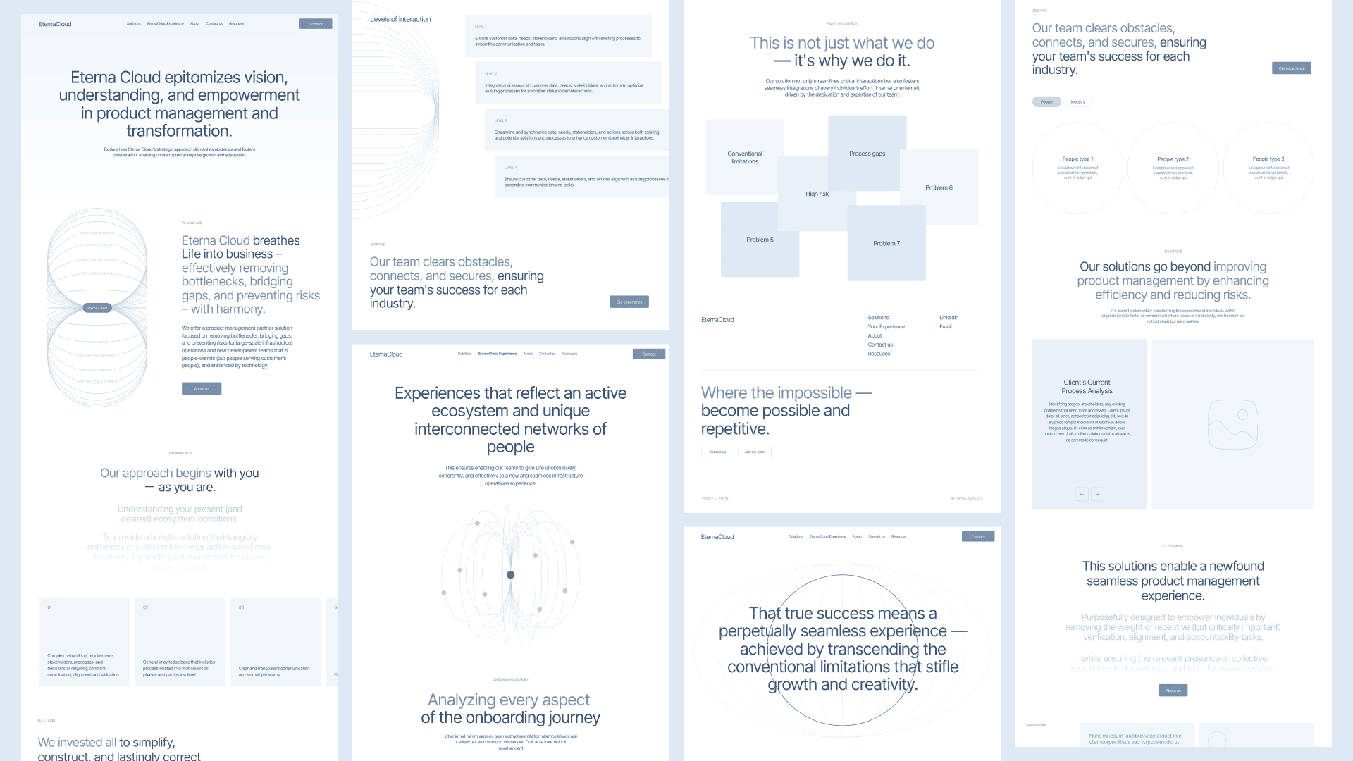
We were designing a structure that made the invisible parts of EternaCloud feel real. The site was abstract by nature. You can’t photograph orchestration or show someone “seamless deployment across providers” in a carousel. So yes—we used UI tricks. A lot of them. But not to distract. To reveal.
We used motion to suggest momentum. Circles to echo the brand’s logic of continuity and clarity. Blur to show abstraction resolving into something usable. Every design choice was doing double duty—visually engaging, conceptually grounded.
Midway through the process, the client ran a round of testing with a small focus group. The feedback? The same thing we’d been sensing: the designs looked elegant, but felt abstract. Beautiful, but not entirely clear. It was a signal, and together, we took it seriously.
We worked side by side to find a middle ground: visuals that still held the elegance of EternaCloud’s original ideas, but now shaped into something more readable. Less metaphor, more message. Still magic, but now it made sense faster.
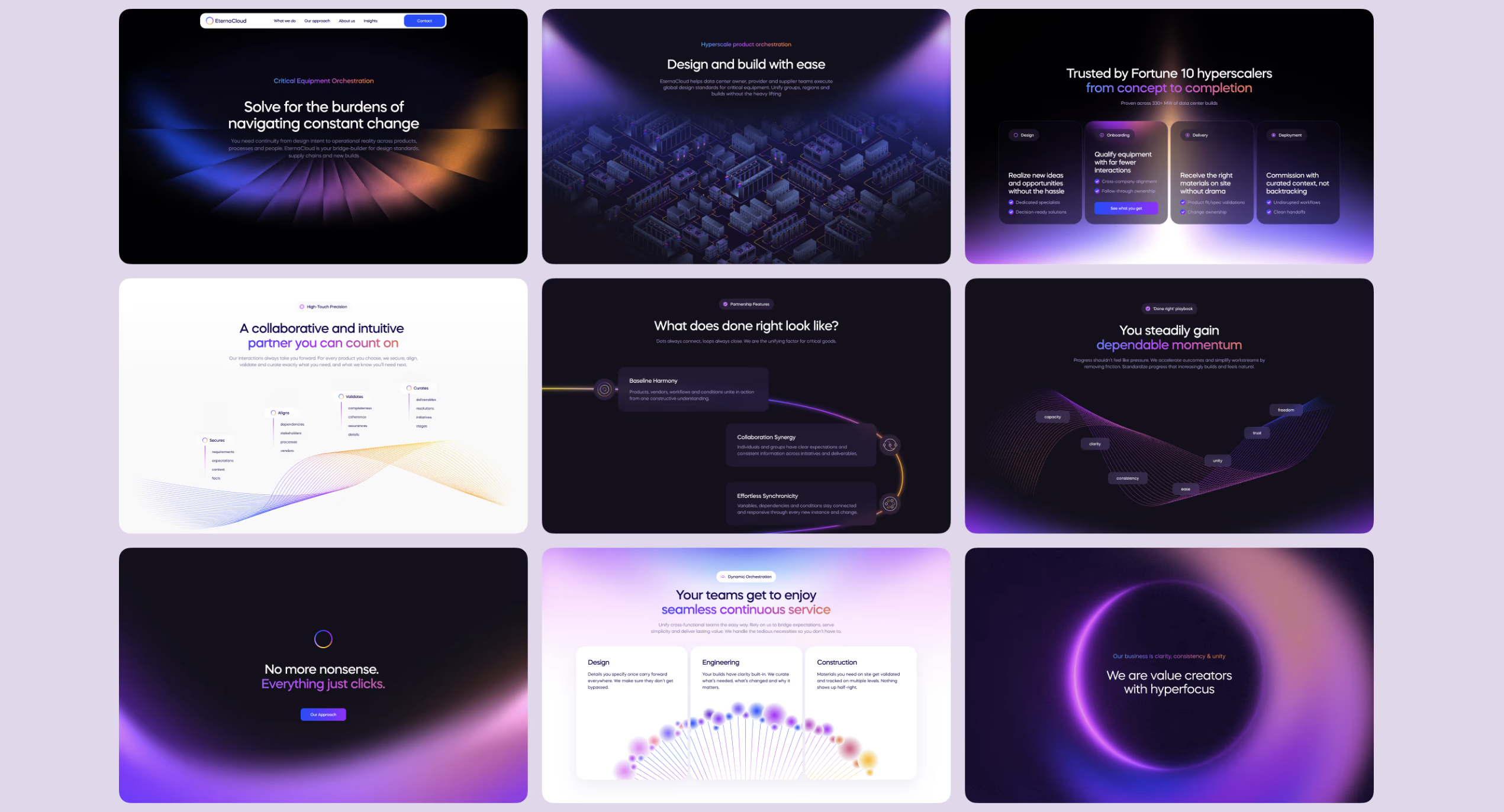
There was no existing hierarchy to fall back on. No standard grid to lean into. The job was to make order from idea soup. And still make it feel light. Anastasiia led the early structure—designing with almost surgical detail. Later, Oksana stepped in with a fresh perspective and helped refine the experience with clarity and polish. The result is a site that feels cohesive and alive—not because it followed a framework, but because we built one from scratch.
This part of the process taught us something big: Sometimes, the more abstract the product, the more precise your design needs to be.
Not to simplify it. But to hold it still long enough for someone else to understand.
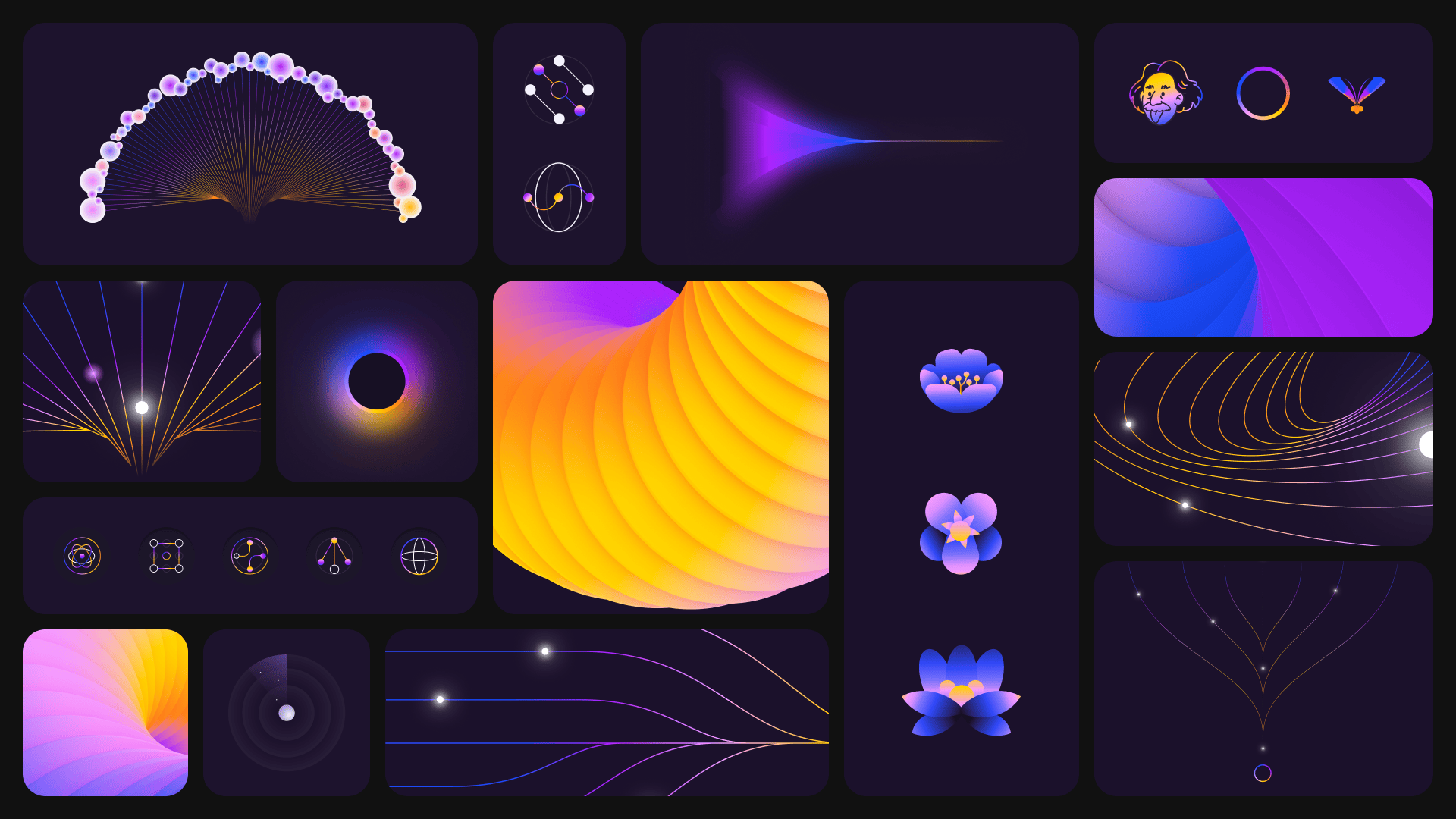
Graphic Design & Illustration
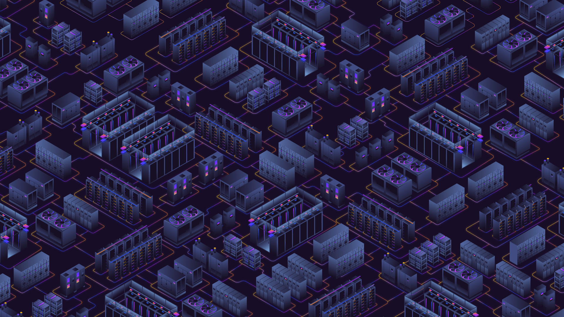
Our illustrator, Maryna, had a unique task: recreate EternaCloud’s real-world server rooms as illustrations—complete with chilled units, backup power systems, and architectural detail. Based on a walkthrough tool the client provided, she studied the internal layout of various technical components—the placement of racks, air circulation units, and redundant power sources—and transformed them into a visual environment that felt both grounded and elevated.
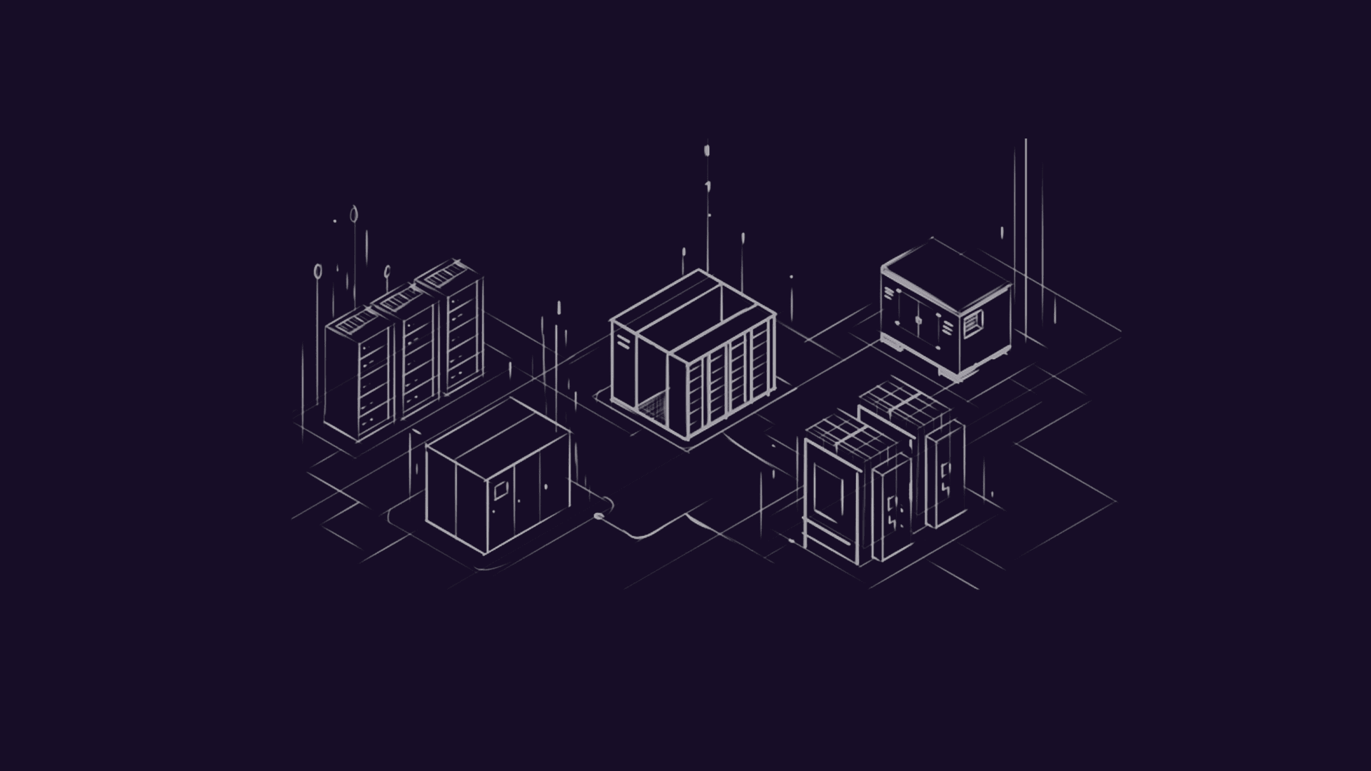
It became one of the most concrete visual elements in an otherwise abstract, minimal layout. A still moment that gave the brand physicality. Where much of the interface was designed to feel light and frictionless, this illustration added weight—something you could almost walk through. It acknowledged the real infrastructure behind the software, without needing to diagram it to death.
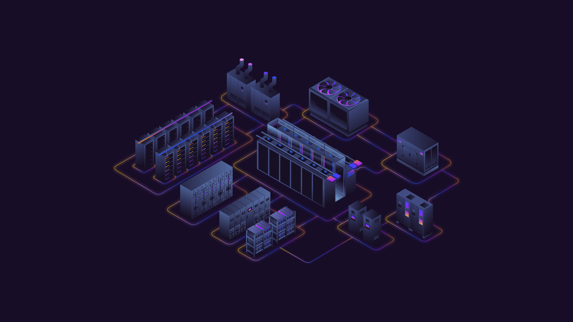
For a client deeply immersed in the technical reality of what they build, this was our way of saying: we see it too. And now your audience will. The final image landed on the homepage like a peek into the physical layer of the cloud—a stylized blueprint that still holds engineering truth. Not photorealistic, but believable. Not cold, but clear.
And then there were the animations, made by Roma and Andriy. One of the most ambitious ones starts with a simple shape: a circle, with a bright white dot in the center—EternaCloud’s client, their core. You see it from the top. Then the perspective shifts. The circle unfolds into depth, and you start to see the inside. At the bottom: external vendors. Small dots, scattered. Necessary, but messy.
And in the middle: EternaCloud. Acting as a connector—not in the way. In between. The one that ensures everything flows and nothing leaks. The one that supports, buffers, holds the structure intact. This one animation distilled the whole brand into motion. It wasn’t easy to make—technically or conceptually—but it made sense. And it stuck. Other animations followed a similar rhythm. Always placing EternaCloud not as the hero, but as the companion. The thing that turns workplace chaos into process.
Meanwhile, the main icon set was finalized by Arthur, who took an already well-developed set (complete with correct brand colors and tone) and refined it further. The task was to make each icon sharper, more readable, more informative. He introduced visual logic that helped distinguish between active and inactive states, creating a clear two-level system that made interactions feel intuitive.
In addition to the icon system, Arthur also worked on a series of abstract service cards—compositions of lines and dots that echoed the same logic as our core animation concept: circles, flow, interconnection. Little visual metaphors that hinted at systems syncing up, tasks resolving, complexity folding into clarity.
What’s also worth mentioning—several other visual directions, early style concepts, and illustration approaches that didn’t make it into the final cut weren’t discarded. The client wanted to keep all of them. They saw potential in those ideas as components—a visual library they could pull from for future materials, internal docs, or alternate touchpoints. Nothing was wasted. It became a kind of design constructor for later.
Motion Design
We wanted to go advanced. Rive, Lottielab, you name it. But tech had other plans. Rive animations crashed all other Webflow motion. Lottielab didn’t play nice with Safari. Eventually, we went back to Adobe After Effects—an old-school choice that gave us complete control.
The motion system follows one guiding principle: move only when it helps you read. Hover states are gentle nudges. Transitions signal change. Scroll triggers feel like the system is responding, not performing.
Kyrylo created a footer animation that blooms—a visual exhale at the bottom of the page. A little reward for finishing the scroll. The result was a site that feels alive, but never distracting.
Webflow Development
The number of animations, videos, transitions, and responsive quirks we packed into the EternaCloud site wasn’t exactly small. Making it all run smoothly—across browsers, across devices, under load—was a feat in and of itself. It had to be dealt with quietly, precisely, and under the hood.
Performance optimization was an ongoing act of compression and balance. Olha, our developer, had to make sure everything preloaded cleanly, that interactions felt fast and intentional, and that nothing crashed—even when the page was juggling motion, scroll triggers, nested loops, and custom CMS content all at once. We do that for most Webflow sites—but here, it was extra. Because the content volume and complexity were extra.
Then came the second half of the job: human-proofing the backend.
The EternaCloud team was curious and proactive. Which is great. They started diving into the Webflow editor directly—tweaking things, exploring, occasionally breaking stuff. Olha spent time guiding them through how to use it “the safe way.” Setting up clear CMS structures, ;ocking down components, naming things clearly enough that even a new hire wouldn’t get lost.
But there was another nuance. The team was used to updating everything in Figma, so at first they struggled to visualize how those decisions would translate into a real site. That’s why Olha started assembling things directly in Webflow very early in the process—not as a handoff, but as a parallel tool for design validation.
In a way, the client became part of the QA team. Checking every corner, flagging bugs, sending feedback on details most people would miss. And it worked. We don’t usually talk about dev like this. But here, it mattered. Because the brand wasn’t just about looking smart. It had to feel solid. And that starts where most users never look: inside the builder.
Recognition
The EternaCloud site picked up an Honorable Mention from Awwwards—for UX, UI, and Visual Design. And that felt… earned.
Not because we pushed boundaries for the sake of it. Not because we stacked animations or spun a product on scroll. But because the site found a balance between abstract thinking and precise execution.
This kind of recognition lands differently when you know how much of it came down to restraint. To pulling things back. To choosing a calmer color. To holding a layout still long enough for the message to settle. That’s a harder kind of design—the quiet kind. And when it works, it doesn’t beg for attention, it just feels right.
The award confirmed what we’d already worked toward with the client: finding a visual middle ground where EternaCloud’s original abstract elegance could live—refined into something legible, navigable, and structurally sound. Still magic. But now, magic that made sense.
Final Reflection
Some projects come together quickly. This wasn’t one of them.
There were dozens of versions. Calls where we reworked spacing by the pixel. Animations that broke in one browser and had to be rebuilt from scratch. Layouts that looked fine until you stepped back and realized—this doesn’t feel like them yet.
What this project taught us is simple, and a little uncomfortable: Great design doesn’t reveal itself early. Not when the subject is abstract and the stakes are high. You have to sit with uncertainty long enough for the structure to emerge. Strip away everything that performs. Keep only what carries meaning and survives use.
But before you even get there—before the layout, before the colors—you need to ask better questions. EternaCloud didn’t come to us unprepared. They knew who they were. But even then, it took deep, careful interviewing to surface the insights that would guide the work. You don’t get usable answers if you ask shallow things.
So here’s a real thing we learned:
Interview your client like you’re designing the story, not just the interface.
Get into the weeds. Ask them to explain the boring stuff. Ask them what breaks when no one’s watching. What they wish users understood. What their team is proud of, quietly.
That’s how you avoid designing from assumptions. That’s how you get to work already aligned. That’s how you help them see their vision—clearly, maybe for the first time.
EternaCloud didn’t need another pretty interface.
They needed a website that matched their precision—and we built one they could grow on.
Recommended Reading
Explore more stories from the Tubik team—deep dives into branding, UX, and the invisible craft behind beautiful interfaces:
Netti Case Study: Measuring the Invisible
SPYLT Case Study: Delicious by Design
Hyperion Case Study: A Production Powerhouse Reimagined
Case Study: HotelCard Service Illustrations. Digital Art for User Experience
Case Study: UClay. Identity and Packaging Design for Ceramics and Pottery Brand