User interface of a mobile application or a website is the part of design which combines a lot of various spheres of activity, including art, color theory, logic and analysis. It makes a designer a kind of magician who has to combine the elements of layout in such a way and manner that would make using the app or the website easy, clear, fast and pleasant. So, no doubt, this job is full of responsibility and demands a lot of knowledge, inspiration, and research from a UI designer.
You could have already read our previous case studies, including the one about UI/UX design. Continuing the set, today Tubik Studio presents the story about creating the user interface for the application aimed to track postal items. It was created by Daria, the designer for Tubik Studio. You could already have seen some parts of the work on tracking app in Daria’s Dribbble shots, and it is high time now we told you more about the project.
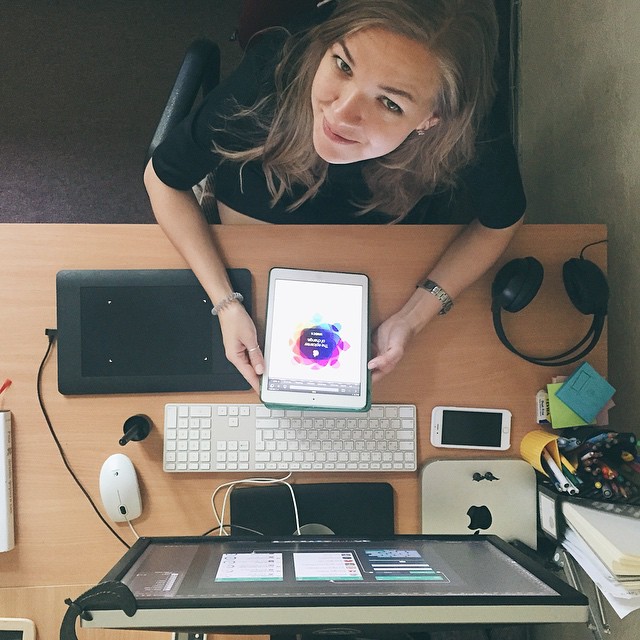
Daria, the UI/UX designer for Tubik Studio
Task:
Design of the interface of a mobile tracking application for iOS and its adaptation to iPad.
Tools:
Pencil sketching, Adobe Photoshop, Adobe After Effects.
Process:
It is a well-known fact that the more practical and applicable is the site or app, the more clear and easy-to-use it should be. There are some types of applications which are totally specific and their target audience is very narrow, but that was not the case. The tracking app was aimed to be used by the wide target audience with different demographic characteristics, level of education and abilities in technology. Therefore, this factor had to be considered to create the efficient and bright design of the interface which would have high aesthetic representation but at the same time would not confuse any user.
The assignment didn’t mean creating something out of thin air: the designer was given the concept of the existing design to be based on in further changes. The version, existing at the moment, already had rather effective user experience which needed only minimal changes and was practically tested by users. However, the customer wanted a new user interface design which would be even more user-friendly, harmonic, intuitive and up-to-date. So, the designer needed to consider all those factors from the very start of the design process.
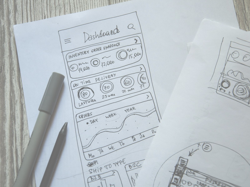
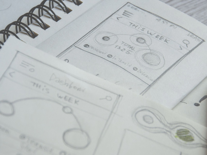
The first stage of the process: creating the wireframes and the general concept of UI
Processing the screens
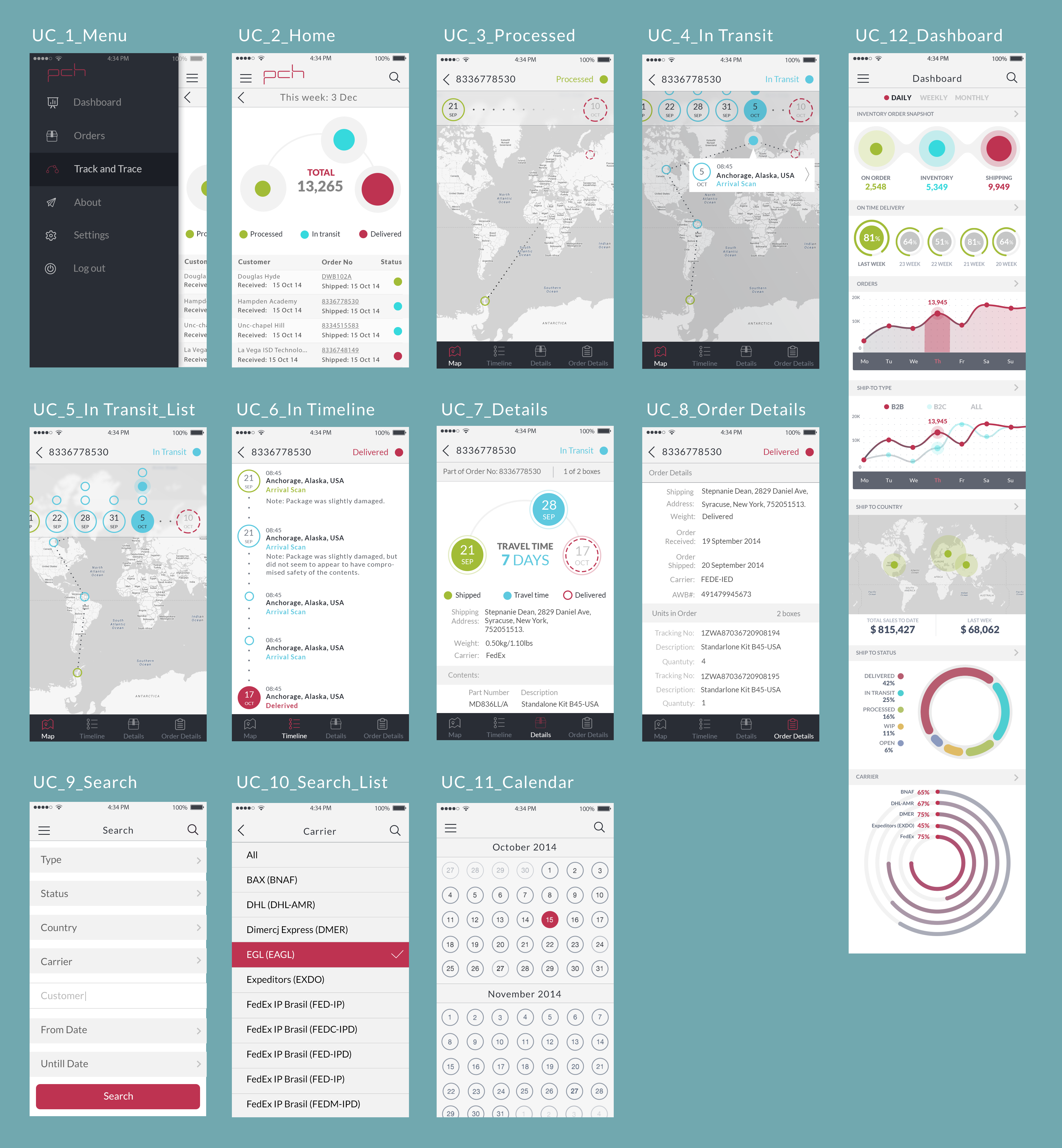
The first conception and stylistic decision for the application presented the version created in dark color scheme. The designer developed and designed 12 screens of different functionality:
- Menu screen
- Home screen
- Screen of processed items
- Screen of items in transit
- Transit list screen
- In timeline screen
- Details screen
- Order details screen
- Search screen
- Search list screen
- Calendar screen
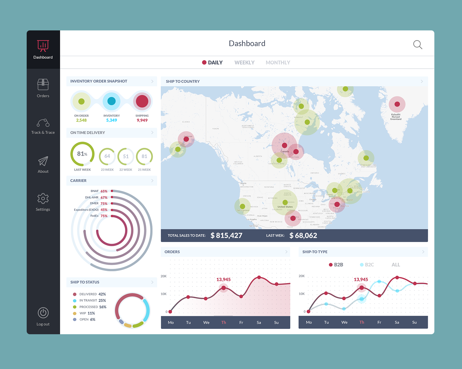
- Dashboard screen
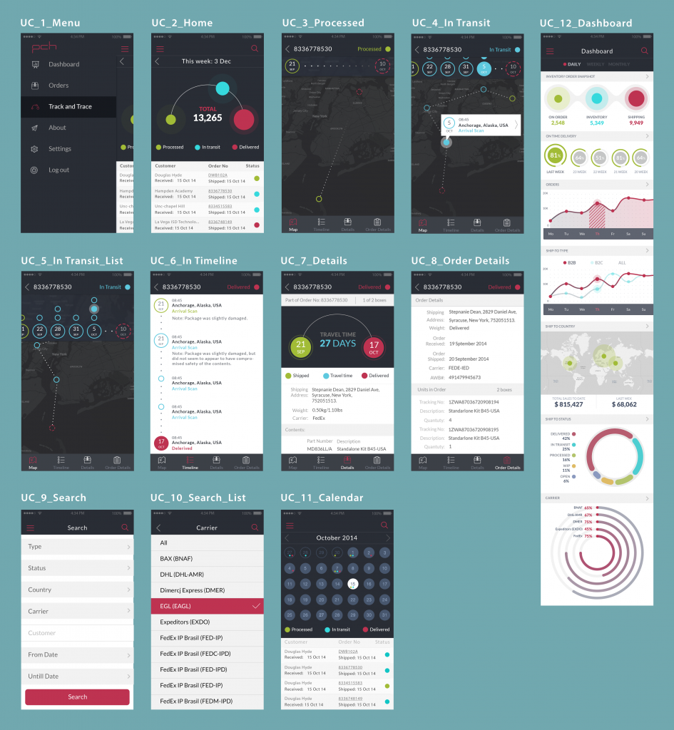
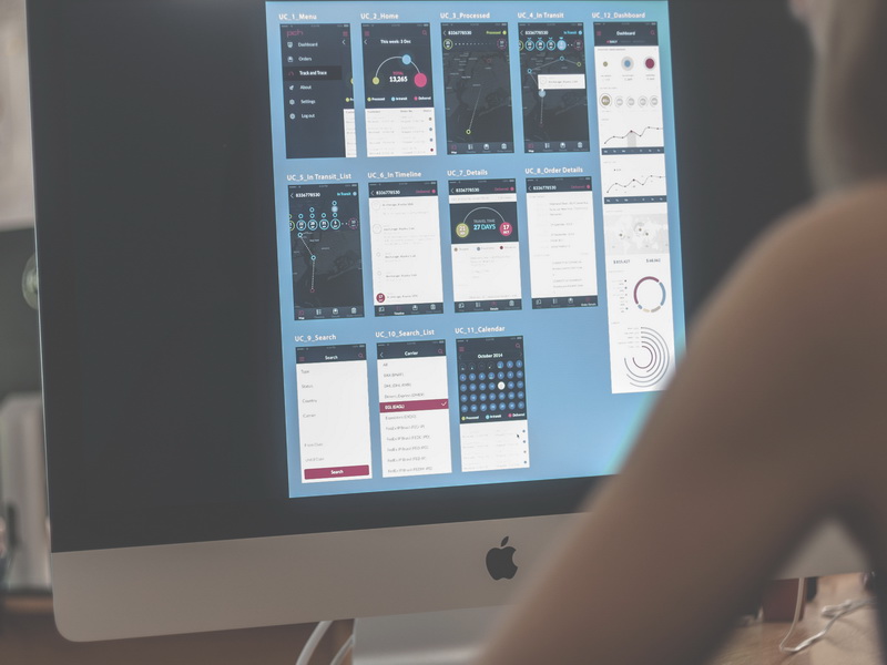
The set of screens for the application
One of the main tasks was to follow the ideas of consistency through the color scheme, layout details and shape selection. Also, for the new user interface, the designer created original icons that corresponded with the general style and were intended to accomplish informative and navigational functions. You can see some of the screens below.
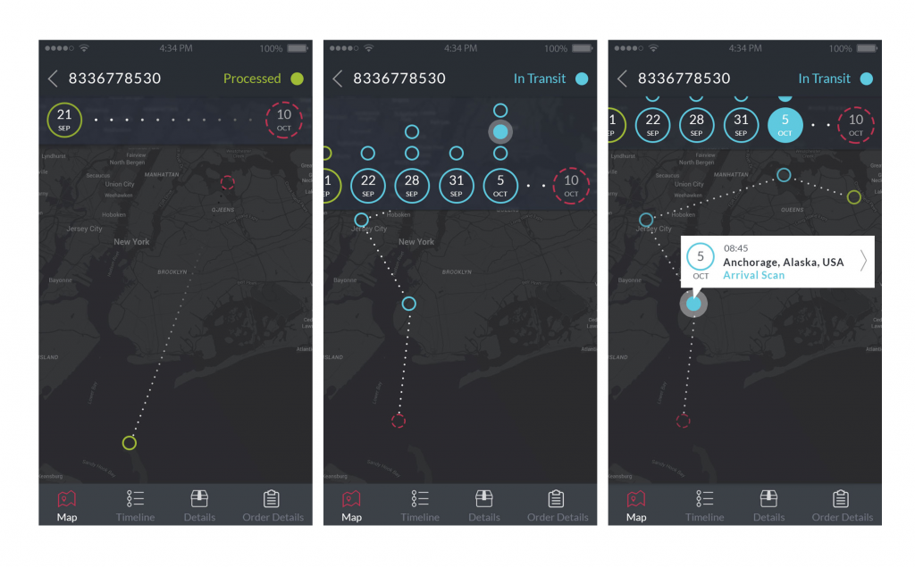
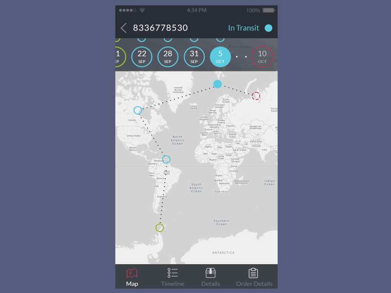
Processing, tracking, and transit screens
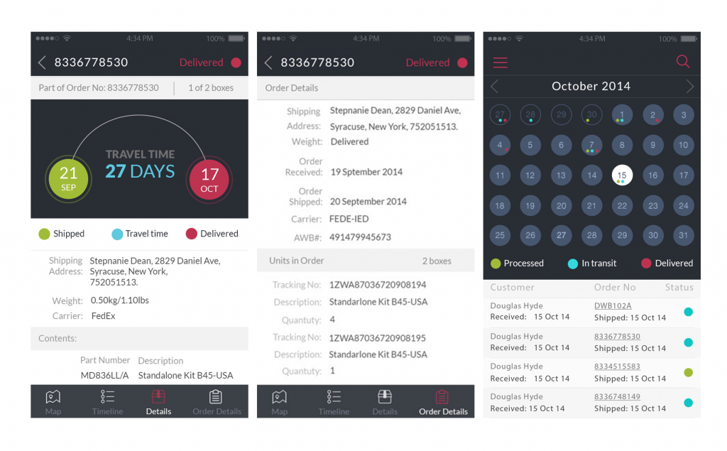
Order, order details and calendar screens
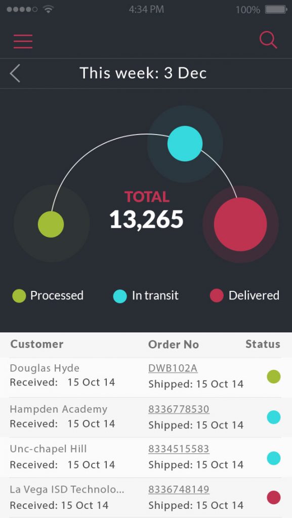
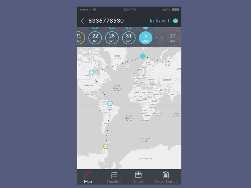
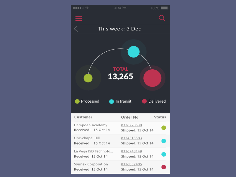
The previous version of design had a graphic feature which the customer asked to preserve and transfer somehow into the new of user interface. The visual expression had had three circles intended to show the percentage of processed items, items being in transit and delivered items. That feature was saved in the new design although the designer updated them and created a new scheme of their placement on the screens so that they could get more visuality and work even more efficiently. All the ideas and updates were regularly agreed upon with the customer. In this way, there was created the image of a track curve with the circles on it.
Home screen. The circles representing processed, transit and delivered items.
All three circles had the base of the same shape and size made in light color and the brightly colored zone inside showed the percentage in this parameter. Moreover, there was used one more interesting interface detail: you can see that on this curve the circle representing items in process is positioned not in the middle but closer to the end of the track. Such placement gives the feeling of positive experience to a user because it makes the items looking like close to their destinations.
![]()
The set of screens featured with the frame of a device
It should be also mentioned that the circles were also featured in original icon created by the designer for Track and Trace position in the menu. The combination of the main visual element with its expression in the icon was a good way to provide a user with the feeling of consistency and fast visual perception of essential details.
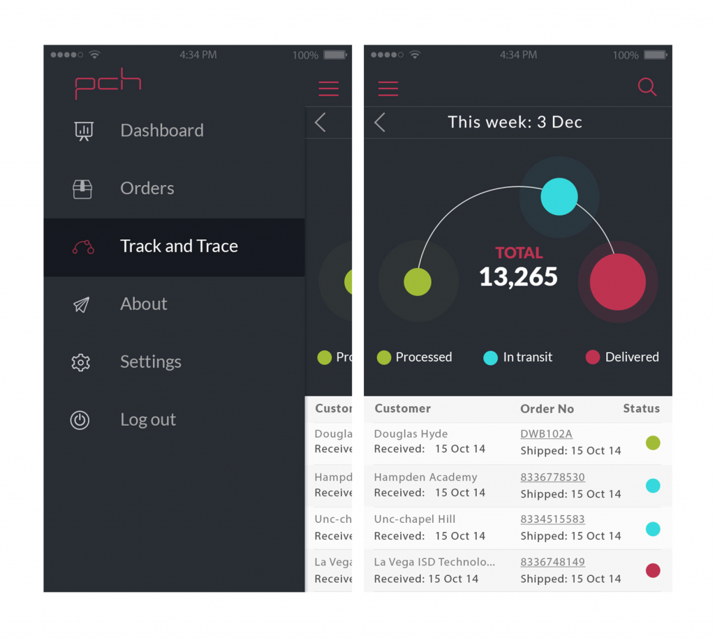
Menu screen and Home screen. The curve with the circles on the Home screen is reflected with the icon in the Menu.
To make the interface of the application functionally interactive and strengthen its usability, the designer animated some elements of the screens. The animation had purely functional goals dealing with the details of navigation to guide a user and make the experience fast, highly informative and enjoyable.
Animated screens for the application
Redesign
When the design of all the screens was completed, the customer was really satisfied with the general style, details, shapes, decisions for icons and buttons, animated elements as well as the general layout of the screens. However, at this stage, the customer reconsidered such a basic thing of the design concept as the color scheme. The reason was not hidden in any personal preferences, as both the customer and the designer liked the color palette used for the screens. Nevertheless, the customer felt that the idea of consistency should go further and therefore the application should closely correspond with the website of the company. The color characteristic was chosen to be the main element of such corporative consistency. It was impossible for the customer to fully redesign the site according to new decisions used in applications, that is why, like it or hate it, it had to be made vice versa: the application had to be partly redesigned to correspond to the site.
The site used light colouring that is why the customer asked to change the color of the screens for the application and make them as similar in colors as possible, but preserving all the other features, details and solutions of the interface appearance.
Although the designer liked the dark color solution more, she redesigned all the screens in different color scheme, supporting the customers’ wishes and business aims.
The version redesigned with light color scheme
Having changed the color scheme, the designer obtained positive feedback from the customer and started the last stage of the work — adaptation of iOS app design to iPad. All the screens had to be adaptive in two orientations saving main solutions of the interface. Processing sub-menus for adaptation was, probably, the most interesting part of this work. As the screens contained a lot of interactive elements, it took a considerable amount of time and efforts to adapt them all to iPad version with no significant changes so that all the versions of application were easily recognizable by the user.
The version of landscape orientation for iPad
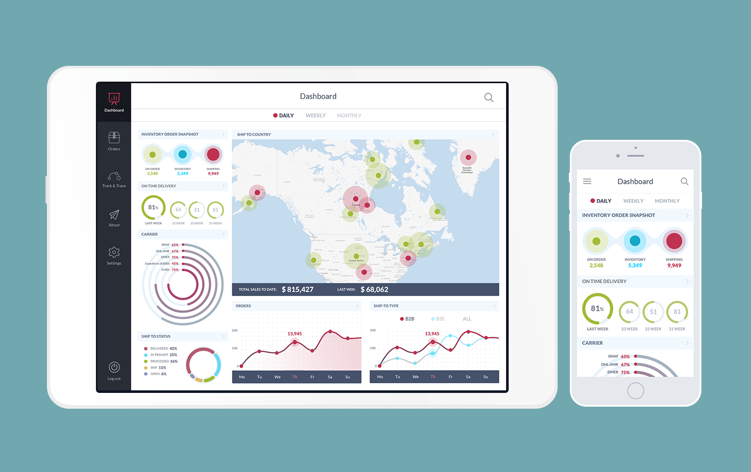
iPad and iOS versions of the application
Projects of this kind provide designers with the great practice of searching for efficient solutions so that the application obtained a high level of utility and usability for all categories of users.
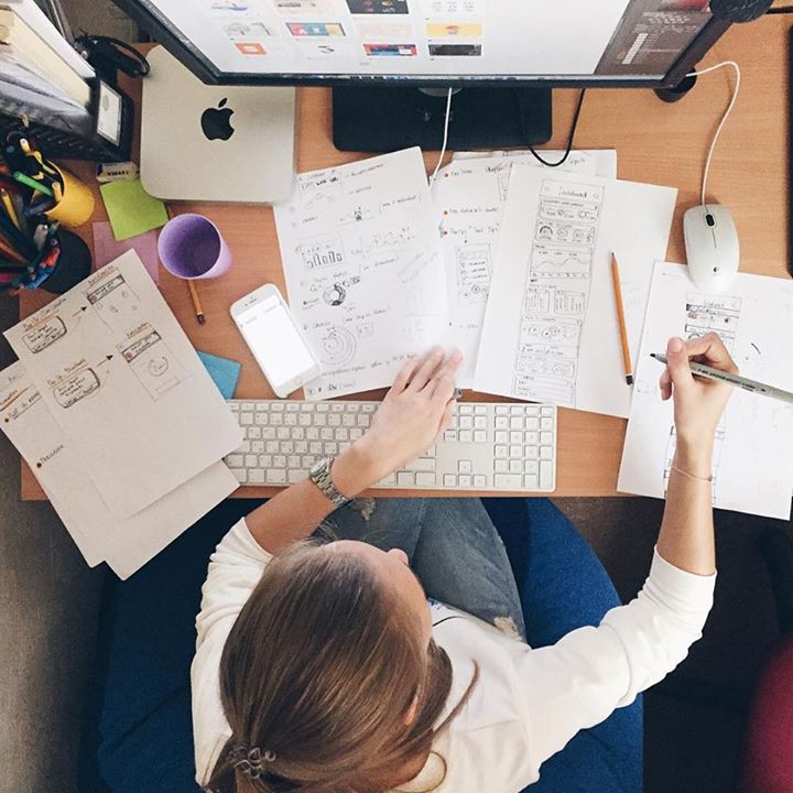
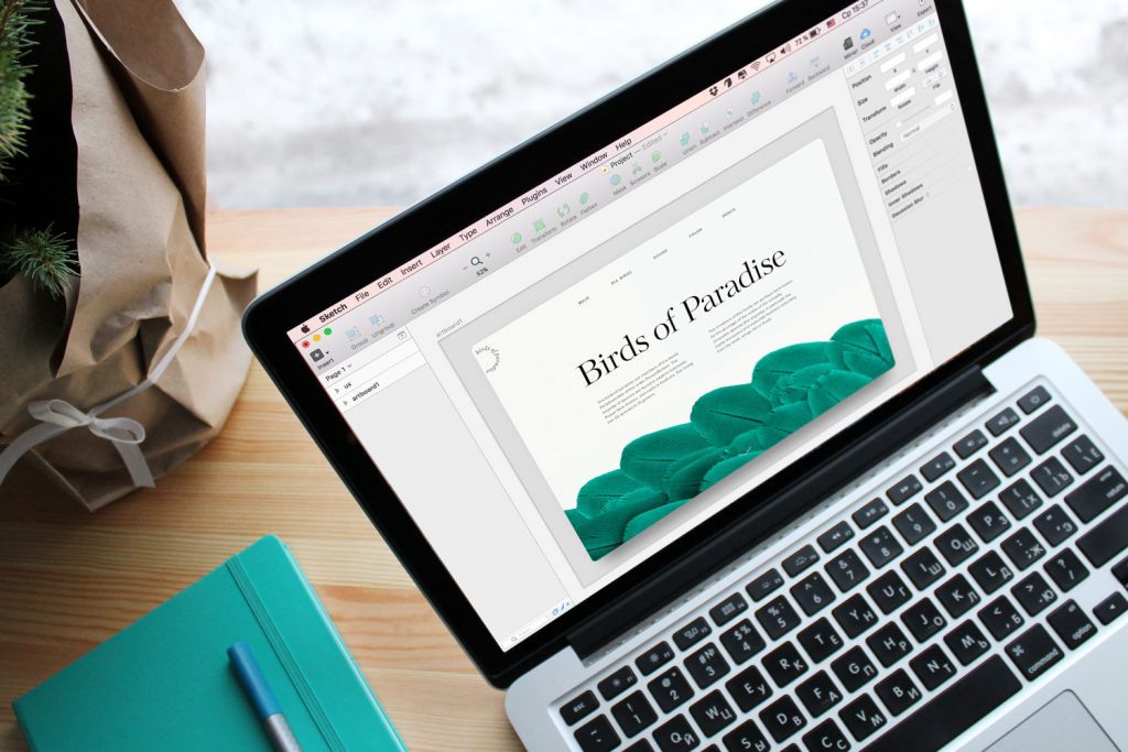
Daria working on wireframes for the project