Playing on the international market, you have no choice but to invest your time, effort, and creative power into not only the product but also its marketing via the Web. It goes into even a harder challenge when the market you operate on is highly competitive. Our today’s design case study tells right about such a project: we are going to unveil the creative process on an animated intro for a brand of wedding dresses.
Project
Illustration, motion design, identity and user interface of the original intro for a brand of wedding dresses.
Brand
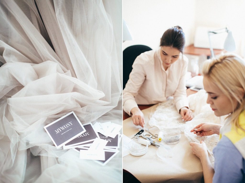
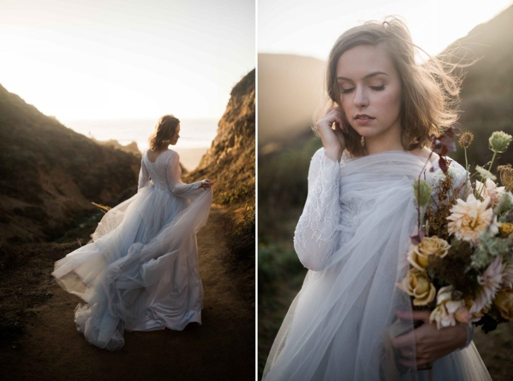
MYWONY is a modern line of personalized wedding dresses with special attention to high quality, elegant details, perfect fit, and feminine silhouettes. The history of the brand dates back to 2012, starting from a small wedding workshop created by a tandem of two designers. Today, the wedding collections of MYWONY are popular with brides from different countries around the world.
Idea
The task for the creative team was to think over a brand intro that would give the boost to the brand promotion via the web and would have virality potential. The design team assigned to the project consisted of the illustrators Yaroslava Yatsuba and Marina Solomennikova, motion designer Andrew Drobovich, and art director Sergey Valiukh. It was important to find a way of trendy promotion that would not only harmonically work with quite a traditional website theme but also boost the brand image with an original story.
Iteration 1: Animated Cartoon Based on Nature Vibes
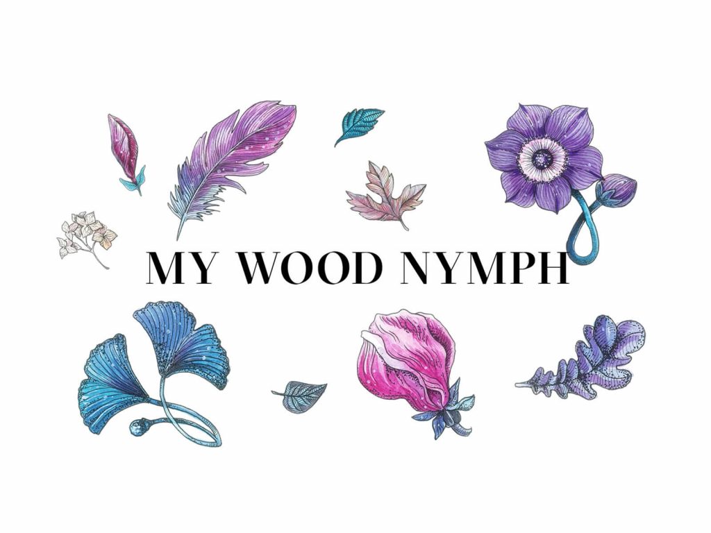
What story could support the feelings of a woman preparing for her wedding? Whatever are the times, trends, fashion, rules, and innovations, some things that never change: for every bride-to-be, her special day is her personal kind of fairy tale. The first idea for the brand intro was based on the idea maximally close to the brand name – My Wood Nymph. Having researched the market, the creative team decided upon a promo campaign that would feature the story of a wedding dress made right by nature, with all the tenderness and harmony. The interactive part of the brand intro design was stretched on branded items in visual details to provide the consistency of the brand image and its communication with users.
Visual Brand Updates
Together with the development of the visual stylistics, the designers updated the logo design. The wordmark got a more elegant and sophisticated look with the trendy and readable font and was complemented with acute, the graphic element which created the association with the French language and France as a known home of world fashion. But the association was not all the sign was needed for: the practical value of the acute was helping the visitors and client to easier understand how to read the brand name and where to put the accent.
The phrase with the abbreviation of which the brand name MYWONY was constructed
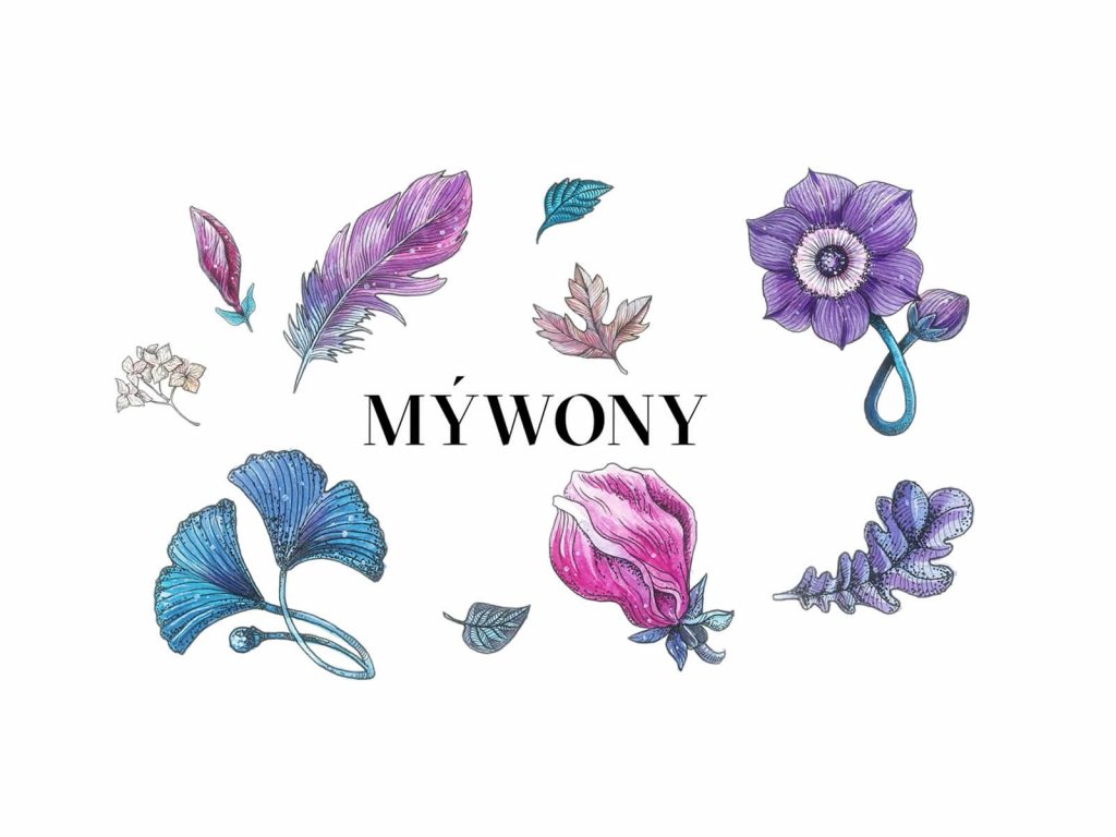
The brand logo wordmark upgraded with sophisticated font and acute mark
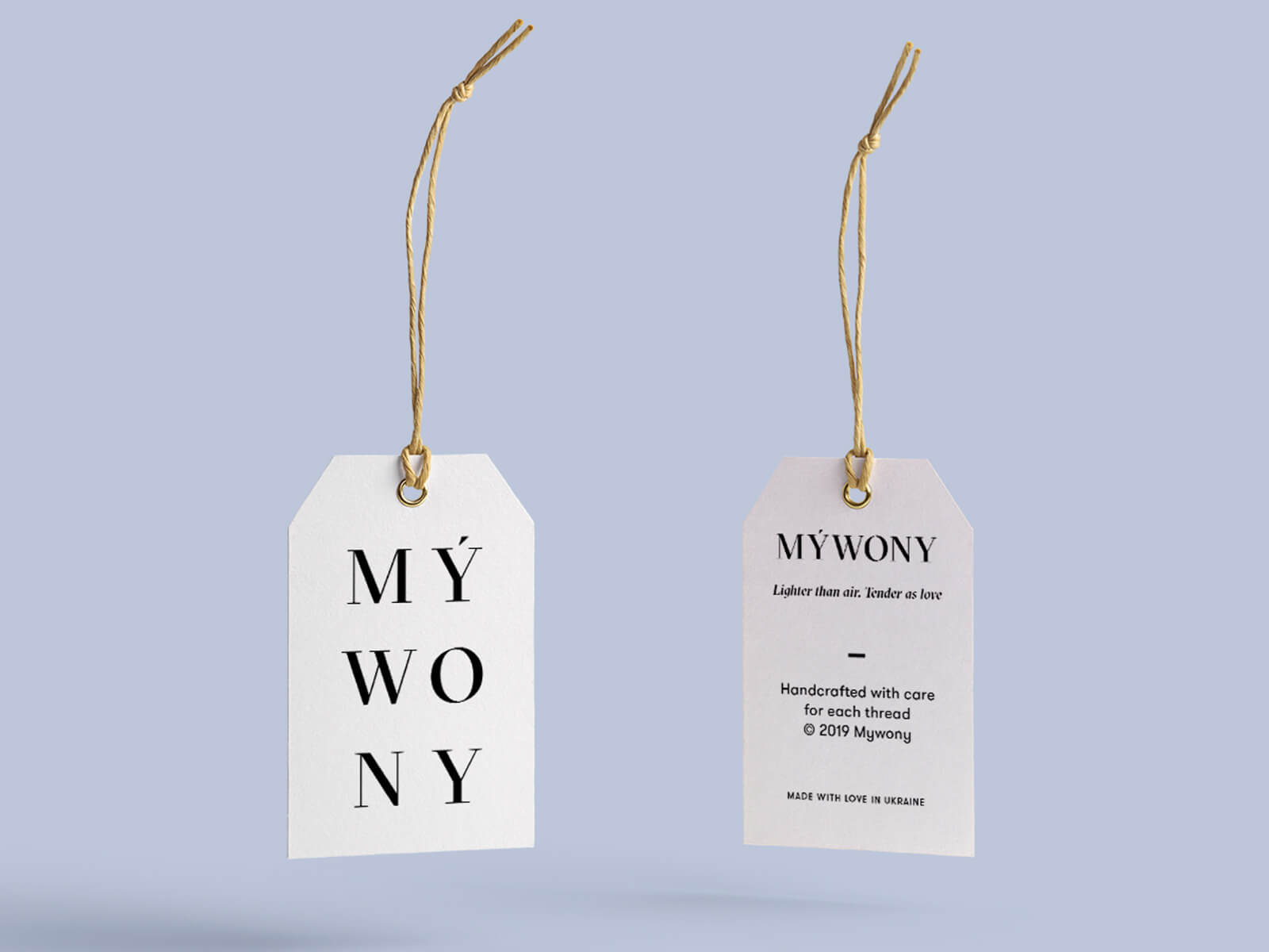
The label design featuring a vertical and horizontal version of the brand logo
The graphic designer Yaroslava Yatsuba developed the stylistic concept that would be applicable for the brand intro cartoon and also the physical branded items to give a consistent look to all the details, like packaging, gift cards and so on. The botanical illustration was chosen as a basis of the concept and stretched on graphics featuring animals.
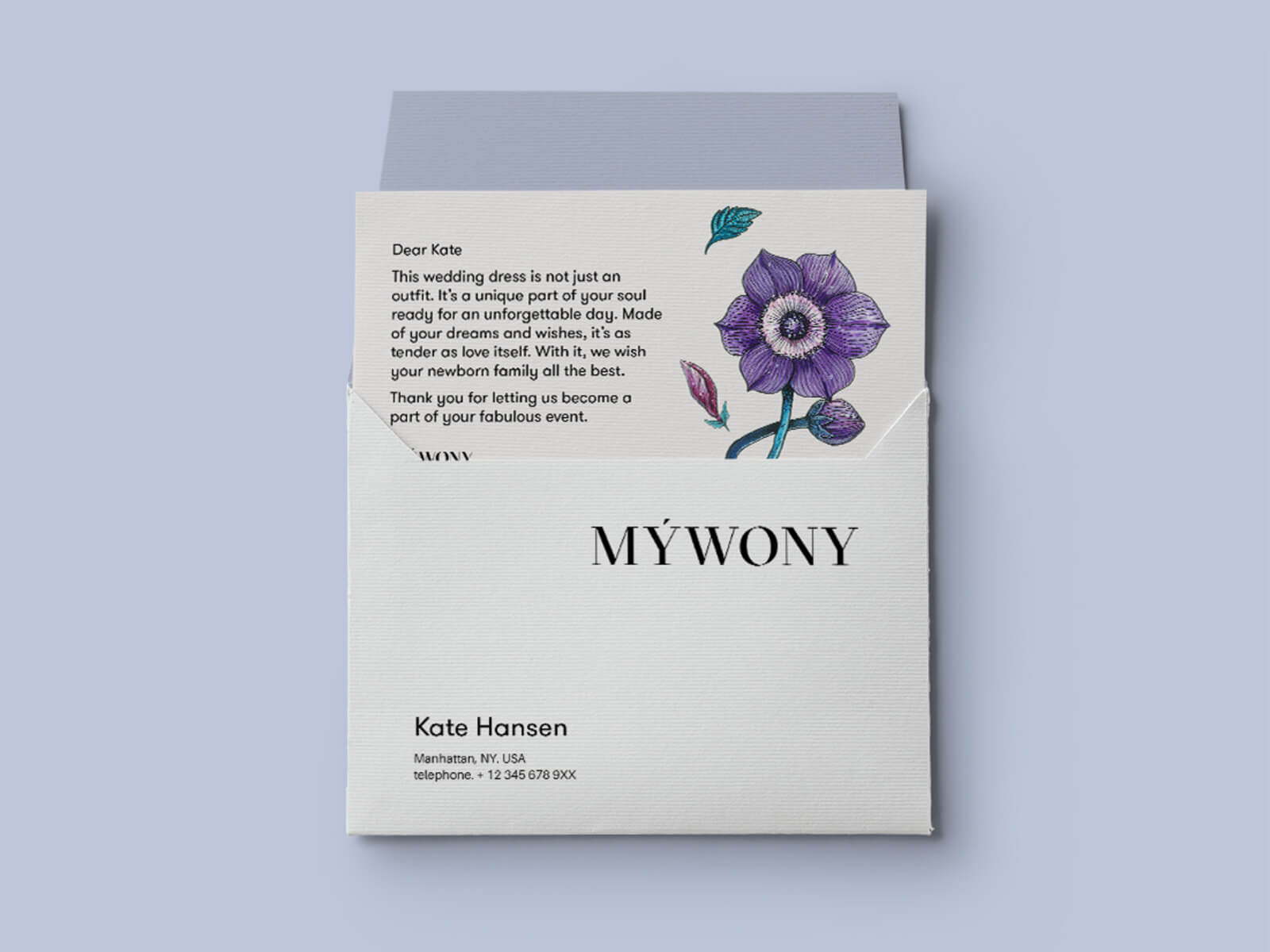
Gift card design
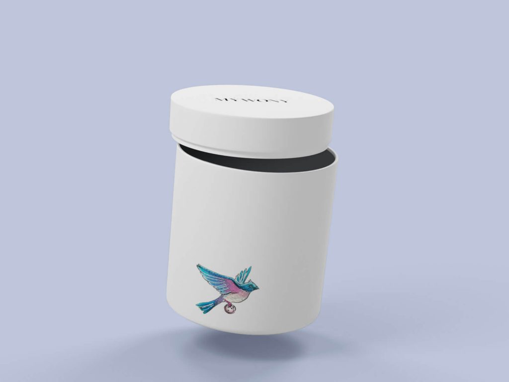
Packaging design
Story
Coming to the brand intro, the creative team built up a tender story full of magic and showing how nature itself created a very special dress for the bride’s very special day. The graphics feature the style of traditional watercolor art filled with nuances and air, rich color palette, and detailed drawing.
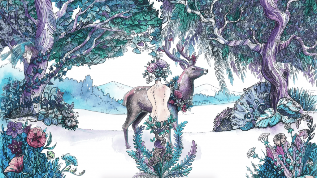
In motion, the cartoon used the technique close to stop-motion animation. Together with lovely music, it supported the atmosphere of the fairytale and allowed the viewers to enjoy the artistic performance. Here’s what the first presentation of the video looked like.
The concept was presented to the clients and approved. But a story wouldn’t have been good enough if it hadn’t had an unexpected twist. In several days after the presentation, the team got a friendly message from the client with the words “It seems you are being spied on…” :
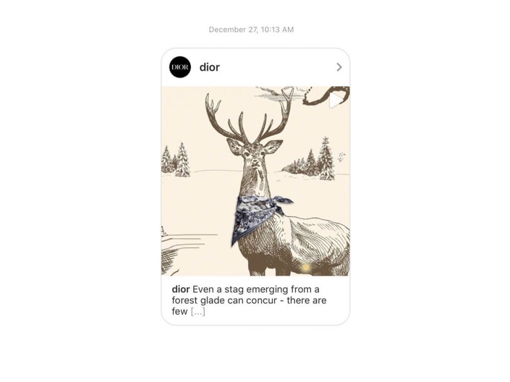
What could be said here? Great minds think alike, nothing more. Whatever different were the stories and the styles of the promo campaigns, it was clear that after the Dior campaign, the work on MYWONY brand intro had to be started from scratch. The creative team had to make a twist half-way and develop a totally new idea.
Iteration 2: Space Adventure Cartoon
The second iteration started from the question: should the brand intro really be another princess-like and super-cute stuff? For such content, there were little chances of not getting lost in the red ocean of the tough competition in the wedding industry. And the previous version showed it brightly. Both designers and stakeholders were keen to rise something really out of the box to fight for the target audience’s attention. In the process of research and brainstorming, they came up with an idea of an interactive space western cartoon “Save the Fiance” to give the brand an exclusive viral factor of promotion and let it stand out.
Story
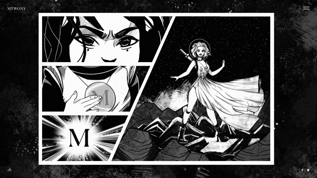
The intro entertains and engages visitors with a story that combines the traditions of illustration for comics, cool sci-fi vibes and slight animation adding dynamics. The characters face challenges and fight to save their love, so that is the eternal story close to any loving couple but performed in modern looks. The plot puts the wedding in the center of the story and makes the wedding dress the symbol of a woman’s love, power, and fondness. This way, the intro supports the MYWONY brand strategy with the power of storytelling. Just for a quick reminder, storytelling in design and marketing is a technique of building users’ engagement, emotional feedback, and empathy with a story that traditionally has a plot, characters, theme, and decor.
Sketches
After having decided upon the general plot and heroes, the designers had to choose the visual stylistics that would balance between the ideas of superhero comics and romantic cartoons, not taking the viewers away from the main topic of love and romance that overcomes any obstacles. So, the illustrator started the creative search of the characters and the environment from sketches.
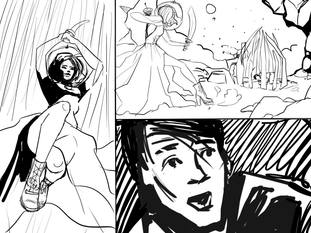
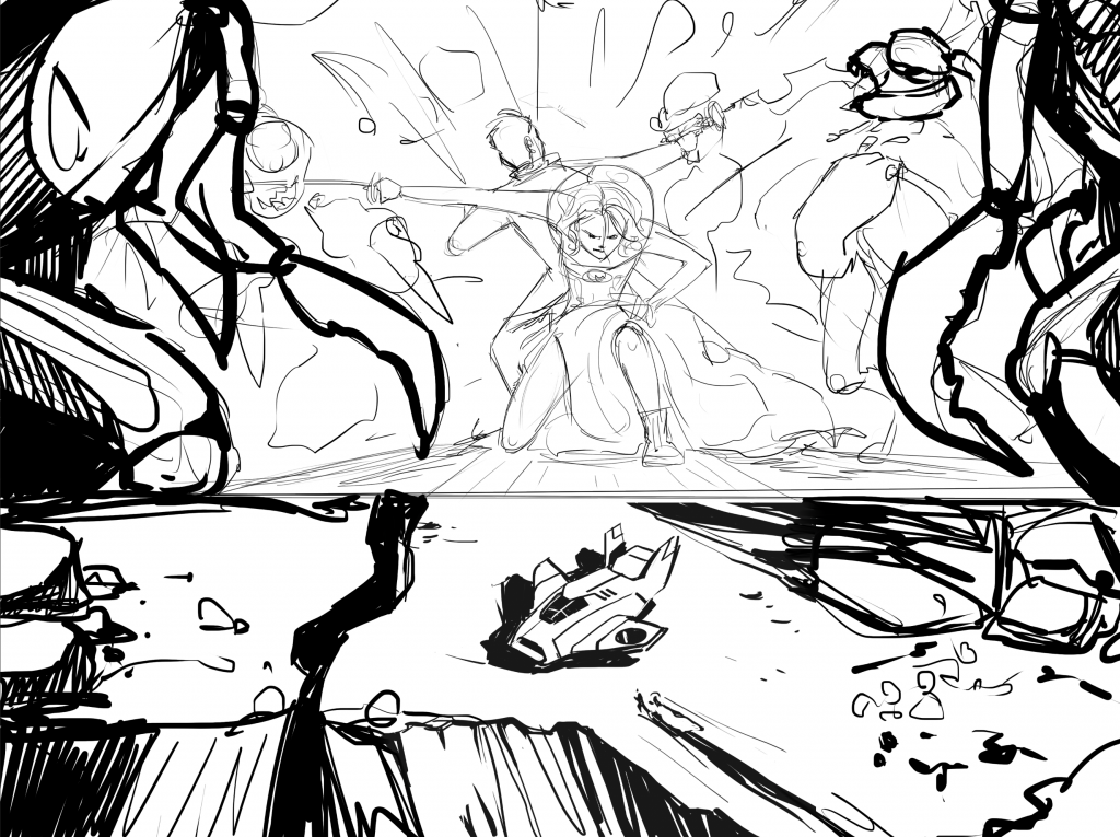
At this stage, the creative team also agreed upon the limited color palette that made the color details even more visually expressive, allowed to echo the style of classic sci-fi comic books and added the atmosphere of magic and mystery to the story.
Character Design
After the basic concept was agreed upon, the illustrator devoted time and effort to the detailed work on the characters and scenery.
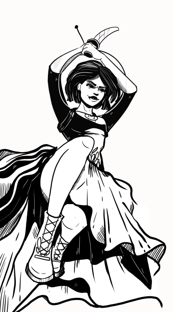
The heroine of the story captured in a dynamic posing

Facial expression details reflecting the character’s emotions
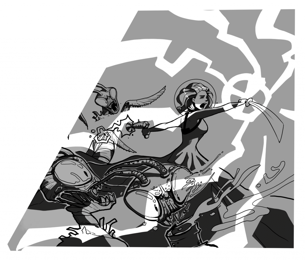
The battle scene development
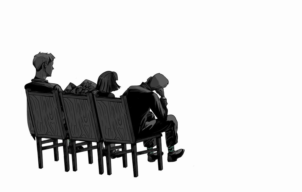
Details of the environment and minor characters
From one episode to the other, the illustrator moved through picturing all the scenes to creating a storyboard.
Storyboard
As we mentioned in our guide to creating promo videos, a storyboard is a set of organized graphic assets. The illustrations were arranged in the sequence of their flow for the cartoon plot. This technique is not a new thing: its early version is said to be invented by the Walt Disney Animation Studio in the 1930s and has been adopted by many animation studios around the world. Storyboard visualizes storytelling and gives a better idea of the video or comic flow. It also allows the design team and the client to discuss the details about the visual part and the sequence of scenes before the motion designer starts the actual animation.
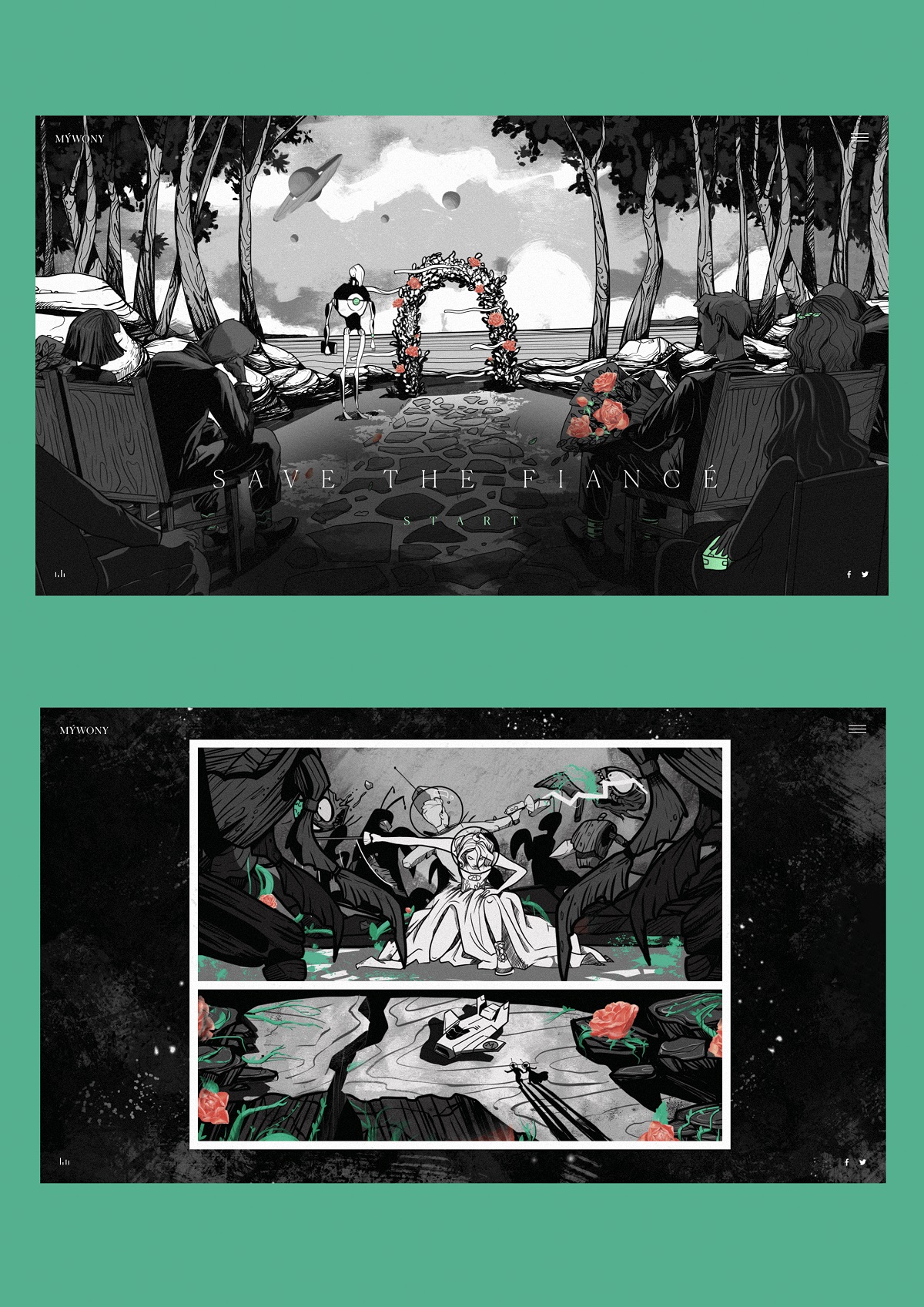
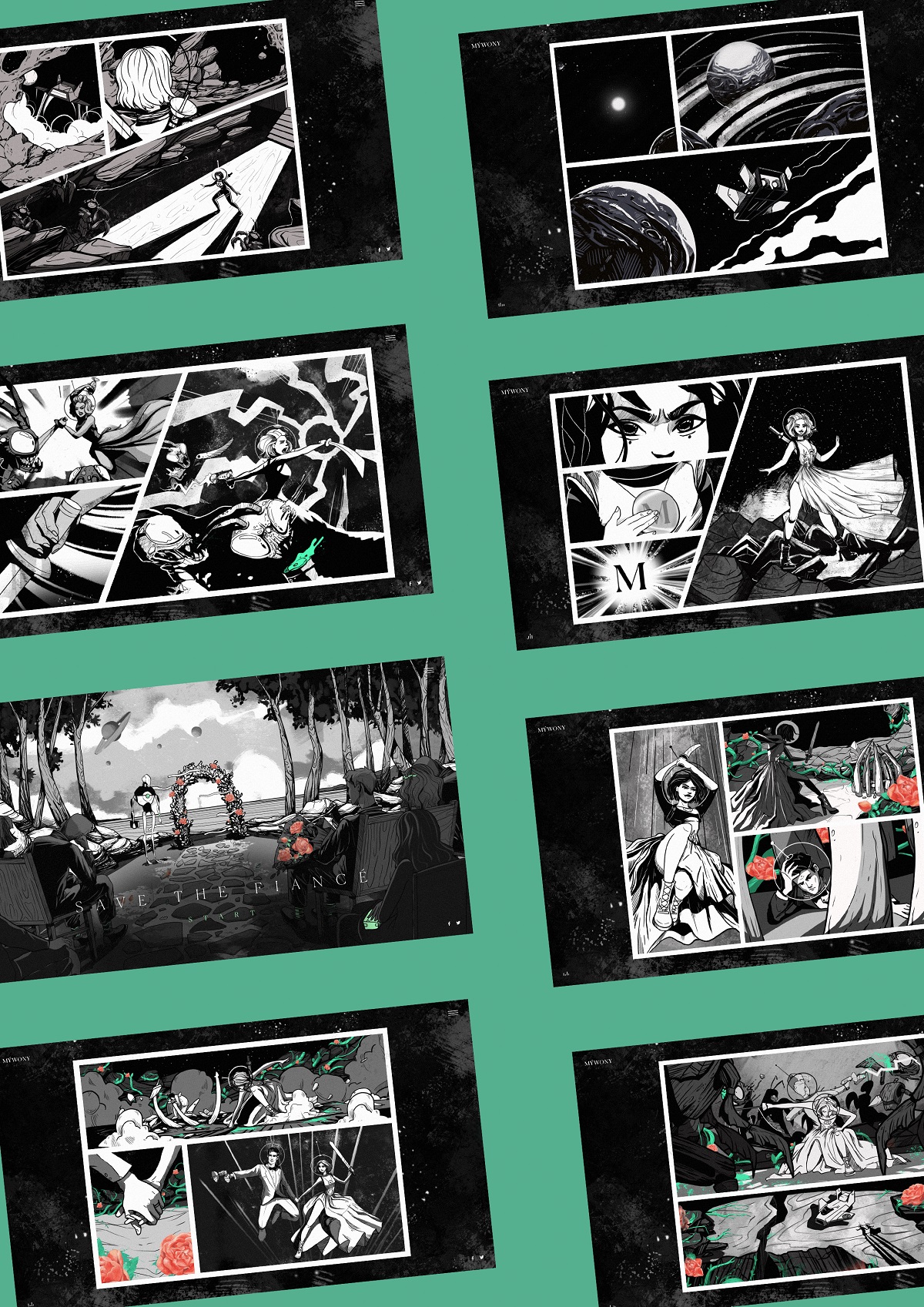
Episodes and UI Design
Let’s check the final illustrations for the episodes of this romantic story presenting the wedding dress as a source of superpower for a modern woman.
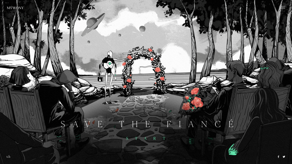
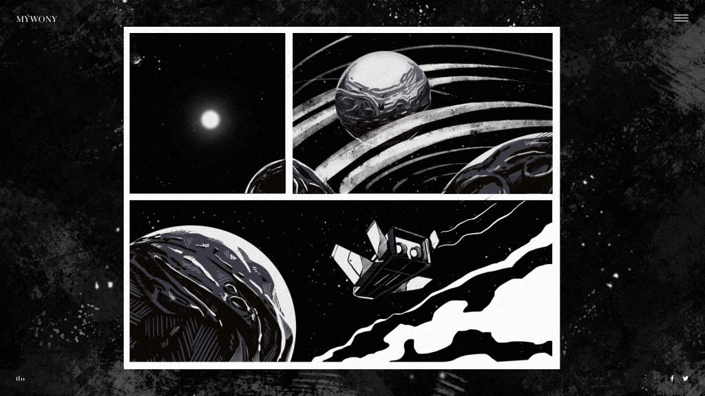
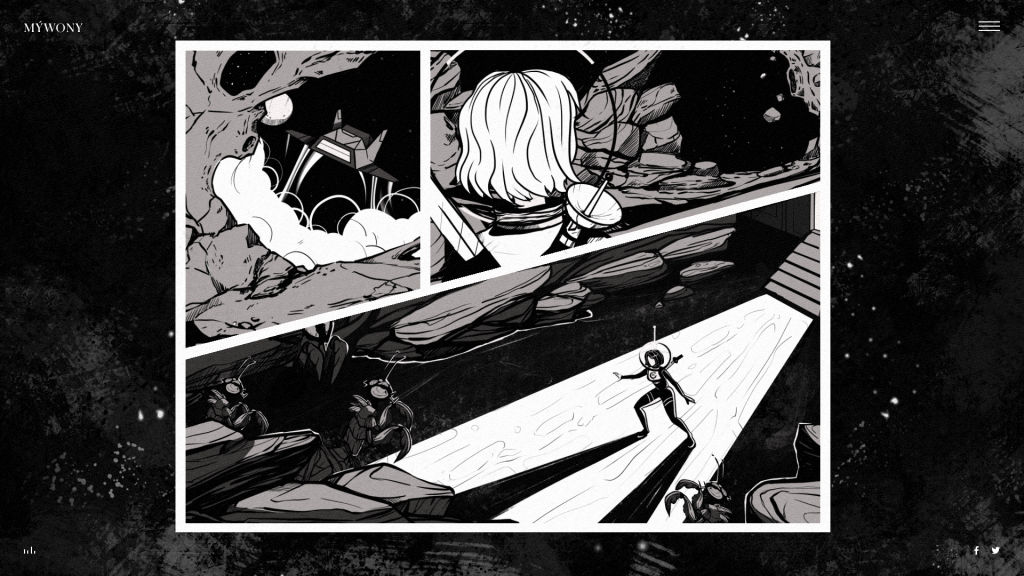

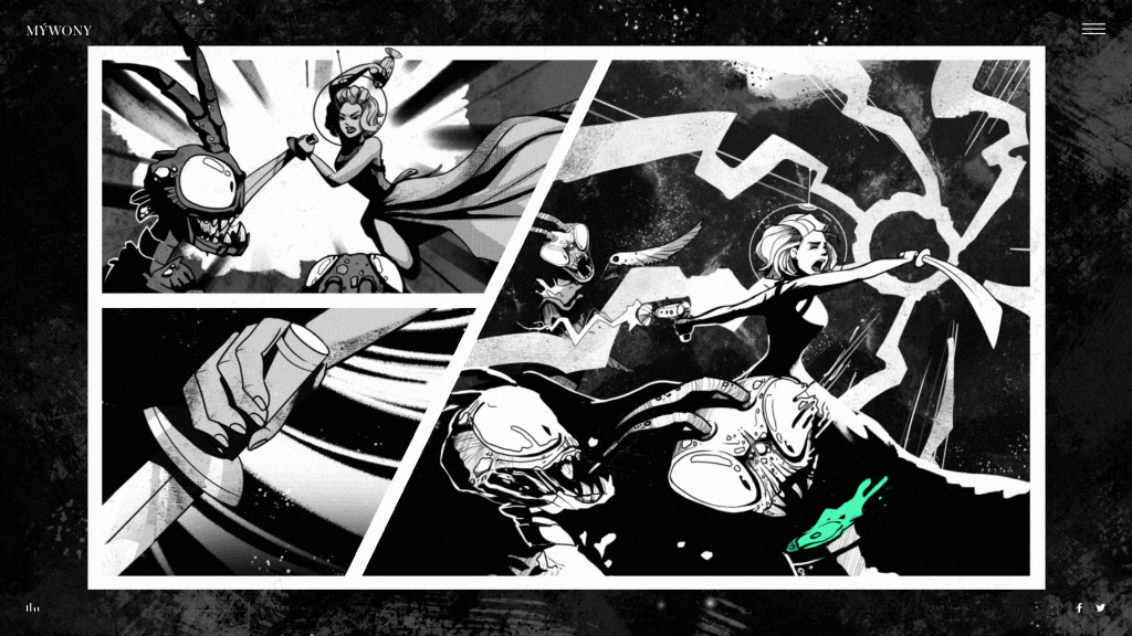
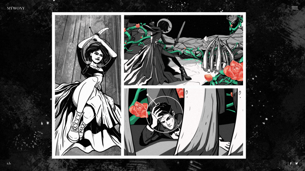
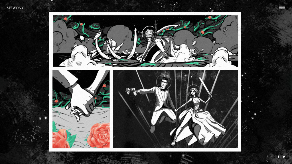
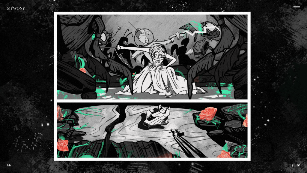
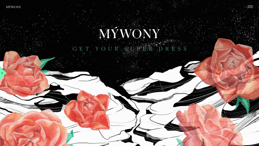
The user experience with the cartoon reminds reviewing a comic book: the visitors move from one episode to the other diving into the story. No hurry, the viewers have all the time they need to look into the details of a graphic adventure.
The illustrations are performed in a minimalist interface: it features the non-obtrusive brand logo in the top left corner, the hamburger button in the top right corner hiding the list of all the episodes, and the sign of audio activated in the bottom left corner. This simple navigation is just a supportive element here, it doesn’t distract from the story. Also, there was designed the start screen welcoming the visitor to begin the adventure and informing that the cartoon has sound so the headphones are needed for better users experience.
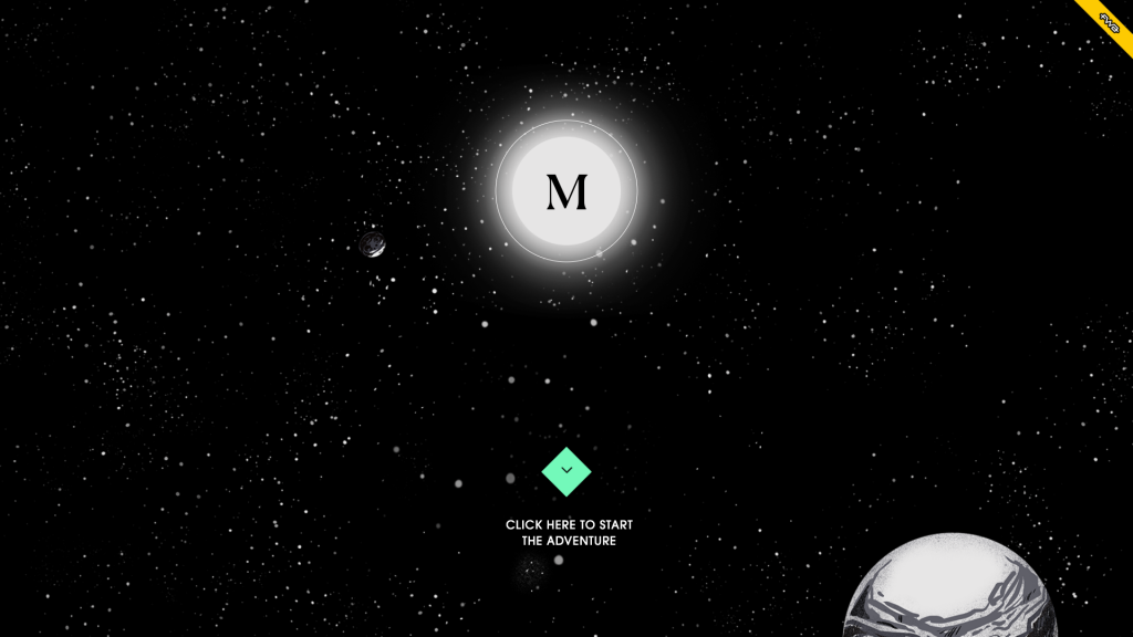
Also, it’s worth mentioning that the visual elements of the brand intro are also used on the website and branded stuff like gift cards to provide visual consistency of the brand image in a variety of channels.
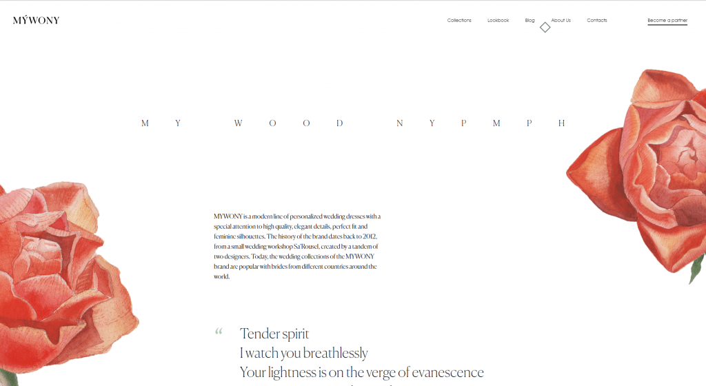
The flower illustrations from the brand intro are featured on the About Us page of the website
Animation
Although the cartoon was not designed as a video flow, the animation was applied to a variety of details in the episodes to make the story even more dynamic and expressive.
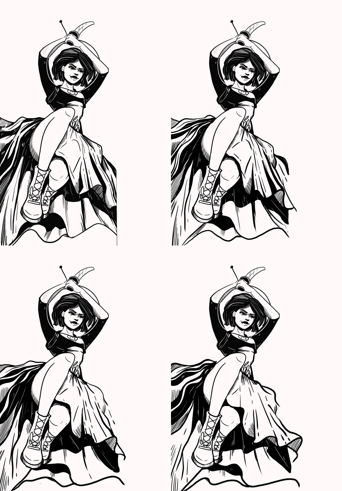
Also, the designers and developers added some hidden interactions into each episode, a sort of “easter eggs” for attentive viewers. For example, the users could try boosting the spacecraft or make the aliens shoot.
Together with sounds and music, it lets the viewer plunge into the atmosphere of space adventure.
Check the full version of the brand intro
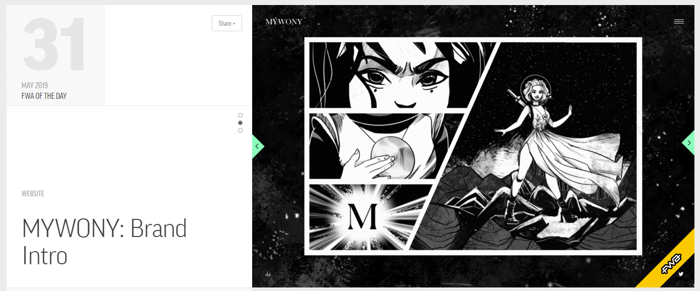
The idea and the work of the creative team have already got the recognition from the professional design community, for example, it won the FWA of the Day.
Useful Articles and Case Studies
Florence App. Illustrations for Healthcare Service
Inspora. Brand and UI Design for Virtual Stylist
OffCents. Explainer Video Production
Binned. Design for Promo Video Production
Step by Step Guide to Custom Promo Video Design


