Motion is the powerful way to liven up design solutions. In our previous articles, we have already shared some ideas on the significant potential of animation in interface design, when it is used wisely and purposefully. The topic is definitely broad and comprehensive so here we will continue the thoughts provided by us earlier with a further step to explore interface animation in more details.
This time we will be concentrated on some purposes that can make the designer think about animated interface elements as the sort of a design solution improving interaction and providing the positive user experience.
Purpose is a key
As we mentioned in our previous article, today interface animation is a great way to retain users as it makes their user experience pleasant and enables solving their problems faster. However, a designer should deeply analyze its potential for increasing usability, utility, and desirability of the product before making a decision to apply any sort of motion design. Animation should be used thoughtfully and always have a clear purpose. Advantages and usefulness of its application in the interaction process have to be obvious and outweighing possible disadvantages. The animation should become the icing on the cake, not a fly in the ointment. The purpose is a key that opens the door to efficient design solutions.
Therefore, the first thing to decide on is the purpose why animation could be applicable in the interface. Here is the list of possible purposes.
Purpose: Showing that the process is progressing
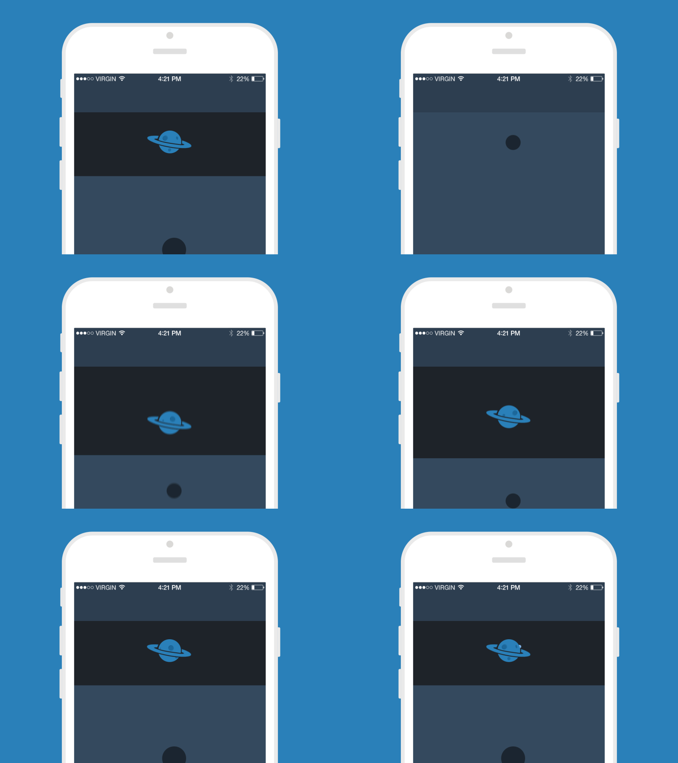
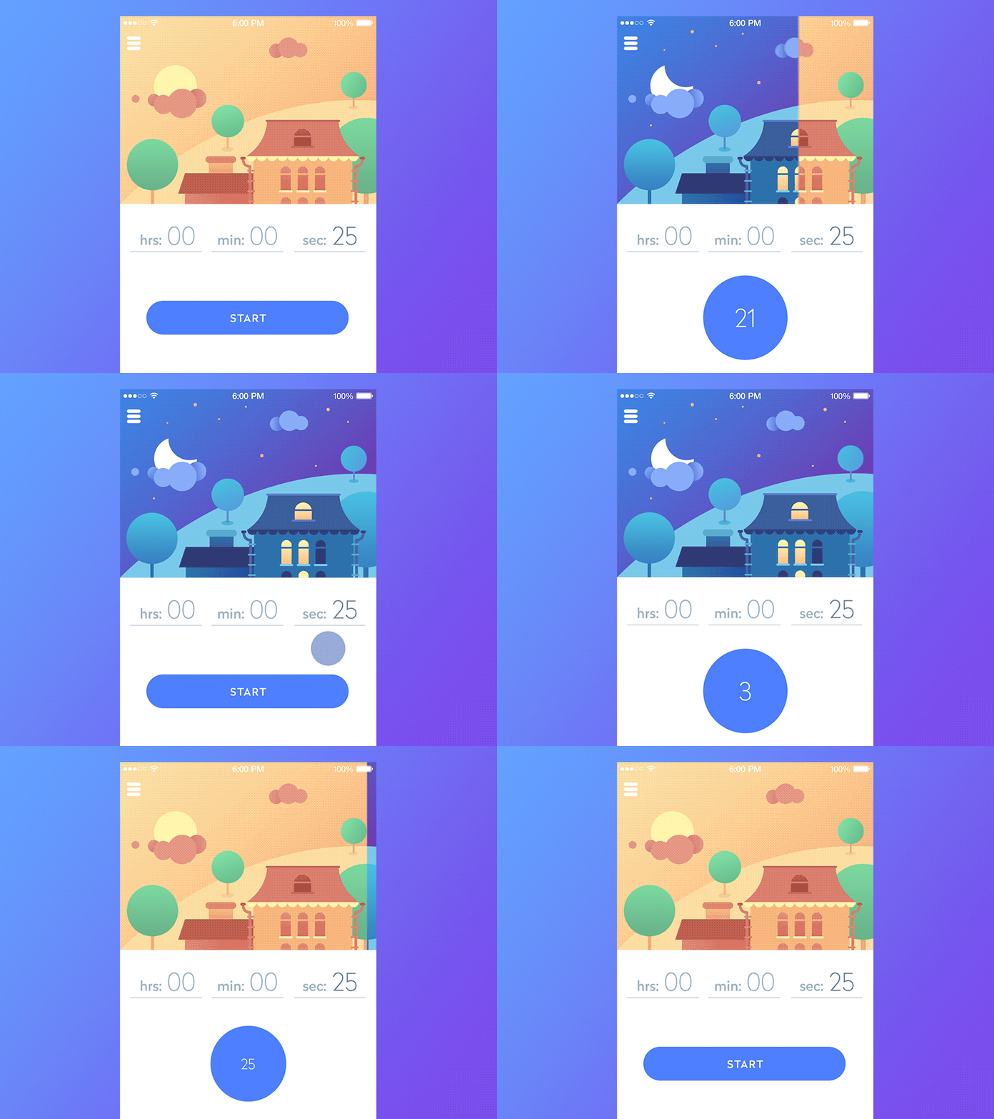
One of the important and essential positive features of interface animation is communication with the user. Animated interface details are able to instantly inform the user about the processes he or she is involved in. Therefore, one of the aims of motion design in UI is to inform the user about the stage of progress.
As we mentioned in the post devoted to animated microinteractions, this is probably one of the most widely-used types of interface animation. It lets the user instantly understand that the process is going on and even show what stage of the process is actual now. The biggest advantage of this animated interaction is providing assurance for the users, making them calm and confident in the process of using the product. A confident and happy user in the vast majority of cases means positive user experience and provides the good ground for high conversion rates.
Certainly, it is not the magic wand, and usability of this trick should be supported with all the other thought-out design elements. However, this particular kind of animated interactions really needs to be considered in terms of creating an efficient user interface informing the user quickly.

Preloader
Pull To Refresh
Timeline App
Purpose: Showing that the action is done
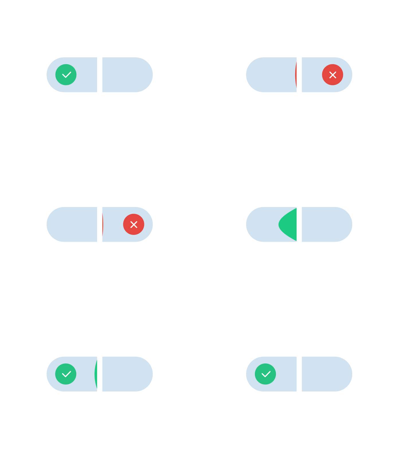
One more popular purpose of user interface animation is somehow the next step of the interaction. It doesn’t show the process, it shows it’s finalization. Again, it’s one more way to inform the user which means that the importance of such interaction is high. At every step of interaction with the product, a user needs to understand clearly and quickly if the action was done and the system responded to it. No wonder, the usability of the product design really suffers if this sort of feedback is not provided as fast and obviously as possible. Various sorts of animated elements from simple ticks to complicated animated mascots or illustrations can serve this need.
Nevertheless, the matter of simplicity for this sort of animation is also the point to consider. Complex animation can overload the page or screen or take too much time for such a simple operation, so it should be properly analyzed. On the other hand, original animation can become both informing and attractive, it can entertain the user which is also an important feature for some applications and websites. Knowledge about the target audience and its potential preferences is extremely helpful here.
Switch Control Animation
Purpose: Grouping the data
One more potential aim is providing groups of any kind for a big base of typical data. Animation, in this case, can liven up the process, especially in terms of a transition from one group to the other. There can be cards with personal data, separated conversations and chats, data about items and products, information about transport, and tons of other options. Motion added wisely here creates the illusion of physical contact with the data cards or groups and can provide a good reason for feeling this experience as positive.
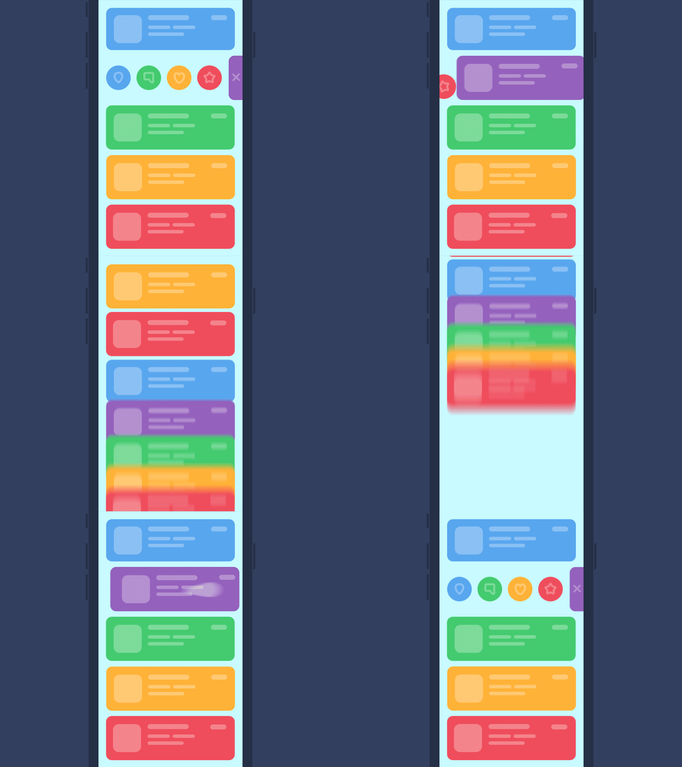
UI Animation Concept
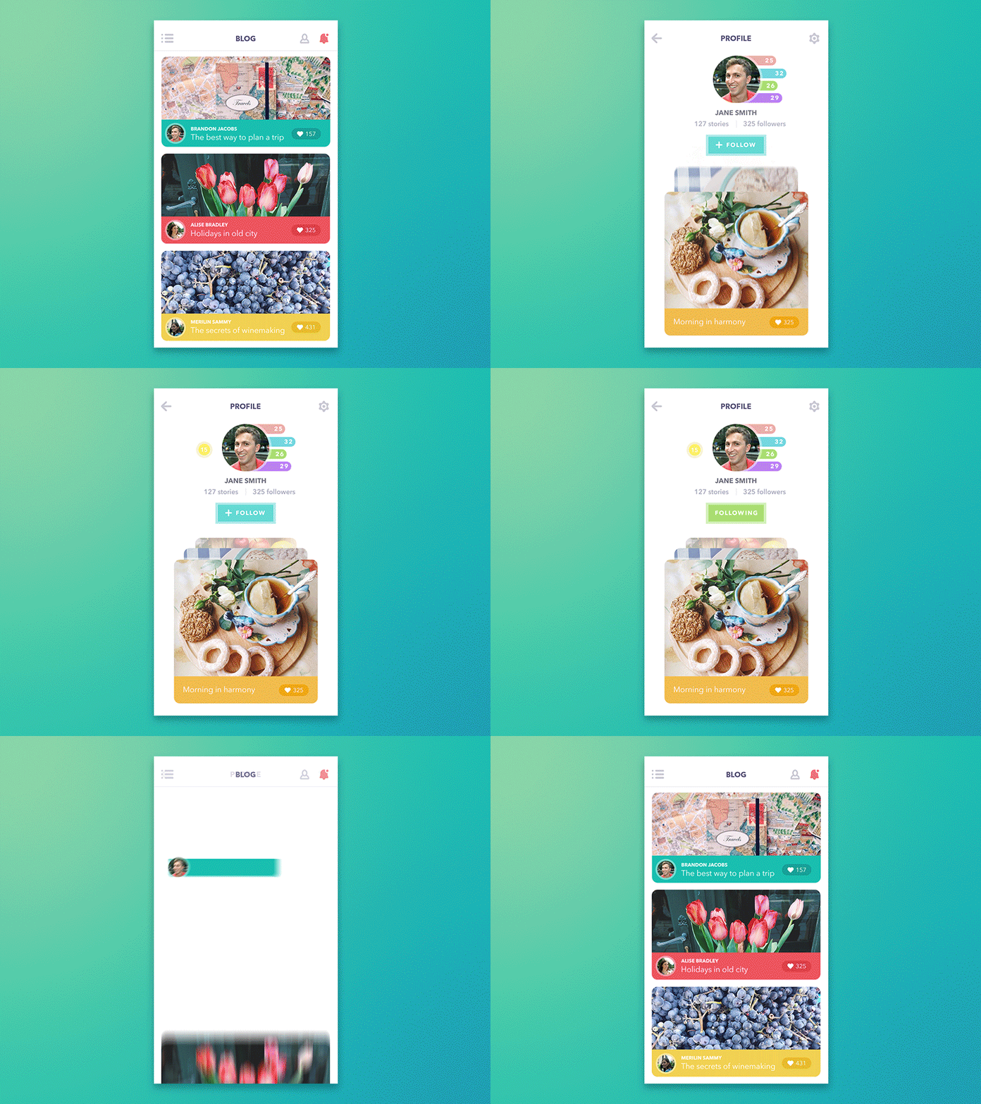
Blog App
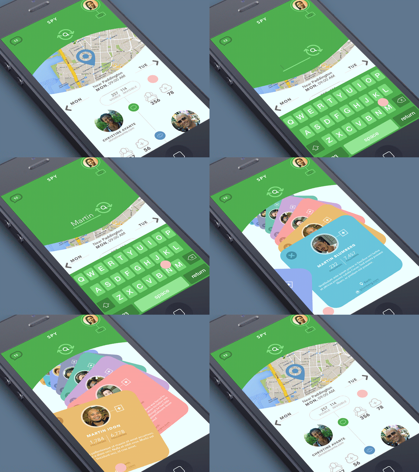
Green Spy Animation
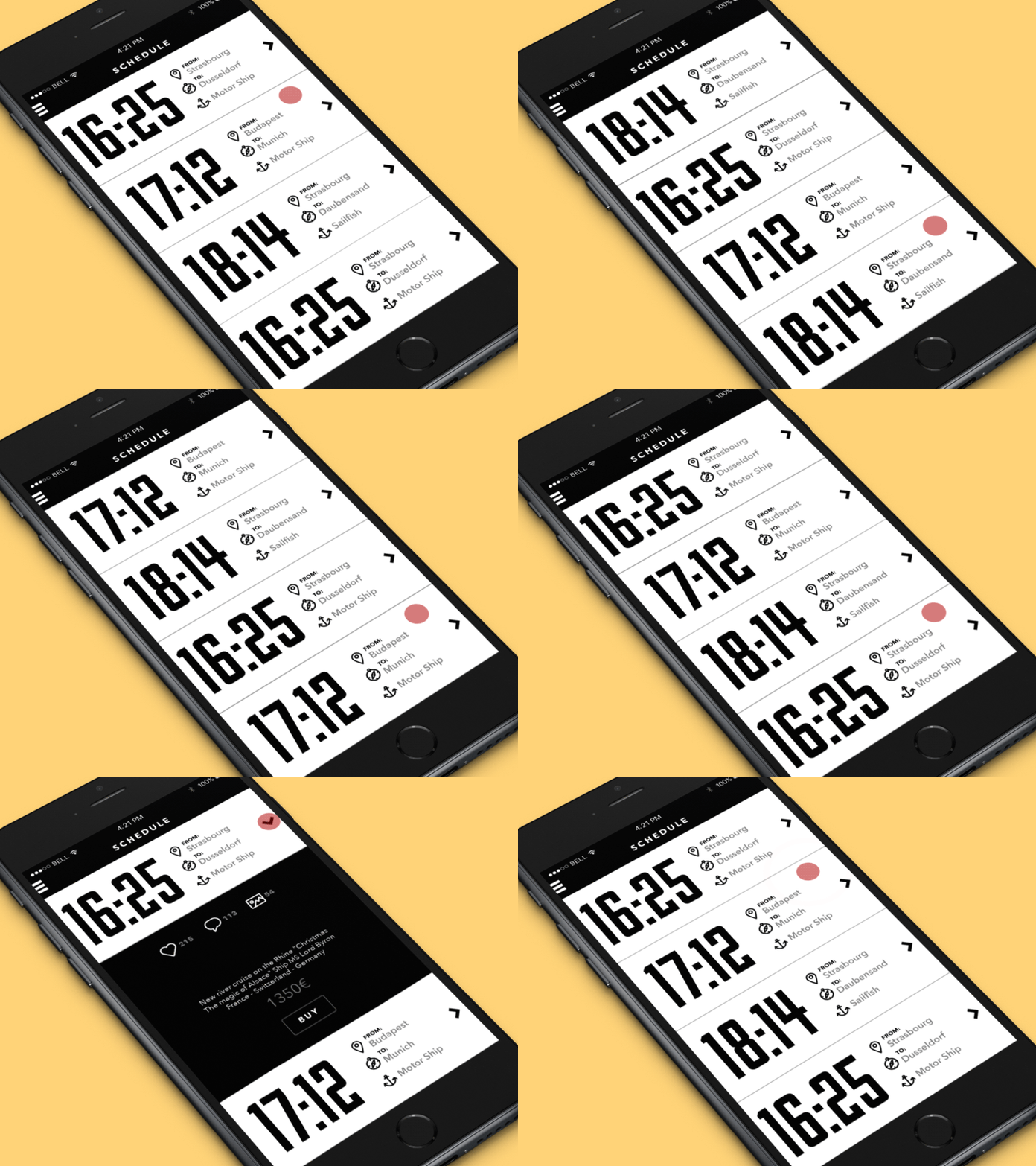
Boat Station App
Purpose: Drawing attention to specific elements
This sort of animation is used to highlight something important that users can possibly miss while shouldn’t. Being animated, the element of the layout gets much higher chances to be noticed even if it’s quite small. However, this sort of animation should be used carefully, otherwise, it can distract the user’s attention instead of concentrating it. If this type of animation is applied, preferably only one element of the layout should be animated in terms of one interaction in order to achieve the highest attention ratio.
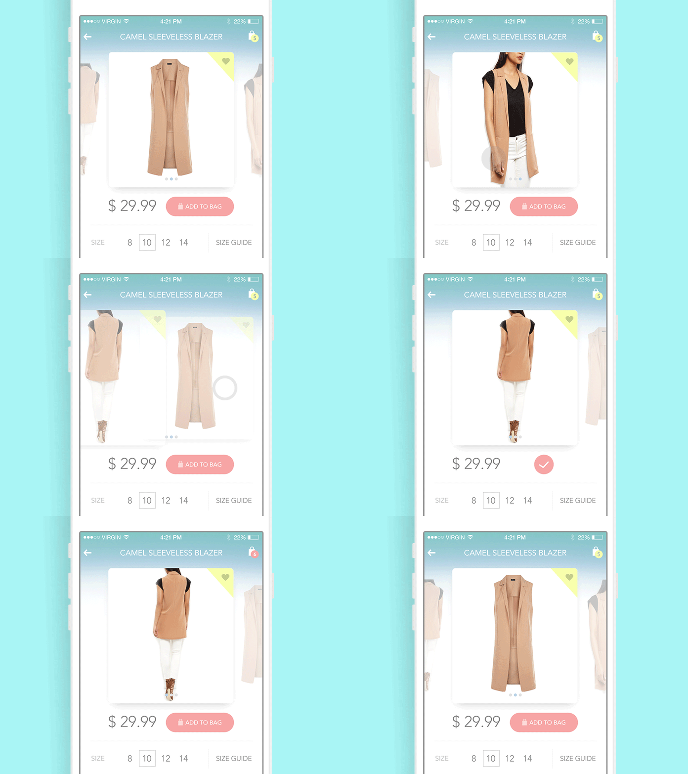
Product Card Animation
Purpose: Providing a prompt to the user
This sort of animation is actually very close to the previous as its initial general aim is to draw attention to the particular element by means of motion. In this case, the trick is used to give users a clue what sort of interaction can be accomplished in places where this interaction is not obvious for everyone. Small unobtrusive interface animation provides instant communication with the user and shows the necessary direction to move one, simplifying the process of dealing with the interface. This kind is really helpful in terms of providing intuitive navigation and therefore usability, crucial for positive user experience.
![]()
UI Animation for Tracking App
Purpose: Supporting general style and branding
One of the cases, when a slight animation is applicable, is adding some motion to the elements of branding which are used in the layout to support brand awareness. In one of our articles, we have mentioned that the strategy of consistent using elements of branding in the interface, especially applied directly in the process of interaction with a product, can be an effective method significantly strengthening brand image. Animation can enhance this effect, draw attention to specific branding elements, and increase general recognizability of the brand.
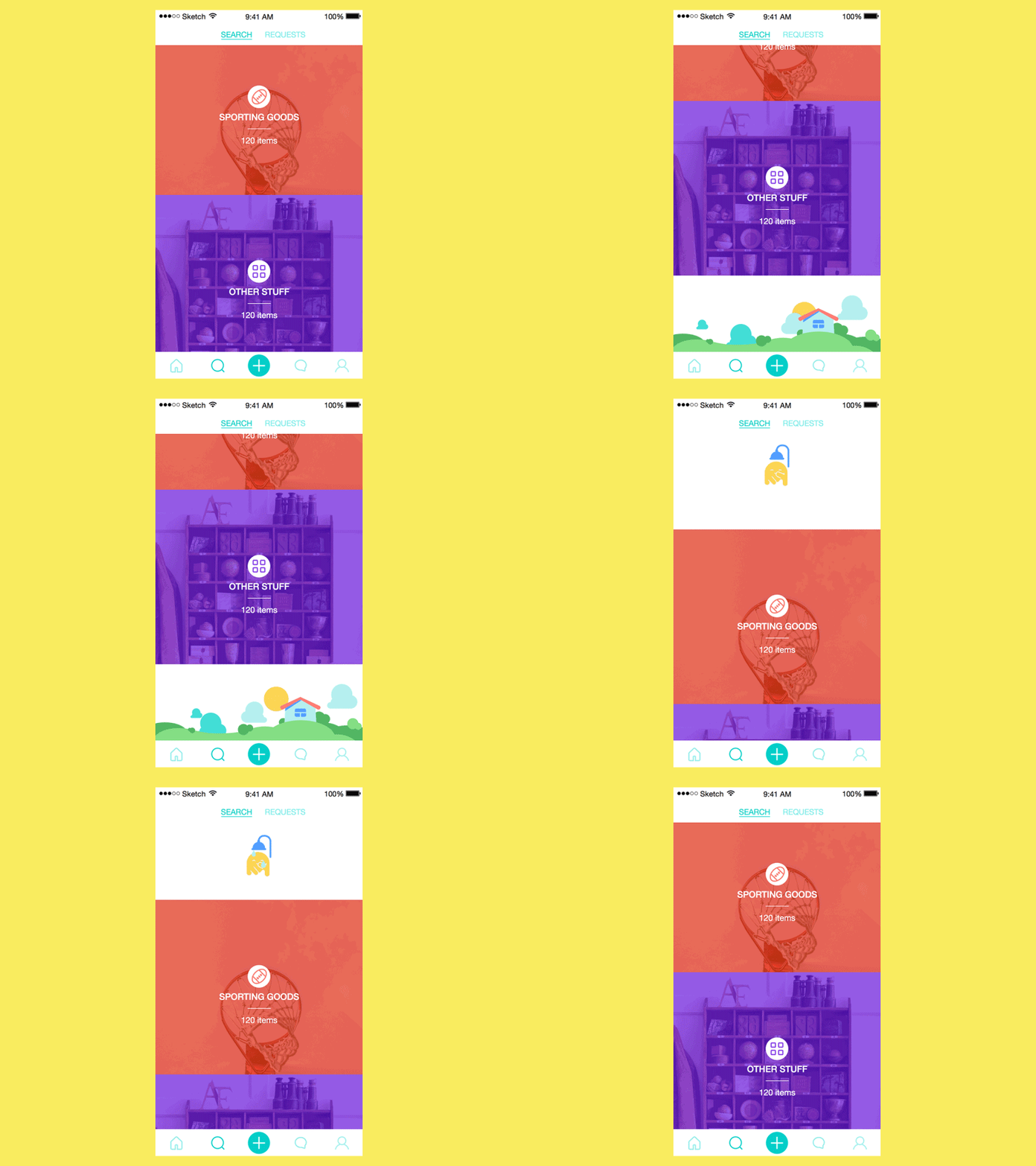
Animation for Saily.App
Purpose: Keeping consistency of transitions
This sort of animation is mostly used in web design frequently in the process of scrolling the page. The effect of well-know and widely-used parallax or other sorts of animated transition has not only the aim of entertaining and creating immediate WOW-effect as it often seems. The deeper function of such a technique is creating a feeling of consistency that makes transitions smoother and more natural. Thus it can create a positive feeling in the process of interaction and if necessary keep elements requiring more attention always in view. Nevertheless, the effect of style and aesthetic pleasure which can be raised by this sort of animation, also shouldn’t be underestimated as it is a good way to attract attention and tickle user’s curiosity.
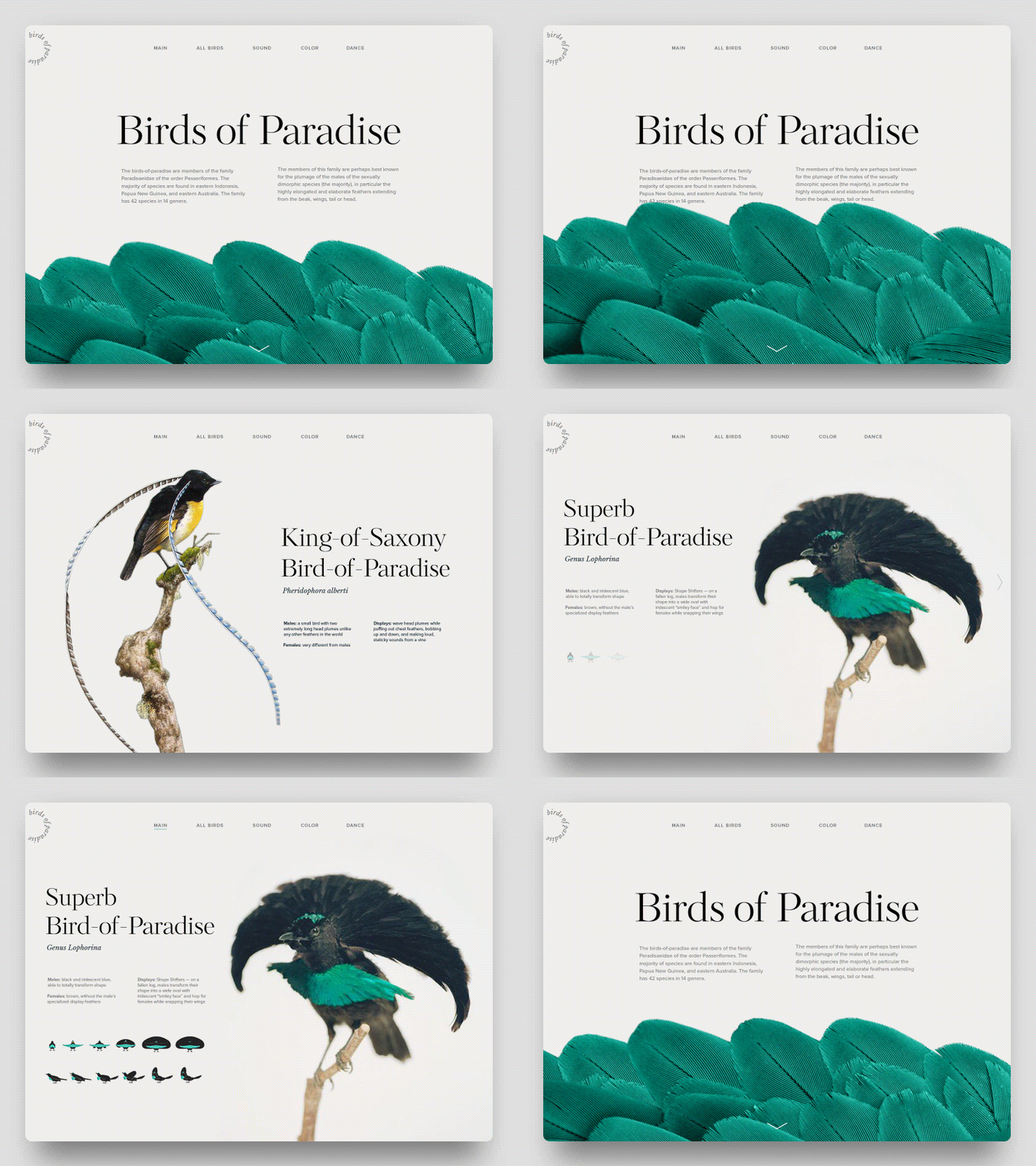
Birds of Paradise Encyclopedia
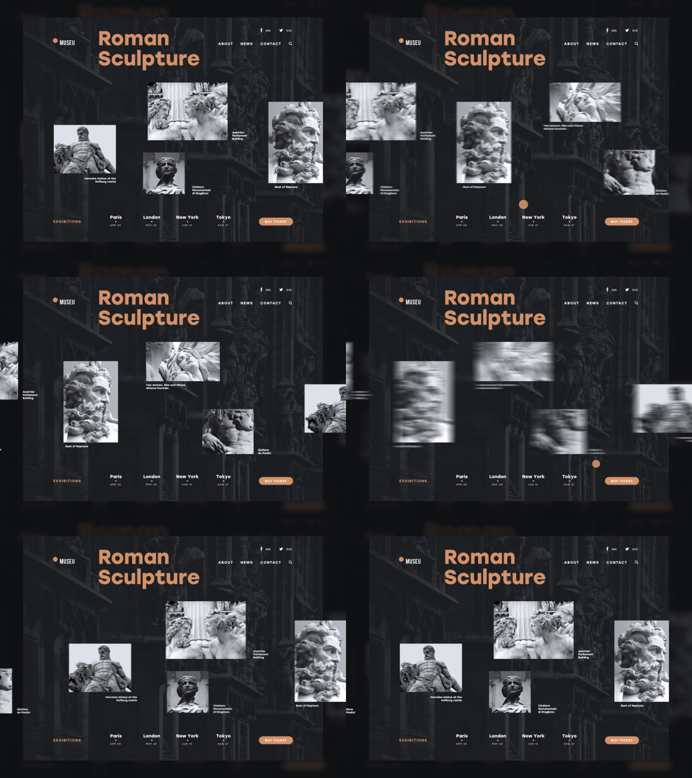
Museu
Purpose: Shock and awe
Perhaps, you remember the episode of “Hitch” comedy where the guy wishing to attract the girl he loved was instructed that the first step to this is to “Shock and awe!” Somehow, it is one of the techniques to work out in design also because users actually start an interaction with the product at the moment they notice it and get curious to try. Sometimes, animation can become the feature instantly grabbing their attention and giving a positive feeling of engagement from the very start. Even a simple splash screen with interesting animation can serve this purpose. Again, this sort of motion design on the screens or web-pages can provoke many debates as the one with the least practical value. However, practice shows that practical issues are not the only thing people want to get from the products they choose. Aesthetic pleasure, entertainment, gamification and challenges, fun and cuteness, style, and amazement can also be strong features in favor of your particular product among the others on the market.
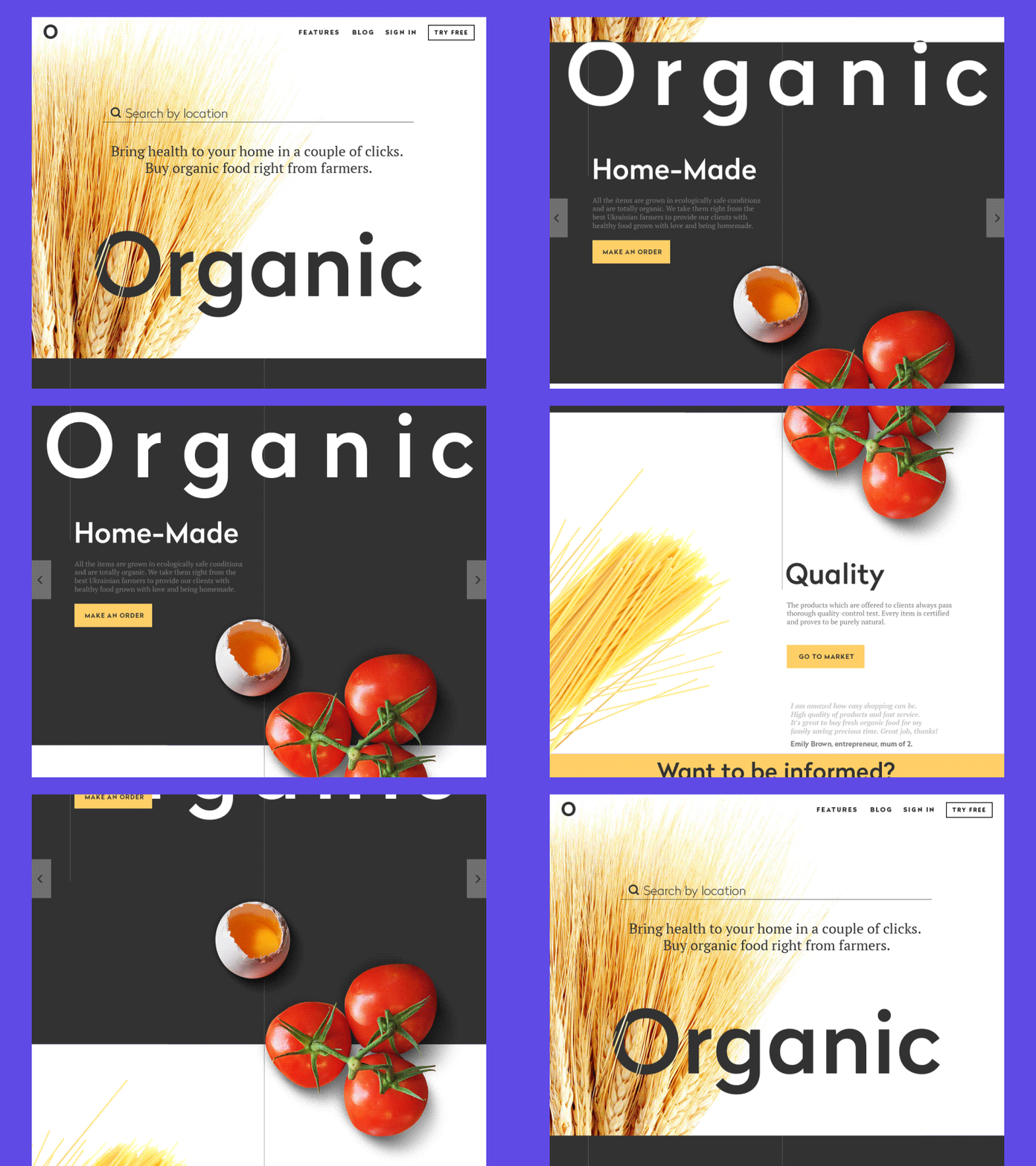
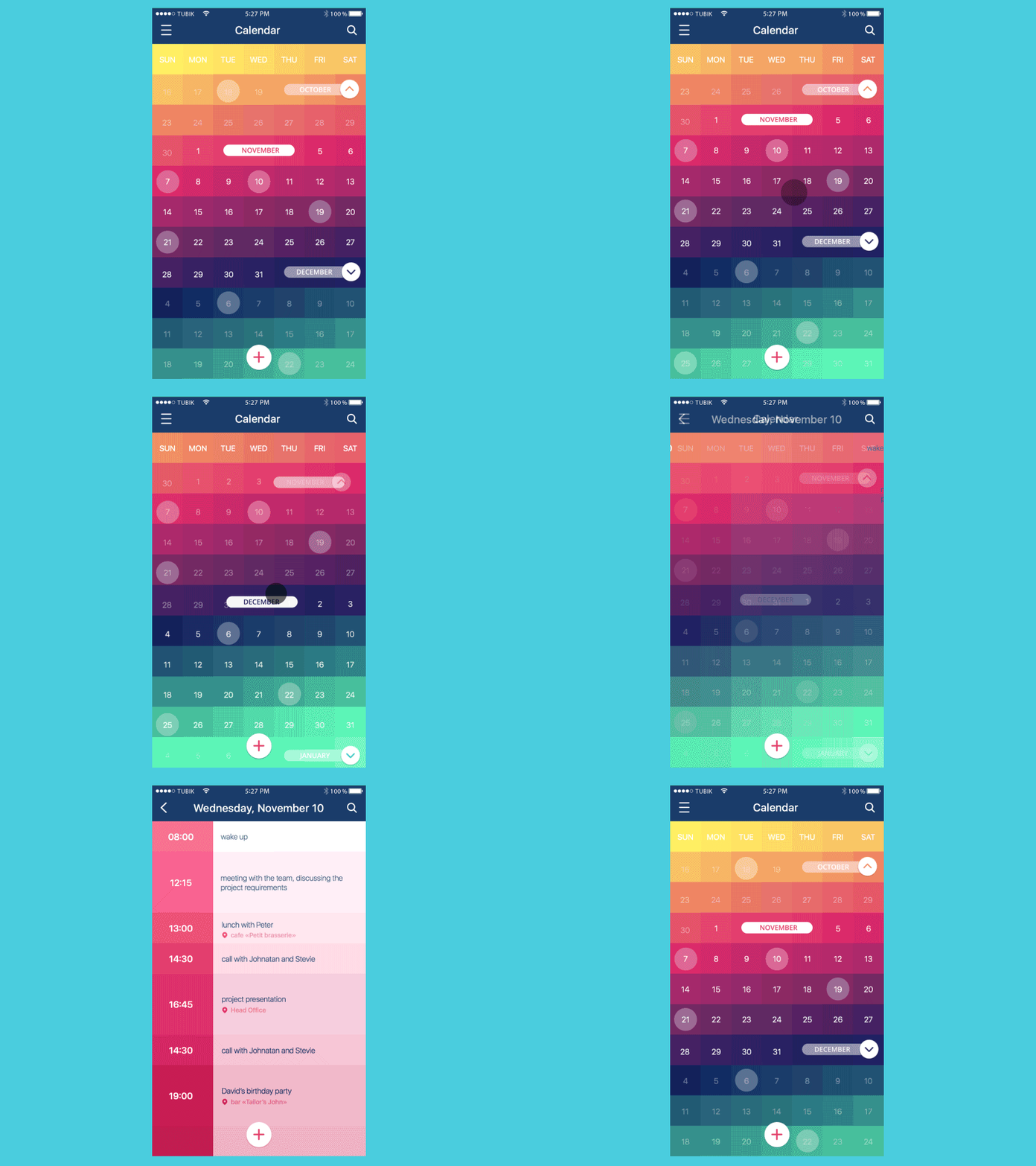
Calendar App Animation
So, the conclusion here is simple: any animation which is applied in the interface should have a clear purpose enhancing general user experience. In the vast majority of cases, UI designer and motion designers try to find design solutions in which animated elements will satisfy multiple options increasing usability and desirability of the interface.
Recommended Articles
Interface Animation. The Force of Motion
UI Animation: Microinteraction for Macroresult
Animated Interactions. Motion on Purpose
UI Animation: Eye-Pleasing, Problem-Solving
UI in Action. 15 Animated Design Concepts of Mobile UI
Case Study: Upper App. Coding UI Animation
Creative Motion: 12 Concepts of Interface Animation


