It started with a gift. Version four of a client’s website that nobody asked for, but we wanted to make it anyway. A summer impulse, if you will. An excuse to get our hands dirty. Our first in-house experiment in creative development. One page, one device, and a lot of scroll.
Our new creative developer had just joined the team. Blender was open, curiosity was high, and we had this one oddly-shaped industrial device that needed a digital stage.
So, What Even Is This Thing?
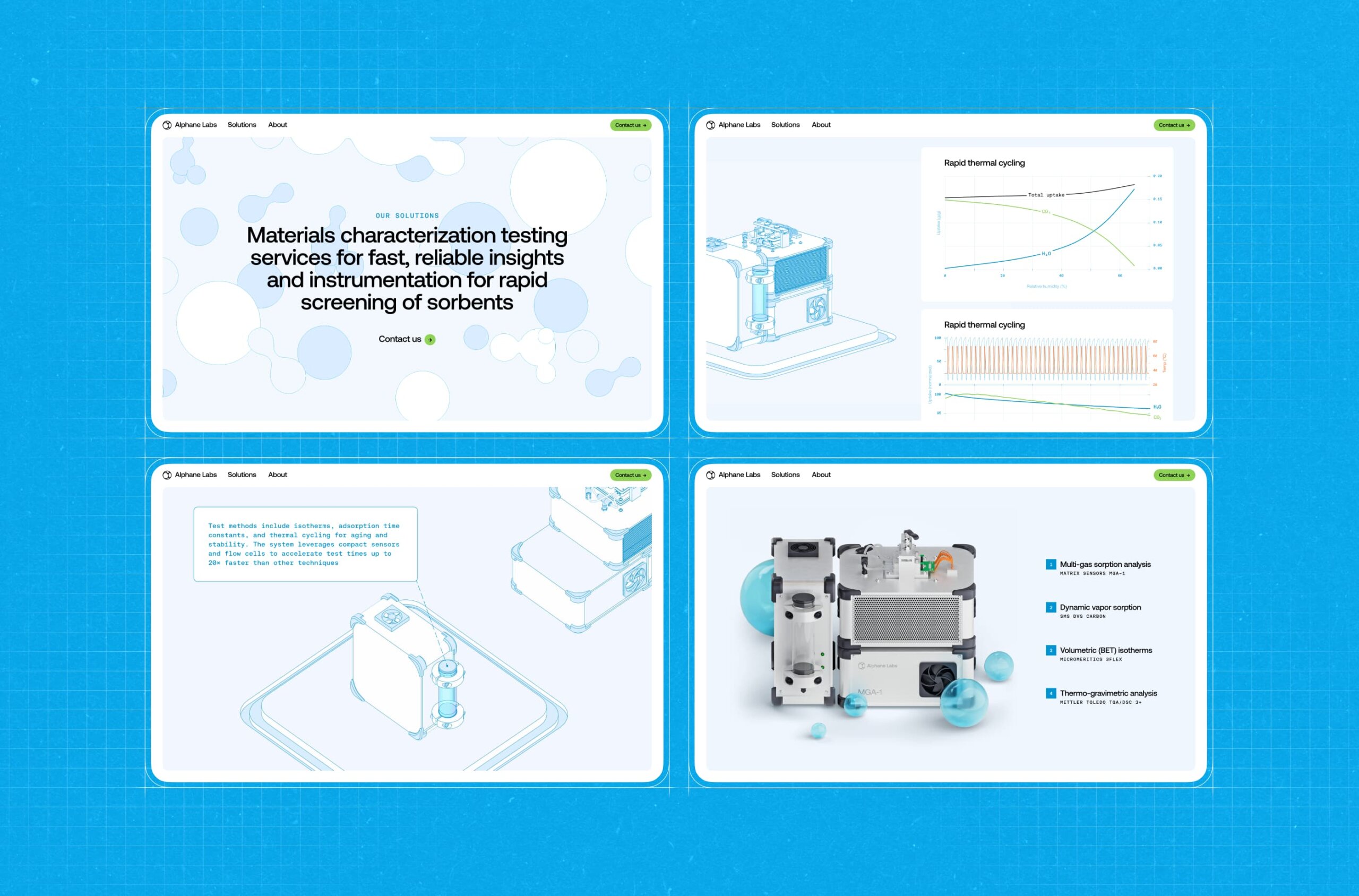
The startup—Alphane Labs—was working on a sensor. A real-deal, heavy-duty gadget used to analyze air composition in industrial spaces. Think: CO2 levels, chemical particles, all the stuff that floats through factory air you probably don’t want to inhale. It was designed for environments like steel plants, furnaces, and factory floors. Serious tech.
We didn’t get a blueprint or a render. All we had was a photo—taken from a weird angle, with lighting that flattened everything into a guessing game. So, we guessed. We reverse-engineered it like archaeologists with a partial skeleton, filling in the bones with imagination and some Blender black magic.
From Idea to Scroll
The goal was simple: build a scroll-based site that walks you through the anatomy of the device. We wanted it to feel like peeling open a manual, only better-looking and less soul-crushing.
The overall concept and 3D model came from Sergii Valiukh, our founder. Ernest Asanov, our Art Director, took the existing UI foundation, isolated the 3D scene into its own module, moved the navigation off to the side, and finessed the balance of typography and color until it felt just right.
Oleg Savenok—our Creative Web Developer—took charge of shaders and interactions. The tech stack was a modern pairing of Nuxt 3 for frontend architecture and Three.js for rendering the 3D graphics. Nuxt 3 gave us fast rendering and a modular project structure. Three.js remains the go-to for WebGL in-browser, letting us balance visual complexity with performance.
We chose orthographic projection for the visual style—no perspective lines, no “real-world” camera angles. Just a clean, technical view, like something pulled from a blueprint. From a dev standpoint, the OrthographicCamera in Three.js made layout logic easier too—no depth distortion, simpler zoom logic, and tighter control over object positioning.
And it felt right—cold, precise, poetic in its flatness. You scroll. You see what the device is. Then how big it is. Then what it’s made of. Then what it shows you—live data, graphed in neat little infographics. Then, finally, a high-res render, where it looks like you could almost touch it.
And that’s it. A one-page story with no dialogue, told through motion, type, and scroll inertia.
Let’s Talk Pipeline
This was our first time running the Blender > Web flow in-house. The rig was basic but functional—build the model, animate it, export, import, pray. Then style the scroll behavior so it doesn’t feel like a PowerPoint.
The export pipeline wasn’t your typical glTF drag-and-drop. To get the stylized edges working, we had to prep the geometry inside Blender: merging vertices, cleaning up normals, optimizing the mesh. Any flaw in the topology would instantly break the shader. Blender cleanup became a pre-flight ritual.
The export wasn’t always friendly, but every glitch taught us something. And when it worked—it really worked.
The Shader Bit
Shaders are one of those things you don’t realize are important until they break. Or until they level up your whole site from “meh” to “whoa.”
For this project, the shader carried weight. We wanted it to match the orthographic style—clean lines, no shadow drama, crisp transitions. The kind of render that feels like an engineering sketch come to life. Oleg built a hybrid shader setup: using standard EdgesGeometry for hard outer contours and a custom-written LineSegments-based shader for internal edges and conditional lines—those that only appear depending on your view angle. The result was a wireframe that looked clean, intentional, and hand-drawn.
What Made It Tricky
Aside from the single photo reference? Probably the collaboration itself. This was our first attempt at stitching together 3D, design, and creative code in a real pipeline. Timing scroll animations with model transitions. Making sure UI didn’t block visuals. Faking depth without losing clarity. And doing it all without a deadline. Which, paradoxically, makes it harder, not easier.
The hardest part dev-wise was shader performance. Especially the conditional logic. It was Oleg’s first time writing a shader this complex, and finding a balance between visual fidelity and frame rate—especially on low-end devices—took a serious R&D phase. Most of the dev time was spent optimizing those few hundred lines of GLSL.
Also, did we mention we built the entire device design by squinting at a single photo?
What We Took From It
This was our sandbox test. A proof of concept for future experiments. It showed us that, yeah, we can go from idea to in-browser 3D experience with nothing but a half-baked concept and a little design mischief.
It also reminded us why we love these side quests. No pressure. No client feedback loops. Just the freedom to follow an idea, mess with it, and see where it goes. And a tiny, boxy air sensor—uncertain of its destiny, but immortalized in pixels, one scroll at a time.
Next time: more weirdness. Maybe even a blueprint or two. But no promises.
Recommended Reading
Liked this project? You might also want to explore these articles:
Immediate Case Study: Rethinking Payday
Small Elements, Big Impact: Types and Functions of UI Icons
Drawing Attention: The Real Power of Illustrations in UI Design
Ecommerce UI/UX: 6 Web and Mobile Design Projects for Online Shopping