
Not every interface problem needs a photo.
In digital products, teams often talk about visuals as if they belong in one big bucket: images, media, content, decoration, whatever. But illustration is not interchangeable with photography, and treating it that way usually leads to weak decisions. A stock photo can add realism. A product shot can build trust. A portrait can signal human presence. But illustration does something else. It simplifies, interprets, and gives a product a visual language that can live inside the interface instead of sitting awkwardly beside it.
That distinction matters. Especially in UI design, where every element on screen is competing for time, clarity, and memory.
Illustrations are powerful because they do more than make a product look friendly. They can guide the eye, explain abstract ideas, soften complex flows, strengthen brand recognition, and make digital experiences feel more coherent. In the right context, illustration is not a decorative extra. It is the smarter medium.
So the real question is not whether visuals matter. Of course they do. The better question is this: when does illustration solve interface problems better than photography or other visual formats?
Let’s start there.
Why Do Illustrations Capture Attention So Well in User Interfaces?
People do not use interfaces in a calm, attentive state only. They open apps in queues, in taxis, between messages, while half-listening to someone else talk, or while trying to remember why they unlocked their phone in the first place. That is the real operating environment we, as designers, have to work with.
In those conditions, attention does not move gracefully through a layout from headline to subhead to paragraph. It hunts for a shortcut. Something readable at a glance, something that helps the brain decide where the screen begins.
Illustration often works better than photography in that role because it can be built for quick recognition. A photograph contains a lot of information by default: texture, lighting, background detail, facial nuance, environment, depth. That richness can be useful, but it can also slow scanning. An illustration can reduce the message to the few visual signals that matter most. One shape. One character. One metaphor. One entry point.
That makes it especially useful in onboarding, feature highlights, empty states, and educational UI blocks. Places where the user is looking not for visual realism, but for orientation.
Inside a layout, illustration also gives designers better control over visual weight. It can anchor the hierarchy without overwhelming it. Or create a focal point, pull the eye toward a call to action. Or separate interface sections without relying on louder dividers or heavier containers. Because illustration can be drawn around the grid, it behaves more predictably than photography inside structured UI.
And memory plays a role here, too.
Users forget labels all the time. They remember forms, characters, colors, and visual scenes. That is one reason certain illustrated onboarding flows stay in your head longer than a perfectly competent interface filled with generic stock assets. The product becomes easier to recall because the visuals attach themselves to product moments.
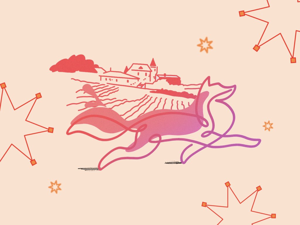
ProAgenda UI Design Case
The ProAgenda UI design case study shows this principle in action. The interface uses a structured illustration system to anchor key product actions. Instead of decoding abstract menu structures, users receive clear visual cues guiding each stage of the workflow.
Real interfaces aren’t opened in quiet design studios. They’re used between Slack notifications, during meetings, in taxis, or while walking down the street trying not to drop the phone.
Design that respects those messy conditions usually wins.
How Do Illustrations Shape the Mood of an Interface Better Than Photos?
Every product has an emotional temperature. A finance dashboard, a mental health app, and a creative collaboration tool may all use cards, tabs, buttons, toggles, and charts. Structurally, they are cousins. Emotionally, they should not feel like they came from the same factory.
That difference is rarely achieved through layout alone—it comes from visual language. And illustration gives teams additional control over that language.
Photography always brings reality with it. Real faces, real rooms, real objects, real lighting conditions. Even when polished, a photo still carries the messiness of the world it came from. That can be an advantage when trust, authenticity, or physical products matter. But many interfaces don’t need literal reality—they need clarity, tone, and control.
Illustration is better suited to that job because it can exaggerate, simplify, soften, or systematize what the product wants people to feel. A healthcare platform can use rounded forms and calm color transitions to lower perceived stress. A fintech product can rely on sharp geometry and restrained compositions to signal control and precision. A kids’ learning platform can build warmth and momentum without looking noisy or chaotic. That level of tuning is much harder to achieve with photos unless the team has the budget, time, and editorial-level art direction.
There is also a systems advantage. Good illustration can be designed to echo the mechanics of the UI itself: the same stroke logic, the same corner radius philosophy, the same palette, the same geometric rhythm. That is why illustration often feels more native to interface design than photography does. It can share the product’s internal rules. When that happens, the visuals stop feeling added. They start feeling structural.
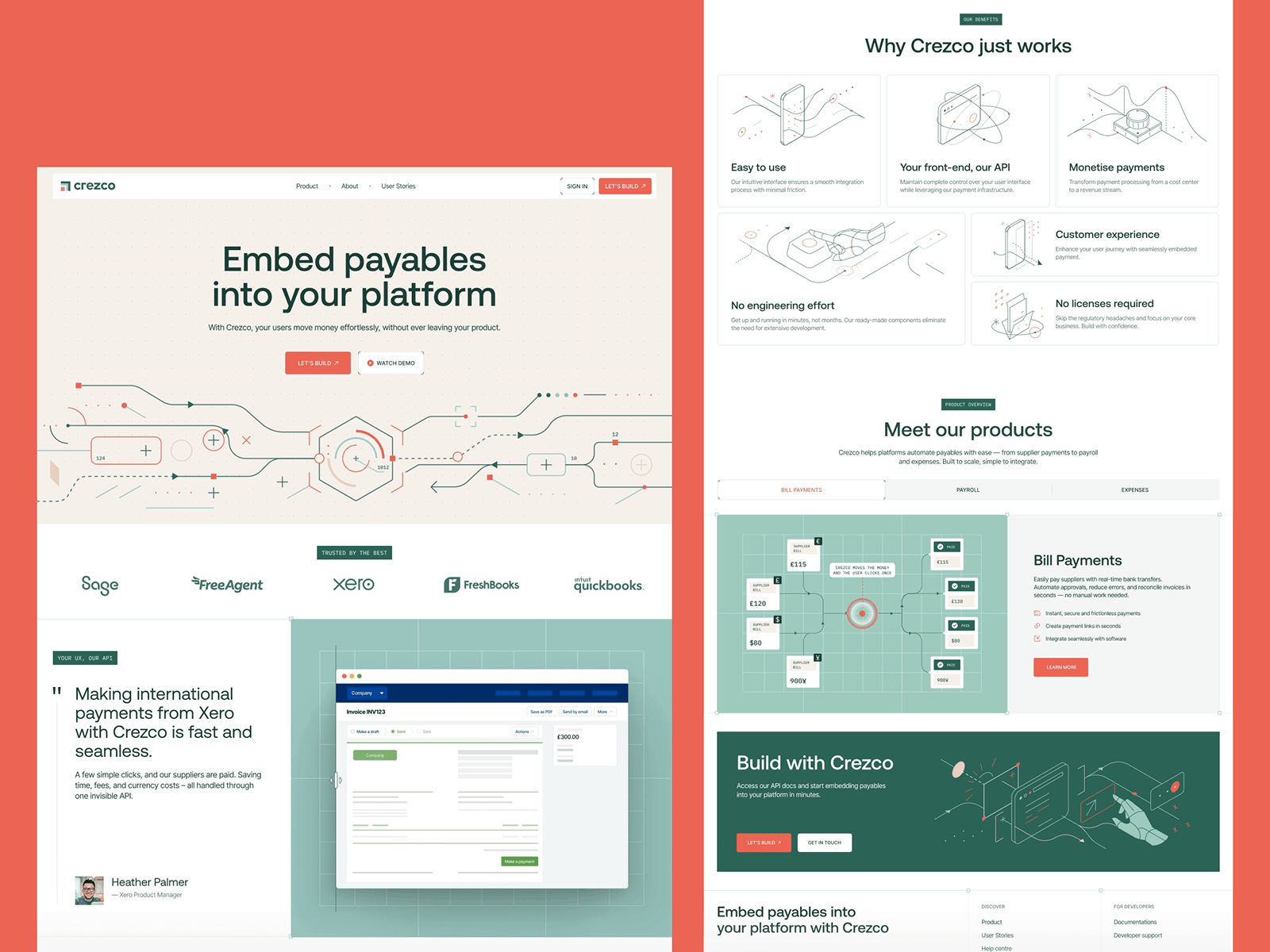 Crezco redesign by Tubik Studio
Crezco’s fintech SaaS redesign demonstrates this shift well.
As the product evolved, the company began focusing more heavily on its API infrastructure and integrations rather than positioning itself purely as a general payments platform for small and mid-sized businesses. The illustration system reflects that transition. Instead of literal financial imagery, the interface uses more abstract, technical visual metaphors that echo the logic of data flows, integrations, and system connections.
The result feels appropriately infrastructural: the illustrations mirror the structural rhythm of the interface—same geometry, same color logic, same visual restraint—reinforcing the hierarchy while quietly signaling the product’s more technical direction.
Most users will never articulate those mechanics, but they feel the atmosphere instantly. And in digital products, perception usually arrives long before explanation.
How Can Illustration Become Part of the Brand, Not a Layer on Top?
A lot of products are technically well-designed and still leave no visual trace in memory. The flows kind of work, the screens are tidy, the product is usable. And then you forget it the second you switch between tabs or close the app.
Illustration can prevent that. Not because every product needs a mascot or a whimsical character—not every fintech platform needs a giraffe in a sweater explaining compound interest—but because illustration gives a brand repeatable visual behavior. Something recognizable beyond the logo.
This is where photography often struggles in digital products. Photos can be beautiful, but they are harder to govern as a system. Different shoots produce different moods. Different models, locations, crops, and lighting conditions create drift. Illustration is easier to codify. Teams can define character proportions, stroke weights, shape language, shadow logic, motion style, and color rules. Once those rules exist, the visual language can scale across onboarding, empty states, feature callouts, notifications, marketing pages, and education flows without losing itself.
That consistency builds recognition slowly, then all at once. A user sees the same illustration logic in multiple places and begins to associate the style with the product. The interface becomes more than a collection of screens. It starts to feel authored.
And that matters more than many teams admit. Especially now, when so many products borrow from the same design patterns, the same SaaS layouts, the same polished-but-anonymous visual culture.
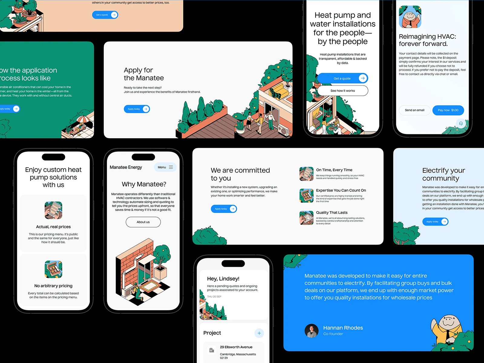
Manatee Energy platform design by Tubik Studio
The Manatee Energy platform is a great example here. Instead of relying only on a mascot gimmick, the product uses a cohesive illustration style that runs across onboarding, educational sections, and product explanations.
In an industry where most competitors lean on generic home photos and technical diagrams, the illustrated language gives the platform a distinct voice. Manny the Manatee appears occasionally as a guide, but the real strength lies in the broader illustration system—friendly shapes, clear metaphors, and a visual rhythm that helps explain complex heating concepts while making the product instantly recognizable.
Why Is Illustration So Good at Explaining Abstract or Technical Ideas?
Some things are hard to photograph and easy to draw.
You can photograph a person using a laptop. You can photograph a payment card. You can photograph a box, a shoe, a salad, a face, a warehouse. But you cannot photograph “workflow automation” in a way that is both clear and interesting. You cannot meaningfully photograph “financial infrastructure” or “decision logic” or “systemic friction” without ending up in the swamp of cliché.
Illustration is stronger here because it can compress abstraction into visual metaphor. It can show process, tension, sequence, risk, transformation, or hierarchy without pretending any of that has a literal physical form. A maze can stand in for bureaucracy. A bridge can suggest connection. Layered shapes can explain complexity better than a staged office photo ever could.
That makes illustration especially valuable in product education, technical UX, and mission-driven storytelling. It breaks dense concepts into legible visual moments, changes the reading rhythm, and gives the user something to understand before they have fully read the explanation.
And unlike photos, illustration can be tuned to exactly the right level of specificity. It does not need to explain everything at once. It can suggest the idea and leave the copy room to do its job.
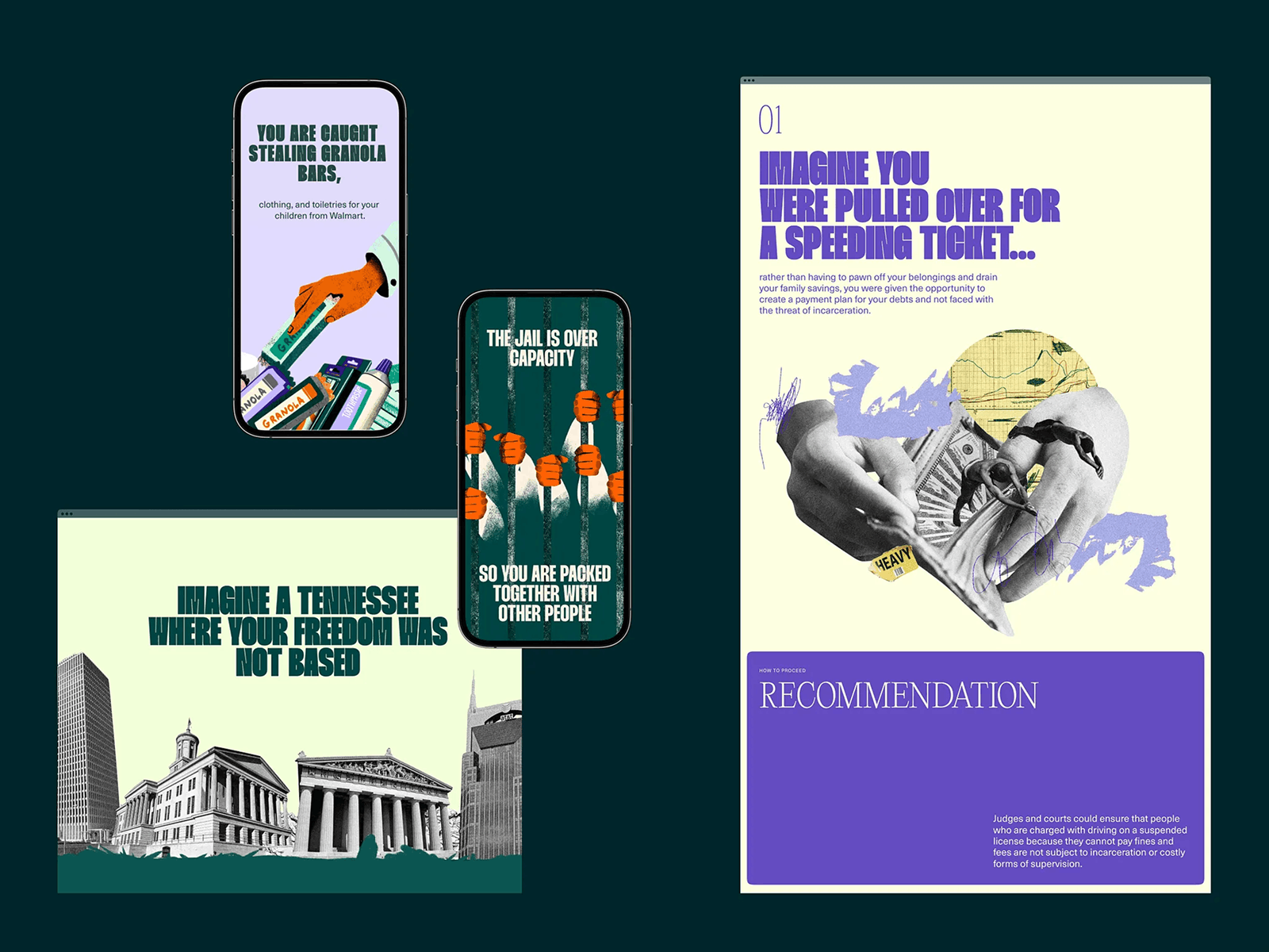
Decriminalize Poverty website design by us
The Decriminalize Poverty project uses this approach effectively. Rather than relying solely on statistics or documentary photography, the interface introduces symbolic illustrations that translate systemic problems into clear visual moments.
Instead of forcing readers to decode complex explanations, the interface lets them see the structure of the problem immediately. And once people see a system clearly, the rest of the story becomes much easier to follow.
Why Does Illustration Thrive in Campaigns, Microsites, and Seasonal UI?
Because those environments reward speed, experimentation, and tone.
Core product UI usually lives under stricter rules. It needs consistency, predictability, and long-term maintainability. Campaign pages and microsites live differently—they are allowed to flirt a little, push a little, dress louder, and react faster.
Illustration is perfect for that territory because it is flexible inside the design process itself. It does not require casting, locations, retouching, usage rights, or a small diplomatic mission disguised as a photoshoot. A team can sketch, test, revise, animate, and ship much faster. That makes illustration a great medium for seasonal promotions, event pages, launch campaigns, and experimental brand moments.
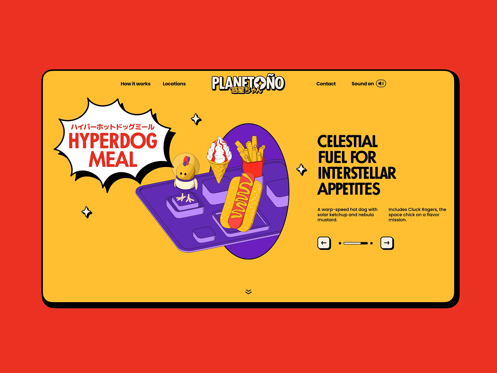
Our Planetoño concept website design
The Planetoño concept website explores that freedom in a deliberately playful way. Built as an internal design experiment, the project imagines a fictional food delivery brand living on a strange little planet where tacos, noodles, and pizza slices float through space like friendly satellites.
The interface leans into illustration as the storytelling engine: cartoon characters, exaggerated food shapes, layered parallax scenes, and animated moments that turn scrolling into a small narrative journey. It is exactly the kind of visual experiment that would feel excessive inside a utilitarian product dashboard—but inside a concept microsite it becomes the whole point. The project shows how illustration allows designers to test tone, motion, and visual storytelling without the structural constraints of a production UI.
Illustration also lets designers try visual ideas that would be too disruptive inside the main product. Strange characters, unusual color combinations, a more exaggerated narrative style, or a slightly chaotic metaphor that would never survive inside a banking dashboard but looks brilliant on an interactive December campaign page.
And that matters beyond marketing. A lot of durable brand language starts in those temporary spaces. A campaign visual lands well. A one-off illustration motif resonates. A holiday interaction becomes memorable. Six months later, some part of that idea has migrated into the main product. That is how visual systems evolve in real life—not always through strategy decks, but through experiments that proved they had legs.
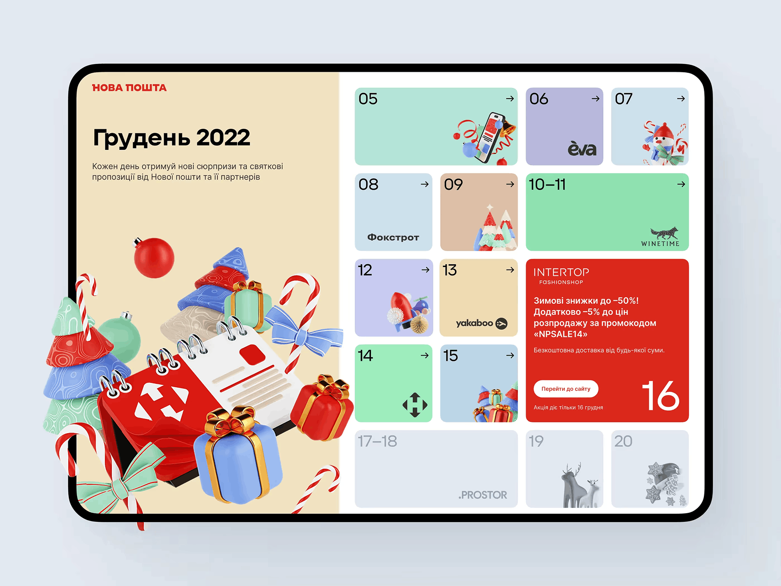
Nova Post Advent Calendar interactive campaign by Tubik
Projects like the Nova Post Advent Calendar interactive campaign show how illustration lets teams push visual ideas much further than core product UI usually allows. Built as a seasonal interactive experience, the campaign turns everyday logistics into a playful narrative space filled with animated scenes, hidden surprises, and visual storytelling moments that would feel excessive inside a functional shipping interface.
Those experiments do more than entertain users during the holidays—they become a testing ground where new visual ideas can emerge and occasionally migrate back into the brand’s broader design system.
When Is Illustration the Right Choice Because a Product Needs Character?
When the interface works but leaves nothing behind.
That is more common than teams like to admit. Plenty of products are clean, rational, and friction-free in the technical sense. Yet they feel emotionally flat. No warmth. No signature. No reason to remember them over the three alternatives sitting in the next browser tabs.
Illustration can solve that, as long as it is used with restraint. It should not turn every product into a theme park—nobody needs a confetti cannon every time they click “Save.” But it might create moments of recognition, relief, or charm in places where the interface risks feeling sterile. Onboarding is a common one. Empty states, too. Feature explanations. Small success moments. Mildly stressful tasks.
At its best, illustration gives the product a pulse without interfering with usability. It can make a technical flow feel more human. It can make a technical flow feel more human, a boring wait state feel intentional, and a product sound like itself visually, not only verbally.
Glup mobile app UI design by us
The Glup mobile app is a good example of this balance. The interface remains minimal and structured, but illustrations appear at the exact moments where the product might otherwise feel sterile: onboarding, feature explanations, empty states.
Nothing about the mechanics of the interface changes. But the experience becomes easier to like. And in a world where users can delete an app in two seconds, likable is a surprisingly powerful UX advantage.
Final Word
Illustration earns its place in UI when the product needs more than realism: clarity faster than copy can deliver, a distinct tone that photography struggles to maintain across dozens of screens, or a way to explain abstract ideas, soften dry moments, and build recognition without losing coherence.
That is the key distinction. Illustration is not there to fill space where a photo could go. It is there because some interface problems are solved better through interpretation than documentation.
Good UI design still depends on structure—grids hold the layout together, typography organizes language, spacing controls rhythm. But illustration can do something those tools cannot do alone: it gives meaning a visible shape.
And the products people remember—the ones that stick in the brain long after the tab is closed—treat illustrations as part of the architecture, not a substitute for stock photography.
Recommended Reading
If you liked this article, don’t stop here! We’ve got plenty more:
Design Process: How to Create Illustrations for IT Blog or Landing Page
Web Design: 5 Basic Types of Images for Web Content
Graphic Design: 24 Elaborate Flat Illustrations for Your Inspiration
How to Create Original Flat Illustrations: Designer’s Tips.
Real Racing. Graphic Design for Mobile Game
Winter Olympics Illustration. Step-by-Step Process
Many Faces of Graphic Design: What Do Graphic Designers Do?
Case Study: Tubik in Paris. Design Process for Narrative Illustration