

Icons are architecture at thumbnail scale.
We tap them hundreds of times a day. A paper plane icon in a message field you hesitate over for half a second before sending something reckless. A trash bin icon when you’re deleting screenshots you swore you’d get back to later (admit it, you’re never going to try out that high protein recipe). Or that magnifying glass search icon that Instagram keeps relocating every other quarter, and yet your thumb still finds it through muscle memory.
Interfaces have become our most constant environment. Work, banking, flirting, booking flights at 2 a.m.. Icons are the control points inside that world. They sit inside 24-by-24-pixel boxes, aligned to an invisible grid, carrying decisions that affect millions of gestures.
In 2026, we don’t need a long origin story for icons, they’re culturally baked-in. A magnifying glass means “search” inside a search field. Put that same loupe inside a photo editor and it becomes “zoom.” Most people learned this language without realizing it.
You see it everywhere: a kid opening a tablet and tapping the camera icon before they can read the word camera, a grandparent finding the green phone symbol on a crowded screen, someone switching apps in a foreign country and still recognizing the same share arrow they use at home. The symbol stays constant. The meaning travels with the interface around it.
Icons work because they compress intent. They’re small agreements between designer and user: this shape means look, that one means send, this one means delete. Once the pattern is learned, people stop reading and start reacting. The hand moves first, the brain catches up half a second later.
In this article, we’ll look at how icons actually work inside modern interfaces: how scale, geometry, and context determine whether a symbol clarifies the interface or sabotages it.
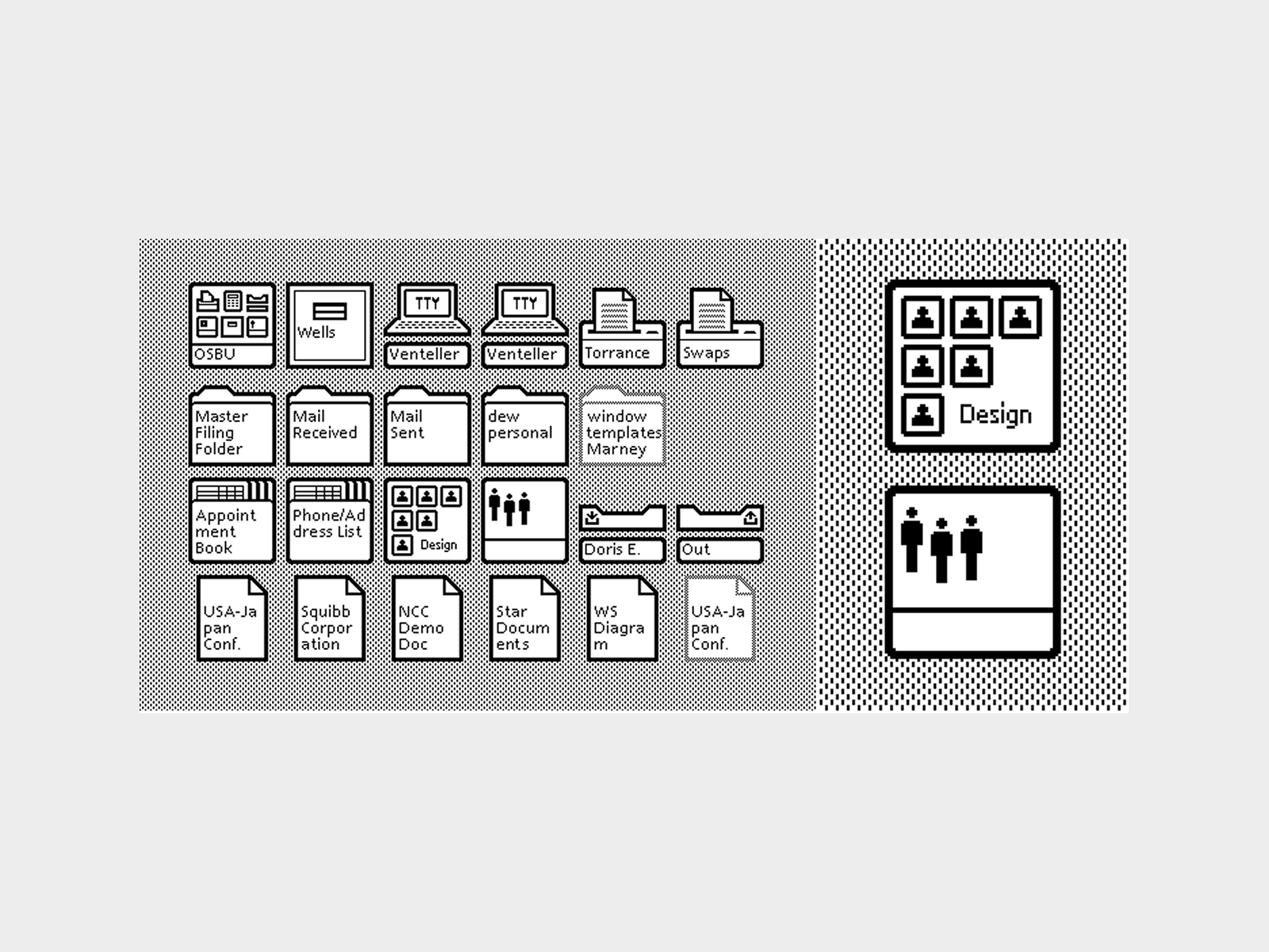
Icons of the first computer with a graphical interface, the Xerox Alto (1973). Source.
The Functional Taxonomy of UI Icons
Icons differ by size, density, and systemic role. That classification determines how you draw, how you test, and even how your product feels midnight, when someone is half-awake, paying a bill on an old iPhone with Night Shift turned on.
We’ll classify them simply:
- Micro icons (glyphs)
- Medium icons
- Large (spot or scene-based) icons
- App icons
Each behaves differently. Each carries a different kind of responsibility.
1. Micro Icons (Glyphs)
Micro icons live under pressure.
They sit in navigation bars, dropdown menus, input fields, toolbars. They’re usually 16×16, 20×20, or 24×24 pixels. On a high-density Retina screen they may look crisp. On an older laptop plugged into a projector in a conference room, they’re suddenly fighting blur, glare, and distance. That’s why their primary requirement is legibility under compression.
You see micro icons dozens of times per day without consciously noticing them. The back arrow in WhatsApp. The paperclip in Gmail. The tiny chevron in your banking app that decides whether you understand where your money just went.
A micro icon must survive reduction. Survival is geometry.
Strokes align to the pixel grid. Corners snap to whole or half pixels depending on display density. Negative space behaves like material. The circle inside a magnifying glass must remain open at 16 pixels. The two bars in a “pause” icon cannot visually merge when viewed in peripheral vision while someone is jogging and skipping a podcast episode mid-run.
Mass distribution is critical. Every glyph should feel optically centered within its bounding square or circle. Designers often draw within a 24×24 frame but construct the active shape inside a 20×20 safe area to preserve breathing space. That internal margin stabilizes rhythm across a row of icons—especially noticeable when they sit side by side in a bottom tab bar you tap hundreds of times per week.
Two dominant construction approaches exist: outline and filled.
Outline icons rely on stroke weight consistency. If the base stroke is 1.5 px at 24×24, all primary lines follow that logic. Stroke caps, joins, and corner radii are defined once and reused. Deviations introduce visual noise. You might not articulate it, but you feel it. The toolbar suddenly feels “off.” Slightly amateur.
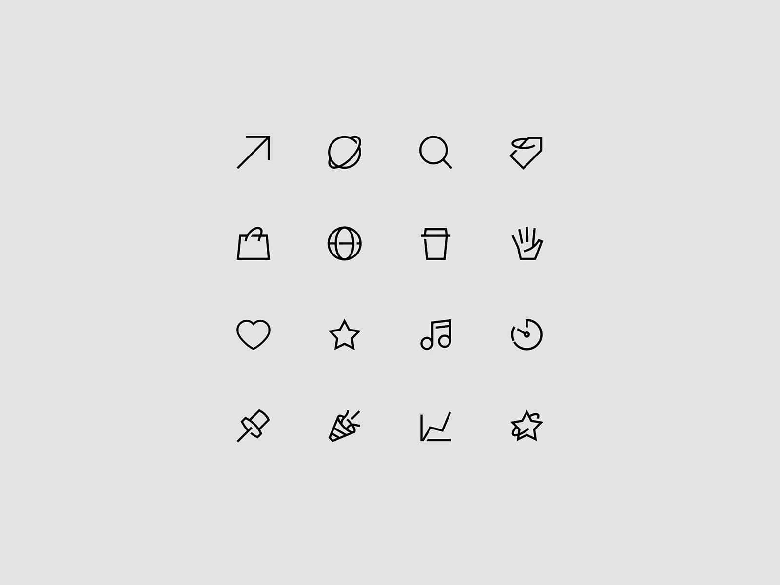
Small icons drawn in one line, for the Knead That Dough project.
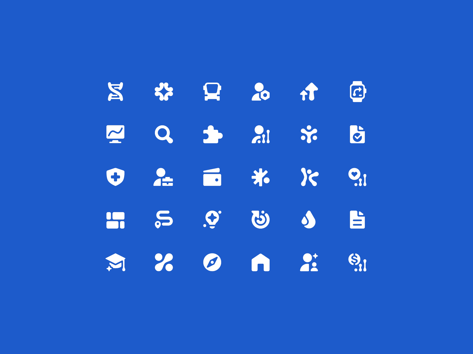
Filled icons reduce detail and rely on silhouette recognition. They often perform better at smaller sizes because they eliminate fragile interior lines. When your storage warning pops up and you start purging files in a mild state of urgency, you don’t parse line construction. You respond to the shape.
Micro icons are operational tools, they must communicate instantly. Ambiguity at this scale costs time. Time compounds.
System guidelines from Apple and Google offer foundational sets. These aren’t aesthetic limitations, but shared agreements. If you redesign a share icon into something overly clever, you inherit responsibility for retraining every user who has already internalized that upward arrow emerging from a box.
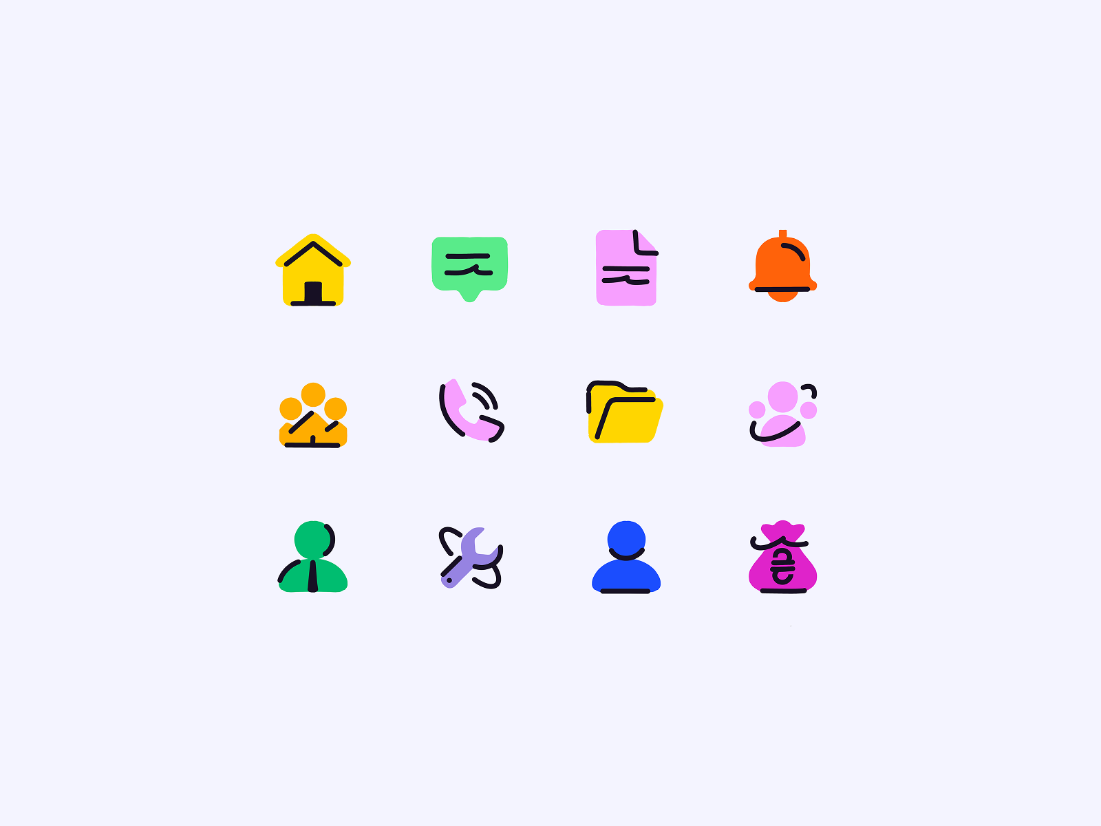
2. Medium Icons
You meet them in subscription dashboards at 11:59 p.m., double-checking whether you actually canceled that trial. In a bank overview screen, where a tiny colored badge signals “crypto,” “savings,” or “recurring.” In the onboarding flow of a new fitness app you downloaded after watching one motivational reel too many.
They usually sit at 32×32, 48×48, sometimes 64×64 pixels. Enough room to breathe, enough room to mess up. At this size, color becomes a tool. Used well, it reduces reading. Your eye separates “income” from “expenses” before your brain touches the labels. Used carelessly, you get a sticker sheet UI: everything competing, nothing leading.
Gradients are possible, though they demand restraint. Soft glass effects, subtle inner shadows, a hint of dimensionality. But when every card icon glows, the whole screen starts hum visually, like too many notifications firing at once. Attention fragments. Users scroll slower, not because they’re engaged, because their eyes are tired.
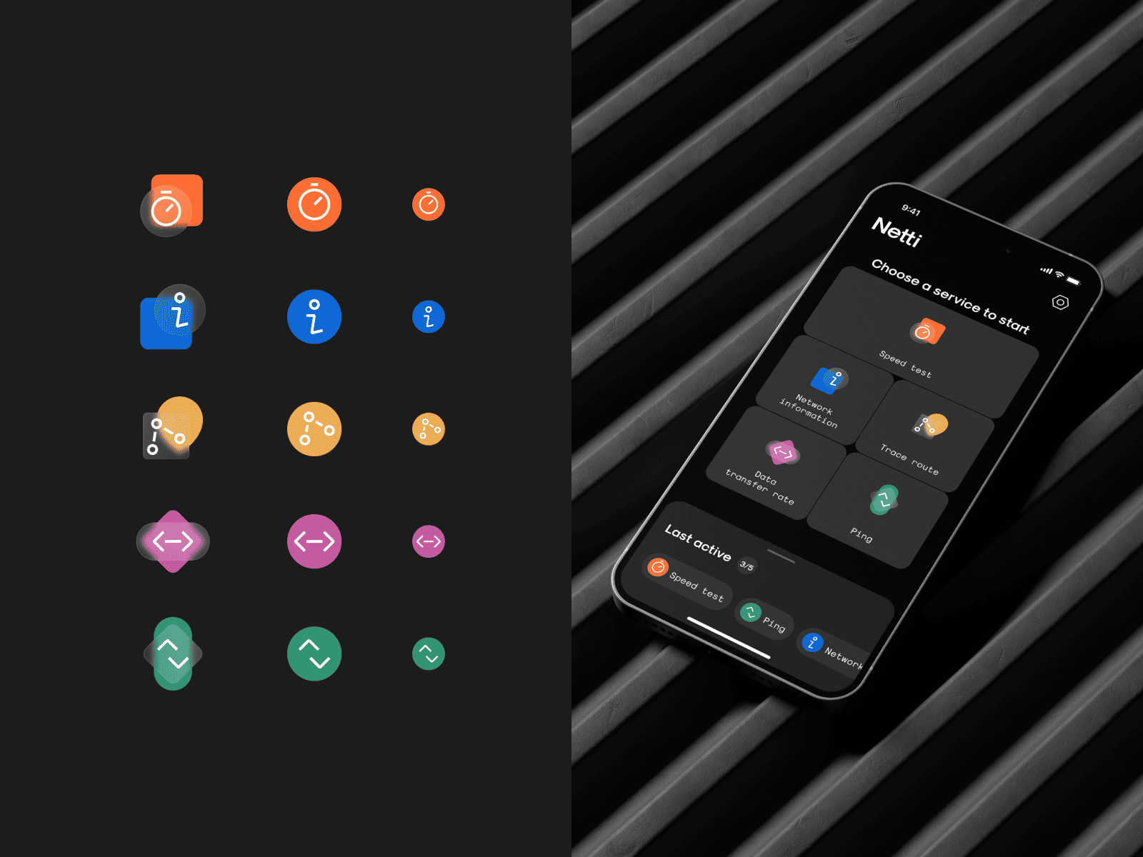
An example of medium icons for the Netti project. As you can see, several colors and a frosted glass effect are already used here.
The same fundamentals still apply:
- optical centering
- balanced mass
- clear silhouette
At this size, icons start telling stories. A shield with a checkmark next to a completed transaction does more than label “security.” It reassures you after three failed payment attempts and one mild spike in heart rate. A cluster of connected nodes in a network dashboard hints at invisible systems running quietly beneath the surface—until one goes red. Medium icons carry narrative cues. They hint at state, priority, risk, reward.
At their best, medium icons become cognitive shortcuts. You scan a tool and instantly separate tasks, files, calendar, integrations—without reading. Shape and color do the first pass. Language follows.
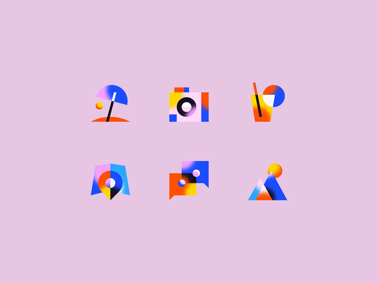
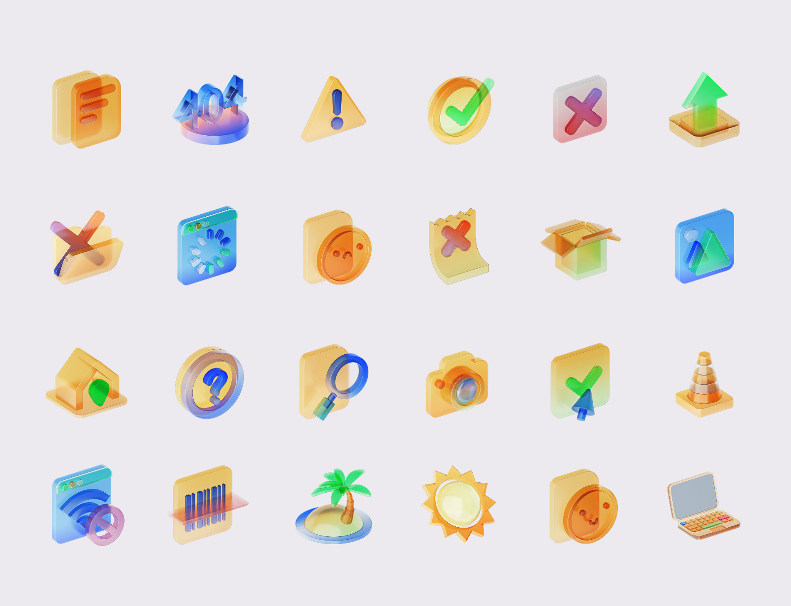
3. Large Icons (Spot or Scene-Based)
Large icons drift toward illustration. 96×96 and up. You meet them in empty states, feature highlights, onboarding moments—places where the interface pauses because the data hasn’t arrived yet, or because the product needs to explain itself.
“No orders yet,” with a tiny package waiting in the center. A budgeting app greeting you with a neat stack of coins on day one. These icons fill the space where the interface has something to say but no data yet to show.
At this scale you can introduce:
- depth
- texture (glass, metal, wood, or other)
- subtle motion
- controlled perspective (orthographic, isometric, restrained 3D)
They can be made in any 3D software, like Blender or C4D, illustrated, textured, animated. All valid. Still system work.
Large icons belong to a visual system, not a mood board. Perspective, light direction, shadow softness, corner radius—these rules must stay consistent. If one icon casts light from top-left and the next from bottom-right, the interface stops feeling intentional and starts feeling like a collage.
Large icons for Nova Poshta, created in Blender. As you can see, they are all part of the same visual system.
The temptation at this scale is to perform. Detail added for the designer’s ego. A flourish that competes with the actual job of the screen. Large icons should support the interface, then step aside. If a user opens a banking app in the morning while standing in line for coffee, the interface should help them transfer money quickly. If an empty-state icon becomes the star, it stole attention from the point.
4. App Icons
The app icon is a compressed brand manifesto. A square with rounded corners on iOS. A mask-adaptive shape on Android. It must remain recognizable at 1024×1024 and at 60×60—sometimes even smaller, when a user squints at their phone in bright sunlight or scrolls through a crowded home screen half awake.
Historically, skeuomorphism dominated this space. Early smartphones treated icons like tiny physical objects—leather textures, chrome highlights, stitched notebooks, wooden shelves for newsstand apps. The original iOS home screen looked less like software and more like a small desk drawer full of miniature things.
Then came flattening. Simplification. With the arrival of iOS 7, most of those textures vanished overnight. The stitched leather calendars became clean glyphs. The camera icons lost their heavy glass reflections. What remained were bold silhouettes and simplified color systems that could survive the growing density of mobile screens.
Today, a strong app icon typically has:
- one clear metaphor (or a tight cluster that reads as one)
- a strong silhouette
- a limited palette
- internal contrast that survives both light and dark backgrounds
The real test is boring and brutal: drop it into a chaotic home screen and see if your eye finds it in half a second. That’s how people actually use app icons. They scan shapes, not labels. Muscle memory moves first.
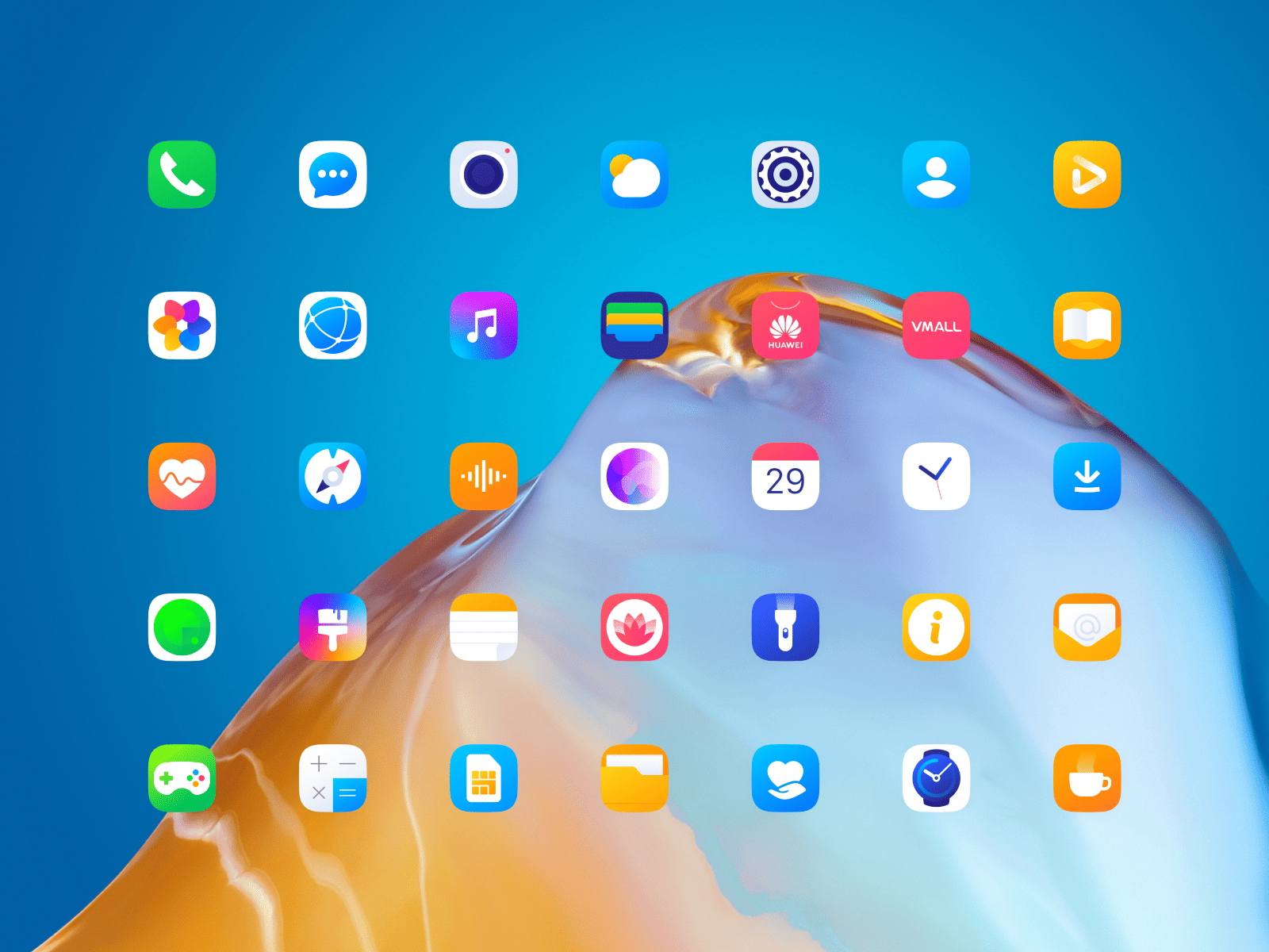
System application icons we designed for HUAWEI EMUI 10
Mood and Brand Integration
Icons carry mood the same way typography does. Through geometry, rhythm, and small visual decisions that most people never consciously notice—yet feel immediately.
Many teams still treat icons like small technical markers. A checkbox here, a settings gear there. Something you grab from a library and move on. For us, icons are where the visual system quietly closes its loop:
- icon corner radii echo button radii
- stroke angles align with typographic character
- spacing logic matches the grid everywhere else
- the icon set feels like it was born in the same room as the UI
You see it in good products without knowing why they feel “right.” Everything just… works.
Broadly, you’ll notice patterns:
- B2C often leans softer: rounded forms, friendly curves, occasional color accents—built for fast, casual use in motion and distraction.
- B2B often leans restrained: orthogonal geometry, symmetry, limited color—built for high-cognitive environments where icons act like punctuation.
Angles matter. Corners matter. Even tiny shifts read as “serious,” “friendly,” “premium,” “cheap,” “unfinished.” However, that’s not a strict rule.
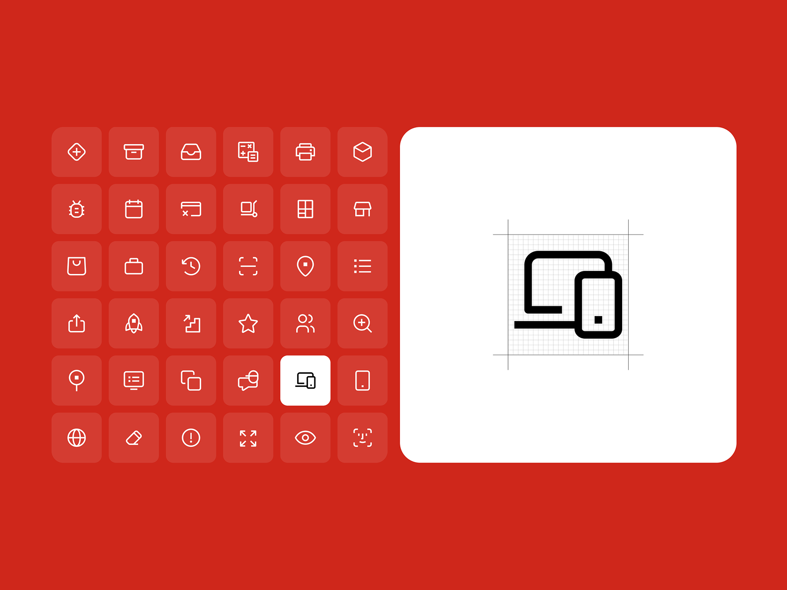
Small icons in a “strict” business style for the Nova Poshta system design. On the right, there’s an example of how exactly the icon should fit into the square for greater standardization.
Small filled icons that can be used in B2C products. Here, you can see the use of bright colors and decorative jagged lines.
One practical rule we stand by in 2026: tiny outline icons packed with micro-details belong to a different decade. That style peaked around 2014 when screens were smaller and designers were showing off line work. Today clarity wins. Simpler shapes. Cleaner silhouettes. Icons that survive quick glances on a phone while someone is ordering coffee and checking a message at the same time.
Less noise. More intention.
An example of how icons with a lot of detail and color accents work even in a business product, but without losing the necessary level of seriousness.
Decorative Icons and Controlled Expression
Sometimes an icon steps outside strict utility and becomes expressive.
Decorative icons can include accent shapes, color contrasts, gradients, texture, or dimensional effects. You’ll see them in products where emotional tone matters: travel platforms, creative tools, lifestyle apps, onboarding moments where the interface introduces itself.
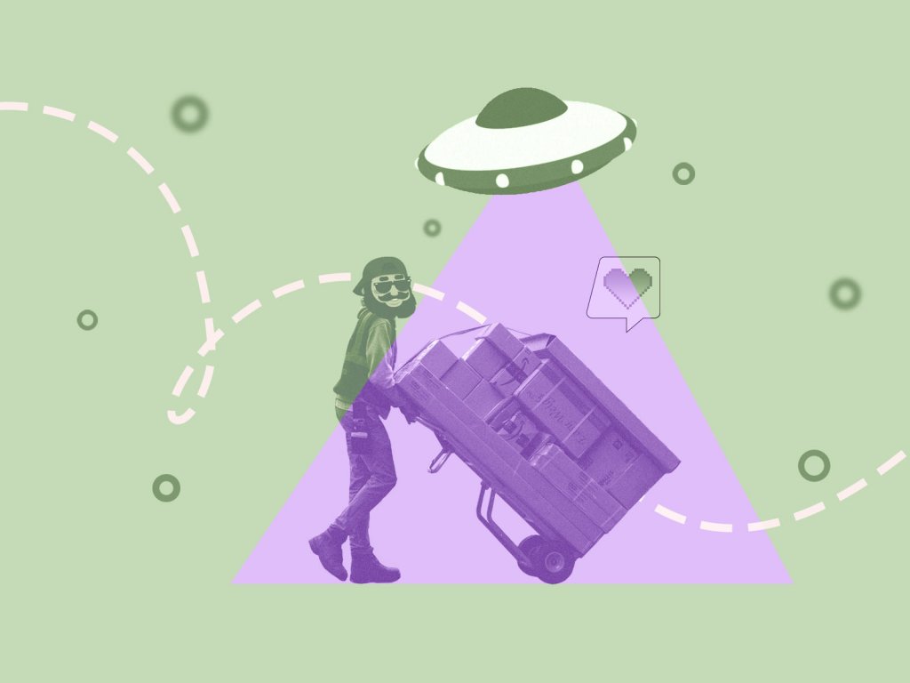
In this example, the decoration is: accent shapes, accent colors, a large number of details, and a noise texture on gradients.
These small touches hold attention. The eye pauses for a moment longer. The interface feels alive. But decoration needs limits too. Without them it quickly migrates into areas where clarity matters more than personality. We usually define very specific zones where expressive icons are allowed—onboarding screens, empty states, or feature highlights. Functional UI areas stay simpler.
Decorations in the form of glass and colors allowed us to maintain the seriousness and restraint of the suppliers’ business portal.
Scale and Context Sensitivity
Icons behave differently depending on context.
A glyph that works perfectly in a navigation bar can become unreadable inside a dense table. A decorative icon that feels delightful in onboarding may look excessive next to financial data.
Designers constantly adjust the level of detail based on where the icon lives. High-cognitive environments—analytics dashboards, financial systems, logistics tools—reward restraint. Icons in these interfaces act more like visual punctuation than illustrations. They help the eye navigate information without competing with it.
Conversely, quieter interface moments allow more expression. Empty states, feature explanations, onboarding flows. These areas often benefit from icons that stretch slightly toward illustration and add warmth to otherwise functional environments.
The real question is always intent.
Is the icon guiding action, or reinforcing narrative?
The answer determines how much visual complexity it can carry.
Custom Icons vs. Libraries
There are thousands of ready-made icon libraries. They’re fast, reliable, and often perfectly usable. Many products start there.
But custom icon systems do something libraries rarely achieve: they bind the interface together. When icons are designed specifically for a product, their geometry, stroke weight, and spacing align with everything else on the screen. Typography. Layout grid. Button shapes. Small decisions begin to repeat in subtle ways. Users rarely articulate it directly. They simply feel that the interface is well made.
Custom icon systems also give teams control. New features can expand the icon language naturally, without waiting for external libraries or forcing mismatched styles into the product.
In the end, icons are small objects with a disproportionate impact. They guide countless gestures every day—where to tap, where to look, what feels trustworthy. When the system works, nobody notices the icons themselves. They simply move through the interface.
Enduring Relevance
A decade ago, designers were busy predicting the death of icons. The argument sounded reasonable: symbols are ambiguous, labels are clearer, maybe interfaces should rely on text instead.
The world answered in emoji.
Today, people conduct breakups, negotiations, and passive-aggressive office commentary entirely in pictographic shorthand. A single skull emoji can end a conversation. A single flame can escalate one. These symbols work because they compress intent with brutal efficiency—and users have learned to read them instantly.
Icons work for the same reason. They reduce cognitive load. They help the eye scan an interface the way road signs help drivers read a highway at 110 km/h.
The problem isn’t the icon itself. The problem is indifference.
Design trends from the early 2010s left us with a graveyard of over-detailed micro icons—tiny outline drawings full of decorative lines that collapse the moment they shrink to real interface sizes. Inconsistent stroke weights break visual rhythm. Random decorative flourishes make a system feel improvised instead of designed.
Strong icon systems rarely happen by accident, they emerge from constraints. A defined grid. Consistent stroke logic. Corner radii that quietly echo the rest of the interface. Testing shapes at the exact sizes people will encounter them—not at comfortable zoom levels on a designer’s monitor.
Inside a 24×24 square, every decision becomes visible. That little box carries brand tone, product clarity, and thousands of daily gestures.
Icons are small. Their influence, however, is anything but.
Every tap, every hover, every glance reveals whether the system was truly designed—or merely assembled.
Recommended Reading
Still scrolling? Here are our other articles on similar topics:
How to Make Your App Icon Stand Out
UI/UX Design Glossary. Navigation Elements
How to Design Effective Search in User Interfaces
Basic Types of Buttons in User Interfaces
Visual Dividers in User Interfaces
Directional Cues in User Interfaces
Error Screens and Messages: UX Design Practices
Iconic Simplicity. The Vital Role of Icons
Visual Perception: Icons VS Copy in UI
Icon Classification: Resemblance, Reference, and Arbitrary Icons