
We feel it before we see it. That wash of calm when a landing page looks clean and safe. That twitch of hesitation when a button flashes the wrong red. That weird satisfaction when everything on screen just… fits. Like it was built for your eyes.
Before a user clicks, scrolls, or reads, they judge. And in the first 5 seconds, up to 90% of that judgment comes down to color. It’s tempting to treat this issue as a matter of taste—pick what looks good, balance a few tones, maybe follow a brand guide. But design isn’t guessing, it’s a system.
Understanding color theory means understanding how visual decisions shape real behavior. Not theoretically, but viscerally. A button shade that feels safer. A palette that guides the eye without forcing the hand. A product that feels premium, intuitive, alive.
This guide isn’t about picking pretty palettes. It’s about why things feel balanced—or don’t. About the logic behind every choice. RGB and CMYK, sure, but more than that. Whether you’re building a UI, creating a brand identity, or refreshing a product dashboard, this is the groundwork that turns intuition into intention.
Because in design, color doesn’t follow emotion. It creates it.
The Color Wheel: Where Visual Logic Begins
Every designer meets it sooner or later. A circle. Twelve hues. At first glance, the color wheel feels like theory—something left over from a dusty art classroom or a childhood paint set. We’ve all seen it. And at some point, we all ignored it. Until we didn’t.
Because eventually, you begin to notice things. Like how red and green don’t just contrast—they clash like cymbals, loud and impossible to ignore (think: a flash sale banner or a stop button that means it). Or how teal on beige feels like a spa ad, but teal on black is a fintech company trying too hard. These aren’t aesthetic guesses. They’re patterns. Wired into the way we read, feel, and decide.
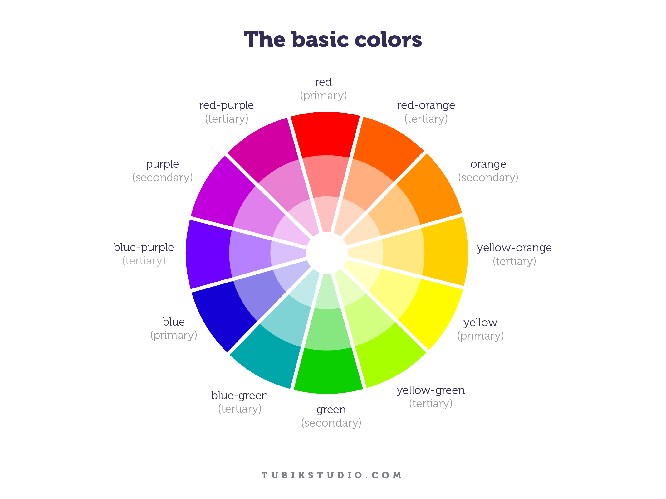
Invented in 1666 by Sir Isaac Newton and evolved across centuries, the color wheel organizes primary, secondary, and tertiary colors into a visual logic. It shows not only what each color is, but where it lives in relation to others. Red doesn’t stand alone—it vibrates against green. Blue stabilizes orange. These aren’t coincidences, they’re connections wired into the brain.
Primary colors—red, yellow, blue—can’t be formed by mixing. They’re the base notes. Secondary colors are what happens when primaries interact. Tertiaries emerge when those mixes mix again—red-orange, blue-violet, yellow-green. Their hyphenated names tell the story.
Understanding this structure helps designers move from instinct to intention. It informs how you build palettes, guide attention, and evoke emotion in UI design, branding, illustration, and motion. The wheel doesn’t dictate which colors to use—it shows you how they’ll behave together.
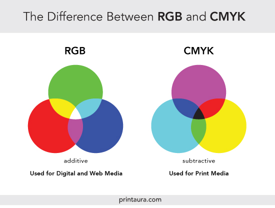
RGB, CMYK, and the Nature of Color: Understanding the Models Behind the Screen
Not all color is made the same. Sometimes it’s pigment on paper, sometimes it’s light hitting a retina at just the right frequency. One you can touch. The other, you can’t. And that difference matters, because it shapes the very systems we use to design.
Behind every digital interface or printed layout are two opposing frameworks: additive and subtractive color models. Both start from the same question—how do we build color?—but answer it in reverse.
The additive model (RGB) begins with darkness and adds light. Screens, displays, projectors—they all speak this language. Red, Green, Blue. When combined at full intensity, they produce white. Turn them off, and you return to black. It’s a logic that can feel counterintuitive to anyone raised on mixing paints, but it’s how your phone renders every sunrise, shadow, and CTA button.
The subtractive model works in the opposite direction. Here, color starts with light, and pigments subtract from it. RYB (Red, Yellow, Blue) is the model most artists first learn, but modern printing evolved past it. Science found a more efficient trio: Cyan, Magenta, Yellow. Add black ink for depth and clarity, and you get CMYK—the backbone of every printed brochure, poster, and packaging label.
Each system has its quirks. Add more RGB, and you get brightness. Add more CMY, and you start veiling light. That’s why printing a pure black without the “K” ends up muddy. Why a digital red doesn’t always match its printed twin. Why designers switching between media must constantly recalibrate what a color means.
Because in the end, color doesn’t exist on its own. It performs—depending on the stage.
Choosing the Right Model: Screen vs Print
Here’s the rule that saves projects from awkward surprises: use RGB for screens, CMYK for print. Always. What glows on a monitor won’t match what dries on paper. The RGB color space is wider, more vibrant, and more forgiving. But printers can’t replicate that range. CMYK strips it down to what ink can carry—more muted, more precise.
So before sending that poster to press, convert. Preview the loss, adjust if needed. Because in design, accuracy isn’t a luxury, it’s respect for the medium.
Screens speak in light. Print speaks in pigment. Know their languages. Design accordingly.
Color Harmony: The Architecture of Emotional Clarity
In design, color harmony is the balance between tones that makes an interface feel clear without explaining itself. It’s what happens when a palette holds together across states and screens, when buttons and backgrounds feel aligned instead of loud. And most of all, it’s what users sense before they understand.
When colors clash, we recoil. Something feels off, even if we can’t say why. Cognitive load increases. Attention scatters. But when colors are in sync—visually and emotionally—users stay. They explore. They trust.
Color harmony isn’t aesthetic luck. It’s a method rooted in psychology, proportion, and rhythm. Organizing hues around a unified structure creates consistency, and consistency breeds comfort. That’s why designers reach for systems: complementary, analogous, triadic, split-complementary. Not because they’re rules—but because they’re reliable places to begin.
These color schemes aren’t trends. They’re frameworks. Ways to bring order to chaos. And while UI design often demands flexibility—dark mode, accessibility, branding constraints—a deep understanding of color harmony gives you tools to adapt without losing balance.
Common Color Schemes That Work—And Why
The color wheel isn’t a menu, it’s a map. And color harmony is less about picking favorites, more about navigating relationships. Each of these six schemes behaves differently, with its own emotional weight, contrast level, and use case in design. Knowing when and why to use each is what turns a palette into a strategy.
Monochromatic: One Hue, Infinite Control
When everything stems from a single hue, nothing feels out of place. Monochromatic color schemes rely on one base color—explored through its tints, tones, and shades. It’s clean, cohesive, and safe, in the best way. In interfaces, it brings calm and consistency, making it ideal for dashboards, landing pages, or products where clarity matters more than contrast. The beauty lies in subtlety. Small shifts in value or brightness create visual rhythm without ever being too loud.
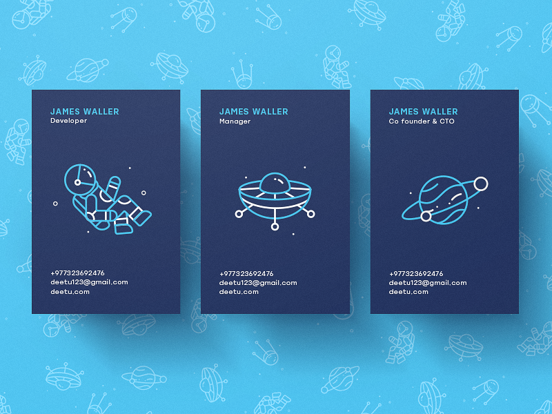
Deetu Business Cards
Analogous: Next-Door Neighbors

Analogous schemes are built from colors that sit side by side on the wheel. They share a root, which makes them feel naturally connected. Think of warm gradients from orange to red, or the cool drift from blue to teal.
There’s minimal contrast here—just flow. That’s why analogous palettes work well in backgrounds, overlays, and any design layer meant to feel smooth and unobtrusive. They’re emotion-driven, often used in wellness apps, nature-focused products, and brand systems where atmosphere beats urgency.
Complementary: High Contrast, High Stakes
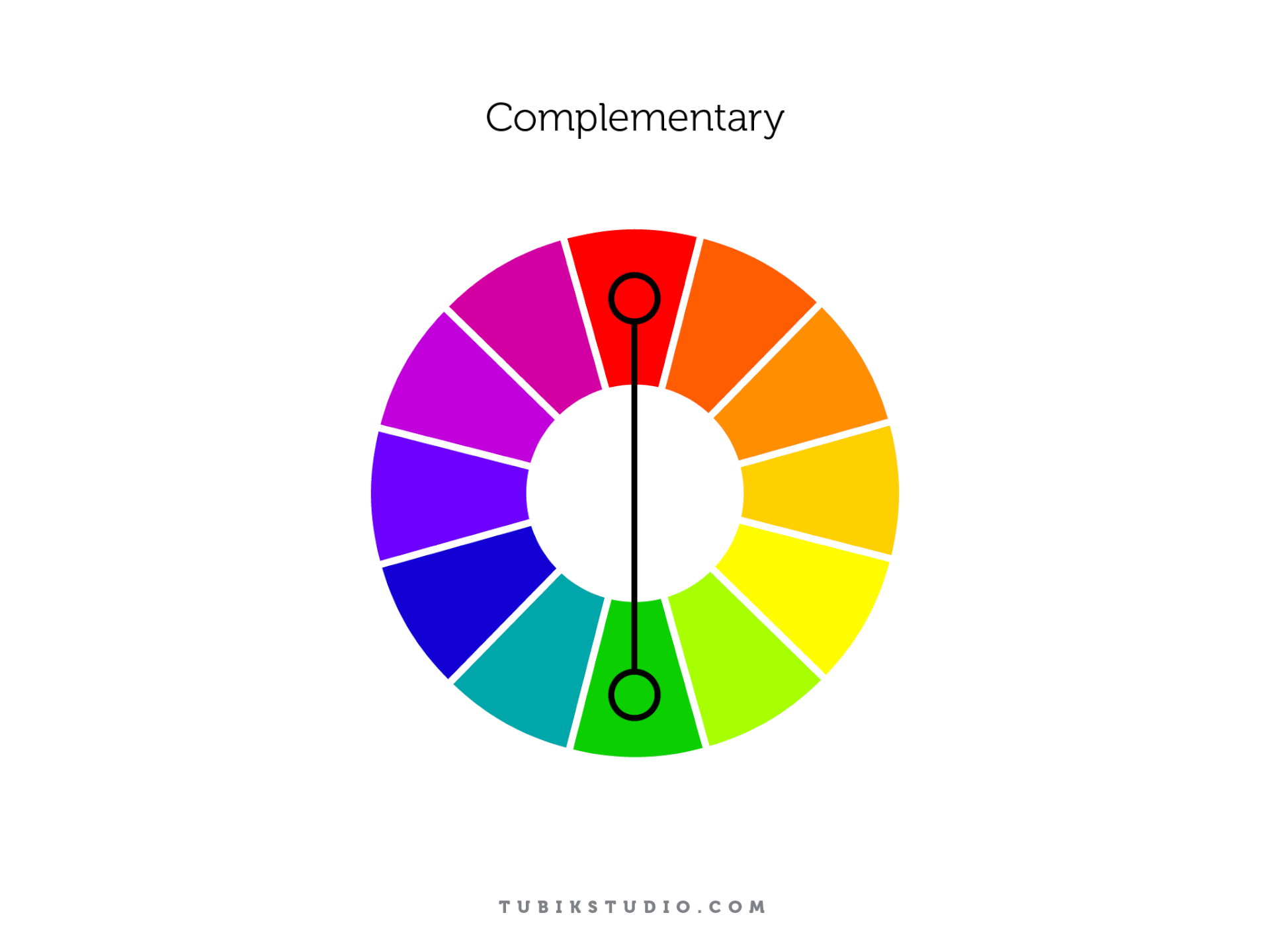
Drop a bright orange button on a deep blue background and see what happens. That’s complementary color theory at work—opposites on the wheel locking into tension. These pairings are bold, visible, and impossible to ignore.
This scheme thrives when you need contrast that performs—think CTAs, alerts, banners. But overuse can backfire. If everything competes, nothing wins. Smart use of complementary colors means contrast where it counts—and restraint where it doesn’t.
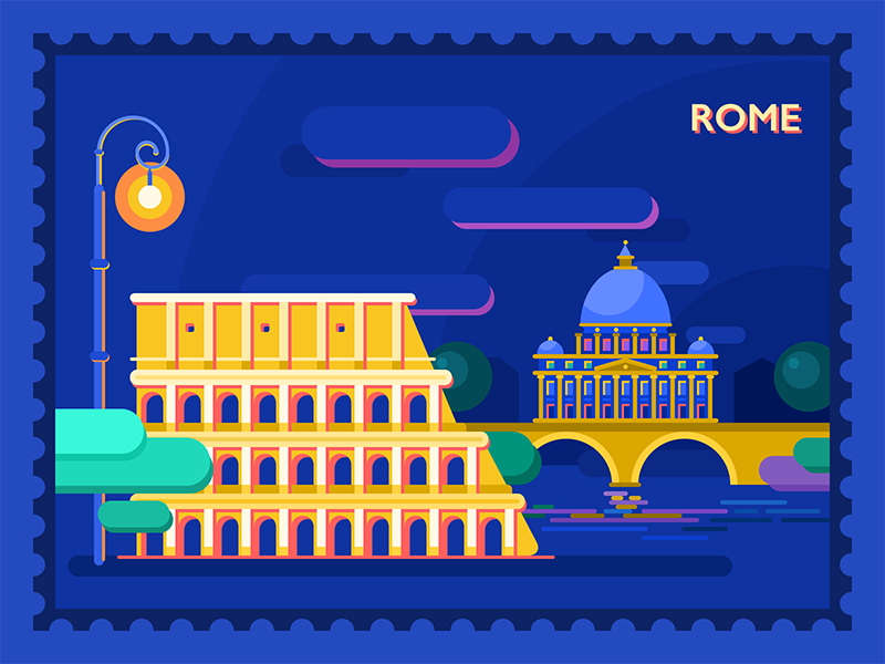
Rome Illustration
Split-Complementary: Controlled Chaos
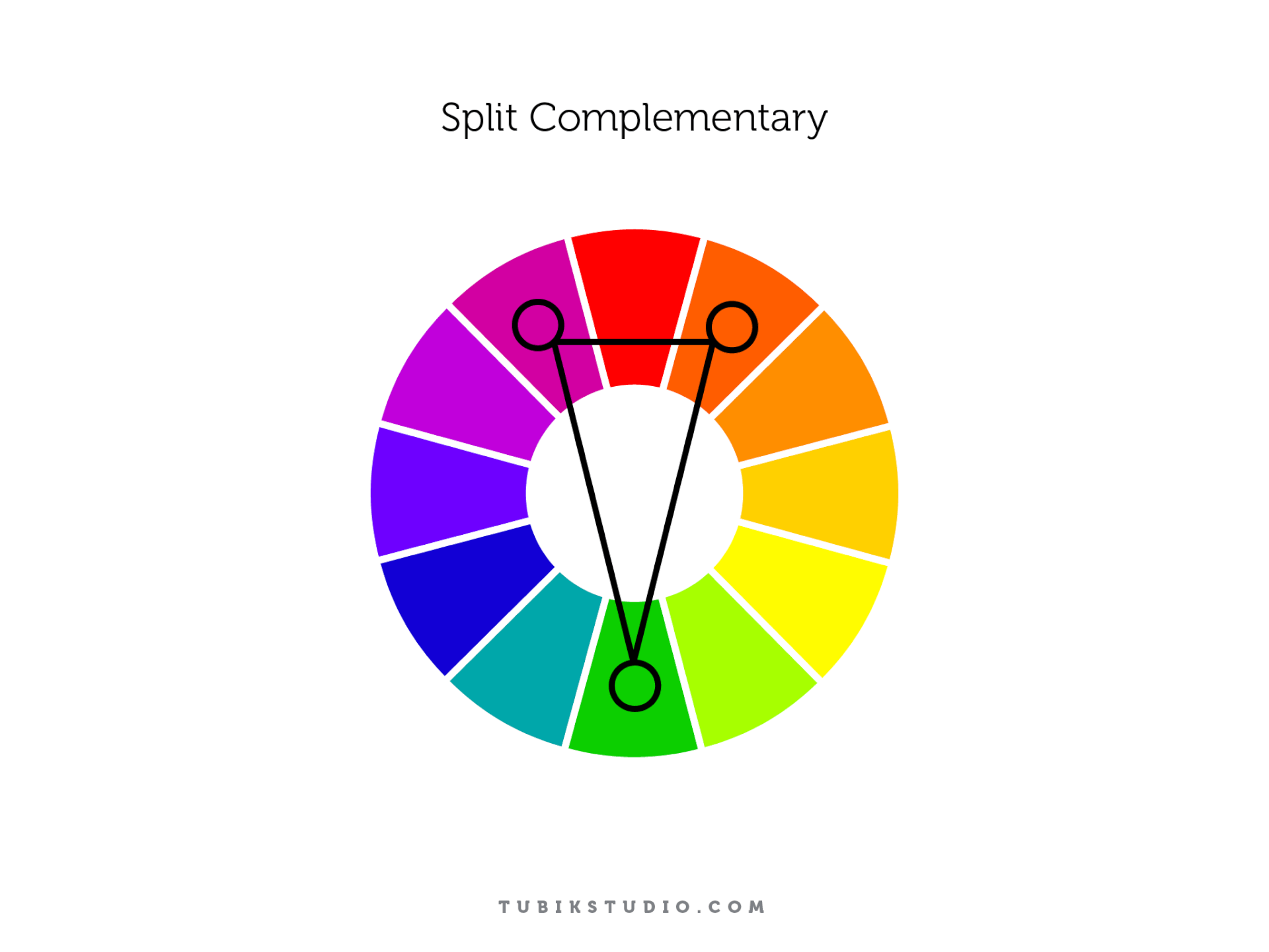
This one’s a balancing act. Instead of using a direct opposite, you reach for the two hues adjacent to it. The result? Split-complementary color palettes offer contrast, but with less aggression.
Say you start with blue. Instead of jumping straight to orange, you lean toward yellow-orange and red-orange. You still get visual tension, but it’s softer, more flexible. Perfect for when you need more complexity in your UI without overwhelming the eye.
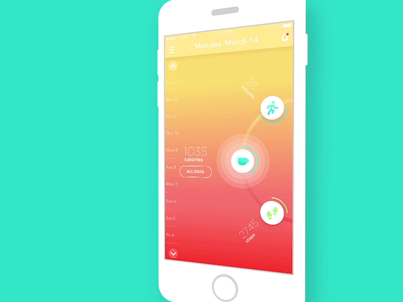
Be Bright App
Triadic: Energy in Equilibrium
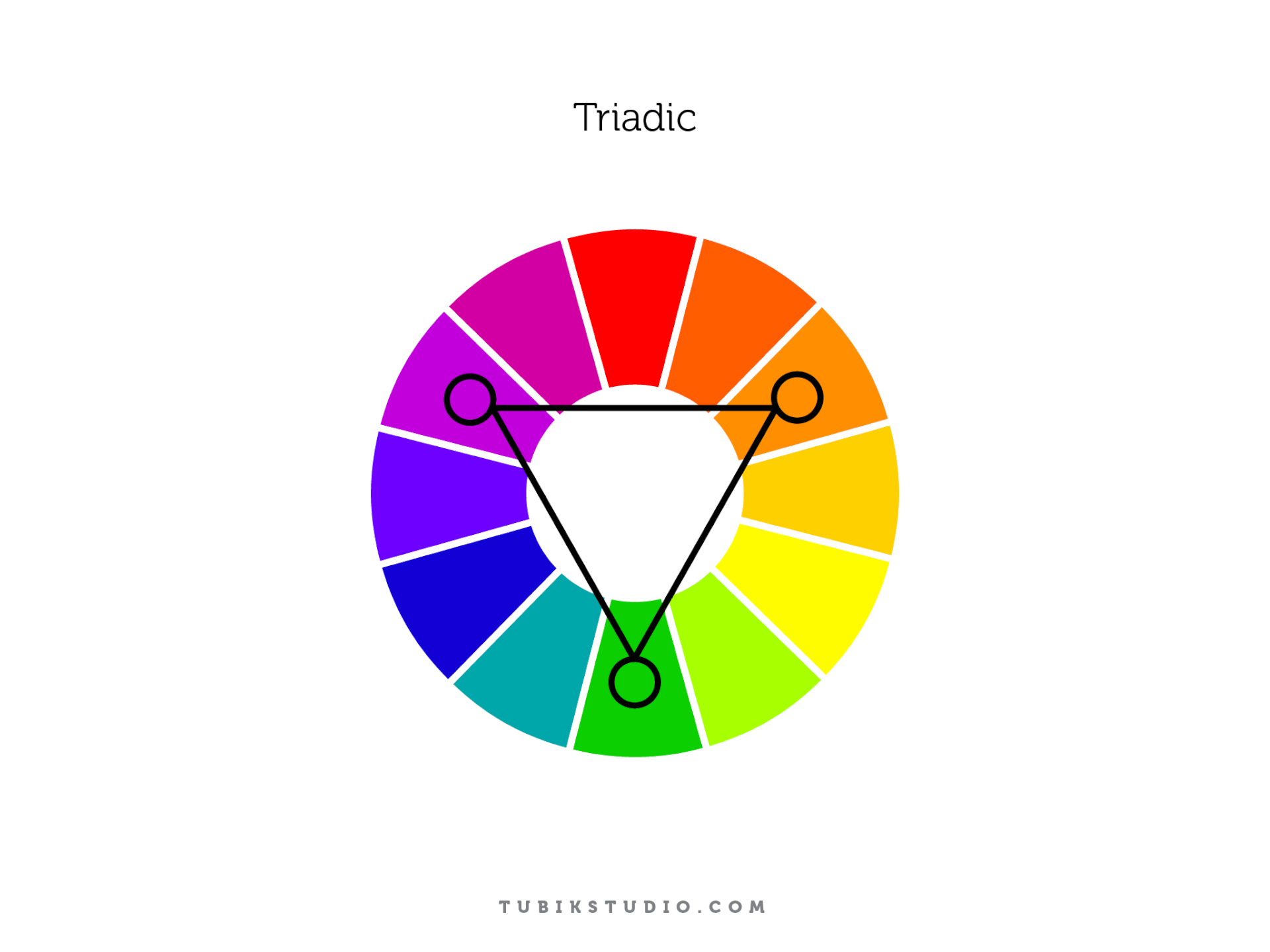
Three colors. Equally spaced, equally potent. The triadic scheme gives you a triangle on the wheel—like red, yellow, and blue. Or purple, green, and orange. Used well, it creates dynamic, colorful interfaces that feel rich without feeling chaotic.
But triadic harmony only works with discipline. One color leads, one supports, one accents. Without hierarchy, the scheme fractures. But when balanced, it sings.

Tetradic/Double Complementary: The Master Level
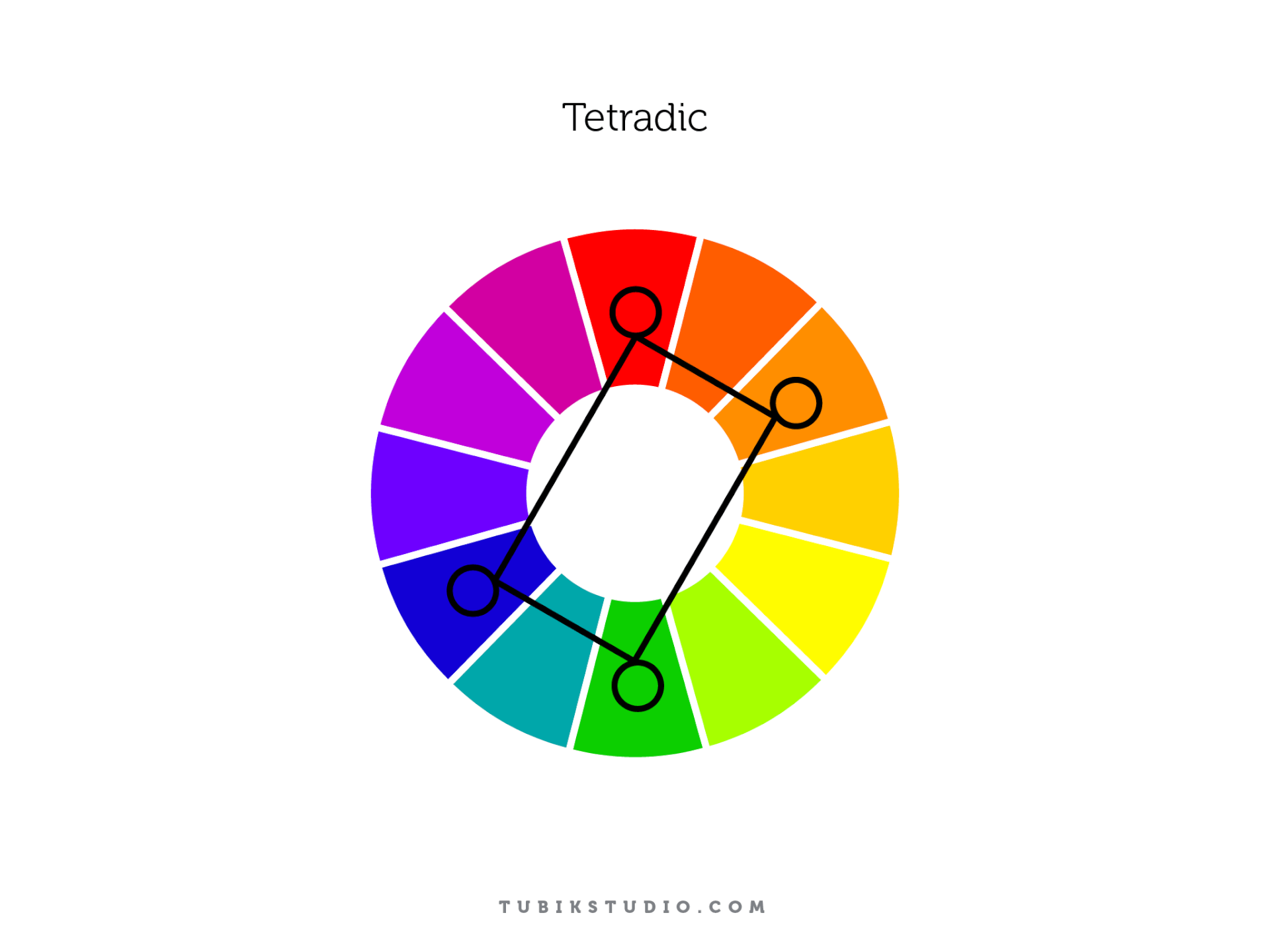
This is the most complex system—four colors arranged as two complementary pairs. Visually, you’re drawing a rectangle across the wheel. Emotionally, you’re walking a tightrope. Tetradic color schemes are high-reward but high-risk. They demand experience, restraint, and a sharp eye for hierarchy. Used well, they unlock incredible range—vibrant branding, game UIs, editorial layouts. Used poorly, they collapse into noise. There’s no safety net here. But that’s the point.
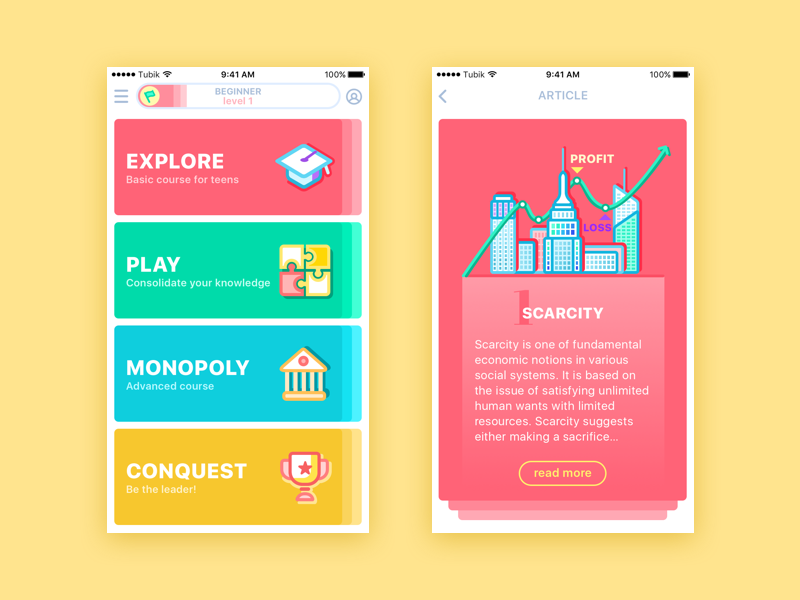
MoneyWise App
Color theory isn’t a shortcut—it’s a foundation. It gives structure to instinct, language to feeling, and clarity to chaos. You don’t need to memorize every scheme or rule. But knowing how color behaves—on screens, in systems, in minds—means you’re not just choosing what looks nice. You’re designing with intent. And that’s where real impact begins.
Recommended Reading
Still curious?
Color is only the surface. Dive deeper into the psychology, behavior, and interface mechanics that shape how we design—and how users respond. Here’s where to go next.
Light or Dark UI: Tips to Choose a Proper Color Scheme
Color in Design: Influence on Users’ Actions
Color in UI Design. Look on the Bright Side