
You’ve seen this kind of product before. You log in. You’re greeted with a dashboard that looks like it was designed by a compliance team on a deadline. Acronyms everywhere. HSA, FSA, HRA—alphabet soup with real money behind it. You hover over a tooltip. It explains nothing. You open a PDF. You close the tab.
Malloy Banks lives in that world. Health benefits, tax-advantaged accounts, the stuff that matters—quietly, expensively, and often invisibly. But instead of accepting the usual trade-off (accuracy over clarity, compliance over usability), we asked a better question: what if design didn’t decorate complexity—but translated it?
This case study is about that translation layer. How we turned a system built for brokers, HR teams, and regulatory logic into something an actual human can use without Googling every second term. It’s about structure, tone, visual language—and the small decisions that make someone feel either lost or guided.
We’ll walk through the market reality, the multi-audience problem, the identity system, the mascot creation, and the UX decisions that make financial logic feel… almost humane.
Let’s get into it.
About the Client
Malloy Banks operates in a space where nobody wakes up excited to engage. They provide health benefit account services—HSAs, FSAs, compliance flows, reporting systems. The whole ecosystem small businesses rely on to offer structured benefits to employees.
On paper, that sounds fairly straightforward. In real life, it means dealing with a service layer where finance, healthcare, regulation, and everyday employee needs all collide.
That mix gives the product a strange kind of responsibility. It has to serve employers who need structure, reporting, and compliance. It has to make sense to brokers who package and recommend benefit solutions. And then, at the end of that chain, it has to work for employees—the actual people logging in to figure out whether they can use their account for therapy, prescription glasses, a dentist visit, or some expense they vaguely remember being “maybe covered.”
What made Malloy Banks interesting from the start was the direction. Instead of building another cold administrative shell for HR teams to tolerate, the team wanted to create a service that feels competent and reliable, but also genuinely usable to the people who depend on it most.
That meant shaping a product and brand that could do several jobs at once:
- support benefit administration for businesses
- communicate trust to brokers and decision-makers
- help employees understand and use what they’ve been given
The Challenge
Health benefit accounts are one of those product categories where the logic makes sense on paper and falls apart the moment a real person has to use it.
The system itself is dense by nature. Tax rules, eligibility conditions, reimbursement mechanics, documentation requirements—it all comes with legal and financial weight, and none of it can be hand-waved away with a cute dashboard and a pastel chart. For employees, that complexity usually shows up in very familiar ways:
- a pause before clicking anything—“wait, will this lock something in?”
- a tab left open “for later” that quietly expires into irrelevance
- rereading the same eligibility line three times and still not being sure it applies
- a quiet “I’ll just ask HR”, even though you really didn’t want to send that message
For small businesses, the friction looks different. They need confidence that the service is compliant, structured, and administratively solid. Same product, completely different anxieties.
The research made the gap painfully obvious. Most products in this category are designed around administration first. They privilege operational workflows, reporting logic, plan configuration, and compliance structures. Which makes sense if your main audience is an internal admin team. But the person who actually has to understand the thing—the employee—is often left staring at a wall of terminology dressed up as a “helpful” platform.
That tension shaped the whole project. Malloy Banks had to speak to brokers, employers, and employees at once, without turning into three disconnected products under the same logo. The design needed to reduce intimidation, create stronger orientation, and make people feel guided rather than processed.
Not softer for the sake of softness. Clearer, because the stakes are real and confusion is expensive
Strategy & Brand Positioning
From the beginning, the project needed a point of view.
A lot of platforms in this space present themselves like they’re trying to pass an audit: cold colors, stiff language, generic layouts, an overall vibe of “please do not ask questions.” That tone may signal seriousness, but it also creates distance. Malloy Banks needed to feel reliable without sounding like a warning label.
So the strategic move was simple, but pretty decisive: put the employee at the center of the story.
That mattered because the product doesn’t actually live in the sales deck or the broker conversation. It lives in the moment an employee opens the platform and tries to understand what their benefits are, what they cover, and how to use them without making an expensive mistake. The brand had to acknowledge that moment and design for it.
The positioning grew out of that logic. Clear, supportive, modern, but not childish. Professional, but not emotionally frozen. The visual and verbal system had to carry two jobs at once: reassure employers and brokers that the service is competent, while helping employees feel like the product is built for actual humans.
Visual Identity System
The identity system had to do more than look polished on a homepage mockup. It had to survive contact with real information—dashboards, educational content, benefit explanations, tables, onboarding materials, all the places where weaker branding tends to collapse into generic UI.
So the system was built with utility in mind. Not dry utility, but useful one.
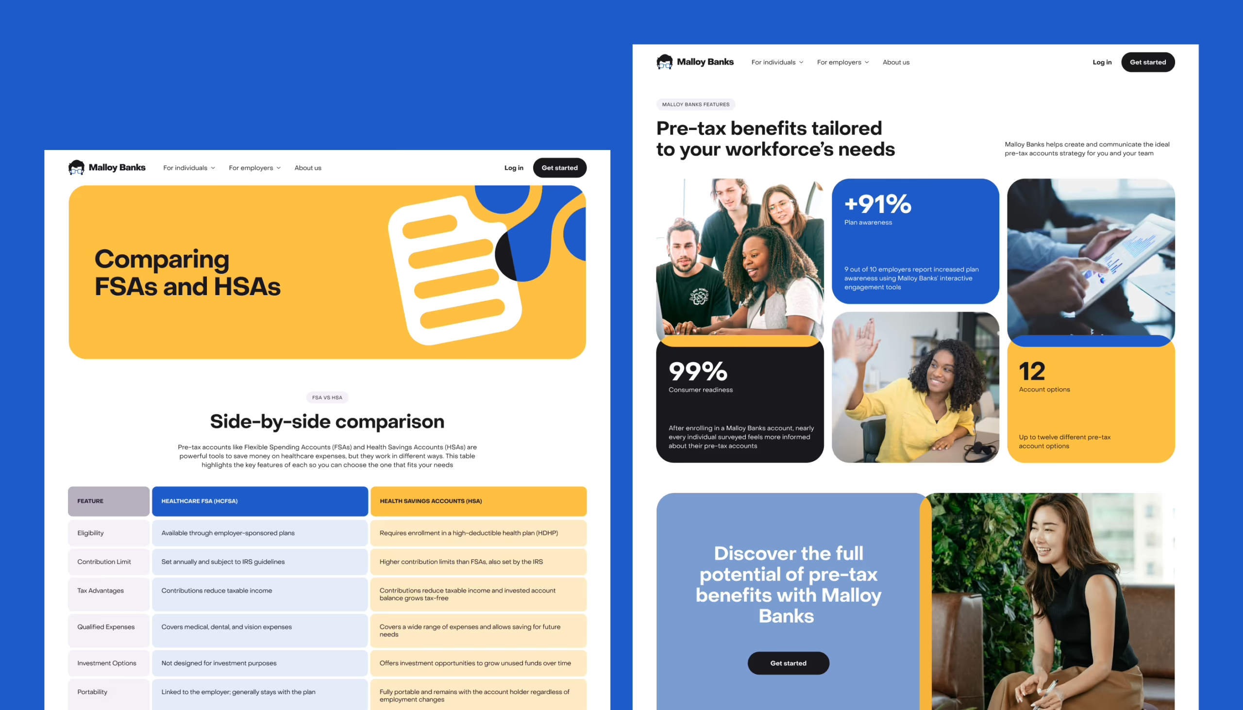
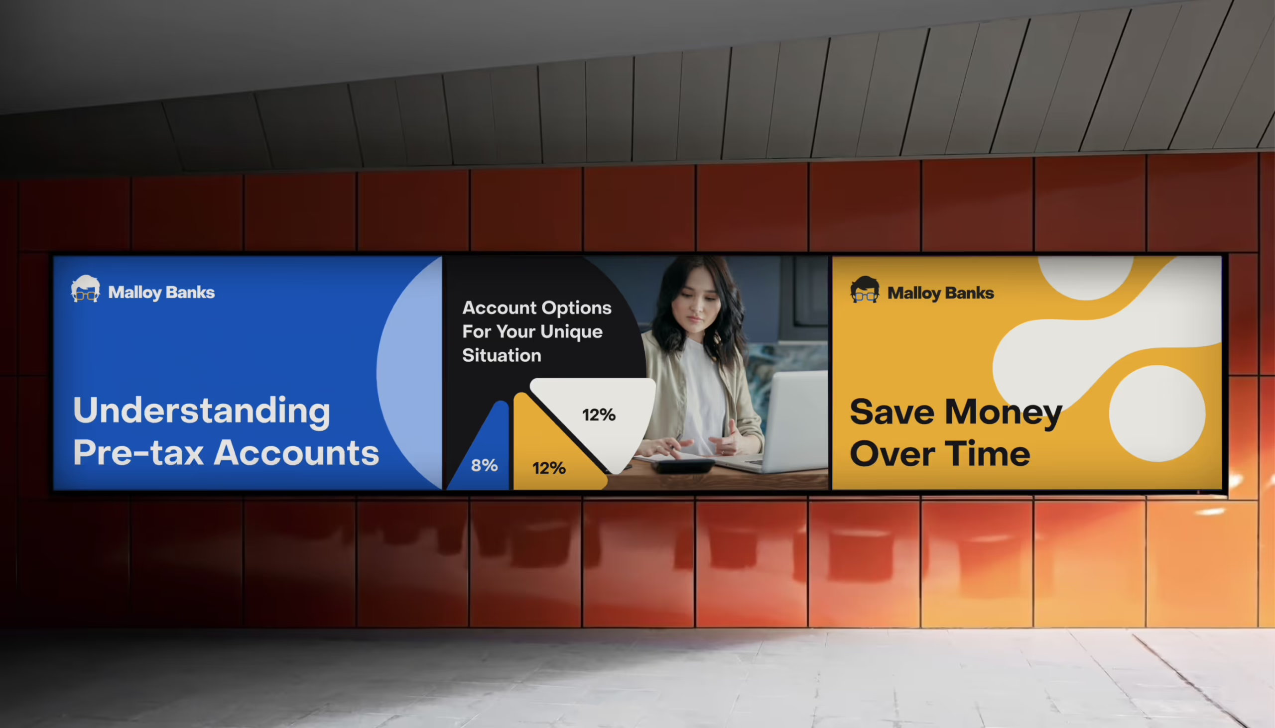
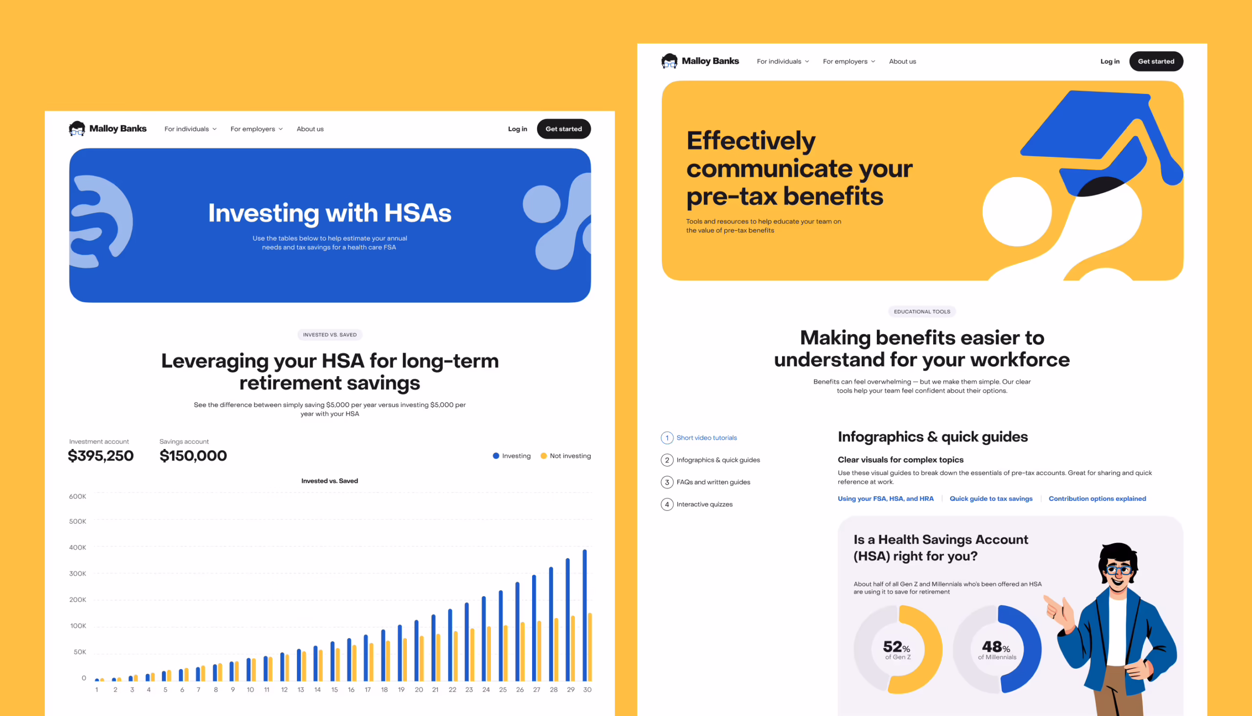
One of the smartest moves here was treating the brand as a communication framework rather than a decorative shell. The palette, for example, wasn’t only aesthetic. Blue tones were used more heavily in materials aimed at employers and brokers, while yellow carried more of the employee-facing and educational layer. That gave the brand a quiet logic. Users may not consciously notice it, but they feel the difference.
Typography played a similar role. PP Object Sans gave the system a modern, neutral voice—clean enough for interface work, warm enough not to feel clinical. The icon set started from a small but deliberate base: soft, rounded shapes with references to the product’s world—folders, documents, charts, abstract elements, and even a pair of square glasses borrowed from the mascot.
The client came in with a pretty extensive list of entities, concepts, and attributes they needed covered, and all of that got translated into a unified icon set that fits naturally within the visual language that had already formed. Instead of just sitting on a page, those icons can combine with photography, overlap, and build into simple, dynamic graphic compositions—held together by a signature technique of color intersections. Those intersections do a lot of quiet work: more active and energetic in marketing materials, more restrained on the website. Same system, different registers. That gave the whole product a more human cadence.
Even the logo came out of the same internal logic. Instead of being designed in isolation, it was shaped in relation to the mascot, pulling from the graphic form of the character’s glasses and hairline. That made the identity feel less assembled and more grown.
Mascot Design—Humanizing Complexity
A mascot in a financial product can go wrong fast. One wrong move and you’re in cartoon-bank-app territory, where a cheerful blob is trying to explain tax compliance, and everyone loses respect immediately.
Thankfully, that’s not how we do things at Tubik Studio.
We introduced the mascot because the platform needed a guide—something that could soften the tone, support the educational layer, and make the system feel less bureaucratic without turning it into a joke. In practice, the character gave the product a face, and more importantly, a social cue. It suggested: someone is here to walk you through this. The company cares.
That matters more than people admit. Especially in systems where users already feel behind before they’ve even started.
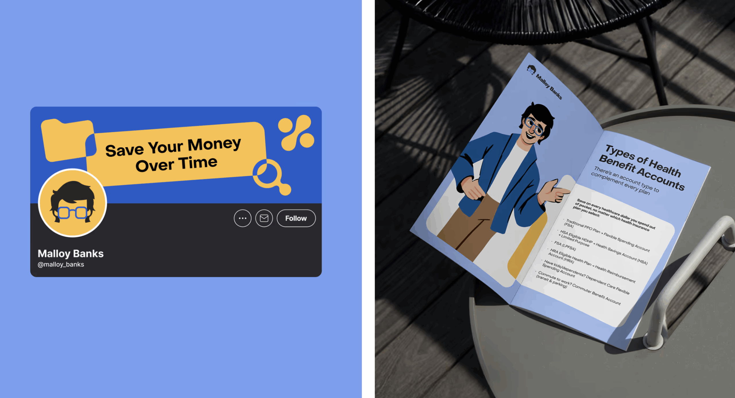
The personality of the character leaned closer to a teacher or mentor than a brand gimmick. Calm, recognizable, slightly local in spirit. The origin of the concept came from sketches tied to a real person from the client’s environment, and that groundedness helped. The final visual development turned that idea into a proper brand asset that could move across training materials, explainers, interface moments, and marketing touchpoints without feeling forced.
In the end, the mascot solved a tonal problem. It made the platform feel more approachable, and that emotional shift opened the door for better understanding.
UX/UI Design for the Website
The website came together the way most real products do: with half-formed ideas and a structure still trying to find its shape. No pristine docs, no locked content map—just a product evolving in real time, while we were already inside it, designing.
So before anything could look good, it had to make sense.
We started by looking at how similar platforms in the US market organize this kind of information—what they prioritize, how they segment audiences, how they explain products that are fundamentally hard to explain. That gave us enough signal to build an initial information architecture and test what the site actually needed to say.
Very quickly, one thing became non-negotiable: employees and employers could not be pushed through the same narrative.
They have different questions, different stakes, different reasons for being there. Employees want practical clarity: what is this account, what can I use it for, where do I start? Employers need to understand the structure and value of the offering from an administrative angle. Once that split became explicit, the interface got sharper.
The UI then followed the branding logic: clean hierarchy, easy scanning, supportive visual cues, and enough consistency between components and brand elements that the whole thing felt like one system instead of several disconnected decisions pretending to be friends.
Motion Design—Explainer Video
The explainer video had a pretty humble job on paper: introduce the company, summarize the service, keep it dynamic enough that people don’t mentally leave after six seconds. In reality, that meant solving a familiar motion problem: how do you make information move like a story instead of a deck?
The answer came from transformation. Instead of building a sequence of isolated slides, the animation was structured so that the content of one scene would evolve into the next. That gave the whole thing a sense of continuity. Instead of just watching cards flip by, the eye was following an idea as it changed shape.
The brand system helped a lot here. The mascot, iconography, and fragments of the interface all became visual material for storytelling, which made the explainer feel tied to the product rather than floating beside it. The motion language stayed metaphorically connected to the script and voiceover, so the information landed more naturally.
The messy part, as usual, was timing. Voiceover arrived late, then changed, then changed again. Early animation timing had to be estimated in-house, then reworked once the client’s audio came in, then adjusted again because the pacing felt rushed. A bit of light sound design helped stitch it all together in the final pass.
Development & Implementation
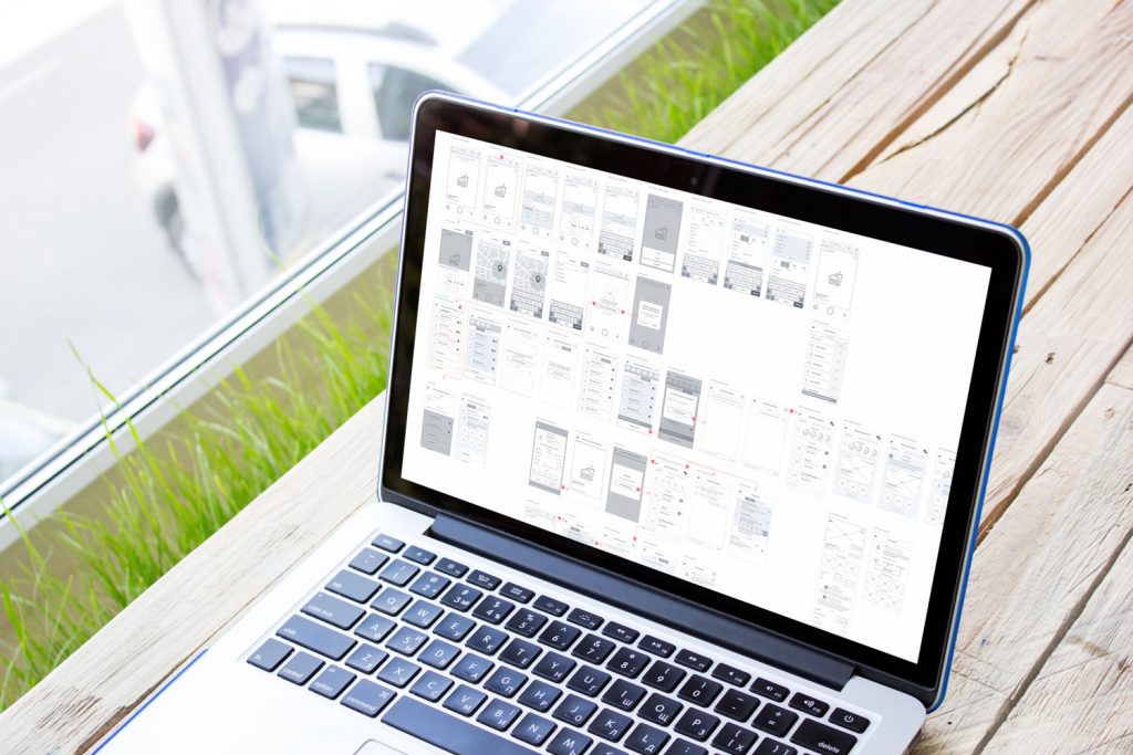
A lot of the implementation logic came down to one practical decision: instead of building static prototypes and treating them like a holding zone, the project moved straight into Webflow.
That made sense for the client. It also made the process a lot more alive.
The catch was that content was still thin, and the structure kept evolving. So what we were really building, at least early on, was a flexible shell—a site framework that could hold the product as it became more defined. Template pages did a lot of heavy lifting there—they gave the project momentum without pretending everything was already settled.
Some details needed more engineering attention than the clean visual layer might suggest. One of the more demanding parts was the page listing reimbursable expenses across different account types. There was a lot of tabular information, and the search and filtering had to work properly, not just look neat in a mockup. The tax savings calculator was another important piece. It had to make an abstract financial benefit feel tangible enough that users could actually estimate value, not nod politely and move on.
Because design and implementation were happening in parallel, every structural shift rippled through the build. That made the process longer and more iterative, but it also kept the system honest.
What This Project Taught Us
This project was a reminder that people rarely experience complexity as “complexity.” They experience it as hesitation. A pause before clicking. A second tab opened to search what a term means. A moment of doubt over whether they’re about to make a mistake with real money. That’s where design either earns trust or loses it.
Malloy Banks reinforced something we keep seeing across fintech and service-heavy products: clarity is not the same thing as reduction. You don’t make a complicated system better by stripping out its logic until it becomes vague. You make it better by structuring the explanation, controlling the tone, and giving users enough cues to move forward with confidence.
A few decisions proved especially powerful:
- the mascot lowered the emotional temperature
- the color system helped separate audiences and content types
- the icon and illustration layer turned explanation into something more navigable
And on the process side, there was another lesson. When content, structure, and implementation are all moving at once, the design team has to keep re-entering earlier stages without losing the thread. It’s not glamorous, but it’s real product work. Sometimes, the most valuable thing design does is keep the system intelligible while everything around it is still in motion.
Underneath all of these design choices sits a more practical reality: people don’t need financial products to be cute. They need them to stop feeling like punishment.
That was the real job here: take a system loaded with rules, filters, and administrative logic and make it feel clear enough that a human being can move through it without friction, shame, or guesswork. When design does that well, it stops being styling and starts acting like translation. And in products like this, translation is the whole game.
Recommended Reading
Still scrolling? Check out other Tubik Studio case studies below:
Immediate Case Study: Rethinking Payday
Fireside Case Study: Turning Sterile into Human
Case Study: Manatee Energy. Designing Warmth