There’s something oddly satisfying about redesigning for a brand that’s both deeply clinical and deeply human. Orakle sits right in that overlap.
A healthcare education company reshaping how clinicians learn, teach, and update their skills, both digitally and IRL. Think: case-based learning, research-backed programs, smart tools for smart people.
Our job was to build a calm but confident website. A homepage that didn’t scream “trust me, I’m scientific,” but earned that trust visually. One that could carry both content and silence. We reached for soft gradients, floating 3D, modular logic—and a color system that feels more like breath than brand.
Clean. Technical. A little strange. In a good way.
About the Client
Orakle builds tools for clinicians: online courses, hands-on programs, diagnostic frameworks, research-based skill-building systems. Their audience is medical professionals who want to practice better medicine—and want a platform that respects both their time and their intelligence.
The visual identity had to reflect that: minimal but expressive, structured but fluid. Less hospital hallway, more controlled clarity.
The Brief
The task was clear: redesign Orakle’s site to feel fresh, modern, and credible—without losing its professional DNA. The challenge? Build trust with a deeply technical audience, while nudging them toward interaction and curiosity.
What that meant, in practice:
- A homepage that feels alive, but never too busy.
- A subtle 3D visual anchor to draw the eye without stealing the show.
- A layout system that scales with content and team growth.
- A design language that stays consistent across subpages (like the advisory board and contact).
- And, quietly, a mandate to keep the brand’s core intact—color palette, typography, and all.
Stage 1. Art Direction & Web Design
Sometimes, less isn’t more. It’s just less. The brief landed with about half a page of content—and the task to build a full, convincing homepage around it. So we leaned into space. Visual rhythm. A grid that breathes.
The layout builds around circular motifs (a nod to continuity and clinical feedback loops), anchored in a clean, modular structure. Blocks scale easily for future team updates or case studies, but never sprawl. On mobile, the experience folds down without breaking form.
Colors stay close to Orakle’s roots: medical blues softened with gradient shifts, punctuated by gold for contrast and focus. There’s nothing flashy here—but it all feels deliberate. Sharp type meets softness. Structure meets motion.
Stage 2. 3D Illustration
The moment you land, you see it: a fluid, golden-ringed structure suspended in space. Familiar, but not literal. Kind of like a cell. Kind of like a portal. Kind of like something you’d find in a microscope… or an art museum.
Our designer, Andriy Drobovych, built it in Cinema 4D, simulating movement with X-Particles, then refined the final frame in Blender. The floating spheres suggest micro-scale systems—bodies, data points, clinical variables—always in motion, always responding to invisible forces. The kind physicians navigate every day.
The twisted ring structure came from a simple idea: take something precise, and let it breathe. Let the perfection bend a little. The result: golden tubing that wraps like a loop of thought—or a diagnostic cycle.
Inside the ring, particles follow a controlled path. They move within defined boundaries, guided by an internal structure you don’t see at first glance. It mirrors Orakle’s work: complex clinical systems shaped by clear frameworks, evidence, and repeatable processes rather than intuition alone.
Golden accents added a layer of precision. Blue fog and translucent textures kept it light. The goal was to make it premium, but not cold. The final render was adapted for both desktop and mobile, keeping the experience smooth without compromising visual quality.
Stage 3. Motion Design
Subtle is easy. Seamless? That’s the hard part. The 3D loop on Orakle’s homepage doesn’t try to impress you. It doesn’t spin or pulse or throw particles in your face. It just breathes—softly, methodically—like it’s alive but knows you’re busy.
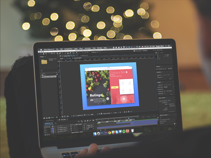
Getting there was anything but simple. The loop runs at 10fps. Feels smooth enough. But under the hood, it’s a stitched-together PNG sequence—baked in Lottie, tuned for Webflow, obsessed over until it hit the exact balance of lightness and clarity. It took some tinkering: the particle simulations don’t loop naturally, so the team had to hide the seams manually in After Effects.
Everything was tuned for performance, not spectacle. Lottie took care of delivery, but the real work happened earlier—dialing in a rhythm that could suggest depth without stealing attention or loading time. No excess frames, no visual noise. Just enough motion to give the page structure and tension.
Our Reflections
The challenge with healthcare design is always the same: how do you make it feel human without making it feel unserious?
Orakle gave us room to find that balance. To play with softness inside a rigid field. To build something tactile, visual, and slightly surreal without losing the audience who actually needs the information.
There’s no single hero here—just a bunch of invisible seams stitched well. 3D that loads fast. Motion that doesn’t distract. A layout that adapts. A palette that breathes.
In the end, it’s less about what we added and more about what we didn’t overdo. No noise. No visual filler. Just one solid system that holds its ground.
Recommended Reading
Healthcare isn’t the only space where restraint matters. Browse our other articles on web design, motion, and 3D—from fintech systems to experimental product interfaces:
EternaCloud Case Study: Calm Design for Complex Systems
Case Study: ABUK—Designing Ukraine’s Leading Audiobook Platform
Case Study: HP23. Website and 3D Animation for Prostheses Producer