
It starts with a button. It always does. Not with the brand story. Not with the strategy deck. Not with the 47-page Notion doc your client swore they’d “keep short.” It starts when you hover over the button and ask yourself—do I trust it enough to click?
That little rectangle is doing a lot of heavy lifting. And behind it? A designer squinting at Figma at 2am, wondering if #FF6136 is too loud or just loud enough. We know, because we’ve been there.
So here’s how we think about CTA button design—messy, human, slightly obsessive, and actually tested in the wild.
What’s a CTA Button?
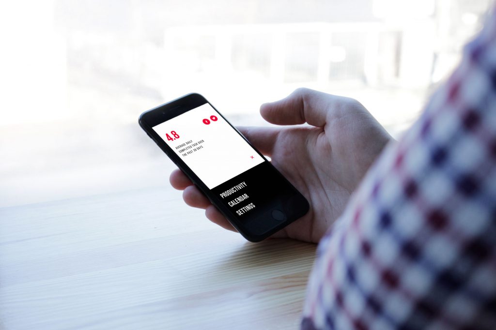
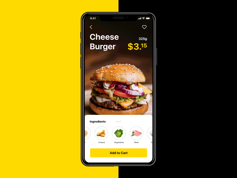
A CTA (call-to-action) button is that bold little nudge on a web or mobile interface—the “Buy now,” “Let’s talk,” or “Get the goods” moment. It’s designed to convert. Whether that means sealing a sale, sparking a subscription, or starting a conversation, a good CTA exists to get people moving.
In the world of business goals, CTAs are your quiet sales reps. A well-placed, good-looking button can drive clicks, leads, purchases, and all the stuff that keeps dashboards green.
In our article Call for Attention. Powerful CTA Button Design, we broke down what makes these buttons actually work: size, color, shape, placement, and microcopy. (Yes, even a single word can change the game.)
So how do you make your CTAs irresistible instead of ignorable? We’ve got you. Here are some smart, practical tips to help your button design actually do its job.
1. Make It Look Clickable (Because Users Won’t Guess)
Ever hovered over text, hoping it’s a button, and it’s not? Yeah. We hate that.
If it’s supposed to be clickable, make it obvious. CTA buttons aren’t the place to get mysterious. Add a shadow, a slight gradient, even a bevel if you’re feeling 2012. Want to stay flat? Rounded edges still whisper “click me.”
The goal is clarity, not cuteness. And clickability isn’t a style choice—it’s a usability baseline.
2. Size It Like You Mean It
You’re not being subtle—you’re being ignored. Big CTA buttons get seen. Big buttons get clicked. That’s the game. But here’s the catch—make it too big and suddenly the layout feels like it was designed in PowerPoint.
Apple says go at least 44x44px for mobile. Microsoft says 34x26px. We say: try things out, then test with real fingers (not just your trackpad). Bonus tip? Zoom out in Figma. If the button disappears into the UI noise, it’s too small.
3. Color Like You Care
Contrast is everything. If your CTA color blends into the background like camouflage, you’ve already lost.
Designers sometimes get weird about this. “But red breaks the palette.” Okay, but does it break the flow? Good. In a blue UI, red or yellow works. In a muted neutral one, maybe try electric cyan. Use the color wheel if you must, or your gut if you’re good. The goal? Stand out, not stand alone. Buttons aren’t part of the vibe. They are the interruption.

4. Keep It Snappy. Copy Is UX Too.
CTA microcopy isn’t the place for storytelling. This is where clarity wins.
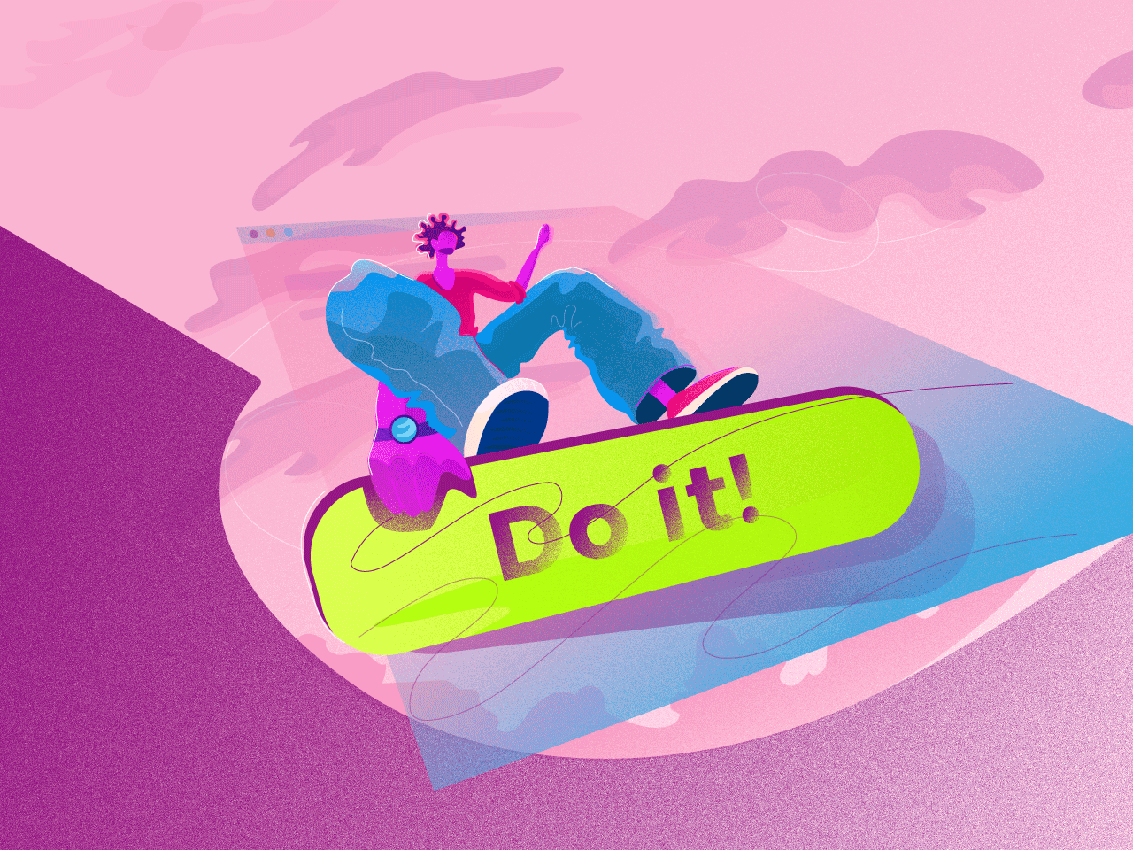
Say the thing, directly. “Buy now.” “Book a call.” “Steal the deal.”
Every extra word is another second of doubt.
Imperatives work. Verbs win. And if you really want to be clever, earn it. Otherwise, keep it clean.
5. Place It Where the Decision Happens
Ever see a Sign Up button before any of the actual offer? That’s like asking for a first date before saying hello. We map user flow like we’d map a good story arc. You build tension, then release. Same with CTAs:
- Tell them what they’re getting
- Then give them the button
And remember—thumbs don’t like corners. Think reachable zones. Think eye-tracking. Think lazy scrolling on a Friday evening.
6. Let White Space Do the Work
Negative space in UI is like silence in a conversation. Awkward when misused, powerful when intentional. Surround your CTA with enough breathing room to make it pop. Don’t crowd it with three other buttons. Don’t trap it in visual noise. Want it to feel important? Make space for it to feel alone.
And if you’re pairing it with something—a product shot, a one-liner—tighten that space to create a bond. It’s visual UX chemistry.
7. Add a Tiny Bit of Context (But Keep the CTA Clean)
Your button should be punchy. But nearby? A little whisper of reassurance helps. “Takes 15 seconds.” “No credit card required.” “We don’t spam. Ever.”
Microcopy isn’t decoration—it’s conversion psychology. Especially if your audience is skeptical (which they are). Soften the ask with small truths. CTA design is often about reducing doubt, not increasing pressure.
8. Test It. Then Break It. Then Test Again.
A/B testing CTA buttons isn’t just for startups with too much traffic. It’s for anyone who wants to learn how people actually behave.
Change one variable at a time:
- Color
- Size
- Copy
- Placement
Track real things: clicks, signups, purchases, bounces. We like setting up tests in Webflow or Figma prototypes, but even Optimizely can get the job done.
And hey—sometimes the version your team hated wins. Let the users be the jury.

CTA buttons aren’t magic. But they are leverage. They’re the handshake. The spark. The moment where design meets decision. And while they may look small on screen, they carry a ton of emotional weight—trust, intent, curiosity, commitment.
So yeah. We care a lot about buttons. Not because they’re trendy. But because they work when you do them right. And when you do them wrong? Well. You’ll know.
Recommended Reading
Curious what else we’re buttoning up? Dive into these:
Call for Attention. Powerful CTA Buttons Design
UI/UX Design Glossary. Navigation Elements
UX Design Glossary: Interface Navigation Elements. Set 2
7 Tips to Enhance Mobile Interactions
3C of Interface Design: Color, Contrast, Content
9 Effective Tips on Visual Hierarchy