We’ve all seen it. You open a website. The typography is elegant, the grid is precise, the color palette is confident, every pixel seems professionally placed. And yet, it feels like a showroom after closing hours. Perfectly arranged. Completely still. No pulse.
That’s usually not a design problem. It’s a motion problem.
Over the years, we’ve watched animation in UX design spark endless debates inside professional communities. Too much? Too flashy? Too heavy? Meanwhile, users quietly made their decision: motion is no longer optional. It’s expected. Instead of being a gimmick, it became a baseline.
In our design process at Tubik Studio, we don’t treat animation as decoration layered on top of static screens. We see it as a behaviour tool—the way a digital product breathes, responds, and communicates.
When used intentionally, motion doesn’t just “look cool.” It clarifies interactions, reassures, and guides the user. It builds rhythm inside the project workflow.
Here are six types of web animation we consistently return to—not because they’re trendy, but because they work.
Let’s dive in!
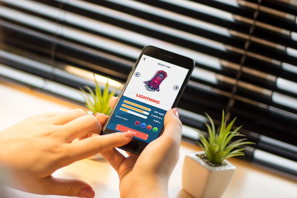
Different types of web animation are integrated into the home page of the ecotourism website.
Hero Animation
The first few seconds the user spends on a website are the most crucial. That’s when they are scanning the layout and deciding whether the product or service is even worth their time.
The hero section—that prominent, above-the-fold visual right below the header—carries a disproportionate amount of emotional weight. It’s the first real exchange between brand and user.
A static hero can inform. It can look polished. But when it moves—thoughtfully—it does something more subtle. It sets atmosphere.
Hero animation activates visual perception instantly. Movement draws the eye before words are processed. And since people decode images faster than text, the hero becomes both an attraction and an information layer at the same time.
In our user-centered design approach, we often think of the hero as a tone-setter. Motion can reinforce hierarchy, gently guide attention toward the call-to-action, and support navigation without shouting instructions.
It also establishes emotional context. Energetic motion signals dynamism. Slow, fluid movement communicates calm. Sharp transitions can suggest precision, soft ones—warmth.
Aesthetics are not secondary in competitive environments. Users expect functionality, yes. But they also expect visual care. Hero animation, when balanced correctly, enhances desirability without compromising clarity.
The key is intention. If the motion doesn’t strengthen the message, it doesn’t belong there.
Prominent and impressive hero 3D animation on the home page of the uMake website gives a visitor an instant visual connection to what the service offers.
The home page for the Synthesized website instantly impresses visitors with an animated full-screen background with abstract patterns adding depth and dynamics to the visual experience and setting associations with the digital technologies.
The home page of the e-commerce website selling stationery uses trendy and elegant full-screen hero animation to set the theme.
The home page of the e-commerce website selling toys uses hero animation to add fun and playfulness to the interactions.
The landing page for the fintech service Uni features a hero animation of the 3D illustration setting the theme of an innovative approach to credit cards.
The website’s home page for Energizou, the electricity provider in Brazil, focused on the retail market, uses an atmospheric hero animation to set the theme and liven up the user experience.
Hero animations on the home page and 404 page of the website for ShipDaddy, shipping and fulfillment service, feature the animated company mascot that adds fun and helps to set solid brand communication.
The landing page for the Pass-On delivery service features the hero animation of the map setting quick association with deliveries around the country.
Loading Animation
Waiting online is a fragile moment. Without feedback, uncertainty creeps in immediately. Did it register? Is it broken?
Loading animation is one of the simplest yet most psychologically important tools in UX design. It turns silence into communication. By animating progress—even abstractly—we reassure the user: the system is working. Your action is acknowledged. Something is happening.
That reassurance matters.
In our creative collaboration with clients, we treat loading states as part of the overall experience, not an afterthought hidden in development. A loading animation can reflect brand character while staying lightweight and consistent with the design concept. It doesn’t need to be elaborate, but it needs to be clear.
Done well, loading animation reduces anxiety and builds trust. And trust is foundational to better design outcomes.
The web page for the egg product e-commerce website uses the counter to show page loading progress.
The loading animation for the e-commerce website of a niche juice brand imitates filling up the juice bottle.
The web page of the website telling about art galleries and events around the world uses captivating and artistic loading animation that imitates painting on the screen.
These article pages for the website devoted to the zero-waste lifestyle use small and beautiful loading animations that echo the title illustration of the article.
This website concept presenting portfolios of designers and architects from different countries uses stylish and captivating page loading animation using the association with an animated grid of tiles.
Accent Animation
Not everything should move. That’s the point. Accent animation is selective, it draws attention to specific details—keywords, informational blocks, brand marks, interactive elements like buttons or cards.
In a dense layout, attention becomes currency. Accent motion helps structure the users’ perception of the page. Instead of overwhelming users with visual noise, it highlights what matters most and makes navigation feel intuitive.
In our design process, we often use subtle motion to emphasize hierarchy rather than redesign it entirely. A small animated shift can direct the eye more effectively than a dramatic visual change.
Accent animation also adds vitality. It prevents interfaces from feeling static or frozen. The interaction becomes dynamic, but controlled.
Restraint is essential here. If everything moves, nothing stands out. Accent animation only works when it’s deliberate.
This website page for fintech service Crezco uses accent animation to draw attention to the key phrase in the text block that informs visitors about one of the core benefits, free payments.
The website for hiring yachts uses accent color and animation to make the CTA elements instantly visible.
The ShipDaddy website uses accent animation to attract attention to the list of the benefits for service clients.
The book review website applies stylish and hypnotic accent animation of a text piece to add dynamics and draw attention to the special feature of an item.
The illusion space website uses different types of slight accent animation, attracting attention to the CTA button, an arrow used as a directional cue, and a tagline.
Interactive Animation
A good interface listens. Interactive animation responds to user actions—clicks, selections, filters, searches. It creates a sense of dialogue rather than one-way instruction.
When an element reacts instantly, the connection strengthens. The user understands: the system recognizes me. It collaborates. It’s not just a lifeless bunch of screens.
This type of motion enhances clarity in multiple ways. It provides immediate feedback and supports decision-making by making options more tangible. Besides, it introduces a subtle layer of playful engagement that users love.
In our workflow, interactive animation often emerges from close client communication. It requires alignment between design and development to ensure motion supports usability rather than complicates it.
When interactive motion is purposeful, it makes digital experiences feel responsive and human, not mechanical.
The interactive menu page of the niche food e-commerce website turns the image of the product packaging each time user hovers a particular category.
The shipping company’s website uses an interactive map page visualizing the destination countries in an engaging and informative way.
The interactive product page of the yacht-hiring website uses smooth animation of the 3D models of the yacht models helping visitors look at them from different points.
The interactive menu page of the booking website offers more options on the hover of the category, wrapped in trendy clickable shapes and smoothly animated.
The interactive home page of the educational web editorial Illuminating Radioactivity opens the field full of bright tags featuring popular characteristics of radioactivity and hiding the name of the project. Moving the mouse cursor, users remove the labels, as well as the website erases the common stereotypes about the theme of radioactivity.
Special Motion Effects
Sometimes motion is about function. Sometimes it’s about presence.
The web is crowded. Attention is fragmented. Standing out isn’t about shouting—it’s about creating memorability. Special motion effects focus more on emotional and aesthetic impact than on direct usability. They can highlight gradients, amplify color transitions, or introduce original transitions that make layouts feel dimensional. A well-balanced interface blends utility and emotion. Users come for functionality, but they stay for experience.
Motion can make elements feel sharp or smooth. Dynamic or restrained. Bold or gentle. It can breathe life into compositions that might otherwise feel flat. But this is where discipline matters most.
Special motion effects should amplify the design language, not compete with it. They should support identity without sacrificing clarity. When we integrate this type of animation, we constantly evaluate impact. Does it elevate? Or distract?
That question guides the decision.
The e-commerce product website uses the animated image of the brand mascot, funny chicken used on packaging and branded materials. This way, it not only adds fun but also supports growing brand recognizability through the memorable character integrated into the product identity and keeps the whole customer experience consistent.
This landing page concept for an innovative charging station, inspired by the 3D concept created by concept designer Rettz Schmettz, uses animation to make the product presentation both informative and impressive.
This cool and bright website for a Chinese restaurant uses nuance animations such as trendy shapes with images of the food and beverages inside and a funny symbolic Maneki-Neko statue welcoming the visitors.
The category website page for Annual Awwwards is interactive and adds a feeling of depth due to the effect following the cursor. The light-backgrounded circle in the center features the category’s title and attracts attention at once, taking advantage of color contrast and smooth accent motion.
The landing page for the niche brand of party drinks uses eye-catchy and dynamic scroll animation and background motion effects to add fun and mood to the interactions.
The Stop Plastic website uses trendy motion effects to make the user experience more engaging, aesthetic, and captivating.
The exhibition page of the Lumen Museum website features the organization and vertical animation of the photo collection that echoes the visual presentation of this interactive set in the exhibition hall of the museum.
The online editorial about insomnia issues uses special motion effects setting the feeling of dizziness and instability that can be typical symptoms of people suffering from this problem.
The illusion space website uses special motion effects, transforming parts of text content and supporting the needed atmosphere.
The website of the company organizing parties for children uses attractive and playful 3D animation for loading and then as an element of integrity for different sections of the web page scroll down.
The clothing brand website uses neat and elegant animation of the thread uniting all the page sections and supporting the feeling of integrity while the visitor scrolls down the page.
Hover Animation
Hover animation is subtle, almost invisible in its importance. When a user moves the cursor over an element and it responds, a micro-conversation happens. The interface confirms: yes, this is interactive.
Hover states are foundational in web usability. They reduce guesswork. They support intuitive navigation. In user-centered design, clarity is generosity. Hover animation offers that clarity instantly.
At the same time, even these small motions can reinforce aesthetic direction. A refined hover state can echo the overall visual system, adding coherence without adding noise.
Good hover animation feels natural. It doesn’t surprise users. It confirms their expectations.
And that confirmation builds confidence.
The cleaning company website uses captivating abstract hero animation and uncommon hover animation for the tabs with categories of services.
The home page of the pet shop website uses a creative approach to hover that enlarges the image of the hovered item and even allows to interact with the card right on the spot.
The website of the spa center uses stylish accent animation and hover animation that makes interaction with the menu of services easy and informative.
The museum website concept uses hover animation to replace black-and-white photos with color ones, and this way, awe and engage visitors to interact with the website.
Cool and playful hover animation for product cards on the BlockStock website
Motion with Intention
Across all these types—hero, loading, accent, interactive, special effects, hover—the pattern is clear.
Motion communicates.
It communicates structure.
It communicates progress.
It communicates hierarchy.
It communicates personality.
But animation is not automatically beneficial. Used carelessly, it overloads layouts, distracts attention, and undermines usability. That’s why in our design process we analyze both sides—the enhancement and the risk. We evaluate context. Purpose. Emotional impact. Functional clarity.
Motion should serve usability, accessibility, and understanding. It should never compete with them. When it clarifies, reassures, and guides—it earns its place. When it doesn’t, it’s just noise.
In the end, if animation doesn’t improve understanding, it simply doesn’t belong in the interface.
Recommended Reading
Here’s a bunch of articles to dive deeper into the theme of usability and user experience design.
How to Use Animation in Mobile Apps
Conceptual Animation. Making UI Design Stand Out
5 Basic Types of Images for Web Content
Aesthetic Usability: Beauty on Duty for User Experience