Every studio has its secret playground. Ours went public.
We call it Tubik Lab, but it’s really a release valve. A digital gallery where we let ourselves make stuff without the pressure of metrics or timelines—or someone squinting at Figma asking if that shade of red is on-brand.
It’s a creative space where we stop playing nice. No briefs. No “can we make the logo bigger.” Just loose ideas, half-cooked sketches, and motion drafts we’d normally bury under client-friendly polish. This is the place for gut instincts and gut laughs. For the color combos that make you go “ew, or… genius?”
A Hypothesis in Motion
The Lab started as a hunch—a hypothesis, really—that our graphic and motion design teams had more range than we were showing.
Commercial work has a way of sanding off edges. You start with something weird and wonderful, and end up with “clean, modern, intuitive.” (Which is code for: looks like everyone else.) So our lead designer, Vlad Radionov, suggested creating a sandbox instead—a space to stretch our own style past the usual and get a little lost on purpose.
At its core, the Lab is about value. Not in the marketing buzzword sense. In the real sense—showing our depth, so the right people find us. The ones who get it.
The product teams deep in the weeds of their next launch, tired of decks filled with stock illustrations and cloned UI. Looking for a visual language that actually gets what they’re building. Some come curious, others come with a mission: to wrap up a campaign, a milestone, or even an entire year.
Or the event planners trying to turn a boring expo booth into a magnetic space. Who care as much about the stage visuals as the keynote. Who want design that lives on walls, on merch, on screens—wherever the vibe demands.
And then there are the visual thinkers like us—the CDs and ADs with Pinterest boards full of references and no patience for mid. They don’t want a studio to “deliver assets.” They want co-conspirators. People who’ll send back an idea that makes them pause, smirk, and say, “ok, now that’s unexpected.” Sometimes that turns into a full project. Sometimes it’s just one sharp little collab that lives in both our portfolios forever.
Tubik Lab is both a portfolio and a proof-of-concept. It’s a lens into the parts of our process that don’t always make it to the final deliverable.
Why “Lab”?
Because that’s what it is—a place to test, play, refine, and repeat. The name came early and stuck. We tried fancier options—Random, Sandbox, EXP, R&D—but “Lab” just felt right. It sounded like exactly what the project wanted to be—the kind of place where you’d accidentally mix the “wrong” elements and discover something better.
No extra metaphors, no branding gymnastics—just a label on the door that says: it’s okay to try weird stuff here.
The Selection Process: Weird Wins
So, what makes it into the Lab? Gut feeling. Then a second gut feeling, shaped by years of visual taste.
Each piece runs through our lead designer’s curatorial eye. What gets in:
- Strange styles
- Bolder typography
- Work that feels niche, raw, or overly technical
- Anything that pushes us just far enough outside our comfort zone
A lot of these pieces don’t belong to any system, and that’s kind of the point. They exist to stretch, not sell.
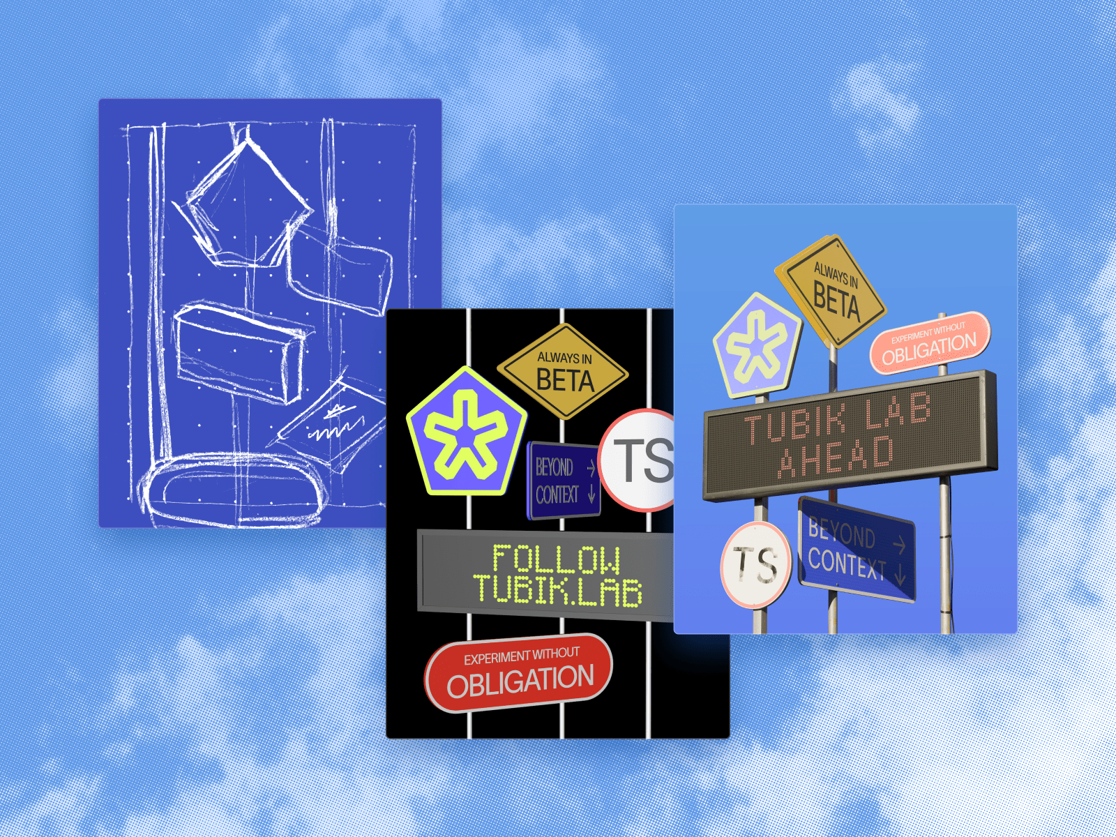
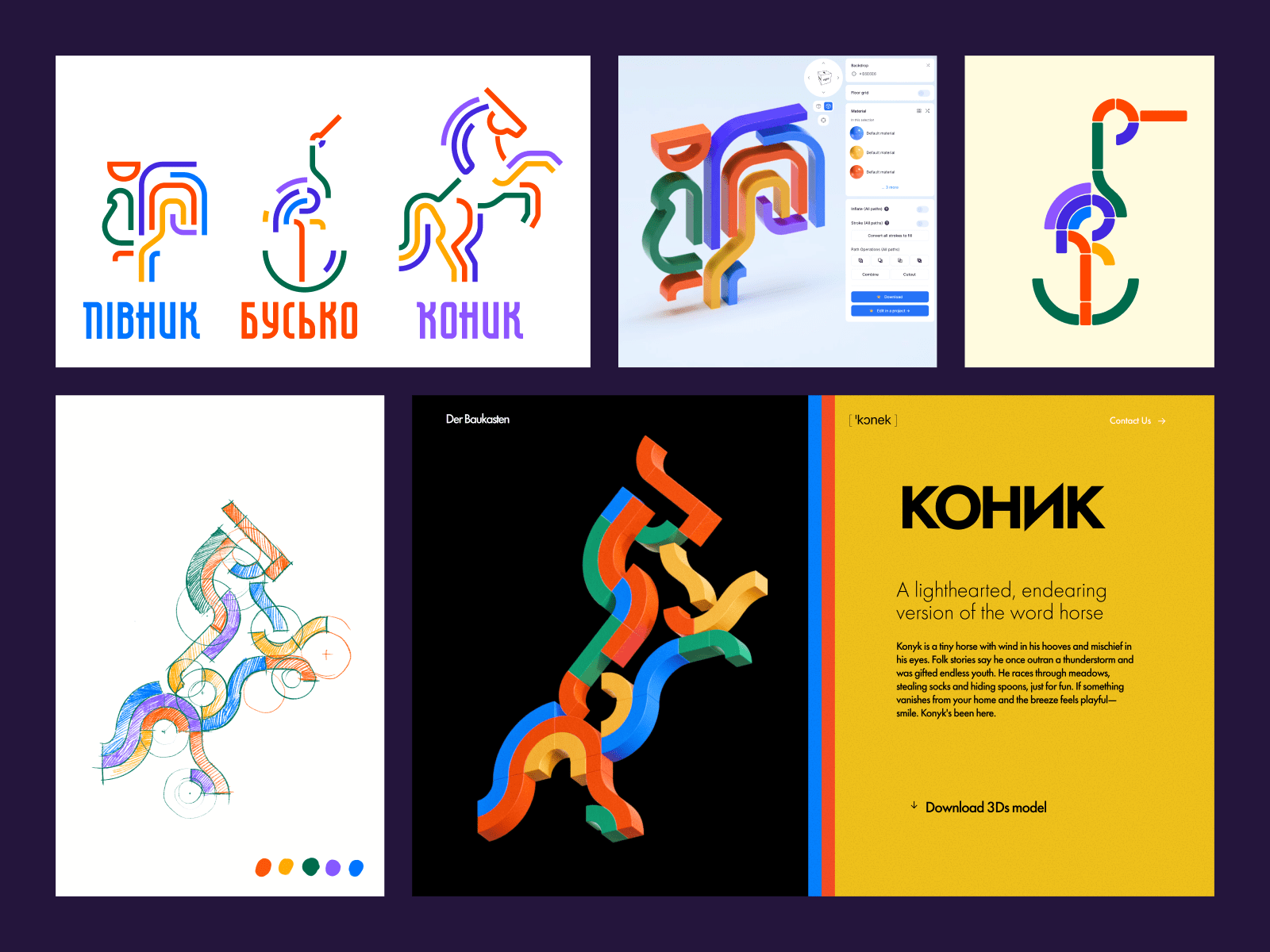
Motion? Always welcome. Sometimes we animate, sometimes we don’t. Depends on the day, the team, the caffeine level. And yes—sometimes, the experiments turn into something bigger. One of them—the modular constructor site Der Baukasten—began as a casual rooster sketch. Playful, colorful, with roots in local mythology. Another designer looked at it and said, “What if this thing existed in 3D?” Three weeks later, we’re modeling joints in Blender and thinking in fridge magnets.
That’s the kind of migration we love.
Exploration > sparked curiosity > commercial direction.
No Context. Just Design.
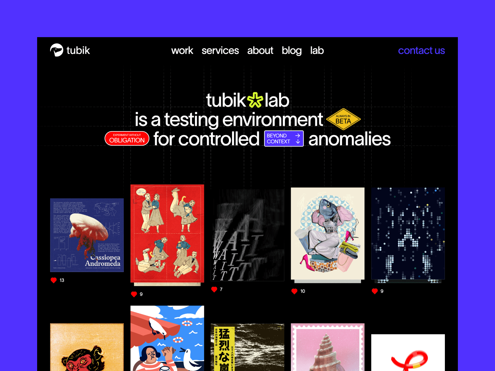
We intentionally keep the gallery minimal—no heavy case studies, no walls of text, just a scrollable grid of visual hits that speak for themselves. You can dive deep or skim quick, and it still works.
It’s not that we don’t have stories—trust us, every piece has a backstory, a meltdown, and probably a cursed Figma or Procreate file behind it. But Tubik Lab isn’t about over-explaining. It’s about letting the work breathe, first and foremost.
Our Art Director, Ernest Asanov, who designed the site, put it best: to him, the Lab is like a hidden room—or a cluttered closet—that only the studio’s residents usually get to peek into. Nothing’s labeled, nothing’s explained. It’s raw, unfinished, and slightly chaotic by design. That’s why there are no captions, no context—just the work, as-is.
Even the faint background grid isn’t decoration. It’s a nod to the visual scaffolding we use while designing—normally invisible, now exposed. A quiet reminder that this is the workspace, not the showroom. A lab in the truest sense.
What’s Next: From URL to IRL?
Right now, we’re in build mode—filling out the archive, keeping the bar high, and growing our visual library. We’ve already built a body of work that lives on its own terms. The Lab has its own space, its own rhythm, its own little following of people who check in just to see what visual rabbit hole we’ve gone down this week. The goal now is to keep adding to it—without dropping the standard. No filler. No fluff. Every piece has to earn its place.
Beyond that, we’re already dreaming past the screen.
Maybe it turns into a zine we hand out at conferences. Or a book with messy margins and dog-eared pages. Maybe even an offline exhibit—with screens and smells and sounds and a sign that says “Please Touch the Art.”
We’re not rushing. But we’re not standing still, either.
The Lab has legs. We’re just figuring out where they want to go.
The Work That Keeps Us Going
Deadlines are loud. Client decks are louder. Tubik Lab is where we exhale.
Every designer needs that one space where they can be a little unhinged. Where the line between “why not?” and “what if?” gets blurry in the best way. For many of us, this kind of creative release is essential.
This is where we try that plugin we bookmarked six months ago and forgot how to use. Where we animate textures that feel too weird for the pitch, but too good to leave alone. Where someone spends a full afternoon adjusting one layer mask, and no one asks why.
It’s also where the real growth sneaks in. Where junior designers stretch into senior ones, illustrators test type, and motion designers flex without timelines.
Tubik Lab isn’t about being perfect. It’s about being alive—visually, creatively, technically.
Final Thought
There’s a difference between doing good design and believing in design. The first gets the job done. The second keeps you up at night—sketching, scrolling, tweaking a frame for no reason other than you want to see what it could be. Tubik Lab belongs to the latter kind.
So, come poke around. Stay a while.
We made this for you.
Recommended Reading
Curious minds don’t stop here. Check out more visual deep dives, case studies, and studio thoughts in our blog:
Case Study: Opera Browser Explainer Videos. Animated Video Production
Case Study: ID Scanning Product Icons. Graphic Design Process
Designing for Justice: Telling the Story of Jailhouse Lawyers
Design for Fintech: UI/UX Projects for Finance and Business
Case Study: Daughter of the Inner Stars. Character Art and Logo Design for Performance