Most apps tell you what to do. Netti made the one that tells you what’s wrong.
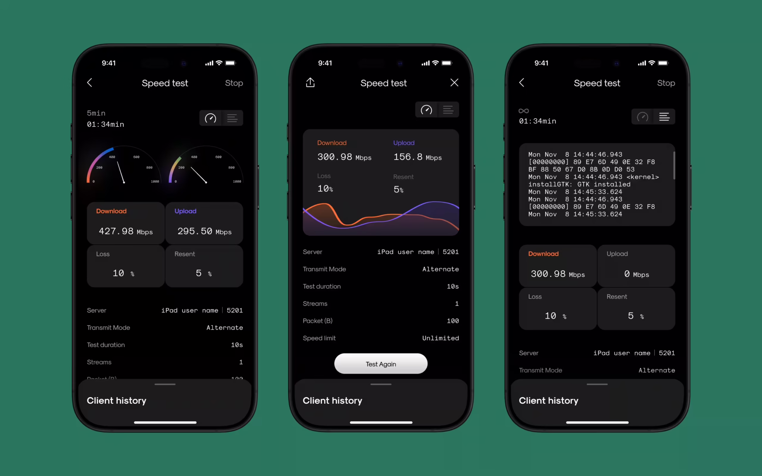
It measures connection speed in real time—download, upload, ping, jitter, signal strength. One tap, and your internet starts confessing—speed fluctuations, bad routing, latency spikes. Suddenly, you’re staring at a bunch of numbers that feel less like metrics and more like a system having a nervous breakdown.
And that’s where we came in. Our job was to make that breakdown readable. Make the chaos make sense. Design a tool that doesn’t just show the problem—it explains it.
And that’s exactly what we did.
The Ask: Make the Invisible, Visual
Netti came to us with a bold idea: a mobile app that could measure internet connection performance in real time—and explain it in a way that anyone could understand. Not just tech bros in their server caves, but your dad testing his new router, your neighbor troubleshooting their streaming, your average user wondering if the lag is them or the world.
Speed test apps existed, sure. But most of them treated you like a modem, not a person. Netti needed to be smarter than that.
It had to be honest, but not harsh. Technically credible, but never cold. Intuitive to use, even if you didn’t know what half the numbers meant.
Our challenge was clear:
Translate a machine’s language into something human.
Research & Strategy: Listening Before Designing
We started by doing what any design team does when faced with technical complexity:
We listened.
To users, to competitors, to the engineers behind Netti.
To that small, persistent voice that says, “I don’t get what this number means—should I be worried?”
Our researcher Natalka Mamchur mapped out the playing field—what users expect from internet test apps, where current ones fail, and what kind of feedback loops we could build into the experience.
Then we got to work defining flows. Where do users land? When do they start drowning in data? How far can we take them without needing a glossary?
Each answer became a post-it. Each post-it became a screen. Each screen had to do one job: make the data feel like a story, not a spreadsheet. For this case, we needed to build a system that knew when to explain—and when to stay silent.

UX/UI Design: Turning Numbers into Interaction
Anastasiia Zhyltsova led the interface design—both for the app and the launch website. She treated the numbers not as outputs, but as characters. Each metric had its own temperament, its own place in the story.
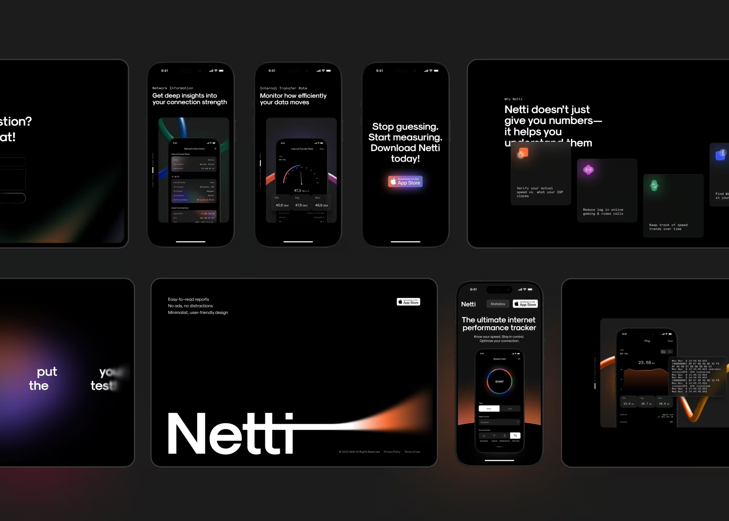
While plenty of speed test tools already existed, most stopped at surface-level stats. Netti went further. It offered real-time access to deeper diagnostics: traceroutes, data throughput, local network info. Serious tools, typically buried behind command-line walls, now packed into a clean mobile UI.
The challenge was to make all of that complexity readable. Not only for the pros—but for the rest of us, too.
So before a single pixel was pushed, we built the bones. Wireframes, flows, scenarios. We walked through use cases like we were debugging a system in real time—testing logic, trimming steps, flagging points of confusion before they could turn into friction. The back-and-forth here was steady and detailed. Not glamorous, not fast, but absolutely necessary.
Once the logic clicked, we moved into the visual layer—shaping a system that felt sleek without trying too hard, distinct without distracting. Accent colors gave us anchors: clear calls to action, visible touchpoints, visual rhythm. Navigation was stripped down to a single home screen—no bottom tabs, no hidden drawers. Everything up front, ready to go.
Tap a service, and you land on a focused screen with a single goal: run the test. The central animation doubled as both anchor and indicator—quietly tracking progress without shouting for attention.
The speedometer got its own redesign, too. We studied car dashboards. Not for style—but for how they deliver information at a glance, under pressure. That’s the level of clarity we were aiming for. One screen at a time, she carved away the noise until the meaning clicked.
The result: a mobile interface where performance metrics weren’t buried—they surfaced, clearly, without yelling.
Iconography: Minimal Shapes, Maximum Clarity
There’s a certain comfort in default icons. Everyone’s seen the same upload arrow, the same network bars, the same “your connection sucks” triangle. Most apps play it safe and call it a day.
But our designer, Vlad, looked at the standard set and thought, “How much can I take away before the meaning disappears?”
So he stripped the icons down to their bones. Then shaped what was left into something unfamiliar—but instantly readable.
Each core service icon started as a geometric seed—minimal, abstract, a little odd by design. Then came a second layer: soft, blurred shapes that peeked from beneath. Not decorative flourishes, but functional silhouettes. Extra signals your brain could read before you even processed the color. Form follows function, yes. But here, function also had to whisper something beautiful.
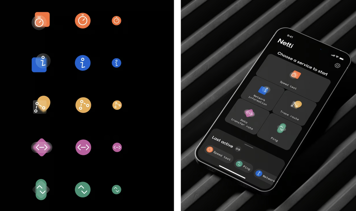
Every piece was built in Figma, component-first, screen-tested in real time. Place an icon, tweak it, see how it sits in the layout. No guesswork, no detours. Just a tight design loop that let us adjust in context—because Vlad knew the best icons don’t live in a vacuum. They live in real screens, surrounded by noise, and still have to make sense.
Even the functional icons—menus, nav, states—followed the same logic. Simplified geometry. Diagonal tension. Soft corners. A shared visual language that tied them all into one system.
Roma Chornyi jumped in, too—helping adapt icons for specific states and edge cases. Nothing flashy, nothing loud. Just quiet precision work that made sure the shapes stayed consistent across contexts.
![]()
Motion: When the Interface Breathes Back
Static metrics feel dead. So we asked: What if the app felt alive—breathing, reacting, pulsing based on your actual connection?
Kyrylo Yerokhin stepped in with data-driven motion design that gave Netti a second skin. The circular speed test pulse, the latency ripple, the subtle feedback when a test started or ended—each movement helped users feel the system’s state without needing to read.
Kyrylo’s motion sketches were tested inside Figma first, then refined for handoff. Some broke. Some didn’t work on certain screen sizes. Some came back and said: nope, too much.
We kept the ones that whispered, not screamed. Because the interface isn’t there to impress—it’s there to explain.
Website: Extending the System
Alongside the app, we designed a lightweight promo website. The goal: don’t sell the app. Explain it. Make the technology feel like a tool, not a trap.
We reused the same design logic—calm surfaces, tight hierarchy, clean iconography. The goal was simple—get users to understand what Netti does and why it matters, without making them dig or decode.
At its core, the site introduces Netti’s capabilities, outlines the value of each tool, and makes the product’s advantages feel self-evident. It’s a walkthrough, not a pitch. The real centerpiece is the statistics page—a live snapshot of aggregated user data across key dimensions. From internal data transfer speeds to router–device combinations, device usage by country, and operator performance by region, it turns individual speed tests into something bigger: a map of how real networks behave in the wild.
It’s not just pretty charts. The stats section includes powerful filters—by country, device, OS, operator—allowing anyone from infrastructure engineers to curious users to drill down and find what matters to them.
That flexibility turned the website into more than a promo asset. It became a standalone resource—part dashboard, part dataset—useful to the people who work with networks every day. And in that sense, it mirrors the product it supports: Smart. Focused. Built to inform, not impress.
The Wrap: Precision, Not Perfection
Some projects ask you to be poetic. This one asked us to be precise—and to mean it.
Designing for an app like Netti doesn’t leave room for flourish for flourish’s sake. It either works, or it doesn’t. And that’s exactly what makes it such a satisfying design challenge.
Because the real tension here wasn’t between aesthetics and function—it was between clarity and overload. Between a user who wants answers fast, and a system that speaks in diagnostics. So we built something that could do both: explain without condescending, and inform without overwhelming.
Sometimes, it meant obsessing over the small things. But all of it—the flows, the states, the silence between data points—had to come together into something that felt quiet, confident, and undeniably sharp.
Netti isn’t here to impress users. It’s here to tell them the truth.
And in a landscape full of noise, that might be the boldest design move of all.
Recommended Reading
Curious how we turn data into design across different industries? Check out our other case studies:
SPYLT Case Study: Delicious by Design
Hyperion Case Study: A Production Powerhouse Reimagined
Case Study: Adam Braun. Creating Personal Website for Entrepreneur
Case Study: UClay. Identity and Packaging Design for Ceramics and Pottery Brand
Case Study: Vegar. Packaging and Marketing Design for Vegetable Producer