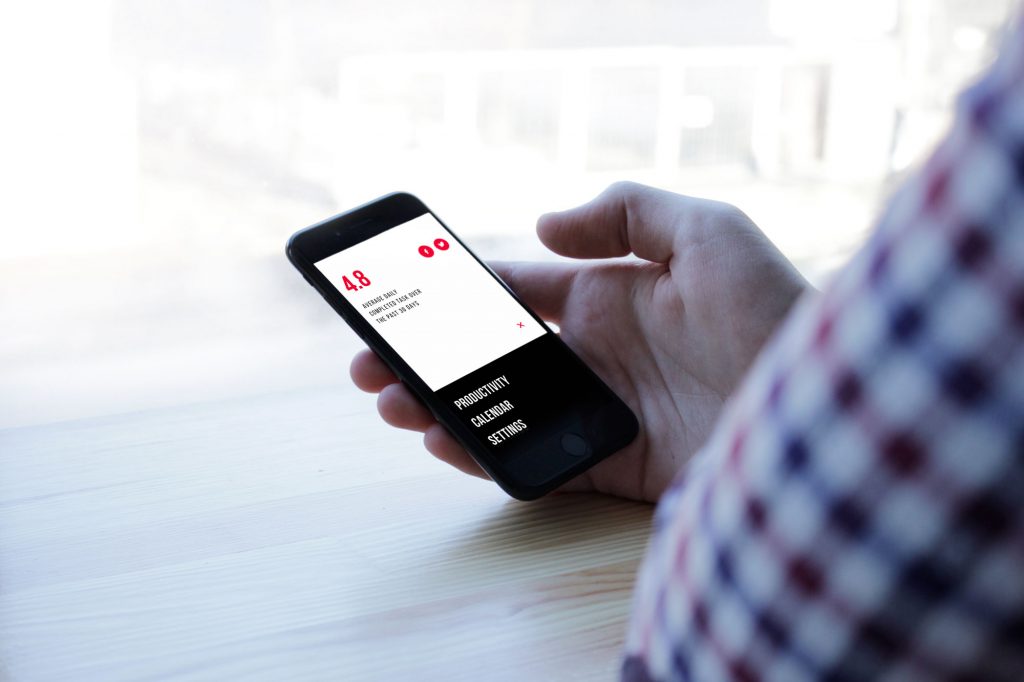
Good editorial design teaches information how to behave.
Anyone can publish content online. A CMS, a headline, a few images—done. But when a website exists to carry serious reading—essays, analysis, research, cultural commentary—the interface quietly becomes the editor in the room.
Margins decide whether people keep reading.
Typography decides whether they trust the text.
Spacing decides whether a paragraph feels inviting or exhausting.
This collection brings together several editorial website examples created by the Tubik team—explorations of web design for editorial websites, media website design, and blog website design where the goal isn’t decoration. It’s clarity.
Each project looks at the same challenge from a slightly different angle: how editorial UX design and information website UX design can turn heavy content into something readable, searchable, and enjoyable to explore.
Different topics. Different aesthetics. Same mission—design that respects the reader.
Let’s dive in!
Crypto Blog
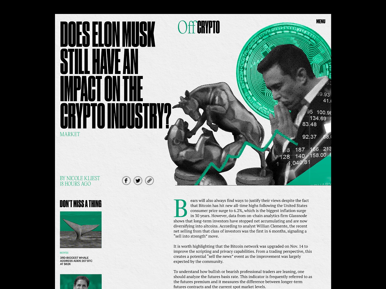
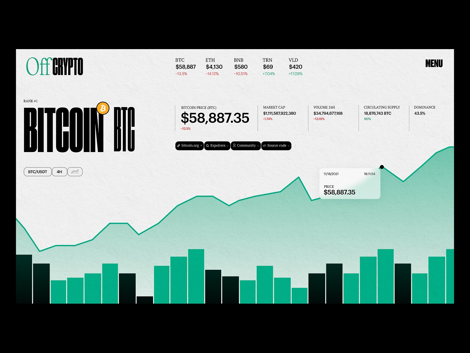
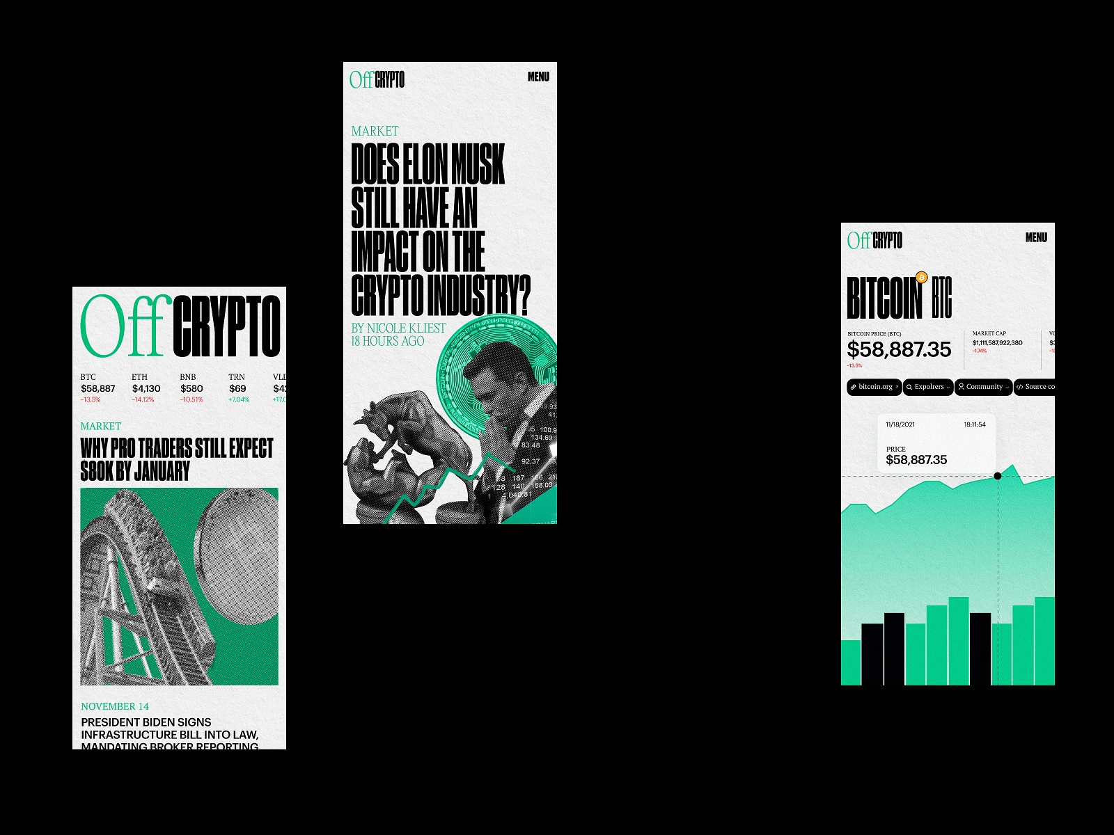
Crypto moves fast. Most interfaces panic and try to keep up.
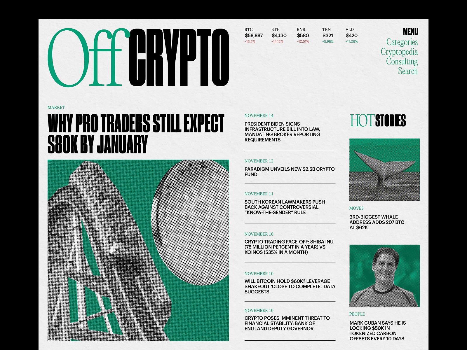
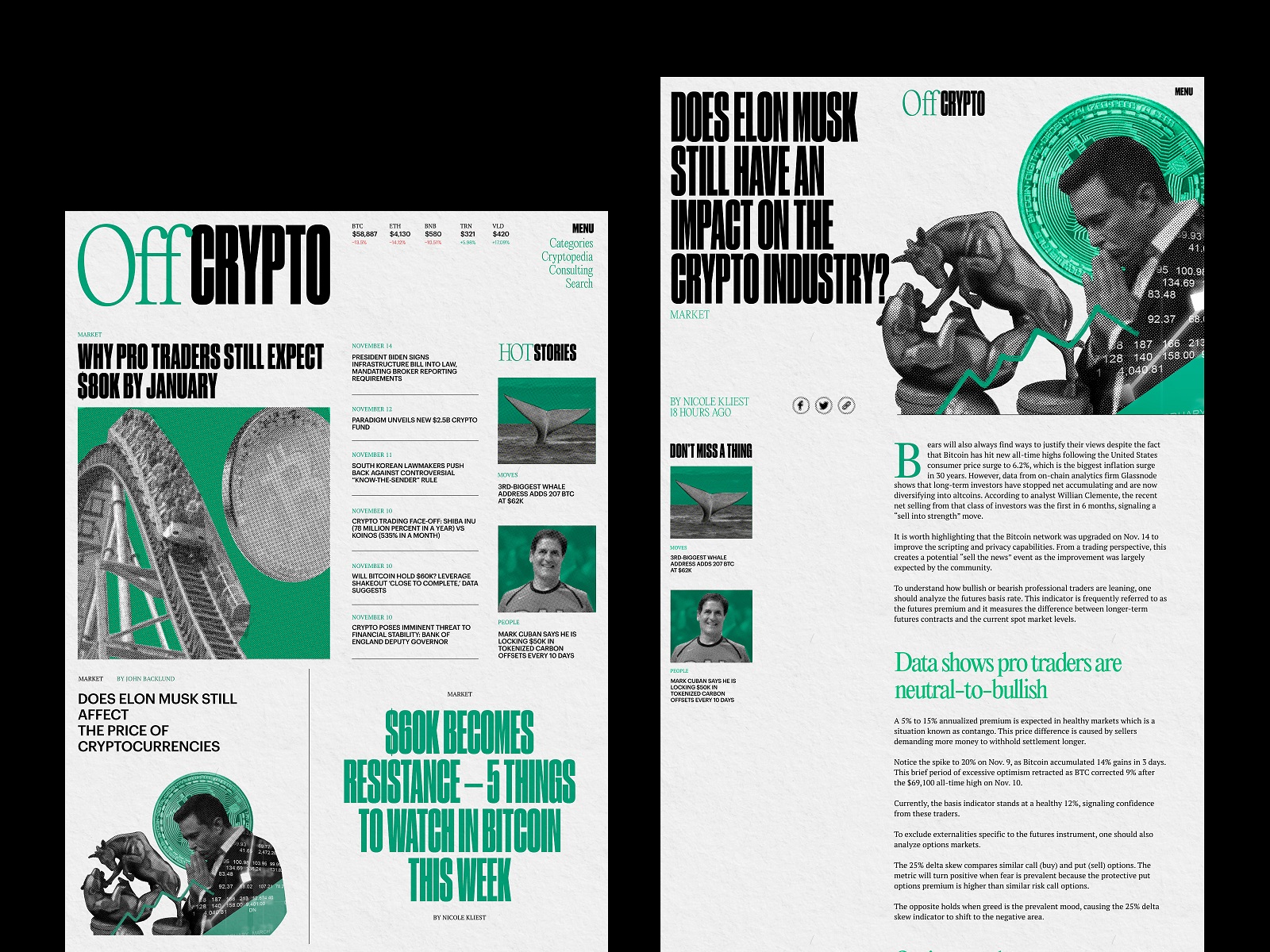
For this blog website design, we did the opposite: slow the experience down so readers can actually process what they’re reading. The layout draws subtle inspiration from newspaper broadsheets—wide margins, structured columns, deliberate pacing—translated into a modern editorial web layout built for screens.
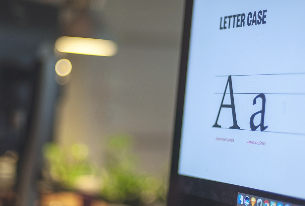
Typography sets the tone immediately. Headlines carry a quiet authority, while the body text uses carefully tuned readable typography for websites that keeps long-form reading comfortable. This is the quiet power of editorial typography web design: when type behaves properly, the interface disappears.
The palette stays restrained—mostly neutral surfaces with cool accent tones guiding interaction. Navigation is predictable, scanning is effortless, and the entire structure supports content scanning and readability UX.
In other words, the interface doesn’t compete with the content. It clears the runway.
That’s the backbone of strong blog UX design and content-heavy website design.
Web Editorial About Insomnia
Some editorial platforms aim to inform. Others try to evoke a mood.
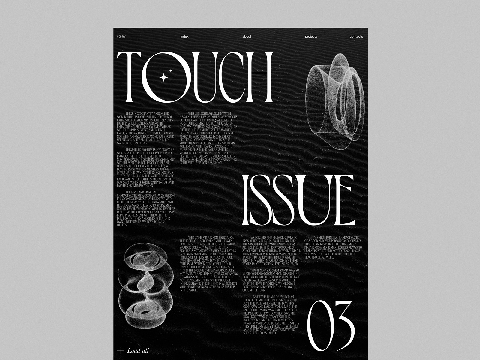
This editorial explores insomnia—the strange mental fog between night and morning—and the digital editorial design leans directly into that feeling. Typography becomes the lead actor here. Headlines stretch and shift, sometimes feeling slightly restless themselves, a visual nod to sleeplessness.
Dark palettes echo nighttime environments. Soft gradients mimic dim lighting. Motion behaves differently too—transitions slow down slightly, creating a rhythm that feels almost hypnotic.
This is where storytelling through web design becomes visible. The interface isn’t simply presenting text; it’s shaping the emotional frame around it. Menus slide quietly. Images appear gradually. Long-form sections support UX for reading experiences that encourage lingering rather than skimming.
A good editorial platform design doesn’t only deliver information. It builds atmosphere.
Illuminating Radioactivity Educational Website
Educational content introduces a different problem: complexity.
“Illuminating Radioactivity,” created in collaboration with Bombshelltoe Arts and Policy Collective and the Stimson Center, explores how web design for educational websites can make intimidating scientific topics approachable.
Radioactivity isn’t exactly casual reading. The design therefore treats the homepage like a discovery engine—a navigational system guiding readers through layers of information rather than dumping everything at once.
Interactive modules support UX design for media platforms that rely heavily on explanation and context. Data visualizations translate dense scientific ideas into visual systems readers can grasp quickly.
This is classic information architecture for blogs and knowledge platforms—organizing complexity so curiosity stays alive.
Blog Layout Explorations
Some projects begin as questions rather than solutions.
This exploration looks closely at the mechanics of blog layout design—specifically the featured article format common across publishing platforms. How large should a headline feel? How quickly should images interrupt text? How much whitespace is enough before the page feels empty?
The experiments rely on a monochromatic palette and controlled typography. The focus stays on editorial grid layout web design—how modular systems help long articles remain visually coherent.
These layouts demonstrate something simple but often overlooked: content-driven web design succeeds when structure stays calm.
Good web layouts for articles behave like quiet stage design. The story does the talking.
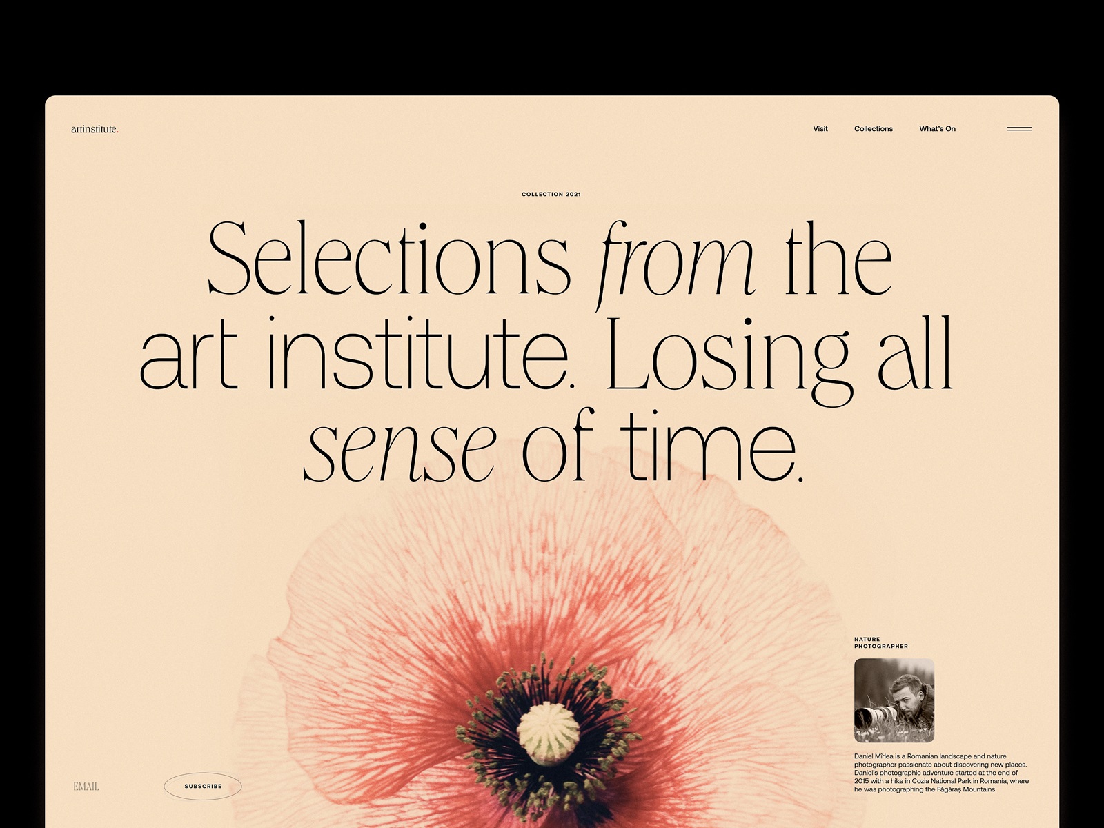
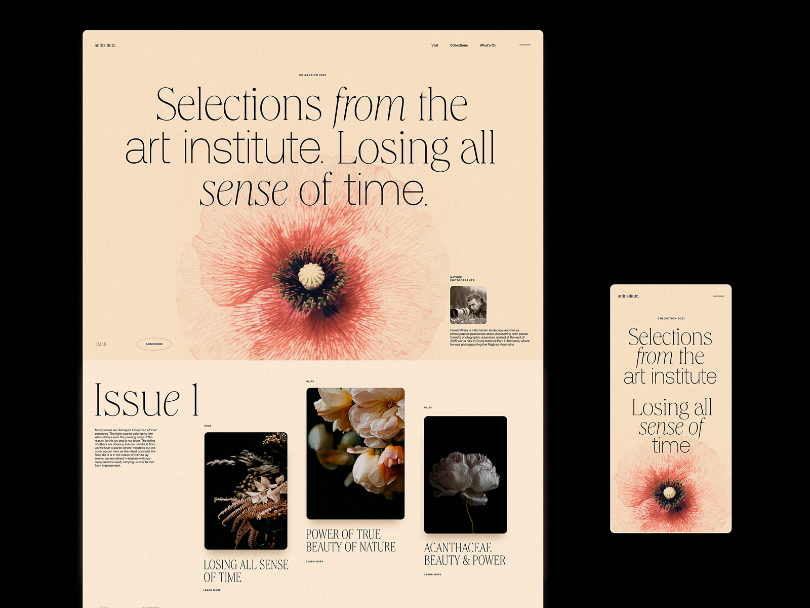
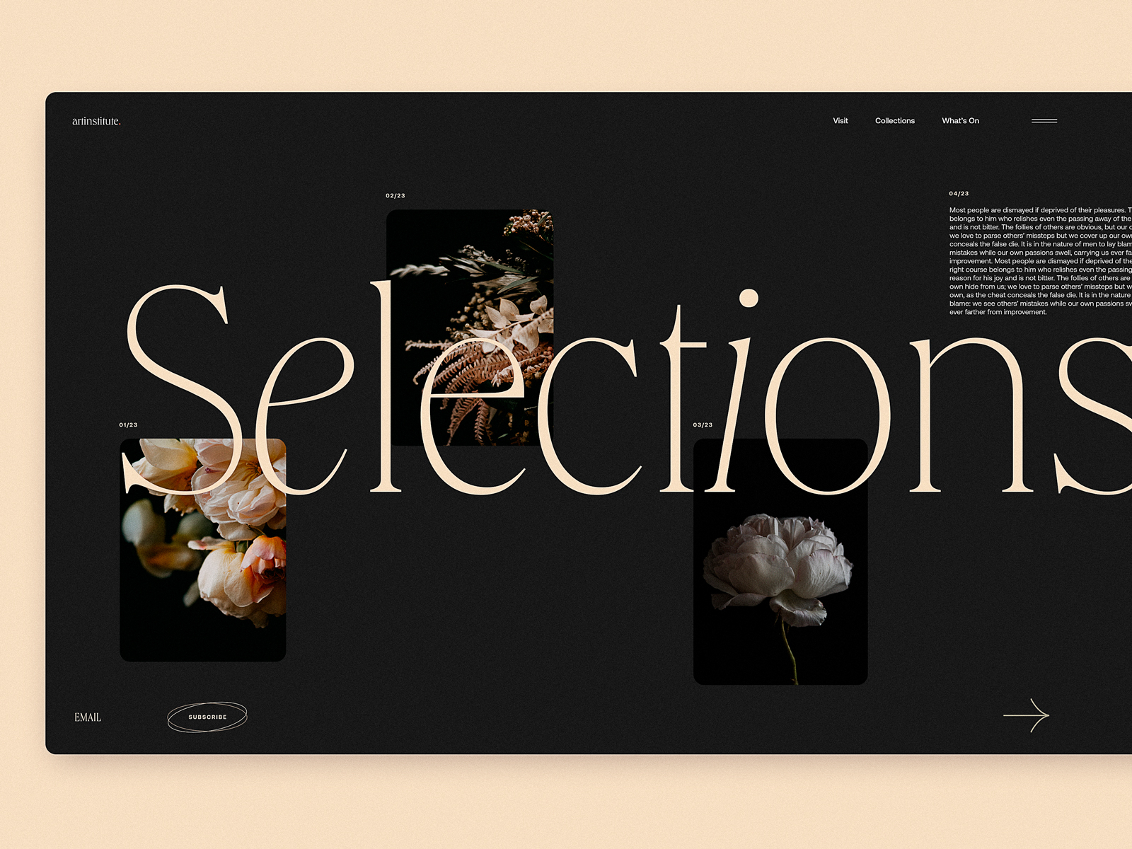
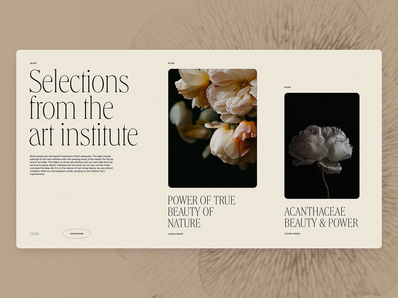
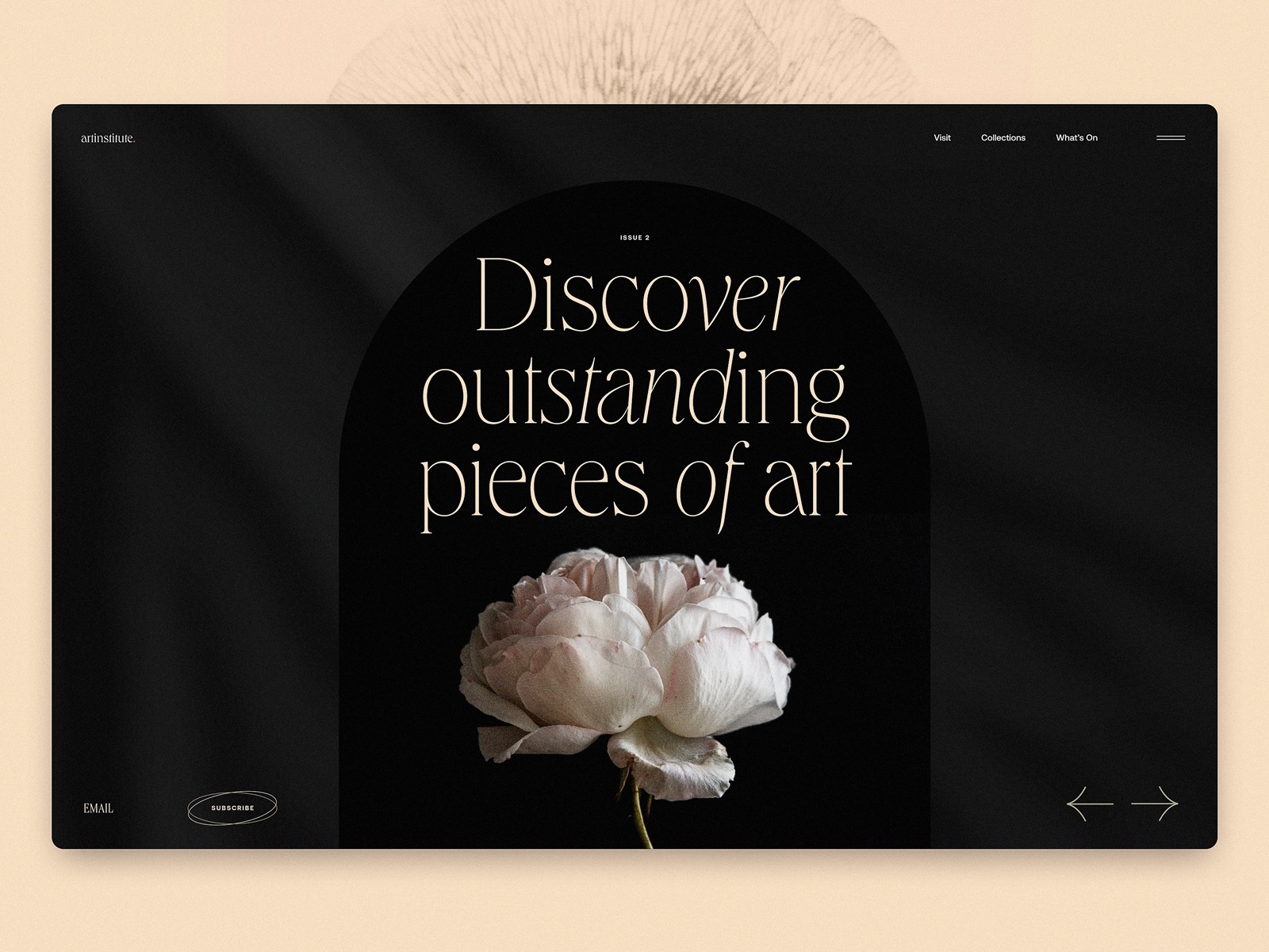
Art Institute Blog Design
Art needs room to breathe.
This magazine website design treats imagery almost like gallery pieces. Photographs sit large and confident, given generous margins so they don’t feel cramped by surrounding text.
Typography follows suit. Elegant serif headlines and disciplined spacing form a refined editorial website UI design that mirrors the tone of museum publications and cultural magazines. Visitors arriving on the page should feel something instantly—curiosity, calm, anticipation. That emotional entry point is where digital magazine UX begins.
The interface doesn’t try to be clever. It simply respects the art.
Geography and Ecology Blog
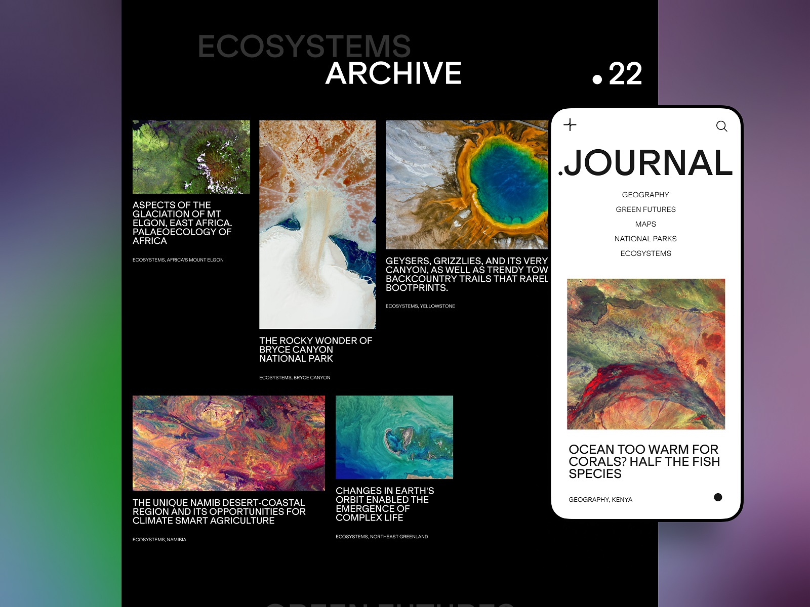
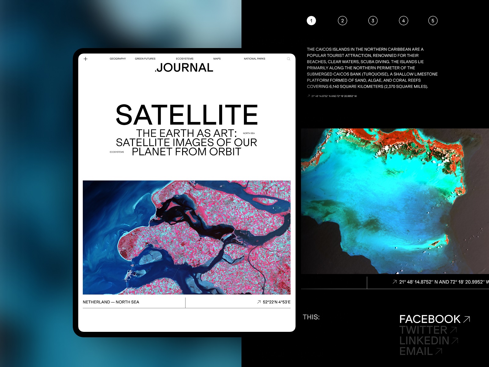
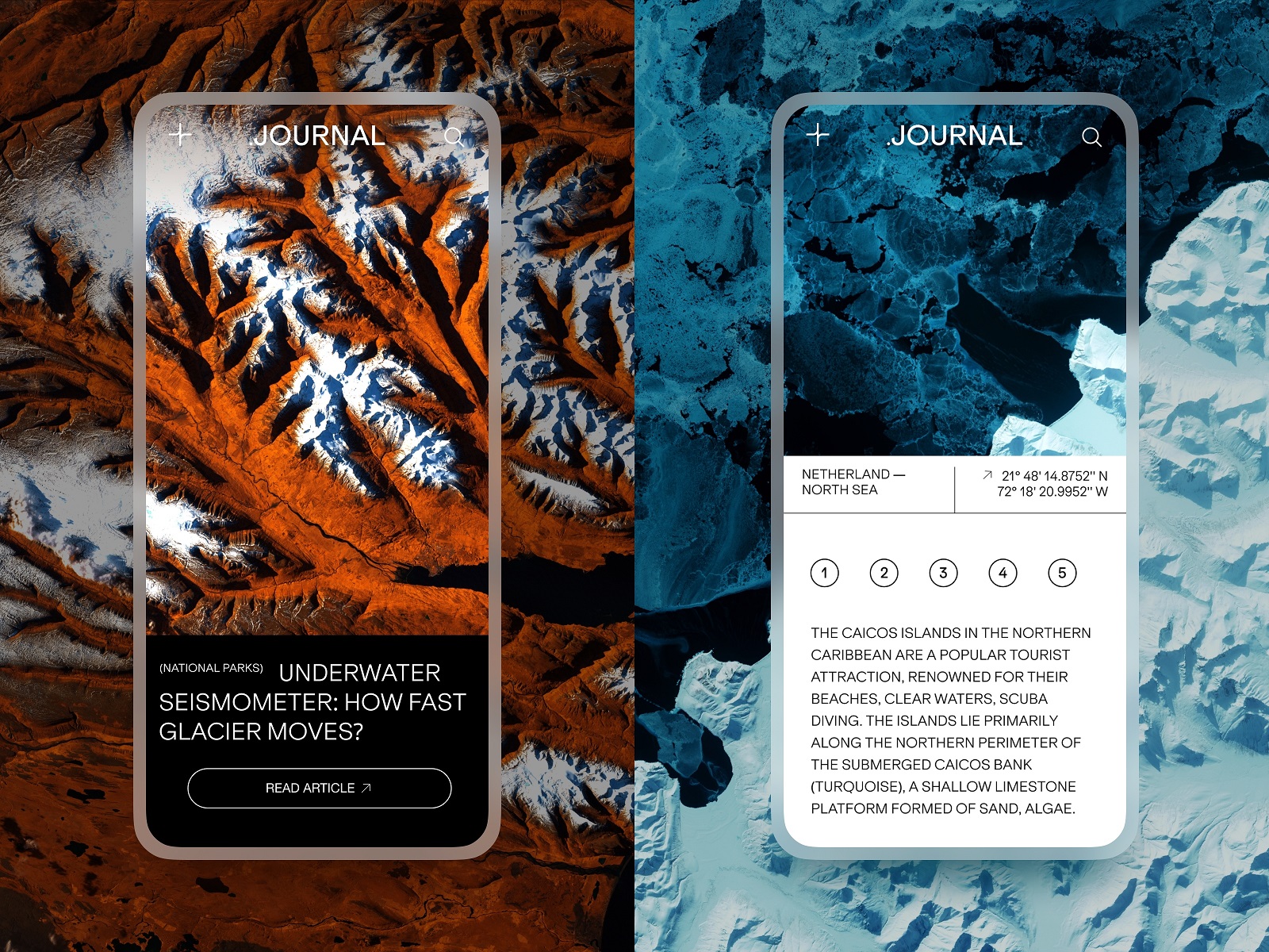
Nature storytelling works best when readers feel the landscape. This concept explores media website UX design for environmental topics—ecology, geography, climate, and natural systems. The interface leans heavily on immersive photography and video, letting the environment introduce itself before the text explains anything.
Large visuals anchor the editorial content layout design, while structured text blocks provide the narrative. This rhythm—image, insight, reflection—shapes the pacing of the reading experience. Design here supports UX for long-form content where visual storytelling and written analysis move together.
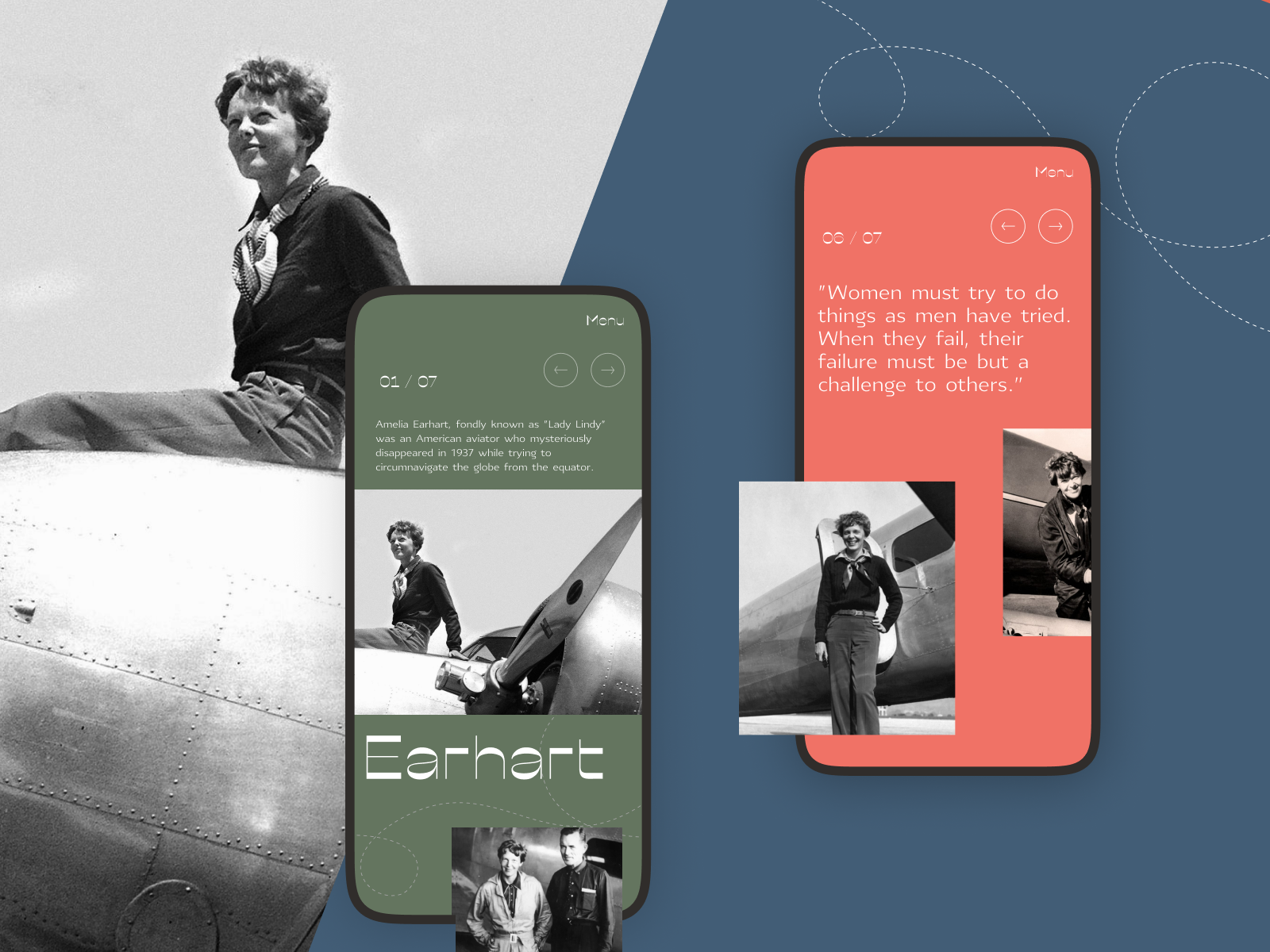
Powerful Women Editorial
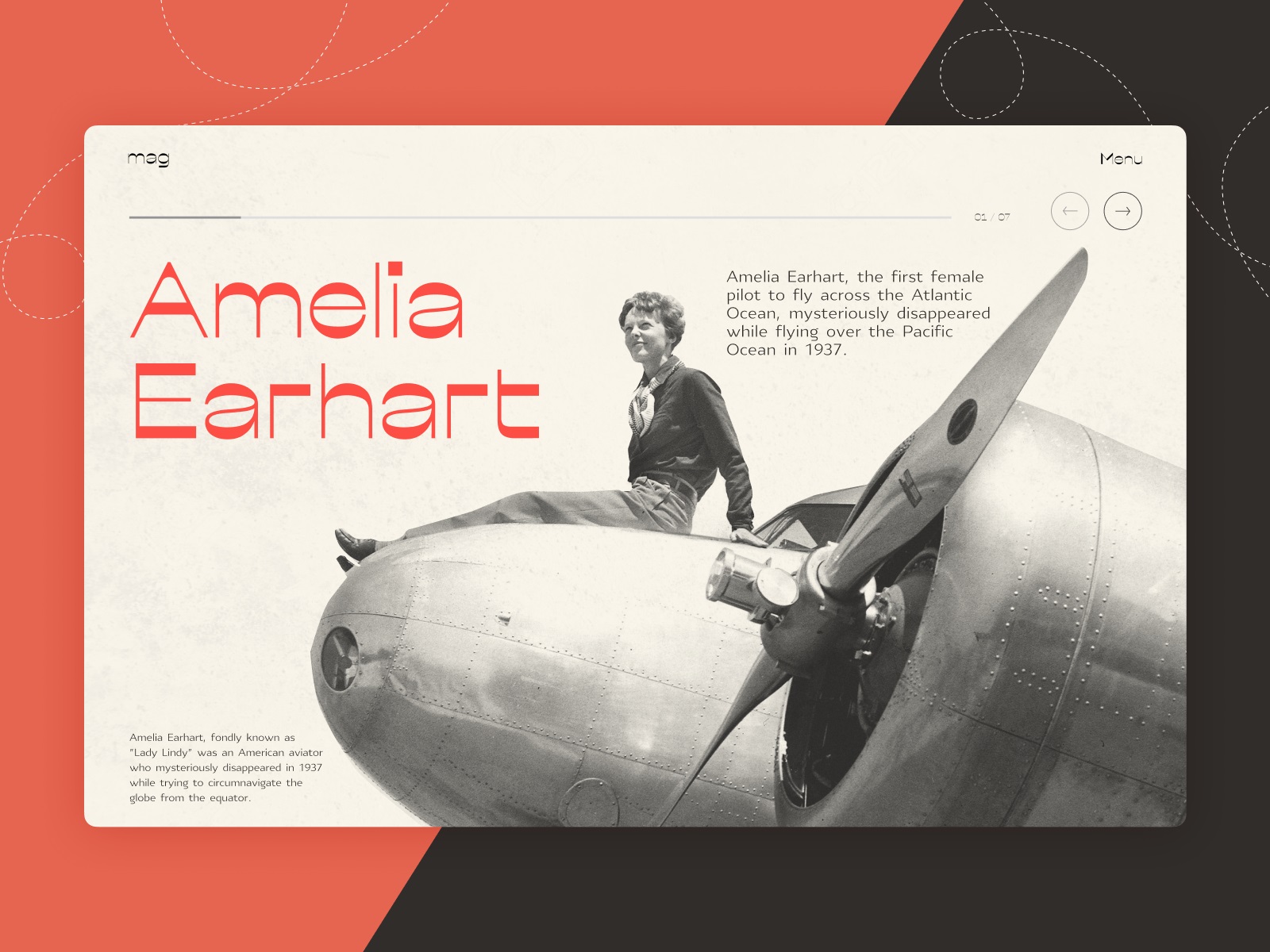
Stories about influential women carry weight. The design needed to respect that.
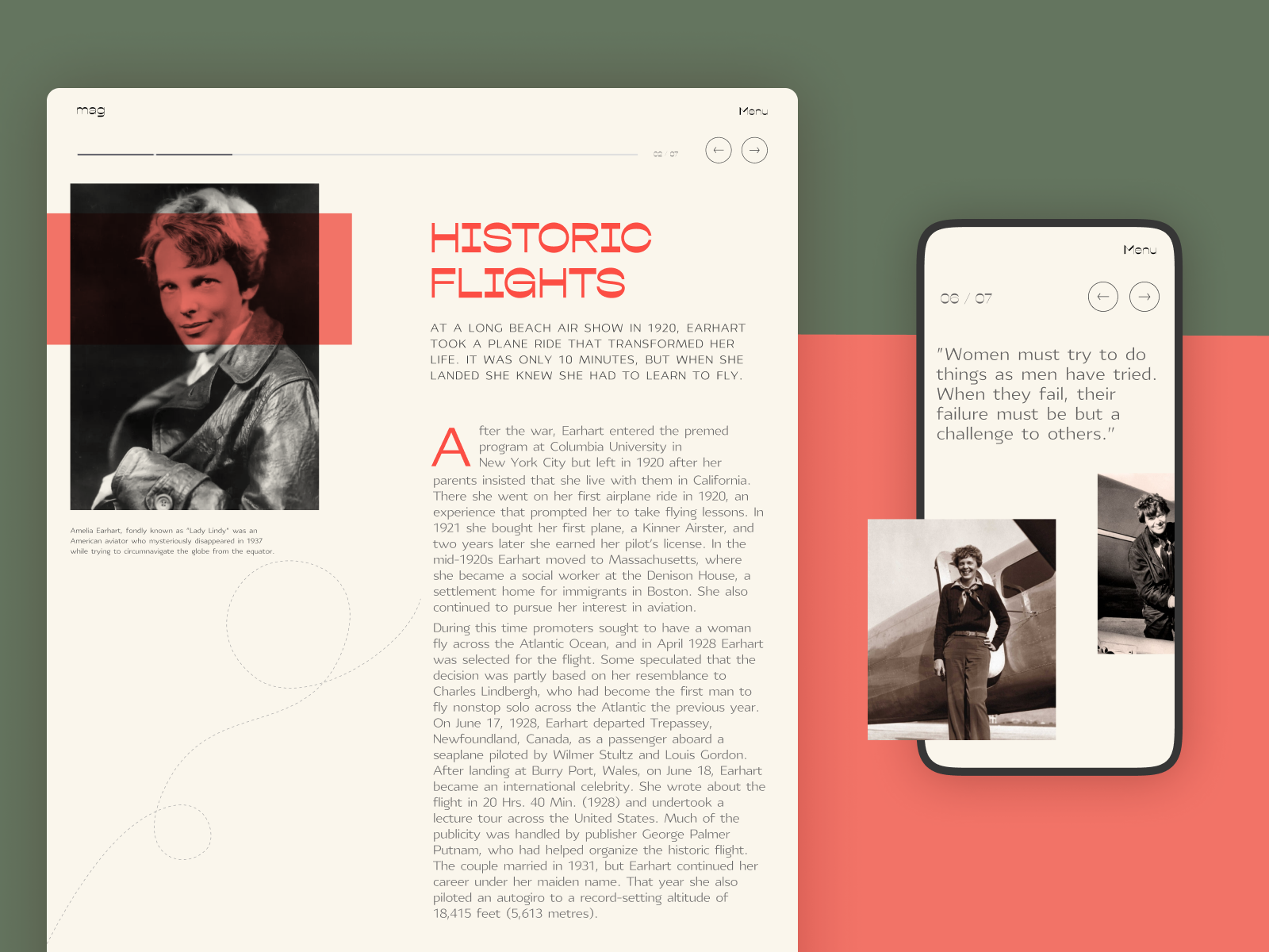
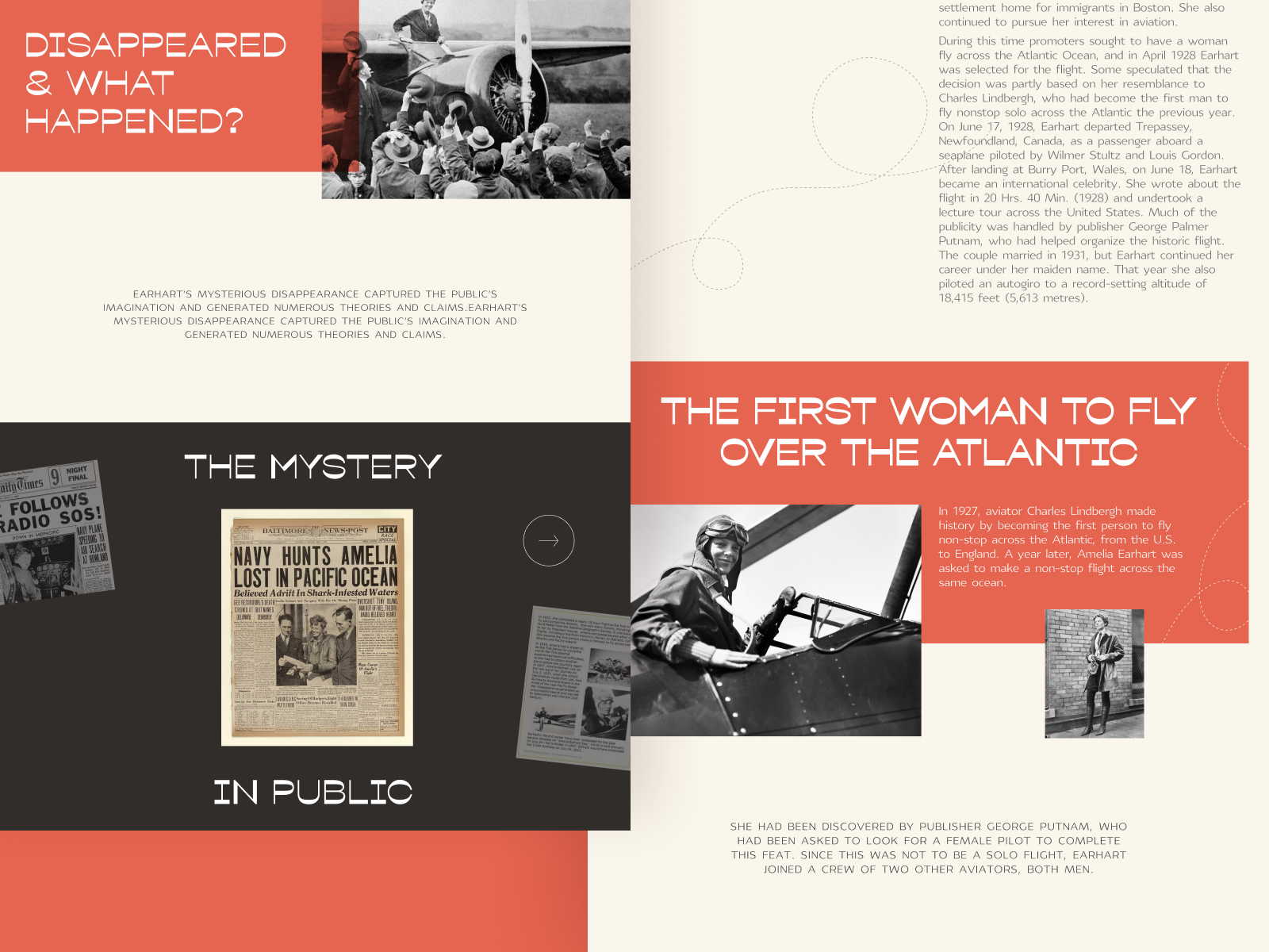
This editorial platform borrows cues from traditional publishing: structured columns, strong hierarchy, and restrained color palettes. The result feels close to print, translated into a modern editorial interface design.
Several elements support the overall editorial UX design:
- thoughtful editorial typography design that supports extended reading
- controlled color palettes guiding visual hierarchy in editorial websites
- prominent photography setting emotional context immediately
- minimal navigation reducing distraction
- subtle motion keeping interaction smooth
Together, these choices create a polished digital editorial design environment where the content leads and the interface supports.
Editorial About Generations
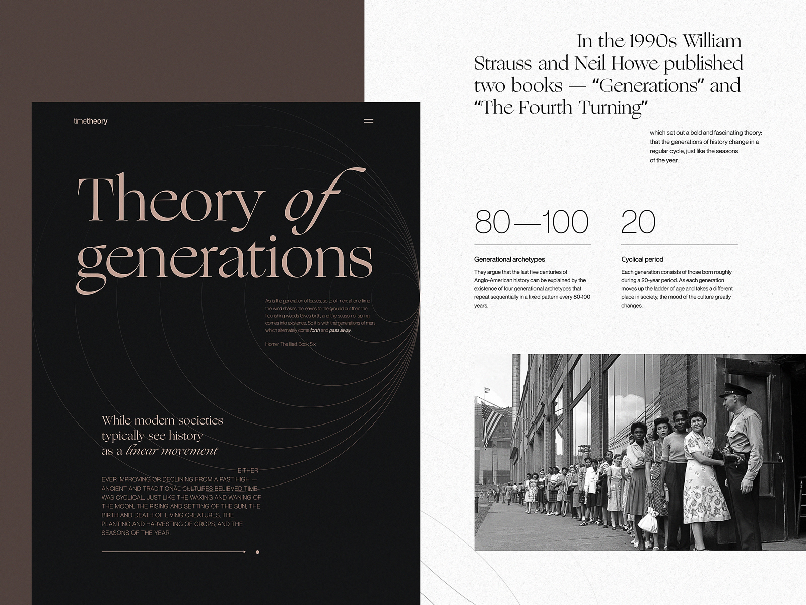
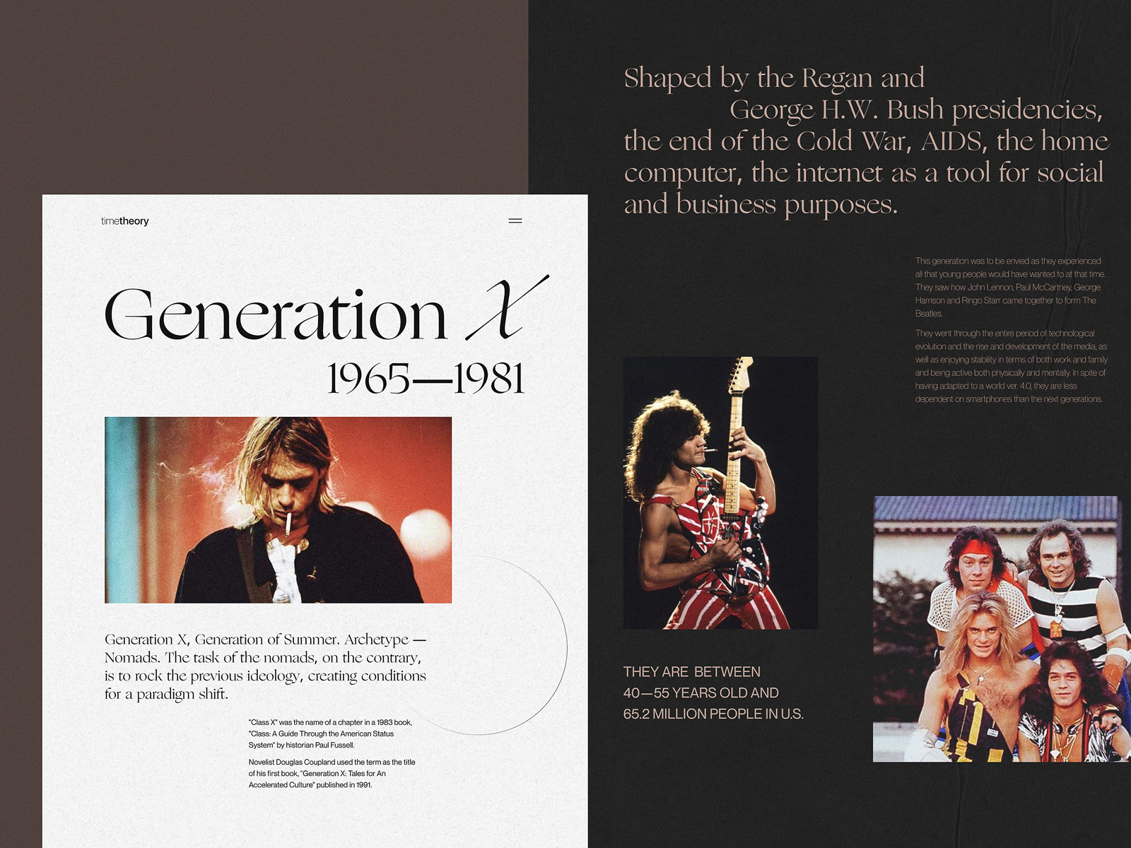
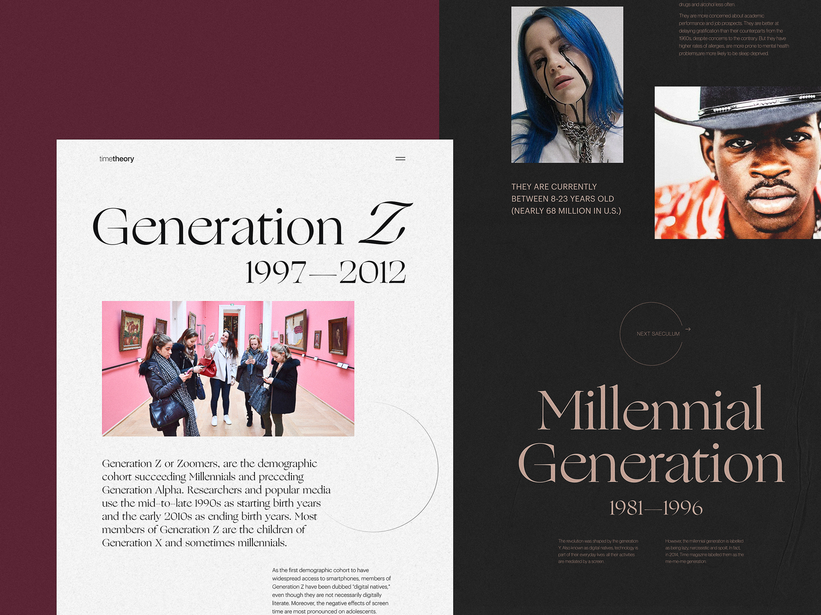
Generational storytelling demands structure. This editorial explores how different generations view culture, work, and identity. The design therefore emphasizes strong contrast and structured hierarchy—visual cues helping readers navigate shifting perspectives.
Typography carries much of the storytelling weight. Headlines punctuate sections while body text maintains calm rhythm across long passages. Airy layouts support quick scanning—a key principle in content scanning and readability UX. Readers can orient themselves quickly before committing to deeper reading.
This approach highlights the importance of modern editorial website design that respects both skimmers and deep readers. Both behaviors exist on the same page.
Bartending Encyclopedia Website
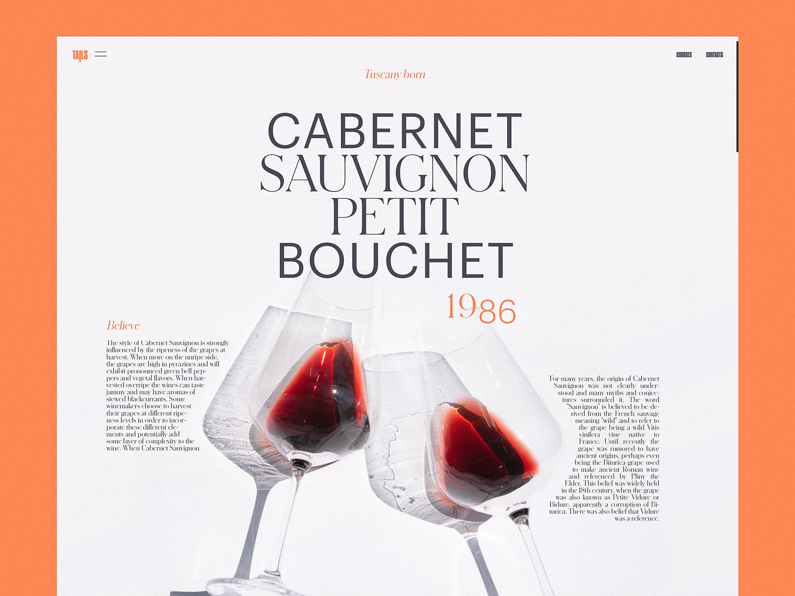
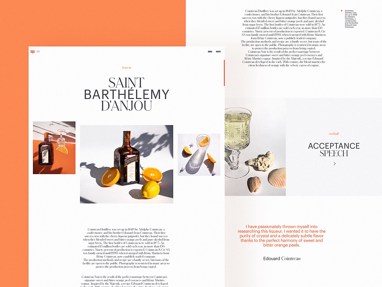
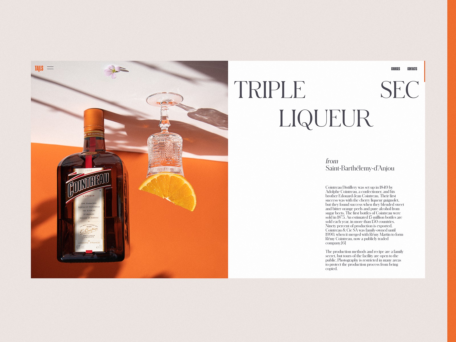
Some editorial platforms behave more like knowledge playgrounds. This bartending encyclopedia blends reference material with cultural storytelling. Each page breaks cocktails into ingredients, techniques, and historical context—a structure well suited for web design for publishing platforms.
Split-screen layouts introduce recipes alongside photography. Bold typography keeps the interface lively while ensuring information remains scannable.
The project sits somewhere between blog website UI examples and educational reference design.
Part magazine. Part encyclopedia. All about discovery.
Stop Plastic Editorial
Environmental topics carry urgency. The media website design for the Stop Plastic editorial leans into that urgency through contrast and visual clarity. Text blocks sit inside generous negative space, ensuring readability even when the subject matter grows heavy.
Photography and video content anchor the narrative emotionally. Motion interactions guide readers through statistics, case studies, and calls for action without overwhelming them. Here, the goal of design for content discovery becomes clear: help readers navigate complex information without losing the emotional core of the story. Design becomes the bridge between data and empathy.
Skateboarding Culture Editorial
Editorial tone should reflect the culture it documents. For skateboarding history and culture, the design intentionally breaks away from rigid editorial grids. Irregular layouts, bold typography, and monochrome palettes echo the raw visual language of skate zines and underground publications.
Archive photography and video clips anchor the editorial platform design, while smooth interaction patterns keep navigation intuitive. This is modern blog design inspiration rooted in authenticity rather than polish. Because sometimes the right grid is a slightly broken one.
Book Review Website
Books need quiet reading environments. This editorial website design focuses on clarity and rhythm. Book covers become visual anchors separating sections, while structured typography maintains comfortable reading flow across longer reviews.
Color contrast separates content zones without overwhelming the page. Subtle animations bring small moments of life to the interface. Strong article layout design combined with web typography for articles creates an experience where readers can move naturally between reviews, recommendations, and discussions.
The interface behaves like a well-lit library room. Nothing loud. Everything readable.
Culture Magazine Web Design
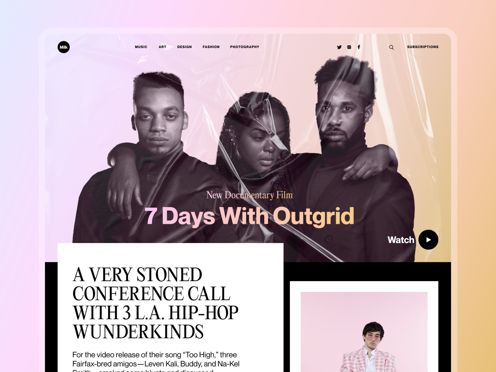
Digital magazines live between two worlds. One foot in traditional editorial publishing. The other in modern interface design.
This homepage concept explores web design for online magazines that combine those traditions. Asymmetric layouts, large photography, and controlled navigation help readers discover stories quickly without losing the editorial character of the publication. Strong hierarchy supports design for content discovery, while careful typography maintains the authority expected from a serious cultural publication.
It’s a good example of how media website UX design evolves without abandoning editorial roots.
Final Thoughts
Editorial design begins where decoration ends. Publishing platforms live or die by how easily people can read, scan, and discover ideas. Layout decisions that seem tiny—line length, spacing, typographic contrast, image scale—quietly determine whether content invites curiosity or repels it.
Across these projects we explored different approaches to web design for editorial websites, from educational platforms to cultural magazines and niche blogs. Each one uses slightly different tools: typography, grid structure, motion, photography, or color.
Yet the principle remains consistent.
Information becomes powerful when design makes it readable.
Recommended Reading
Still curious? Here are a few more case studies from the Tubik team that break down real design decisions, layouts, and UX thinking behind different digital products—from web platforms to mobile interfaces and brand systems.
UX Design for Traveling: Impressive Web Design Concepts
22 Impressive Web Design Concepts for Various Business Objectives
Mobile Design: 14 Stylish and User-Friendly App Design Concepts
Design for Sales: 10 Creative UI Designs for Ecommerce
Save the Planet: Web Designs on Environment and Ecological Issues
Steal the Show: Creative Web Design for Diverse Events
Web Design: 26 Examples of Creative Landing Pages


