There’s a particular kind of design brief that arrives once a year, smells faintly of pine needles, and demands that you somehow make logistics feel magical. This is one of those briefs. Let’s walk through a new chapter in our ongoing collaboration with Nova Post—building an interactive advent calendar for their winter holiday marketing campaign, complete with 3D art, a scrollable map, and enough gamification to make even the most calendar-fatigued user lean in and tap.
Project and Client
Nova Post is a major Ukrainian postal and courier company, and a case study in how logistics app UX design doesn’t have to be dry. Our collaboration with them has covered a lot of ground over the years: courier service app UI, landing pages, product design, and now, for the second year running, a holiday marketing campaign design built around the advent calendar format.
The scope: UI/UX design, graphic design, 3D art, animation. The Tubik team on this one included Sergii Valiukh, Ernest Asanov, Denys Koloskov, Oleksandra Mykhalyk, Yaroslava Yatsuba, and Anastasiia Iliashevych.
The Concept: What Is This Thing, Actually?
The mechanic is simple. Throughout December, Nova Post app and website users unlock a new partner offer each day—discounts, deals, surprises. Classic advent calendar logic. One day, one door, one treat. The design question is never what it does. It’s always how it feels to use it.
Last year, working under a tight deadline, we presented the Nova Post team with a menu of structural options for the calendar interface:
- blocks
- timeline
- flip calendar
- cardholder
- long-scroll parallax calendar
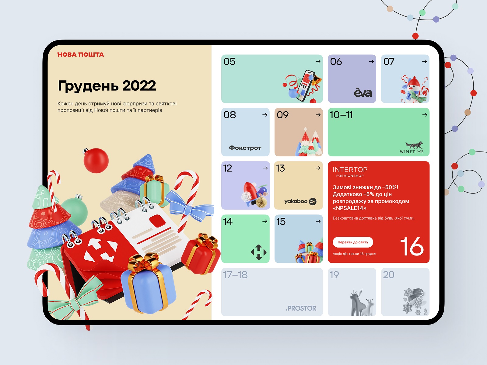
Time pressure won that round, and the dynamic blocks approach took the prize for its speed-to-build ratio. It worked. But the parallax map idea? It stayed in the room, waiting for its time to shine.
This Year: The Map Gets Its Moment
Starting in autumn rather than November sounds like a small thing. It wasn’t. That extra time meant the parallax map idea—the one that got shelved last year purely on deadline grounds—could finally come off the shelf.
Gamification in UI design gets thrown around a lot, often to describe things that are barely interactive. But a map is gamification in the most literal, effective sense: it gives users a place to be in the experience, not just a screen to look at. Game designers cracked this decades ago. Spatial progress—a path, a visible destination, a sense of how far you’ve come—keeps people engaged in a way that a grid of tiles simply doesn’t. And an interactive advent calendar is already a game by structure: 24 days, 24 unlocks, one finish line. The map just stops pretending otherwise.
So users scroll. Trucks move through the landscape. The Christmas narrative isn’t stated—it’s traveled through.
The Design Process: Where the Work Actually Happens
The primary tools: Blender for the 3D world-building, Figma for assembling it all into a working interface. For anyone researching how to design an interactive advent calendar or looking for gamified UI design examples, this combination deserves a closer look.
Step 1: Establishing a Visual Language
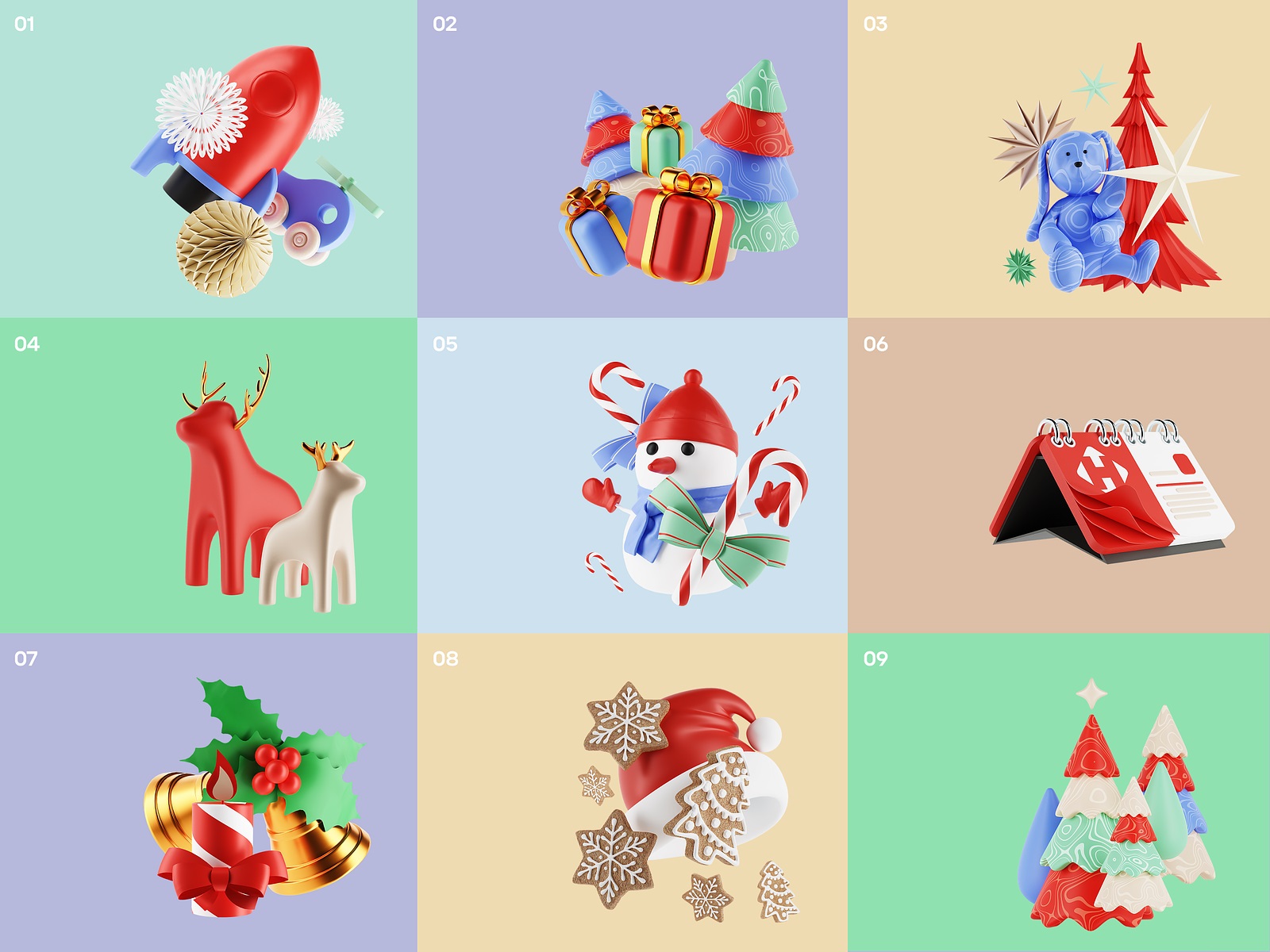
Because Tubik has been working with Nova Post long enough to develop a genuine shared design vocabulary, we had an existing 3D illustration guide covering how art should look and behave across their digital products—websites, landing pages, the mobile app. The advent calendar map slots neatly into that ecosystem. Brand colors, object rounding, shape style, branded graphics: all present, all consistent. This is what UI design for seasonal campaigns done right looks like—festive enough to feel special, disciplined enough to feel like it belongs.


Step 2: The Maths Nobody Talks About (But Should)
Before a single building was modeled or a single tree placed, there was arithmetic. A scrollable map UI design that needs to accommodate different screen sizes, a variable number of campaign days, and maintain visual coherence across every scroll position doesn’t start with inspiration—it starts with a spreadsheet.
The resulting artboard clocked in at 1,800 × 22,000 pixels. Yes, really.
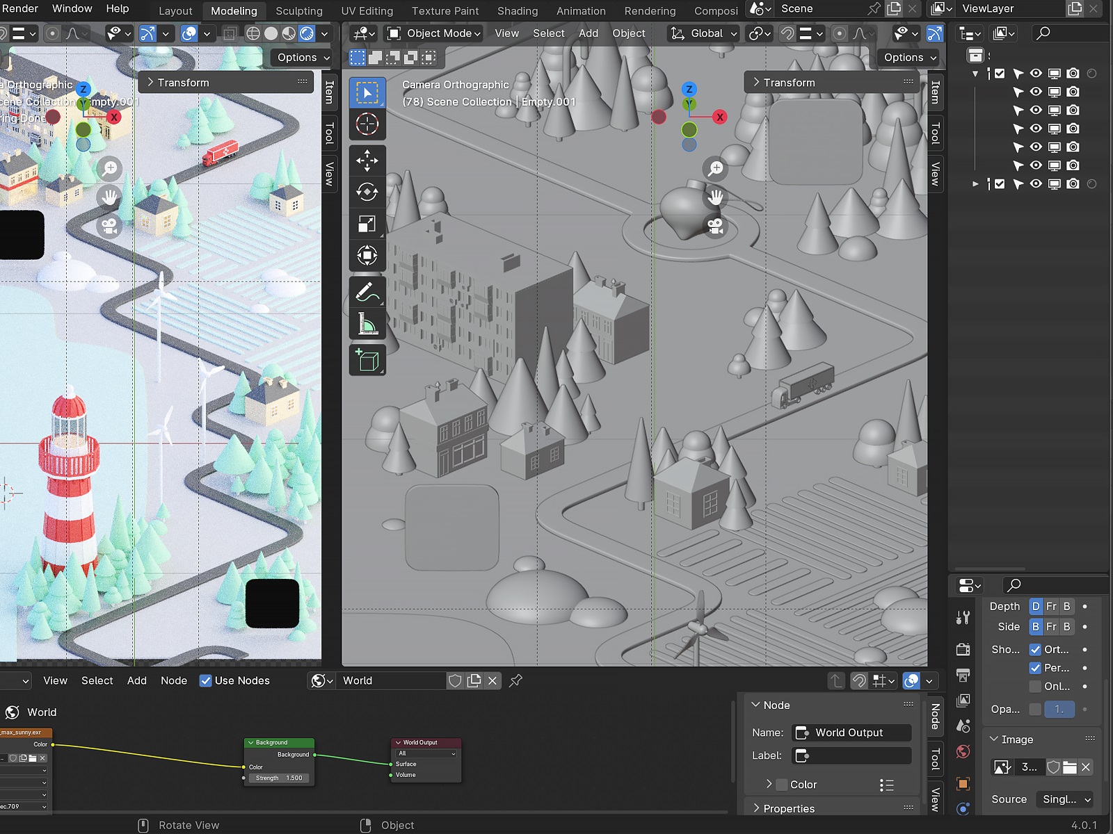
Step 3: Building The World
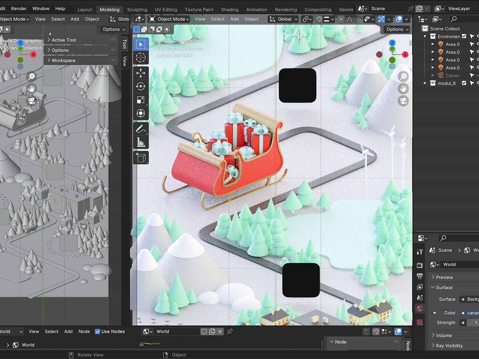
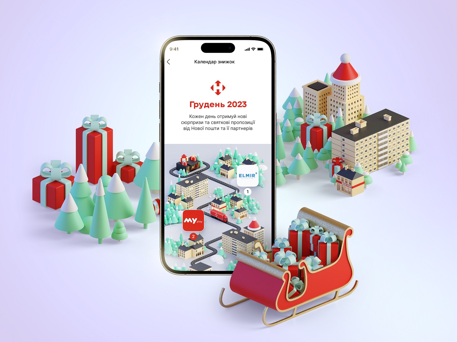
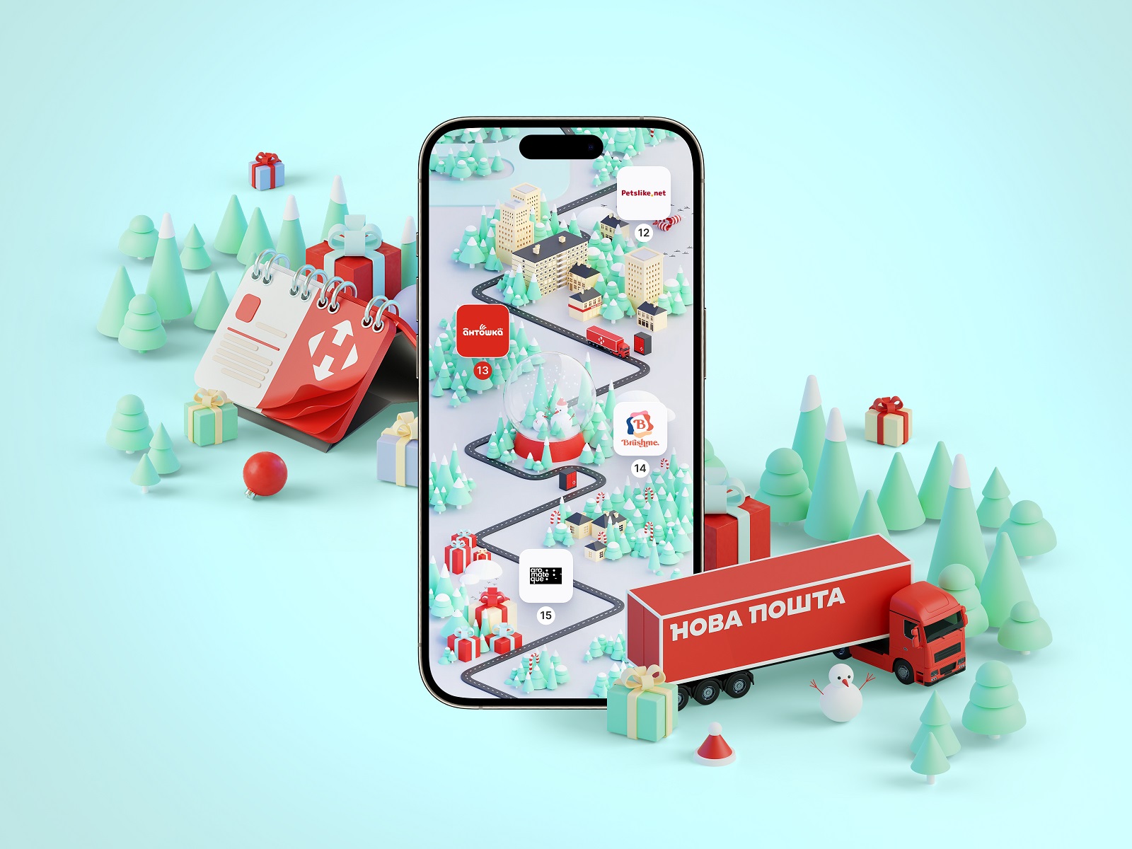
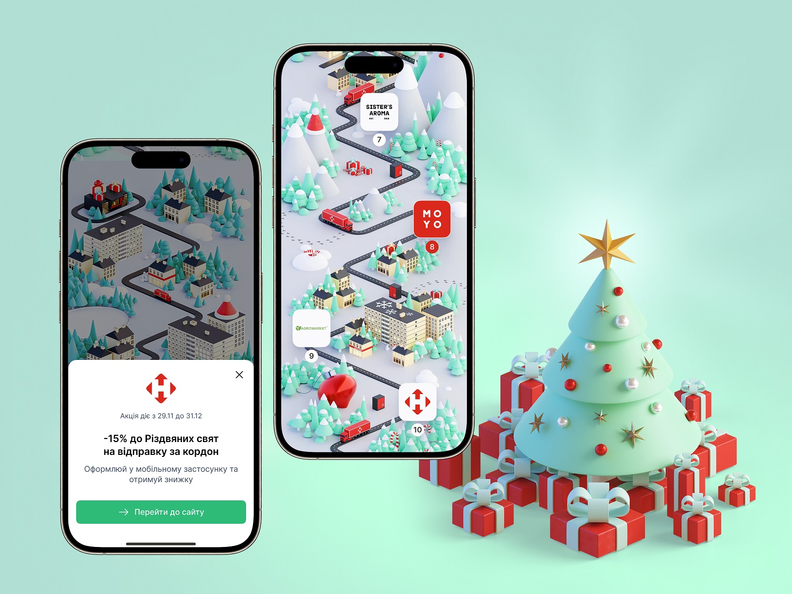
The map is a road that goes somewhere: cities bleed into towns, towns into villages, villages into stretches of countryside with mountains in the background and forests on the sides. Cozy, slightly stylized, recognizably Ukrainian. Scattered throughout are 3D objects—Christmas trees, sweets, presents, a postal machine, Santa’s sleigh, buildings that range from charming to post-industrial depending on where you are on the route. The pins marking each offer sit along the road like waypoints, their visual state shifting based on the date—past, present, locked future—which is the oldest trick in game UI and still one of the best.
Step 4: The Lego Approach
Rendering a 22,000-pixel-tall map from scratch, element by element, would be a recipe for creative burnout and broken deadlines. Instead, we built a library of reusable components first: building shapes, tree variants, window types, small environmental details. Then modifiers in Blender did the mixing and matching. The result looks varied and considered; the process was modular and fast. Think Lego, not sculpture.
Even with that system in place, Blender still needed to be handled carefully with an artboard this size. The solution was to split the map into nine separate units—each one designed and rendered independently—then stitch them back together in Photoshop. Every unit is roughly one screen: a road segment, a truck, some scenery, three or four pins. Nine pieces that, assembled, read as one uninterrupted journey.


The Interface: Making it Actually Work
A beautiful map is one thing. A beautiful map that functions as a digital campaign UI design is a whole other story.
Each pin carries a small icon connecting users visually to the partner brand behind that day’s offer. The current day’s pin is red—Nova Post’s primary brand color, impossible to miss. Tap it, and a pop-up appears with the offer details and a clear CTA. The interaction is minimal by design: discover, tap, decide. No friction, no confusion.
And because this is a UX design for promotional campaigns built to reach people wherever they are, the interface was fully adapted for mobile (multiple screen sizes), tablet, and desktop. The map scrolls beautifully on all of them.

What Makes It Special
As a UI/UX design process case study, this project holds several lessons worth pulling apart:
The Christmas marketing campaign UX ideas that work best are the ones that give users a reason to come back daily—not just a discount, but a sense of journey and anticipation. The map provides that scaffolding.
The 3D map UI design case study aspect is a reminder that visual richness and interface clarity aren’t mutually exclusive. The map is dense with detail, but the user’s path through it is obvious.
And as an example of designing interactive holiday experiences, this project demonstrates that brand consistency and seasonal creativity can coexist—that you don’t have to blow up your design system to make something feel special.
More Design Case Studies
Still scrolling? Check out other design projects done by the Tubik team:
HP23. Website and 3D Animation for Prostheses Producer
FluxWear. Web Design and Development for Health Tech Product
Magma Math. Web Design for Educational Platform
Synthesized 2.0. Web Design for High-Quality Synthetic Data Platform
HotelCard. Brand Identity for Hotel Offers Service
Nibble Health. Identity and UX Design for Healthcare Fintech Service
Physica Magazine. Web Design and Graphics for Scientific Blog
CSConnect. Website Design for Immersive Experience Marketing Platform
ProAgenda. Identity and Website Design for Golf Management Service
Kaiten. Identity and Product Design for Food Marketplace
THT. Website Design for Electrical Engineering Service