

There’s a client request I’ve heard so many times I could recite it in my sleep: “Let’s just nail the UI first, we’ll sort out the logic and features later.” It usually arrives with the confidence of someone who has clearly already decided. Who has, in their mind, already pictured the thing looking incredible. The features are a detail. The architecture is someone else’s problem. Right now, let’s make it gorgeous.
A less experienced designer—or one willing to trade long-term integrity for short-term approval—will take the path of least resistance. Start with the form, skip the foundation, worry about the cracks when they appear. That’s the “UI fast food” order: delivered hot, looks great in the box, deeply regretted roughly three sprints in.
What I’ve learned the hard way: Giving clients what they’re asking for right now isn’t a designer’s real responsibility. You need to protect them from what’s going to break later as well. Jumping straight to visual execution before properly mapping the business problems—problems the client often doesn’t even know they have yet—is a liability.
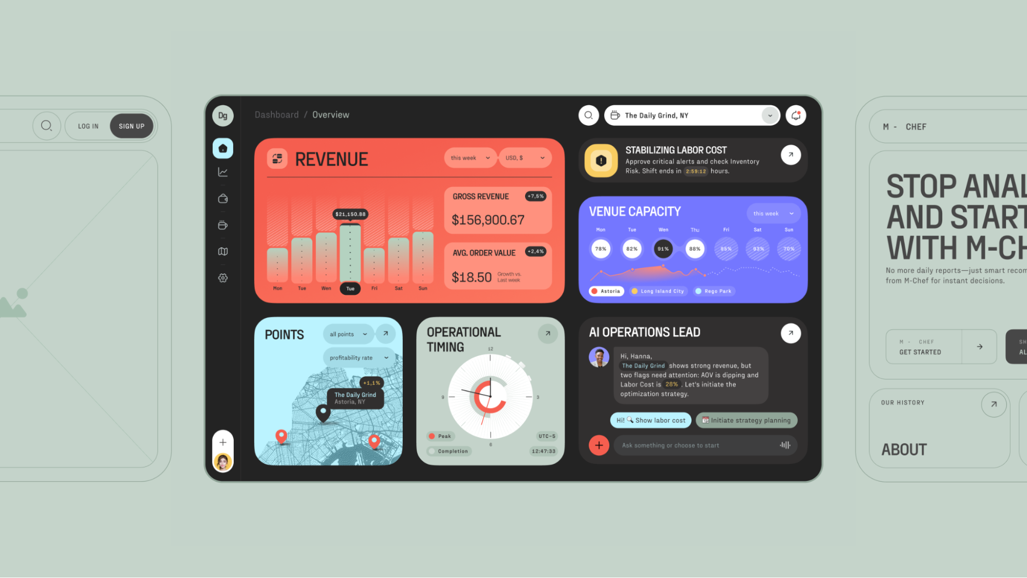
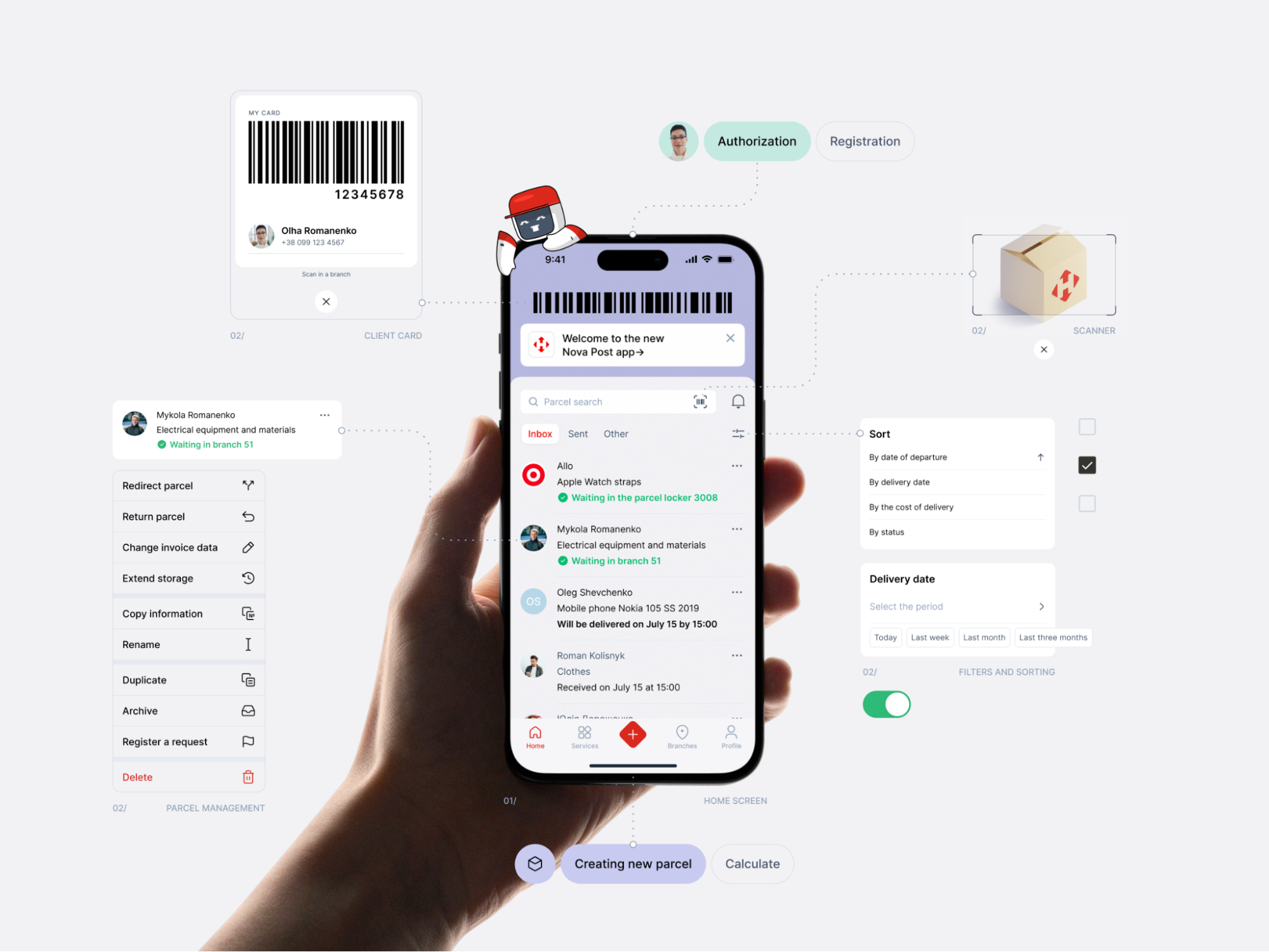
AI-Powered Operational Dashboard for Restaurant Owners
“Design is really an act of communication, which means having a deep understanding of the person with whom the designer is communicating.”―Donald A. Norman, The Design of Everyday Things
To make this more than abstract moralising, let’s look at what actually happens when businesses skip the function and rush the form. A couple of cautionary tales still paying out in lost revenue, brand damage, and the particular shame of a very public failure.
Microsoft Windows 8: When “Modern” Became a Monster
Windows 8 (2012) is probably the most-cited redesign disaster in digital history, and it earned that reputation with real commitment. Microsoft replaced the familiar Start Menu with Live Tiles—dynamic, animated blocks that flickered and distracted and generally made desktop users feel like they’d accidentally opened someone else’s tablet.
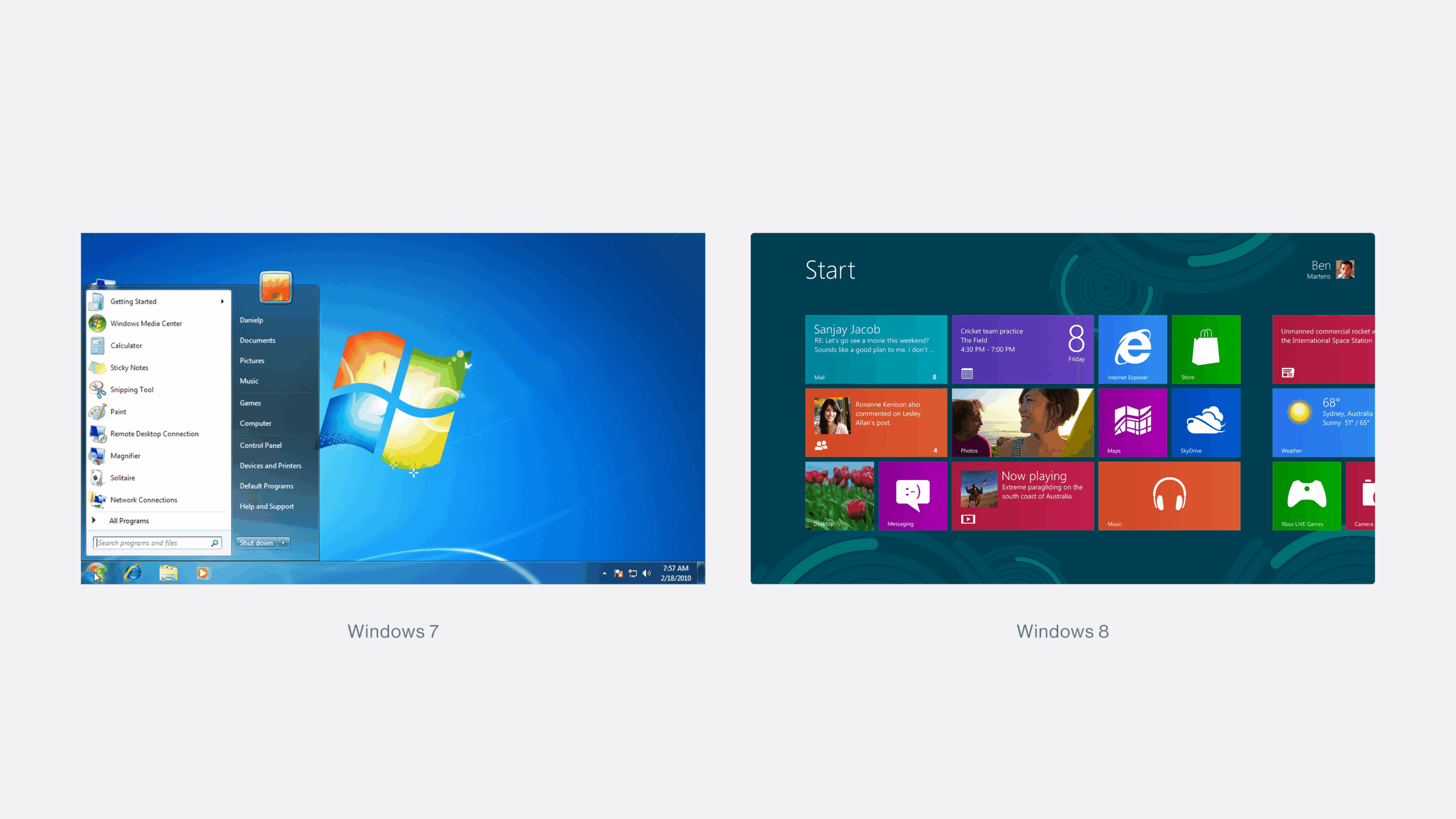
The design worked fine for Surface tablets. For the other 90% of users sitting in front of a desktop, it was—in the words of usability legend Jakob Nielsen—“Mr Hyde: a monster that terrorises poor office workers and strangles their productivity.”
Users flooded forums with workarounds. Petitions circulated. Sales cratered. PC sales dropped 24%, net profit fell 22%, and Windows 8 became the worst OS launch in Microsoft’s history. Billions lost. A reputation dented. All for a redesign that had, at its core, a deeply simple failure: nobody seriously asked the users what they needed, or tested whether the new form actually served the existing function. The team fell in love with the visual idea and shipped it.
That’s a mistake that scales. And it scales expensively.
Apple AI Summaries: Moving Fast, Breaking Trust
If Windows 8 is about ignoring existing users, Apple’s AI Summary scandal from early 2025 is about something subtler and, in some ways, more alarming: ignoring what your feature actually does while you’re busy being excited about what it is.
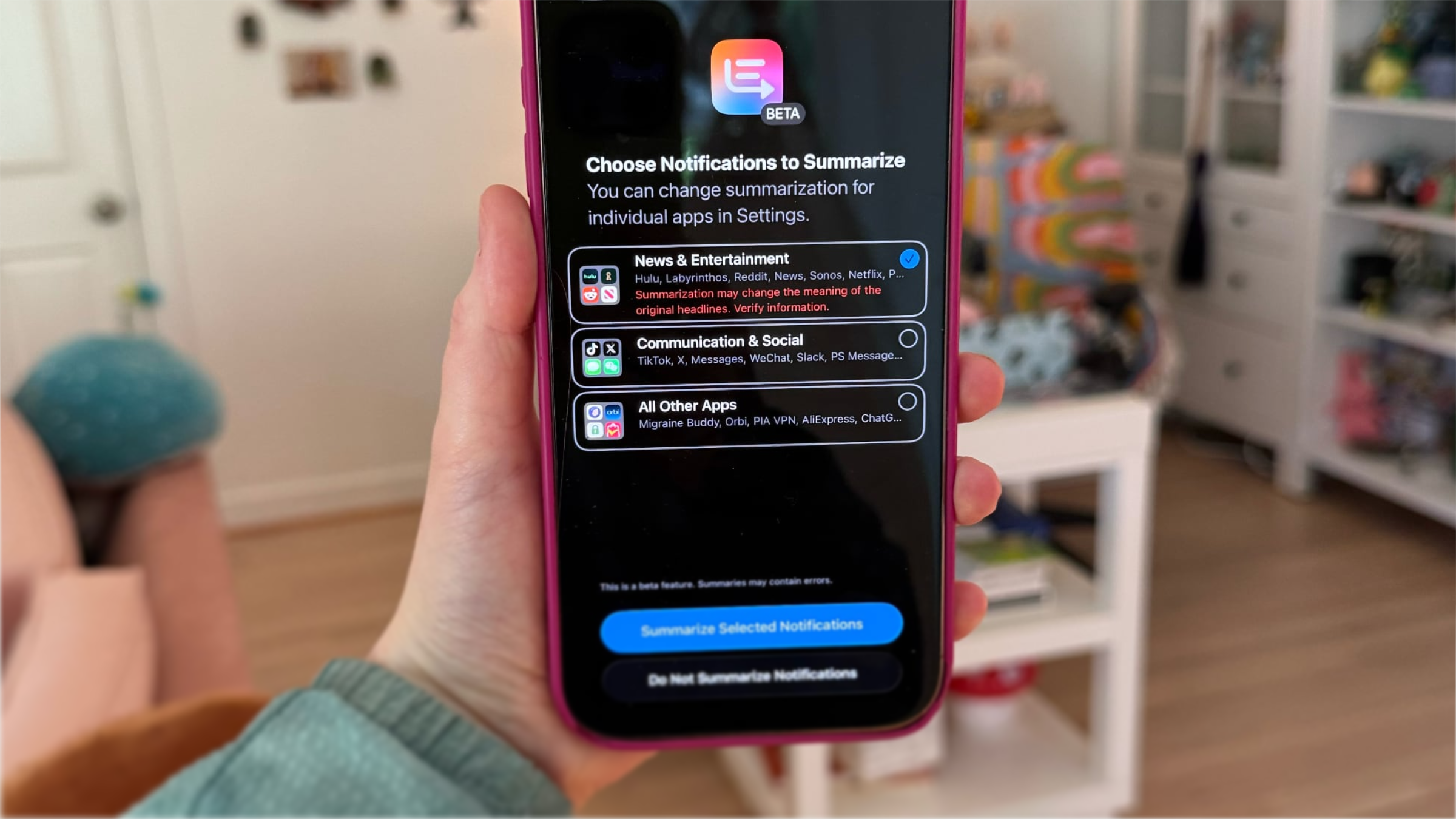
Apple Intelligence’s news notification summaries—rolled out in iOS 18.3 beta—were confidently condensing news articles. They were also, with equal confidence, inventing facts. Fabricated headlines. Made-up quotes. Delivered in the clean, trustworthy visual language of iOS, to hundreds of millions of people who had no reason to doubt them.
BBC, Sky News, The Telegraph, and The Washington Post raised the alarm. The National Union of Journalists and Reporters Without Borders demanded the feature be removed entirely. On January 16th, Apple quietly paused summaries for news and entertainment, adding a note that content “may contain errors,” a remarkably composed way of admitting that your product had been undermining the credibility of some of the world’s most respected media brands.
The promise was elegant: key information in a few sentences. The delivery eroded the very trust it was supposed to build. The function hadn’t been properly validated before it was wrapped in a pixel-perfect interface and handed to the world. That’s the fast-food design trap operating at enterprise scale. And the cleanup, reputationally and technically, will take far longer than the feature took to ship.
Twitter Becomes X: When Vision Eats the Product
In October 2022, Elon Musk completed his acquisition of Twitter. By July 2023, it had become X—quickly, surgically, and with what appeared to be genuine indifference to the $5.7 billion in brand equity being dismantled in the process.
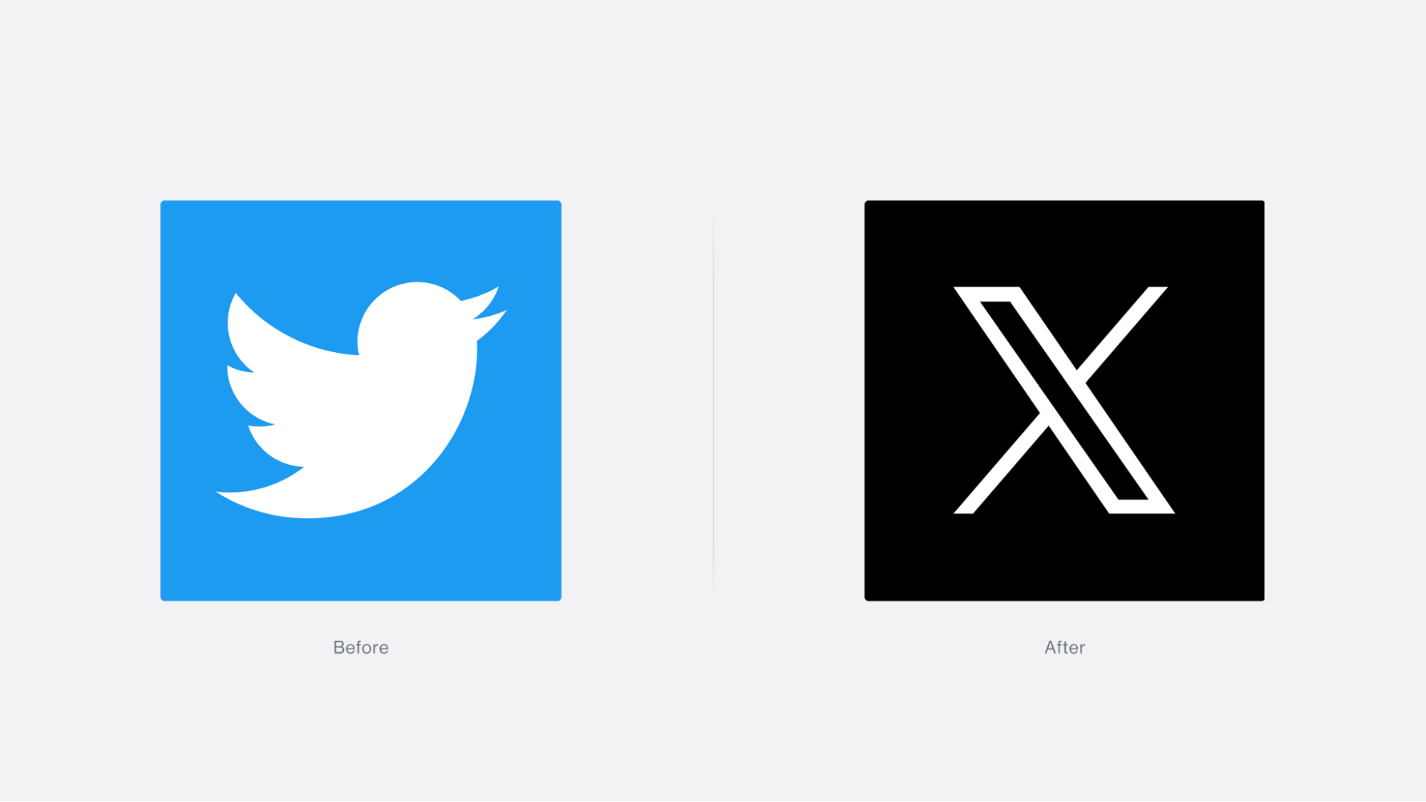
The blue bird was gone. “Tweets” became “posts.” The platform declared its ambition to become an “everything app”—a Western WeChat, transaction-focused rather than advertising-driven. The visual language shifted to minimalist futurism. There was a business logic to it, partially: Twitter had always felt boxed in by its own identity. But what happened in practice was that vision got confused with design.
A rebrand is a signal. And the signal here was received as chaos. Brand value collapsed from $5.7 billion to an estimated $0.7 billion by 2024 (per Brand Finance). Revenue dropped 50–66%. And—perhaps the most devastating detail of all—users still call it Twitter. Seventeen years of brand recognition don’t obey a logo change. The product’s form was overhauled. The user’s relationship with it was not consulted.
That’s the thing about “visionary” redesigns: the vision needs to be grounded in something more than the founder’s ambition. Otherwise, you’re not designing. You’re decorating a different idea and hoping nobody notices the gap.
Is Your Pretty Design Already Quietly Hurting You?
Before moving on, sit with these two questions for a moment: Is our good-looking design already suppressing metrics we haven’t looked at closely enough? And: Did we actually understand what this thing needed to do before we decided how it should look?
Uncomfortable questions, maybe. But consider the alternative. Here are five signs that form has already won the wrong fight:
Conversion is falling. If users can’t quickly complete the action they came to take—regardless of how elegant the interface is—they leave. Unclear CTAs and unnecessary steps don’t read as design restraint, but as friction. Friction kills sales.
Bounce rate is climbing. A screen that’s impressive but communicates nothing useful gets abandoned immediately. For landing pages and e-commerce especially, the first five seconds are the whole ballgame.
Users never reach the core feature. Many redesigns don’t fail because they look bad. They fail because the search, purchase, publish, or configure action—the whole reason the product exists—got buried under the new aesthetic. The product looks fresh, but performs worse.
Brand trust is eroding. When the visual promise of an interface doesn’t match the reality of using it, the gap reads as either incompetence or indifference. Both are difficult to recover from. Redesigns that break the product’s recognisable logic are especially costly here.
Hidden costs are compounding. Bad UX inflates support load, forces post-launch rework, drags out development cycles, and turns problems that were preventable into emergencies. The business pays twice—once for the flawed design, once to fix it. Sometimes a third time, in churn.
Even one of these is a reason to stop and reassess.
The Three Must-Have Stages Before Touching UI
1. Start with the problem, not the pixels
Before a single component is placed, be explicit—in writing, ideally, and agreed upon—about who the product is for and what specific problem it solves. Without this clarity, you end up optimising an abstract beautiful screen rather than building a useful scenario. This sounds so obvious that I’m almost embarrassed to write it. And yet it is skipped, routinely, in studios and product teams everywhere.
2. Define the core functions
Once you know who you’re designing for and what they need, align on the functions without which the product simply doesn’t work. This is where user research earns its keep—real behaviour patterns, real context, real motivations from real humans who are not on your team. The Nielsen Norman Group’s discovery-phase cheat sheet (requirements and constraints gathering stage) exists precisely because internal opinions, however confidently held, are a spectacularly unreliable substitute for watching actual users try to do actual things.
3. Build an Information Architecture or Mind Map
IA organises content, navigation, and transition logic—it’s the structural skeleton that determines how users find their way through your product. For complex digital products, skipping this step is like framing a house without a blueprint and being surprised when the doors don’t align. For simpler products, a clear mind map that visualises the whole as a system is enough. Either way: do it before you open the color styles panel.
Two Should-Have Stages Worth Actually Taking Seriously
Build user journeys. For complex flows, this reveals precisely where users stumble—before stumbling costs you anything. For simpler products, a short workshop-format scenario achieves the same result with considerably less overhead.
Create and test low- or mid-fi wireframes. Structural logic, navigation, and core scenarios should be stress-tested at wireframe stage—not at high fidelity. Testing a rough prototype with real users costs almost nothing and reveals almost everything. Discovering that the beautiful hi-fi version you spent three weeks crafting doesn’t actually work costs a great deal more, in time, morale, and the particular dread of having to explain it to a client.
Conclusion: Design That Earns Its Beauty
We live in the era of UI fast food. Speed is rewarded, aesthetics are applauded, and a gorgeous mockup can sail through a stakeholder meeting that a rigorous IA deck never would. The pressure to ship something beautiful before something functional is real, and it comes from everywhere—clients, timelines, competitive anxiety, the very human desire to have something impressive to show.
But the products that last—from global platforms to scrappy local tools—share a quiet foundation: someone, at some point, asked the uncomfortable questions before the design system was built. Someone insisted on the research. Someone said “we need to understand the user before we choose the typeface” and meant it enough to push back when the timeline got tight.
The discovery phase, the IA, the prototype testing—none of this slows design down. It insures it. It converts the expensive guesswork of post-launch fixes into time well spent at the start, when changes are cheap and the product is still genuinely open to being shaped. Skipping these stages isn’t efficiency. It’s debt.
So: ask the awkward questions. Insist on understanding before expressing. Build the architecture before you build the aesthetic. Resist the very understandable pull toward starting with the thing that’s most satisfying to make.
Design where form genuinely serves function doesn’t just look good—it works. In the end, a product that works is the only one worth making beautiful.
Recommended Reading
Good design rabbit holes are worth falling into. Here are a few more think pieces from Tubik studio—pick one and we’ll see you on the other side:
The Glass Is Half Empty: How Apple’s Boldest Redesign Missed the Point
User Experience: Insights Into Consistency in Design
Drawing Attention: The Real Power of Illustrations in UI Design
Talk First, Design Later: The Secret to Better Projects
The Anatomy of a Good Design Review
Small Elements, Big Impact: Types and Functions of UI Icons
Motion with Intent: How Animation Earns Its Place in Mobile UI