The highest priority, which the designers set for creating a website or mobile application, is functionality and usability of the interface – and for sure, that’s the right direction. However, it shouldn’t be forgotten that one of the crucial conditions of positive user experience is desirability. People aren’t only made of logic and action; they are also full of feelings, intuition, emotions, and memories. That’s what designers have to keep in mind aiming at user-friendly products.
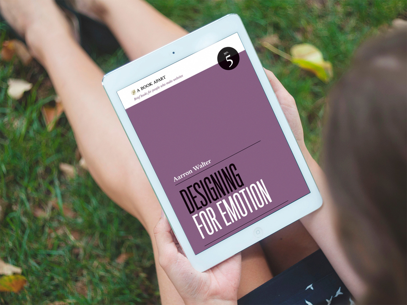
Earlier we have already shared numerous expert quotes, tips, video talks, and books worth reading to support our readers with useful resources. In particular, you could check the insights into Design Is a Job by Mike Monteiro – the book belongs to the series A Book Apart, supporting designers with a diversity of expert tips, case studies, and resources. Today continuing this way, we would like to share a new set of quotes from the book highly recommended for UI/UX designers: Designing for Emotion by Aarron Walter, former Director of User Experience at MailChimp and now the VP of Design Education at InVision. The book offers the reasons why users’ emotional responses mean much for setting a positive user experience, strengthening this idea with references to scientific research works and practical case studies of design for recognized websites. So, here we will save a bunch of 35 useful expert tips from the book for Tubik Quotes Collection – join in, and let’s look into the design for emotion together.
For a user’s needs to be met, an interface must be functional. If the user can’t complete a task, they certainly won’t spend much time with an application.
Many websites and applications are creating an even better experience. They’re redrawing the hierarchy of needs to include a new top tier with pleasure, fun, joy, and delight. What if an interface could help you complete a critical task and put a smile on your face? Well, that would be powerful indeed! That would be an experience you’d recommend to a friend; that would be an idea worth spreading.
We’ve been designing usable interfaces, which is like a chef cooking edible food. Certainly, we all want to eat edible foods with nutritional value, but we also crave flavor. Why do we settle for usable when we can make interfaces both usable and pleasurable?
Emotional experiences make a profound imprint on our long-term memory. We generate emotion and record memories in the limbic system, a collection of glands and structures in the brain’s foldy gray matter.
When you start your next design project, keep this principle in mind: people will forgive shortcomings, follow your lead, and sing your praises if you reward them with positive emotion.
Certainly, emotional design has risks. If emotional engagement compromises the functionality, reliability, or usability of an interface, the positive experience you wanted will mutate into a rant-inducing disaster for your users. A friendly wager with an upset customer isn’t always going to turn the tide.
Our definition of beauty originates in our own image. The human mind is exceptionally skilled at scanning objects and information to discover meaning in abstract forms. We can find traces of ourselves in most anything we see, and we like that. Our ability to find signal and discern patterns in so much noise is a very important trait we use to navigate life, and as you might expect, this ability to recognize patterns greatly affects the way we design.
As you increase the number of high contrast elements on a page, you proportionally increase the time needed to perform a task, learn a system, and remember pathways. Adding stuff pushes the human brain to its limits. Have you ever been to a party where everyone is yelling to speak to the person next to them? As the volume increases, everyone must speak louder to be heard, but that makes it even harder to have a conversation. Design works in the same way. If everything yells for your viewer’s attention, nothing is heard.
Design is too often wrongly taken for the indulgent frosting on a functional interface. Have you ever overheard a colleague declare, “It would be nice if we could have a sexy interface, but people care more about what the site does than how it looks”? Would this person show up to a job interview in their pajamas because people only care about what they can do and not how they look? If they did, I’d bet they’d discover that thinking is flawed.
Through our personalities, we express the entire gamut of human emotion. Personality is the mysterious force that attracts us to certain people and repels us from others. Because personality greatly influences our decision-making process, it can be a powerful tool in design.
With personality as the foundation of your designs, you can layer more emotional engagement on top.
Emotional design’s primary goal is to facilitate human-to-human communication. If we’re doing our job well, the computer recedes into the background, and personalities rise to the surface. To achieve this goal, we must consider how we interact with one another in real life.
In modern web design, we research, plan, and create with our audience’s attitudes and motivations in mind. User experience designers interview their audience, then create personas—a dossier on an archetypal user who represents a larger group. Think of personas as the artifacts of user research. They help a web design team remain aware of their target audience and stay focused on their needs.
Following a structure similar to a user persona, you can flesh out your design’s personality by creating a design persona. Personality can manifest itself in an interface through visual design, copy, and interactions. A design persona describes how to channel personality in each of these areas and helps the web team to construct a unified and consistent result.
We know that people using websites and applications navigate and process content quickly and that their attention is limited. Introducing surprise into an interface can break a behavior pattern and force the brain to reassess the situation.
Aside from being the right thing to do, surprising people with kindness and individual attention can help a business achieve success.
Anticipation is what game designers call an open system. Games designed with an open structure, like The Sims, allow users to wander and shape game play on their own terms. Open systems encourage people to use their imagination to create a personalized experience.
Giving users the power to choose changes the tone of their response. When forced to change, people often react negatively. Allow people to change on their own schedule, and you empower them, diffusing animosity. We’d all rather hear “You may …” instead of “You must ….”
Surprise, delight, anticipation, elevating perceived status, and limiting access to elicit a feeling of exclusivity can all be effective in getting your audience to fall in love with your brand. But your tactics must be appropriate for your audience and brand experience.
As designers, we’re in a unique position to help users follow their gut instincts. Using common design tools like layout, color, line, typography, and contrast, we can help people more easily consume information and make a decision driven by instinct more than reason. Just as you chose the shirt you’re wearing because it felt right, we can help our audience sign up for a service or complete a task because their gut tells them it’s the right thing to do.
The way type, color, and layout fit together says a lot about a brand and shapes new users’ perceptions.
Appearance can greatly influence perceptions, and we carry that mental model with us when sizing up a website.
Skepticism is not the only obstacle we confront when trying to entice our audience to act. Laziness is just as big a hurdle. In truth, people really aren’t as lazy as we like to think they are. They’re just looking for the path of least resistance to their destination. When people are reluctant to act, sometimes a little incentive gets them moving.
Great design that uses cognitive and visual contrast not only makes you stand out, it can also influence the way people use your interface.
Users react apathetically to websites when the content is irrelevant to their interests, or when content is poorly presented. Content strategy will help you create the right content for your audience.
Great content delivered in an emotionally engaging manner is like kryptonite for apathy.
Emotional design is not just about creating positive experiences and overcoming obstacles. It can also help us deal with difficult situations like server downtime, lost data, or bugs that affect a user’s workflow. Mistakes happen. Things go wrong. But a well-crafted response, and the cache of trust you accrue with your audience through prolonged emotional engagement, can save you in times of trouble.
In fact, when you create a compelling experience, your audience will often forget about the inconveniences they’ve encountered over time and just remember the good things about your brand. So long as the good outweighs the bad, you win.
When people are deeply stressed by an outage or a mistake you’ve made, you must explain what happened swiftly, honestly, and clearly. Give people the facts of the event, communicate that you’re doing your best to resolve things, then update users regularly, even if not much has changed.
Updates let people know you’re still focusing all of your attention on resolving the problem. They give you another opportunity to apologize for the inconvenience and reassure your users that you’ll fix the problem as quickly as possible.
In high-stress situations, your top priority must be to tame negative emotions as best you can and, if possible, shift them back to the positive.
Emotional design is your insurance to maintain audience trust when things aren’t going your way. If you’ve ever been emotionally committed to someone who has hurt you, you know that the human response to such situations is driven by gut feeling more than by logic. You don’t add up the good and bad experiences in your mind and do a detailed comparison before deciding whether or not to maintain ties with the person. You simply respond based on the strength of your emotional commitment. We react similarly to products and services.
Emotional engagement can help us look past even the most serious infractions, leaving the good more prominent in our mind than the bad. Psychologists call this phenomenon of positive recollection the rosy effect. As time passes, memories of inconveniences and transgressions fade, leaving only positive memories to shape our perceptions. This is good news for designers, as it means that the inevitable imperfections in our work don’t necessarily lead to mass user exodus.
Emotional design does more than entice and keep your audience, it helps ensure you’re talking to the right people. Not every customer is right for your business. Some will be so high maintenance that they will cost you more than they contribute. That can be a real morale and financial drag.
We’re not just designing pages. We’re designing human experiences. Like the visionaries of the Arts and Crafts movement, we know that preserving the human touch and showing ourselves in our work isn’t optional: it’s essential.
As a bonus, we also add the video talk by Aarron Walter, continuing the ideas from the book – it was included in the set of must-see expert speeches for UI/UX designers.
Welcome to check the quotes by Mike Monteiro from “Design Is a Job” for A Book Apart
Welcome to check issues of Tubik Quotes Collection on branding, usability, user-centered design, and content strategy
Welcome to read or download Tubik Magazine free books on logo design, design for business, and problem-solving web design


