

Consistency has a branding problem.
Somewhere along the way, it got reduced to matching buttons and aligning corner radii. Designers nod solemnly, tweak a color, call it “aligned,” and move on. But in real product teams—where roadmaps expand, features multiply, and Slack threads never really end—consistency is less surface polish and more system thinking.
The brain loves patterns. It hates re-learning the same thing twice. Every unexpected shift in behavior, layout, or motion is a tiny cognitive tax. And cognitive taxes accumulate. Consistency, then, is trust architecture. It’s decisions repeated intentionally across a product so users don’t have to question the logic every time they click.
In modern digital products, consistency lives not in pixels but in patterns—patterns of behavior, language, motion, and hierarchy. When those patterns align, users relax. When they don’t, something feels… off. Like a light switch that moved overnight.
And friction, even subtle friction, is expensive.
Consistency as a Strategic Tool, Not a Cosmetic One
The biggest misconception we see is treating consistency like a visual clean-up pass at the end of the project workflow. As if you can build a house freely and then, at the very end, decide to “align the walls.”
In reality, consistency is strategic infrastructure. It’s what allows a product to scale without turning into a Frankenstein UI stitched together from quarterly releases, rushed MVPs, and that one emergency release someone pushed at 2 am before a demo. When systems are consistent, new features integrate seamlessly because they plug into existing logic. Without that logic, every addition becomes an exception.
Sure, scalability is not glamorous. But it’s the difference between a product that grows and one that bloats.
When new markets are introduced. When new teams join. When PMs push for “quick experiments.” Consistent systems prevent fragmentation, and shared patterns act as guardrails. Designers, developers, and product managers operate from the same logic model instead of negotiating every hover state in Slack.
We’ve seen what happens when there are no shared rules—endless debates, micro-misalignment between design and development, rework, quiet resentment. None of it leads to better design outcomes. Consistency reduces noise, so creative collaboration can focus on solving meaningful problems instead of re-defining button padding for the fifteenth time.
Types of Consistency (And Why They All Matter)
Consistency is not a single layer. It’s a stack.
Visual consistency is the most visible: color systems that don’t drift, typography scales that respect hierarchy, spacing logic that feels intentional, iconography that speaks one visual language. These are the basics of user-centered design that form the visual grammar. But visuals are only the beginning.
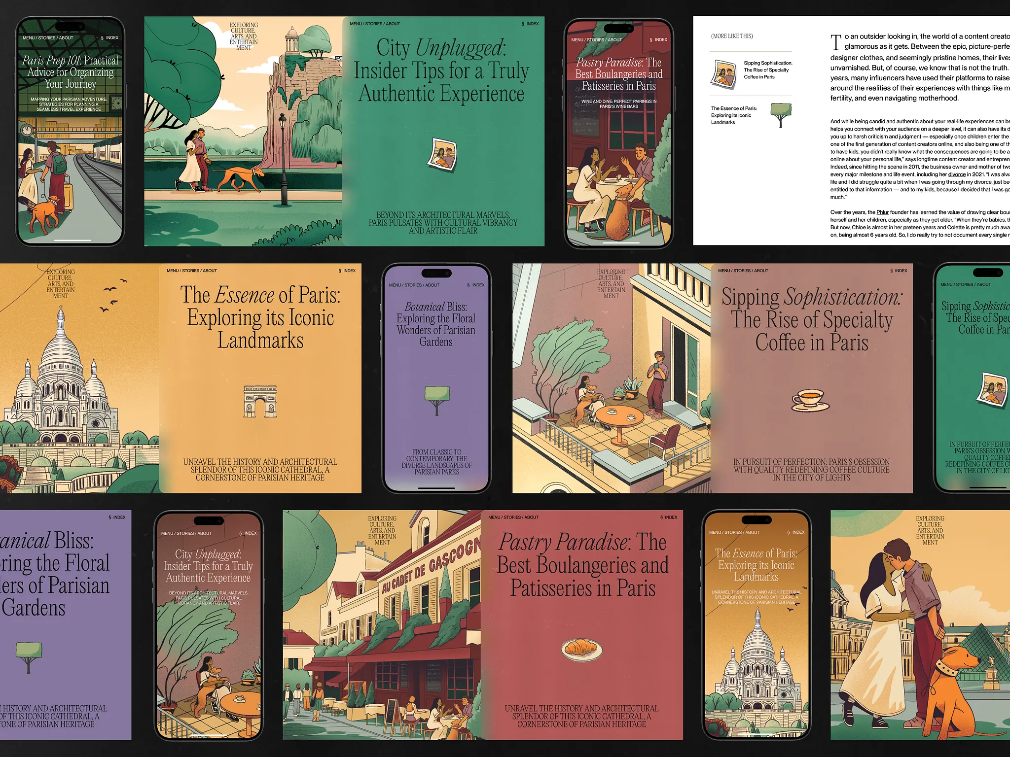
Tubik Case Study: Paris City Guide Website
Functional consistency is where behavior aligns. Similar actions behave similarly across flows. A primary action looks—and acts—like a primary action everywhere. A destructive action always carries the same signals. When behavior changes unexpectedly, trust erodes.
Content consistency might be the quietest yet most powerful layer. Tone of voice, terminology, labeling logic, CTA structure. If one screen says “Start,” another says “Continue,” and a third says “Proceed,” users hesitate. Language shapes perception.
Layout consistency creates predictability. Grid behavior. Information hierarchy. The way cards align. The rhythm of white space. Users don’t consciously audit grids—but they feel when a layout suddenly abandons its own logic.
And then there’s motion & interaction consistency. Standardized transition durations, unified easing curves. Predictable hover, press, and feedback states. Microinteractions that feel like they belong to the same physics engine. When motion patterns shift arbitrarily, something feels off, even if users can’t articulate why.
The thing is, users don’t actually separate these categories. They don’t think, “Ah yes, the spacing system is delightful on this page.” They just feel coherence. Or they don’t.
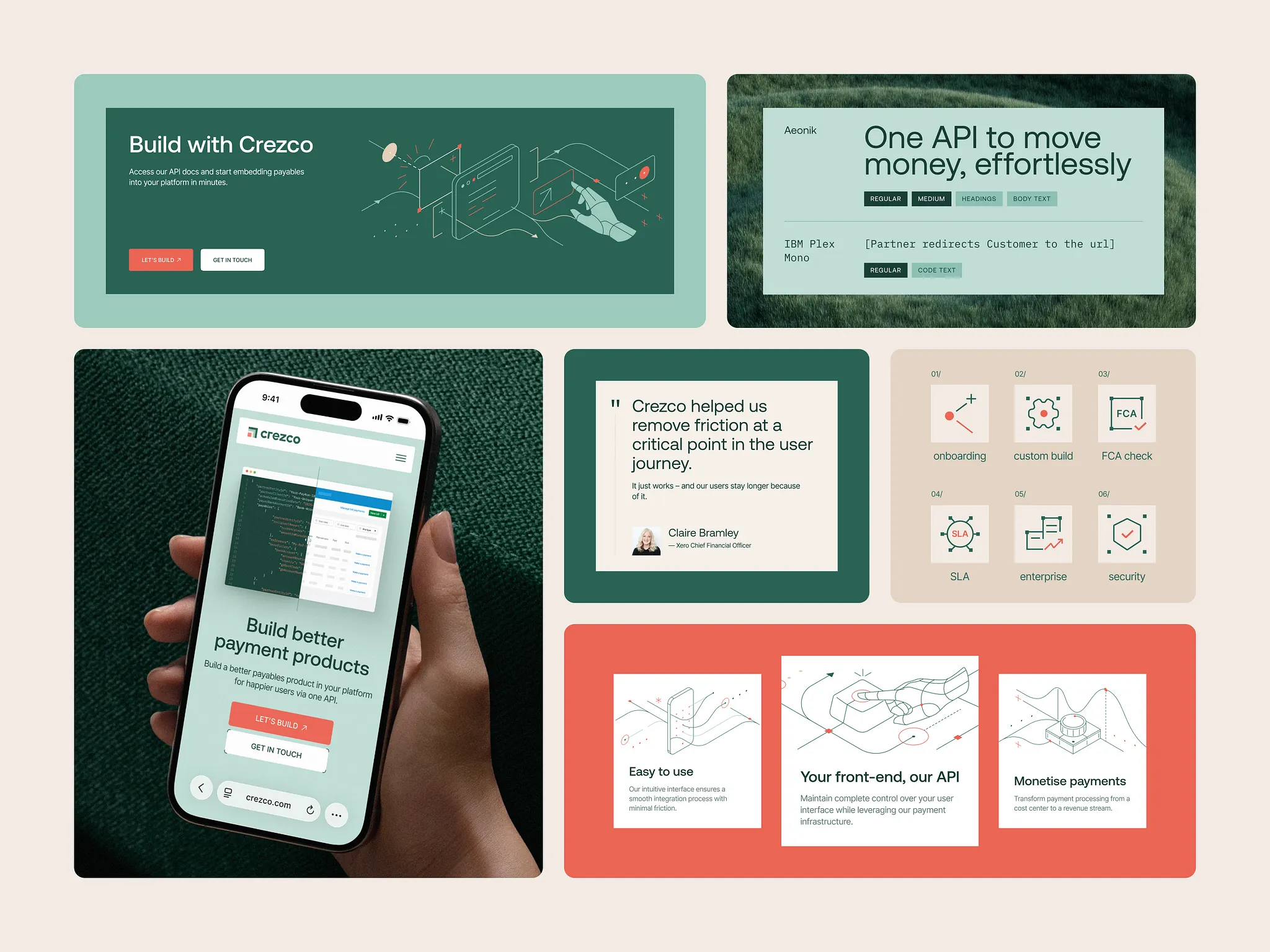
Design Systems: The Backbone of Consistency
A “design system” that exists in theory but lives as a messy Figma page called “UI Final v7 New Clean” is not a system. It’s a liability.
A real design system is a single source of truth. Component libraries and design tokens encode decisions so they don’t have to be re-litigated every sprint. Tokens are the quiet architecture beneath all of it—color, spacing, and typography defined once, reused everywhere, so that changing a single value ripples coherently through the entire product rather than triggering a manual, fragile cascade of fixes.
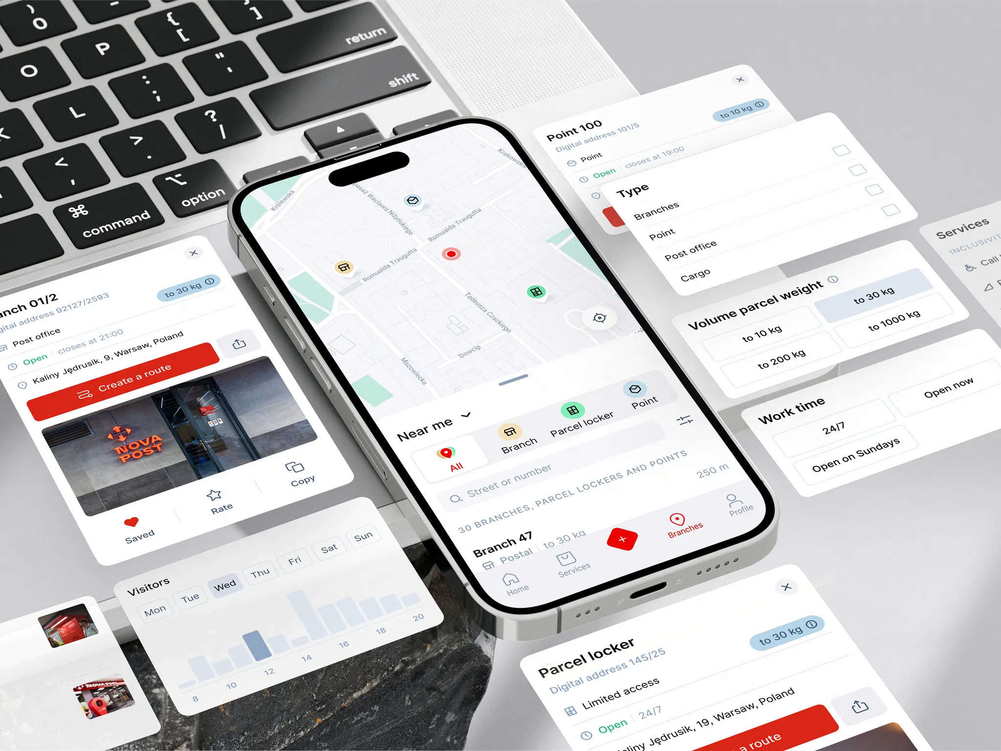
Nova Post Redesign by Tubik Studio
Reusable components go further still, turning perpetual debate into pre-agreed structure—shifting the conversation from “how should this look?” to “what problem are we solving?” Reusable components ensure cross-platform consistency—web, mobile, dashboard, marketing pages—without duplication.
Documented interaction patterns clarify states, edge cases, and behavioural rules. What happens on error? On loading? On disabled states? If it’s not documented, it will fragment. Someone will improvise. And improvisation scales badly.
Governance matters just as much as creation. Who owns the system? How does it evolve? How are updates versioned? Without clear ownership, even the best systems decay. Because consistency is not a PDF that died in 2022, it’s a living organism. It breathes with the product. It adapts. And it has to be maintained.
Accessibility as Consistency in Its Most Honest Form
Accessibility is often framed as a checklist. At Tubik, we see it differently. For us, accessibility is consistency in its most honest, uncompromising form.
WCAG standards are more than bureaucratic hurdles; they remind us that a digital product is public infrastructure rather than a private playground. If consistency means anything, it must hold up across abilities.
Standardized error message placement reduces anxiety. When an error appears in the same predictable area, behaves the same way, and speaks the same language across flows, users don’t panic. They adjust, correct, and move on. Inconsistent feedback, by contrast, feels personal. It feels like failure.
Keyboard focus order might seem like a technical afterthought, but it’s navigational logic. A predictable tab sequence communicates hierarchy. It tells users, “We’ve thought about your path.” And for screen reader users, a clear heading hierarchy is orientation itself. Structure becomes spatial awareness.
Then there’s language. Terminology that shifts mid-flow creates cognitive overload. A “project” becomes a “workspace,” then a “dashboard,” then a “hub.” Each rename costs attention; that’s why consistent terminology is a must.
Accessibility, when practiced through user-centered design, ensures that the same product remains usable by more humans. That is consistency at scale. Not uniformity, but coherence across difference.
Consistency Across Platforms: One Brain, Many Surfaces
A modern product rarely lives in one place. Sometimes it sits on your 27″ monitor at work, sometimes on your iPhone while you’re half-listening on a Zoom call, and sometimes on the tablet you swear is only for “reading.” Same product, different surfaces, different levels of attention. And the challenge is subtle: how to maintain one shared logic across many surfaces without flattening the unique character of each.
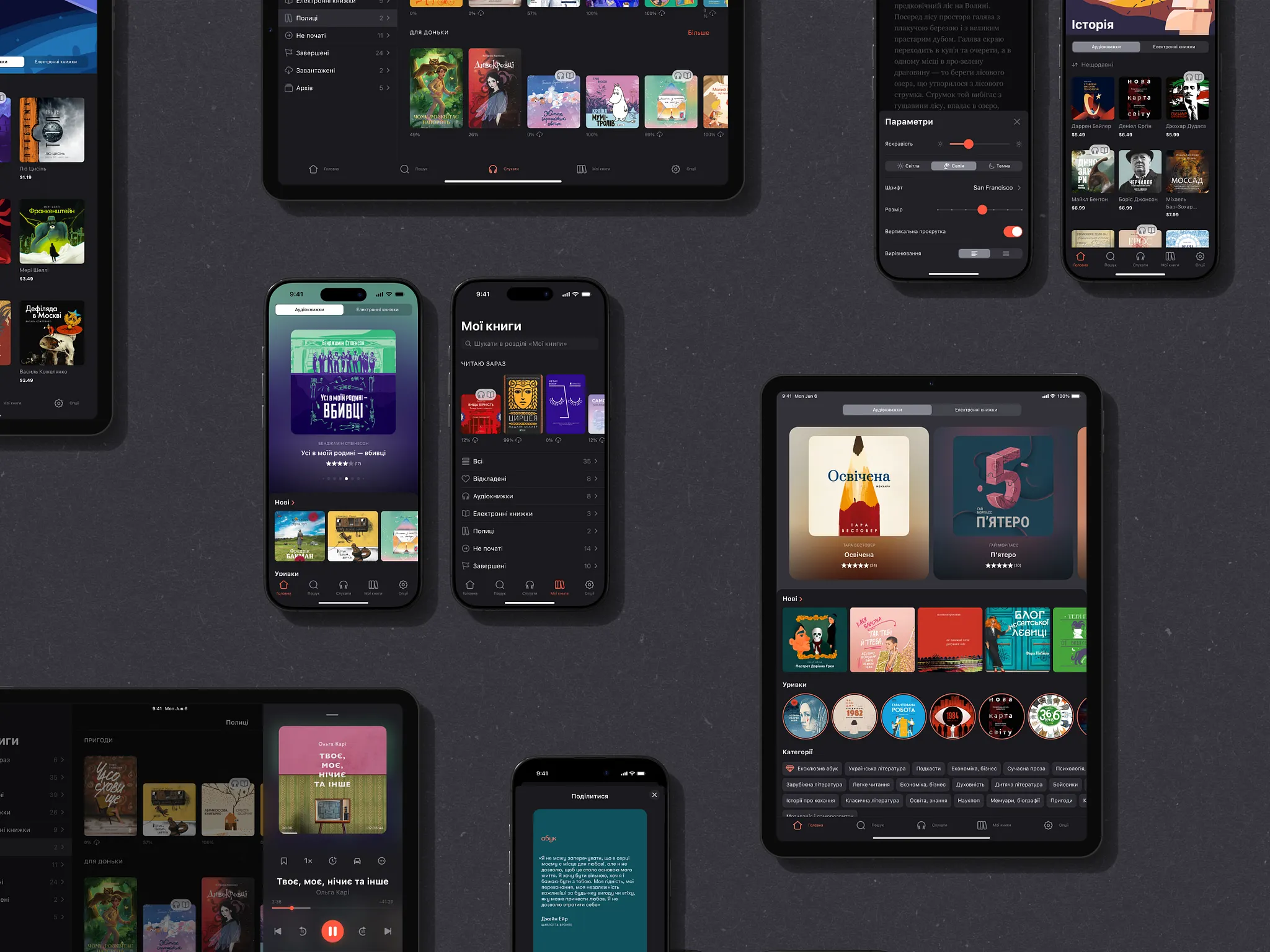
Abuk Cross-Platform Design by Tubik
Consistency across platforms does not mean cloning interfaces. It means preserving core interaction principles while respecting platform conventions. A swipe on mobile is not a click on desktop, but the intention behind the action should feel familiar. The mental model must survive the transition.
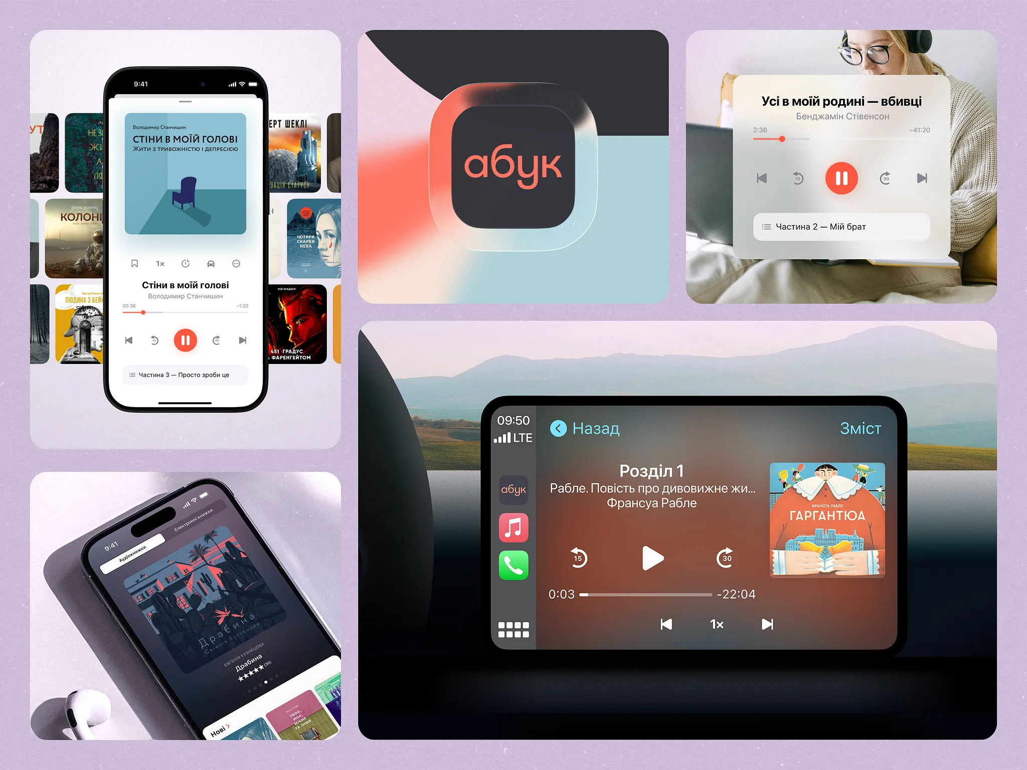
Abuk Cross-Platform Design by Tubik
We approach this as translation, not duplication.
The “grammar” is stable:
- Information hierarchy stays recognizable.
- Core components behave in familiar ways.
- Flows keep the same underlying rhythm, even if the choreography changes.
Responsive layouts can rearrange blocks, compress copy, shift a sidebar into a bottom sheet. But the reasoning behind the interface—why things live where they live and behave how they behave—has to survive the move. The moment the mobile version starts offering options the desktop flow hides, or a critical CTA moves from obvious to scavenger hunt, you feel the product splitting into parallel universes.
This is where cross-platform components come in handy. Design tokens, reusable modules, and shared interaction patterns become connective tissue. They allow teams to adapt without reinventing logic every time. They don’t strangle creativity; they give it a spine.
The goal is simple to state and hard to execute: whether someone meets your product on a dimmed iPhone at midnight, on a corporate Windows laptop at 10:03 during a “quick sync,” or on a tablet clipped to a stand in a retail store, it should feel the same.
Governance: How to Keep Consistency from Decaying
Even the cleanest system slides into chaos if nobody watches it. The first version is usually pristine: a lovingly curated design system, immaculate Figma pages, token names that still make sense. Then real life starts.
New features arrive. One team is racing a launch date, another is fixing production bugs at 1 a.m., a third has a “tiny urgent tweak” that skips the usual review. Someone copies a component locally “just this once.” Someone changes padding “because it looked weird here.” After six months, your product begins to feel less like a composition and more like a collage of half-remembered ideas.
This is where governance becomes essential.
Design reviews are checkpoints for systemic integrity. Pattern audits reveal quiet divergences before they calcify. A slightly altered spacing rule here, a new button style there. Individually harmless, but collectively destabilizing.
At some point, someone has to be responsible for saying “no.” Clear ownership of the design system is non-negotiable. Without it, systems decay. Someone—or a dedicated team—must maintain the single source of truth, manage updates, and ensure documentation evolves alongside the product.
And this only works if the feedback loop is real. Designers, developers, and product managers have to talk before shipping, not after the bug reports arrive. A Slack thread where a developer asks, “Why are there three different primary buttons?” is a governance win, not an annoyance.
Consistency is less of a one-time sprint milestone, and more of an ongoing maintenance. It lives in documentation, audits, and disciplined restraint. In other words, it lives in culture.
The Human Side of Consistency
Consistency is invisible—until it breaks.
Users don’t open an app and applaud its systematic thinking. They don’t leave five-star reviews for aligned spacing logic or unified interaction patterns. They unlock their iPhone while half asleep, interact with your product, and proceed to live their life. The magic trick of consistency is that when it’s working, nobody names it.
They do, however, feel it when it fails.
A button that lives in the bottom right in every flow suddenly appears at the top. A familiar label quietly changes wording. A critical action moves from a clear primary CTA to a text link buried in a secondary menu. Each inconsistency is a micro-speed bump. One or two you forgive. A whole road made of them and you’re turning off notifications, closing tabs, and abandoning carts.
Predictability, in that sense, is a form of respect. We’re not asking people to re-learn the system every time they navigate to a new screen. We’re acknowledging that their time and focus matter. In a world saturated with digital noise, that kind of restraint feels almost radical.
Over time, this becomes a signal of maturity. Not “we have the fanciest UI,” but “this thing was built with principles.” You can feel it in small ways:
- Flows that line up logically, even as they get more complex.
- New features that arrive already speaking the same visual and interaction language instead of feeling like plug-ins.
- Copy that doesn’t oscillate between styles depending on which squad wrote it.
Coherence tells you there’s someone behind the curtain thinking long-term. And that is the goal.
We design for the product to feel as if it were shaped by one clear, deliberate mind—even when the reality is messier. Even when the product is the result of dozens of people collaborating across teams, departments, and time zones.
When consistency holds, the user never sees that chaos. All they see is a product that feels stable, considerate, and easy to trust. One system, many surfaces—and an experience that behaves like it knows you have better things to do than fight your own tools.
Recommended Reading
If this sparked a thought, don’t stop here. Dive into our other articles on design, systems, and digital craft:
Visual Dividers in User Interfaces: Types and Design Tips
Best Practices on Preventing Errors in User Interfaces
How to Design Effective Search in User Interface
Directional Cues in User Interfaces
How to Make User Interface Readable
Basic Types of Buttons in User Interfaces
3C of Interface Design: Color, Contrast, Content