A new generation of apps gets more and more personalized to dive deep into specific problems of a particular user. Today’s design story is about a product of this kind: meet Inspora, a virtual personal assistant in the issues of style and fashion. The Tubik team had a chance to work on the design of logo, user interface and promo video for this project, so let us unveil some details.
Project
Every day, millions of young women from different corners of the world face the same problem: they stand in front of the wardrobe and have no idea what to wear. In various situations, it can result in stress, discomfort, and bad outfit choices. The idea of creating a product helping to solve this problem transformed into creating a special chatbot based on artificial intelligence.
So, in short, Inspora is a virtual stylist aimed at taking off the stress of getting dressed. The flow is simple: a user has to just ask Inspora „what should I wear?” on Facebook Messenger and she’ll create outfits for any occasion that you can easily recreate at home.
Inspora has 3 key benefits. It’s:
• Smart: Inspora’s artificial intelligence combines the expertise of hundreds of real-life fashion stylists.
• Truly personal: Inspora gets to know you and your taste in a fashion directly by talking to you.
• Reliable: You can text Inspora 24/7 and receive instant advice – it’s entirely automated.
How does Inspora know what is good to wear for you? Just like when you’re becoming friends with someone: the more you communicate, the better she’ll get to know you and your taste in fashion. Through natural language processing, she is able to extract context, meaning and even the mood you are currently in. She’ll keep an eye on any fashion-related information you give her and ask in case there’s something missing.
As you could already have noticed, the product is initially positioned as gender-marked: it’s seen as a woman, it called “she” instead of it and it is aimed at teens and young women as its core target audience. The creators took into account an influential fact: Gen Z loves texting! They now spend more time on messaging platforms such as Facebook Messenger than on any other website or app. Fashion brands have ignored the latest shift to conversational interfaces for too long. So, Inspora is building a new kind of fashion/technology company that provides what Generation Z really wants: a highly personalized, chat-based interface which helps them create outfits, improve their style and discover fashion content.
Logo Design
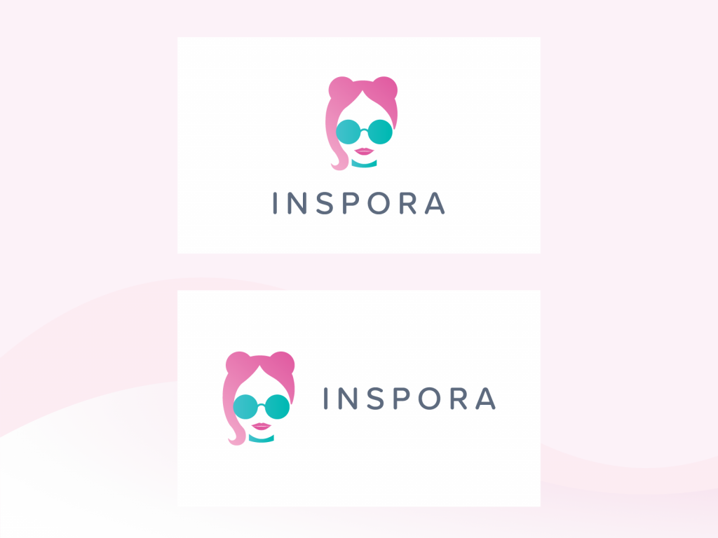
The design process started with the brand sign. Considering the above-mentioned points, in the process of creative search, graphic designer Yaroslava Yatsuba developed the idea of a logo symbol that would reflect an easily decoded image of a girl. Also, it had to look elegant and immediately connect users to the theme of fashion. Human image instead of abstract sign was found an effective choice for the product based on deep personalization. Here are the options that were created in the process in line with the described strategy. All of them feature easily recognizable girls’ heads but differ in detail.
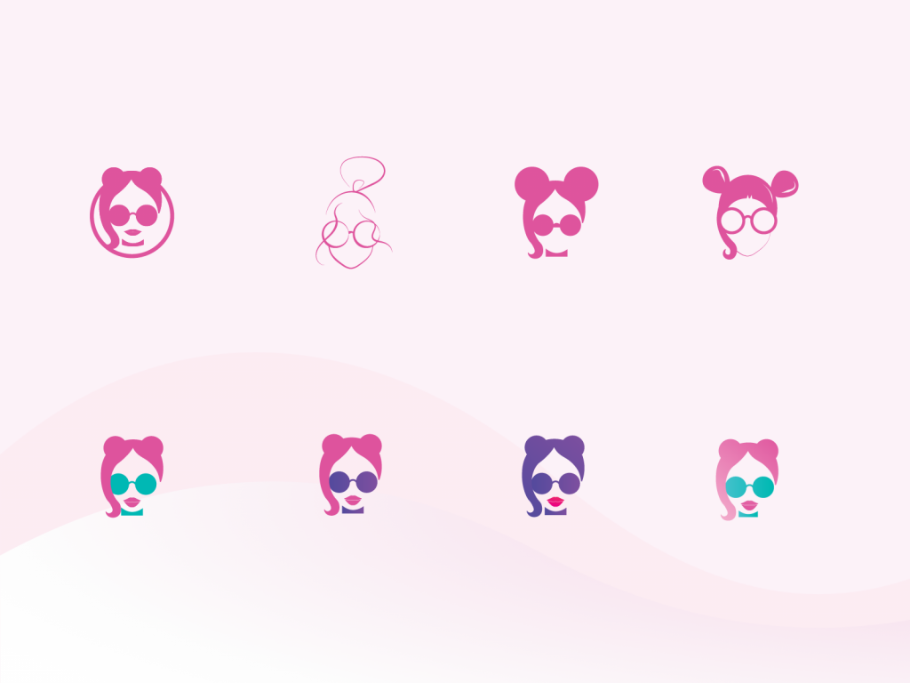
In the process of discussion, the choice was made upon the bright image of a girl with no additional geometric details around. It’s based on white as a base color and two bright accent colors that together make a catchy and trendy combination. The lines are smooth and curvy to make the image feminine but bold. Another thing to mention is the use of negative space that makes a logo look elegant and light. As soon as the final version of the symbol was improved, the typographic part of the logo was added to present the brand name. The designer chose a simple, highly-readable and lean fonts that would combine harmonically with the sign in both horizontal and vertical scheme.
Graphic Design
The next part of the project was a cool challenge for the graphic designer: she had to create a huge set of unique icons, all in one style, to mark various types of clothes and footwear. All of them were tested in different sizes and resolutions to prove their legibility on various devices.
![]()
UI Design
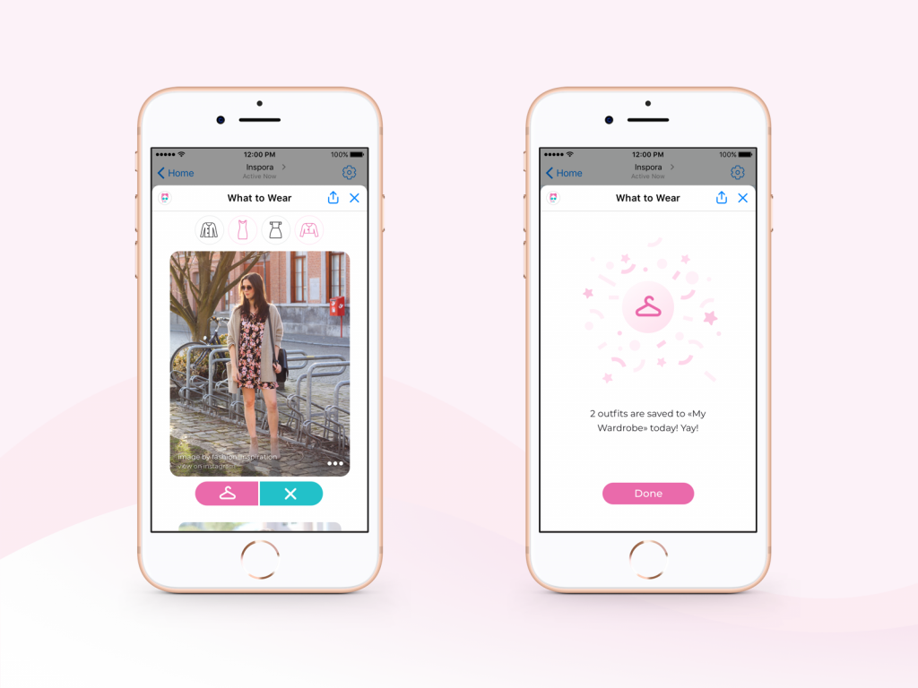
User interface design part required to find the solutions of the screens that wouldn’t be too overloaded with data and wouldn’t make users input a lot of data getting bored. For example, check the left screen below: the icons at the top part of the screen offer users to choose categories of clothes just hitting the buttons marked with the relevant icons. Then it suggests outfits based on Inspora’s knowledge about the user’s personality, preferences, and app usage history. The user can save the offered outfit into her wardrobe or remove it, again just hitting the button with an icon. It’s easy to notice, that buttons and color accents echo the colors chosen for the logo. This way consistent app branding is achieved.
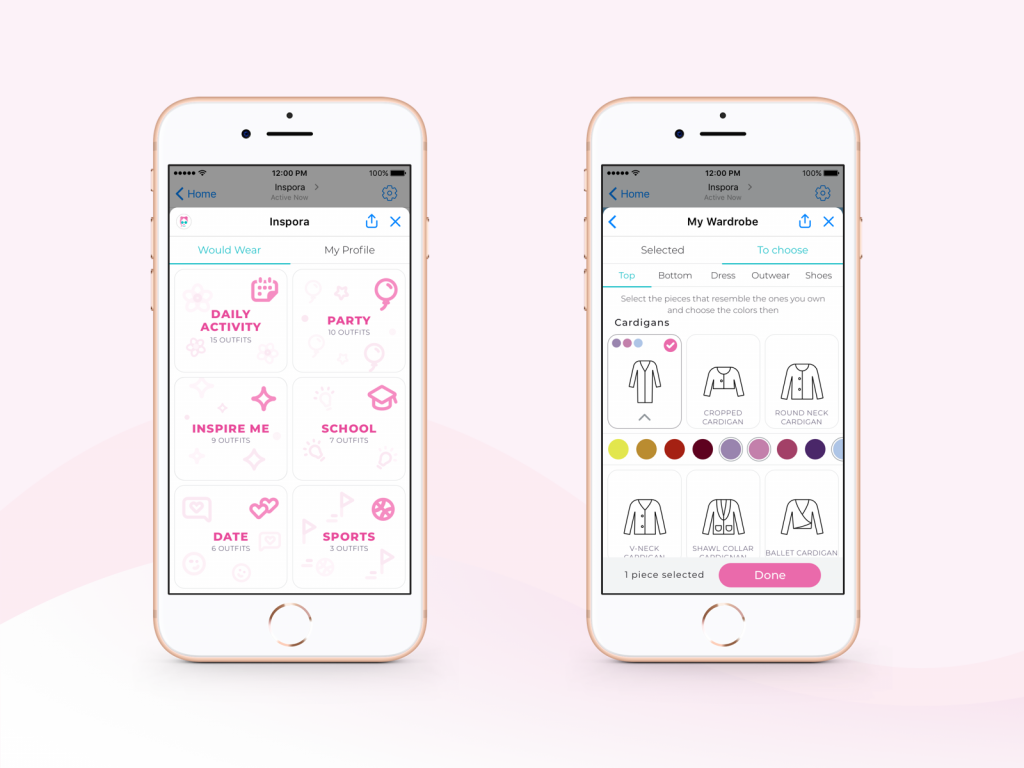
The outfits are categorized according to the styles and occasion marked with simple and easily decoded icons. Moving to the My Wardrobe screen, users choose the models of clothes and footwear that are close to what they really have, so the assistant offers the options that are available for the user.
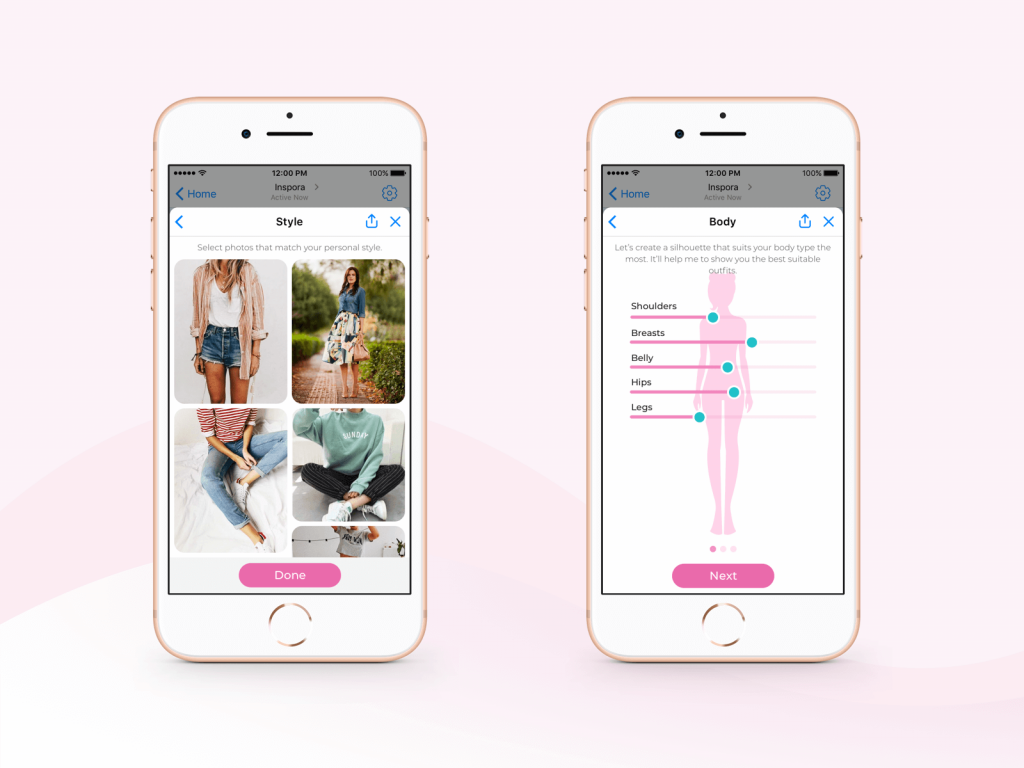
To understand users’ preferences, at the beginning the assistant offers a user to choose photos that match their style and comfort (left screen below). Another essential point is informing Inspora about the type of figure the user has as it’s influential for choosing appropriate outfits. Not to make the user input a lot of data and numbers right from the start of the interaction, the simple system was developed for editing the silhouette changing the basic parameters of the human body and seeing instantly how it changes and if it looks like yours. You can see it on the right screen below.
One more interaction set is aimed at “staying on the same page” and understand the user’s mood and vision better. A quick personality quiz helps to set the connections.
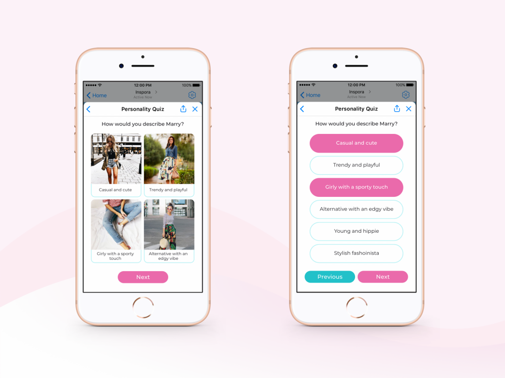
In general, the layout is airy and light, with bright interactive accents in brand colors and trendy fonts that are easily readable on different devices and on the go.
Promo Video
To support the product marketing and inform potential users about the benefits of Inspora quickly and effectively, a short and simple promo video was designed. Video content is an impactful type of transferring the message especially to the generation of young users that are accustomed to this way of getting informed. What’s more, videos are strong in creating the necessary emotional background. So, Inspora is presented in the elegant and clear screencast that shows real interface and interactions, drawing attention to the core benefits with catchy taglines.
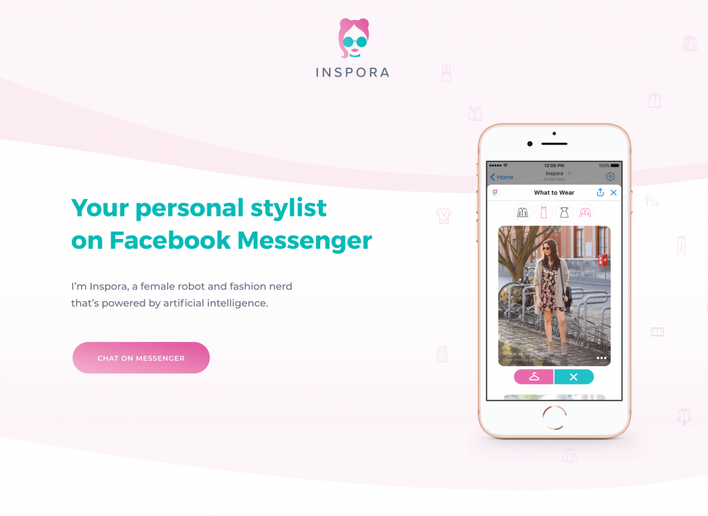
In case you are interested to try it live, welcome to check it via Inspora’s landing page and start messaging right from there.
Useful Case Studies
If you are interested to see more practical case studies with creative flows for mobile UI design, here is the set of them from Tubik.
Bitex. UX Design for Stock Analysis App
Slumber. Mobile UI Design for Healthy Sleeping
Letter Bounce. UI Design for Mobile Game
Real Racing. UX and UI Design for Mobile Game
Manuva. UI/UX Design for Gym Fitness App
Cuteen. UI/UX Design for Mobile Photo Editor
Tasty Burger. UI Design for Food Ordering App
Watering Tracker. UI Design for Home Needs


