
Mobile apps evolve fast. Faster than blog posts, faster than design systems, sometimes faster than our ability to remember why we added that third floating action button in the first place. Features multiply, UI patterns mutate, and “best practices” in mobile app UI design quietly expire.
And yet, open almost any mobile application today—whether it’s a fintech app interface, a meditation app UI, or a grocery delivery app—and you’ll still recognize the same core screens. Not because designers lack imagination, but because these mobile UI screens solve very real, very human problems that haven’t gone away.
This article is a walk through the most common types of mobile app screens—the ones designers keep returning to—and the UI and UX design decisions they demand. If you’ve ever asked yourself why a screen feels off, or why users keep dropping right here in the user flow, chances are the answer lives somewhere below.
Common Screens
Splash Screen
The splash screen is the digital equivalent of clearing your throat before speaking. It doesn’t say much, but it sets expectations for the entire mobile user experience.
Technically, a mobile splash screen exists to mask loading time. Emotionally, it establishes trust. Users see it before they understand your value proposition, before they interact with your UI components, and before they decide whether this app survives the next storage cleanup.
That’s why the most effective splash screen designs stay minimal: logo, wordmark, sometimes a restrained animation. Centered layouts are an insurance policy against the chaos of mobile screen sizes, resolutions, and aspect ratios. Designers who’ve tested splash screens across Android devices and one stubborn iPhone SE know exactly why this matters.
Timing matters too. Four to eight seconds is already generous in mobile UX design terms. Any longer and users aren’t admiring your branding—they’re questioning performance. Showing loading progress, even subtly, gives users a sense of control. And control, in mobile UI design, buys patience.
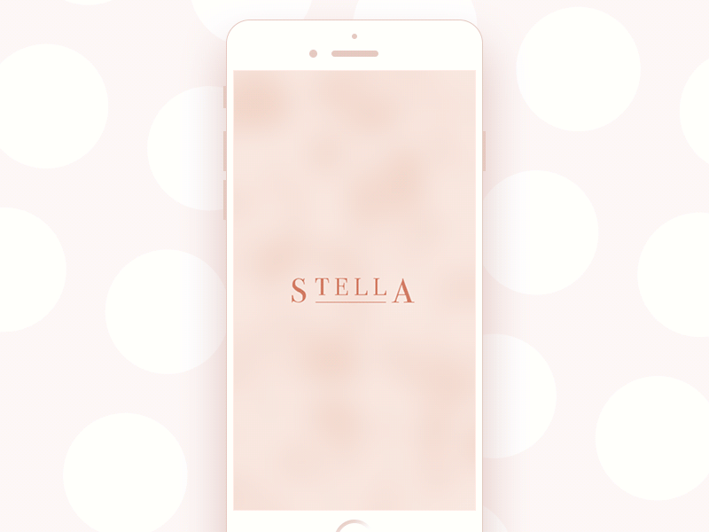
Jewellery E-Commerce App
Onboarding Tutorial Screens
In theory, onboarding screens explain features, benefits, navigation, and value. In practice, users swipe through them at the speed of mild distrust.
That’s why modern mobile onboarding UX favors clarity over completeness. Custom illustrations work because they compress meaning faster than text—especially on small mobile screens used one-handed, outdoors, or mid-commute.
Mascots appear often in onboarding UI design not because every app needs personality, but because humans respond to perceived intent. A character guiding the flow feels more conversational than instructional—even when we know it’s scripted.
Copywriting plays a decisive role in onboarding UX. Short, readable, and functional beats clever every time. If the value isn’t clear at a glance, users won’t stay long enough to decode your metaphor.
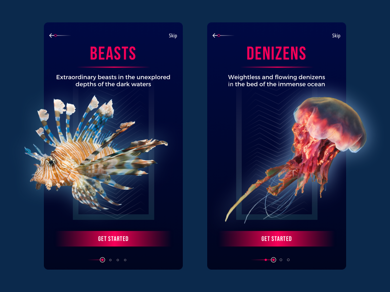
Underwater World Encyclopedia — section tutorial
Home and Menu Screens
If onboarding is the handshake, the home screen is the relationship.
This is where users return—repeatedly. Sometimes impatiently. Often with a specific goal in mind. That’s why home screen design in mobile apps prioritizes orientation, access, and momentum.
Search bars appear everywhere not because they’re fashionable, but because users think in outcomes, not information architecture. They want results, not navigation theory.
Menus—whether bottom navigation, hamburger menus, or contextual drawers—act as the structural backbone of the mobile UI navigation system. Predictability beats novelty here. Experimental navigation rarely ages well.
Menu design benefits from restraint. Keeping options under seven supports cognitive load management in UX. If everything is important, nothing is.
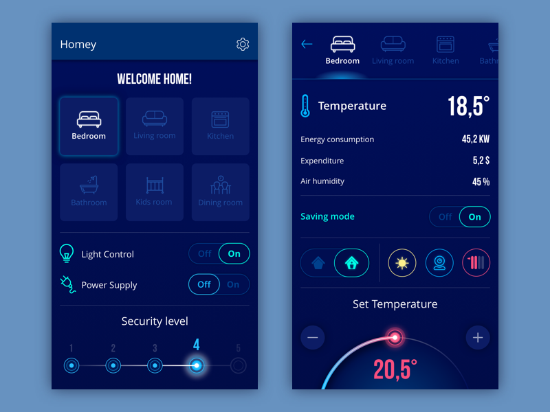
Homey App
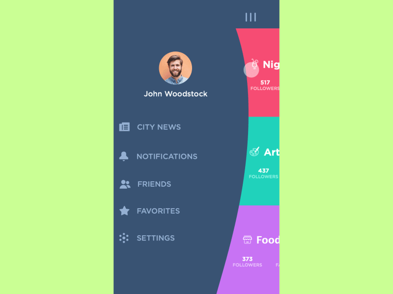
Slide Menu Concept
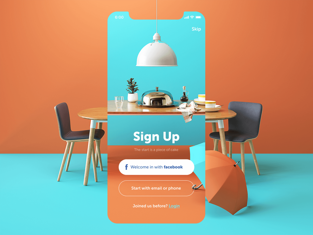
Log-In and Profile Screens
Log-in screens look simple, but they’re conversion landmines. Two fields. One button. And countless ways to introduce friction.
Minimalist login UI design is practical, not aesthetic. Every extra option increases hesitation. Social login exists because typing passwords on glass remains frustrating—no matter how elegant the UI.
Restaurant App
Profile screens, meanwhile, handle identity, preferences, and personalization. In social apps, they double as self-representation. That’s why clarity beats density in profile UI design.
Effective profile screens limit information without hiding it, guide navigation intuitively, and reflect real user behavior discovered through UX research—not assumptions. Different audiences tolerate different complexity levels, and guessing wrong shows.
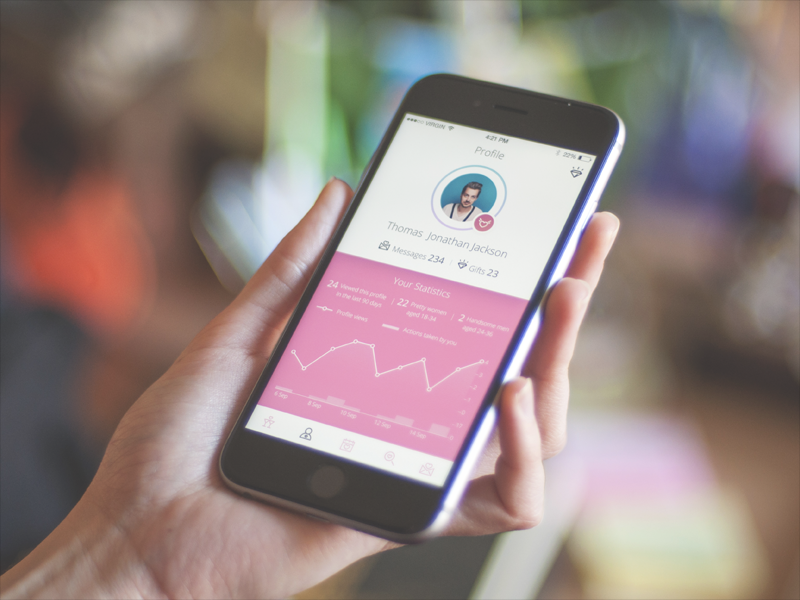
Dating App
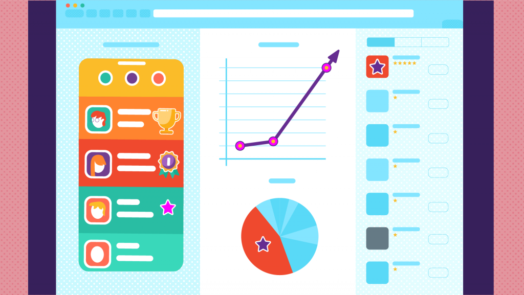
Stats Screen
Stats screens are where designers meet numbers—and humility. The challenge isn’t displaying data. It’s prioritizing it. Users don’t want all the metrics. They want the ones that answer the question they’re currently asking.
Charts, graphs, and scales help, but only when paired with legible typography and thoughtful hierarchy. A beautifully animated graph that requires squinting fails its job.
The best mobile analytics screens feel calm. They guide the eye. They don’t shout. Designers who’ve redesigned dashboards after watching usability recordings know this: confusion rarely looks dramatic. It looks quiet—and then users leave.
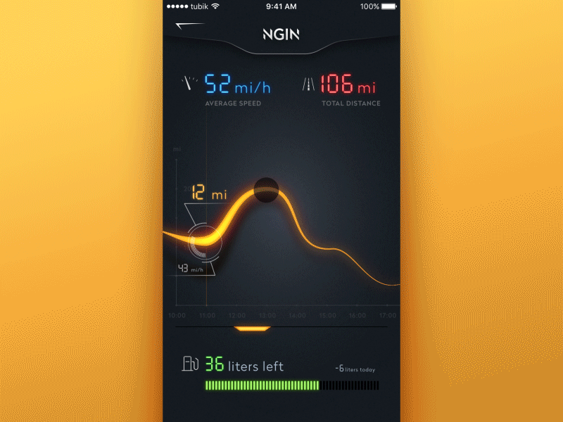
NGIN App

Stats screens for Calorie Calculator app
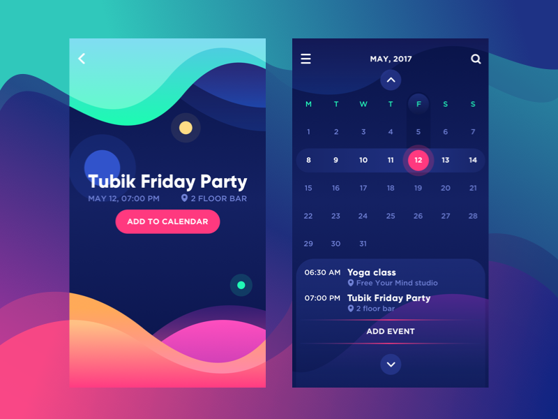
Calendar
Calendars appear everywhere: event apps, productivity tools, fitness trackers, even banking apps. And each one quietly carries expectations shaped by years of Google Calendar muscle memory.
The function defines the form. A scheduling calendar isn’t a habit tracker. A reminder tool isn’t a planner. Visual style should echo the app’s purpose, not fight it.
Consistency matters more than creativity here. When dates behave unexpectedly, trust erodes fast.
Bright Vibe Calendar
E-Commerce Screens
Catalog Screen
In mobile e-commerce design, the catalog does most of the selling before the user realizes they’re shopping.
Vertical scrolling grids feel familiar because they work. Designers adjust the number of items per row based on screen width, image clarity, and thumb reach—not aesthetics alone. Horizontal scroll rows add rhythm and discovery, especially when the last item peeks into view, signaling continuation. That tiny cropped card is a quiet invitation to explore.
High-quality images aren’t optional. They replace touch. They replace weight. They replace texture. A blurry product photo doesn’t lower quality—it lowers trust. Adding to cart directly from the catalog reduces friction. Every avoided tap counts.
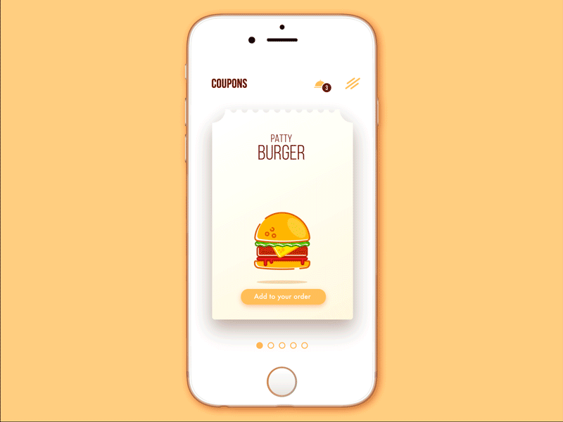
Cafe Coupon App
Product Card Screen
This is the decision screen. Product cards exist for users who need reassurance. Clear imagery, focused descriptions, and structured information blocks help them decide without cognitive overload.
Grouping details—size, material, specifications—isn’t about neatness. It’s about scanning behavior. Users hunt for specific answers, not paragraphs.
Designers often center the product image because it anchors attention. Everything else supports that moment.
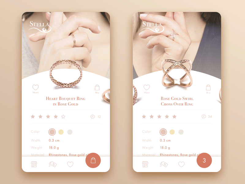
Jewellery E-Commerce App
Checkout Screen
Checkout is where anxiety lives. Users hesitate here not because they doubt the product—but because they fear mistakes, data loss, or security risks. That’s why checkout UI design prioritizes clarity, reassurance, and momentum.
Forms should feel inevitable, not overwhelming. Visual cues like trusted payment icons, secure badges, or subtle copy reminders reduce uncertainty. They don’t need to scream. They need to exist.
Every unnecessary field is a chance for the user to abandon your product.
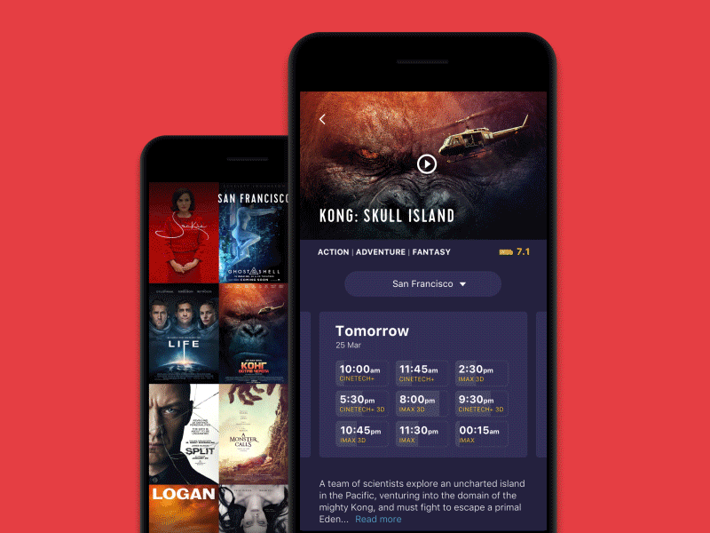
Cinema App
Social Screens
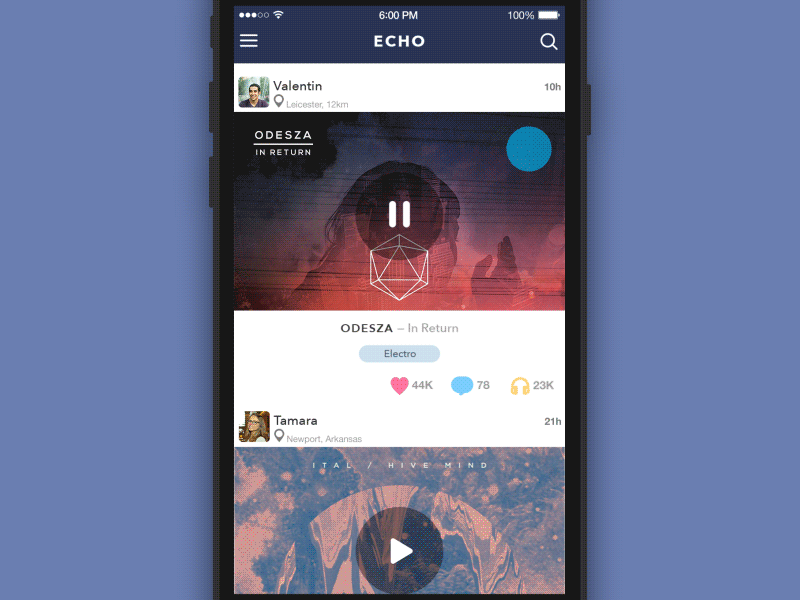
Feed
Feeds are designed for scanning, not reading. Mobile users flick through content rapidly, guided by instinct more than intention. That’s why feed design favors simplicity, spacing, and visual rhythm.
Partial previews signal continuity. Over-decoration kills velocity. Designers learn quickly that attention is fragile—and easily lost to clutter.
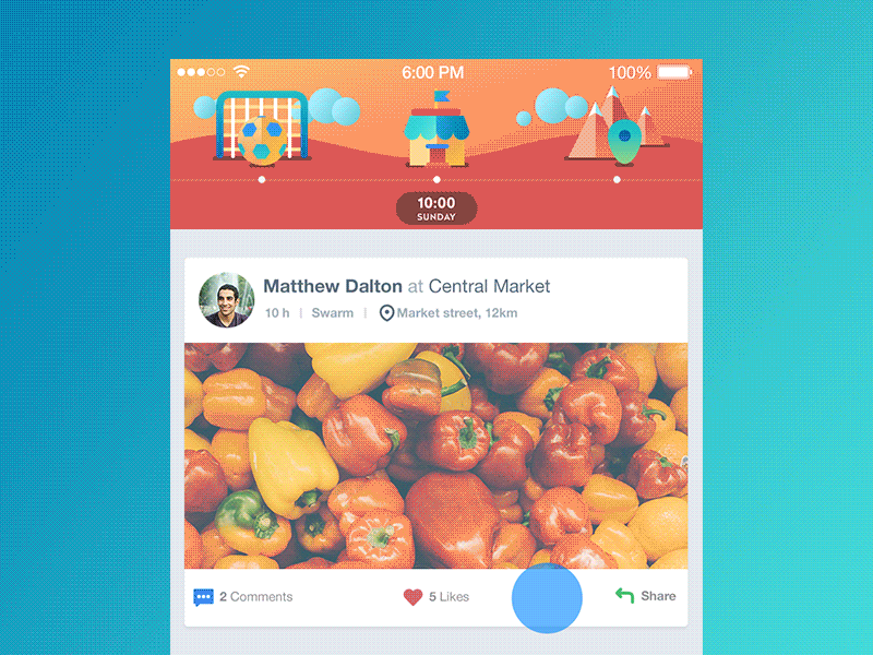
Timeline App
Contacts
Contacts screens are old—and that’s their strength. Alphabetical sorting, recognizable avatars, tap-through details: none of this is innovative, and that’s the point. When users search for people, they want certainty, not surprise.
Photos reduce cognitive load. Familiar patterns reduce hesitation. This screen doesn’t need reinvention—it needs reliability.
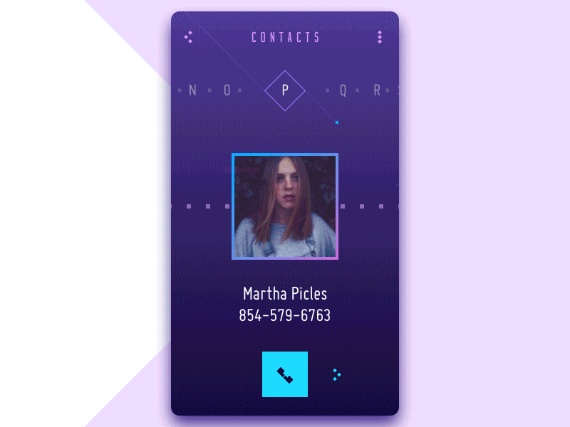
Contact List Concept
Music Screens
Playlist
Playlists are personal. They carry moods, routines, memories. The playlist UI usually follows a predictable structure: track name, artist, duration, optional artwork. Consistency matters more than novelty here. Missing album art still needs a placeholder—empty space feels like an error. Designers earn points by making reordering, sharing, and editing feel effortless.
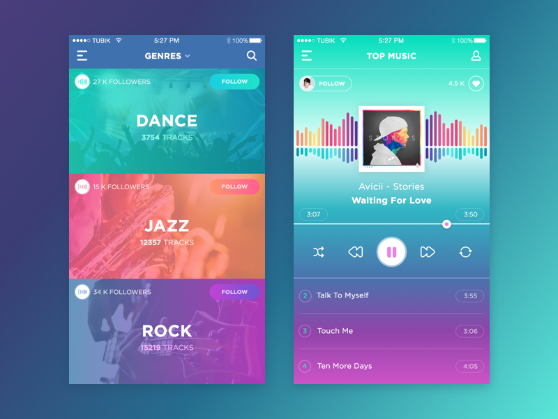
Music App
Player
The player is where control becomes tactile. Play, pause, skip—these buttons are universal for a reason. Designers rarely reinvent them because recognition matters more than novelty here.
Album art dominates because it contextualizes sound. Visualizers offer expressive freedom, but only when they don’t compete with usability. Creativity earns its place when it supports immersion, not distraction.
What Comes Next
New apps will keep introducing new screen types. New use cases will demand new patterns. That’s part of the job. But these screens persist because they solve recurring human needs: orientation, trust, choice, control.
Designers who understand why these screens exist don’t copy patterns—they adapt them with intent. And that’s where real craft lives.
Recommended Reading
Explore our other articles on design psychology and real-world UI decisions shaped by user behavior, not trends:
Mobile App Design: Big Guide into Types of Mobile Applications
Web Design: 16 Basic Types of Web Pages
The Big Guide into Different Types of Websites
UI/UX Design Glossary. Navigation Elements
Mobile App Branding: Tips, Strategies, and Examples
How to Use Animations in Mobile Apps
7 Tips to Enhance Mobile Interactions
The Ultimate Guide to Creating a Mobile Application
Basic Types of Buttons in User Interfaces