There’s a moment in every design project when someone in the room says: “Let’s just make it look clean.”
Clean. The great escape hatch of the design world. Clean means inoffensive. Clean means safe. Clean means we avoided a real decision. Here’s what nobody tells you: users don’t experience interfaces. They feel them. And clean has nothing to do with it.
The designers who understand this—really understand it—are making things that work on people at a level most of us rarely think about consciously. They’ve essentially become amateur therapists, decoding why humans do what they do, what makes them stay, and what sends them running without a second thought.
Psychology is the foundation. Everything else is just a decoration.

The Brain You Never See Coming
Before a user reads a single word on your page, something has already happened. A verdict has been reached. The case is closed.
This is visceral reaction—the product of what neuroscientists sometimes call the “old brain,” the part that evolved long before language or logic or landing pages. It responds in milliseconds, operates entirely on instinct, and doesn’t care about your carefully chosen typeface.
What it does care about: Is this beautiful? Does it feel safe? Does it feel trustworthy?
This is survival instinct repurposed for a digital era. Humans evolved to make fast pattern-recognition decisions. A brightly colored berry could be food or poison. A shadowy shape could be shelter or predator. Today, a website can be a solution or a scam, and the old brain starts making that call before the conscious mind catches up.
The implication for design is profound and humbling: if your aesthetic impression is wrong, nothing else matters. The copy won’t be read. The features won’t be discovered. The conversion won’t happen. You lost before the game even began.
Great designers don’t leave this to chance. Every visual decision—photography, color temperature, whitespace, the weight of a headline—is a message sent directly to that ancient part of the brain. A message that either says “you’re in the right place” or “get out.”
The Invisible Grammar of Visual Perception
In the 1920s, a group of German psychologists made a discovery that should have changed design forever. They called it Gestalt—the idea that the human mind doesn’t see individual elements, but relationships.
You don’t see a circle with a gap. You see a broken circle straining toward completeness. You don’t see scattered dots. You see a pattern, a shape, an implied meaning. The brain is constantly, compulsively finishing sentences that were never started.
This is the invisible grammar your users are reading—whether you wrote it intentionally or not.
Proximity tells them what belongs together. Similarity tells them what plays the same role. The natural direction of a line tells their eye where to travel next. These aren’t design conventions. They’re cognitive reflexes, baked in at a level that predates education, culture, or preference.
The practical consequence: every time you place an element on a screen, you’re making a grammatical statement about the relationships between things. You’re either writing clearly or mumbling. The interface that “feels confusing” is usually one where the Gestalt grammar is contradicting itself—where proximity groups things that shouldn’t be grouped, where similarity suggests equivalence that doesn’t exist.
The truly unsettling part? Your users will never be able to tell you why it feels off. They’ll just leave.
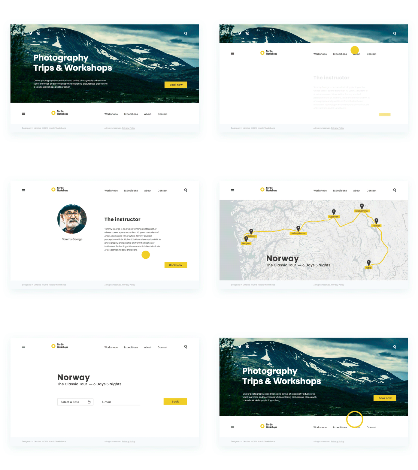
Photography Workshops website
Color Is Never Just Color
If someone on your team says “let’s use blue because it’s calming,” they’re not wrong. They’re just not nearly right enough.
Color psychology is one of the most weaponized and most misunderstood tools in the designer’s kit. Every color carries a weight of cultural meaning, emotional resonance, and contextual expectation. Red doesn’t just mean passion—it means urgency, danger, love, hunger, error, and celebration, depending entirely on what surrounds it. Context is the operating system that color runs on.
The meaningful question isn’t “what does this color mean?” It’s “what does this color mean, here, for this person, in this moment?”
A luxury skincare brand using the same blue as a hospital software company is speaking a different language with the same word. One is serene sophistication. The other is clinical sterility. Visually identical. Experientially worlds apart.
What sophisticated color strategy actually looks like: understanding your audience’s existing emotional associations, choosing a palette that amplifies your brand’s truth, and then being ruthless about consistency. Color leaks everywhere—illustrations, photography, loading states, error messages. Every leak is either reinforcing the message or diluting it.
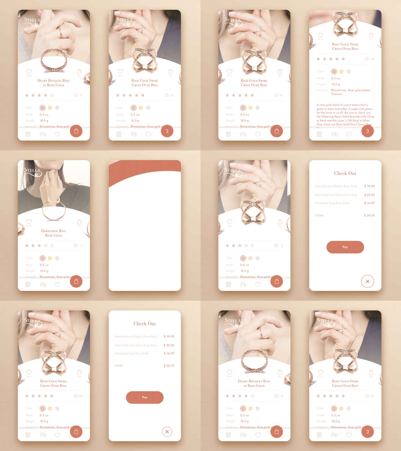
Jewelry E-commerce Application
You Have More in Common with a Gas Station Than You Think
Nobody has ever pulled up to a pump feeling delighted. Nobody lingers. Nobody tells their friends about it. And yet, the gas station is a quiet masterpiece of design—because you already know exactly how to use it. The pump is where you expect it. You just get gas and leave.
Similarly, users arrive at your interface carrying a set of expectations so deeply ingrained they’re invisible. A blog should have posts arranged by date. An e-commerce site should have filters on the left. A pricing page should have three tiers with a “most popular” badge in the middle.
These aren’t best practices, but psychological contracts.
When an interface breaks pattern—even if the break is more elegant, even if it’s objectively better—users feel a low-grade anxiety they can’t name. Something’s off. Something doesn’t add up. That unease gets attributed to the product, not to the friction of encountering the unfamiliar.
This is why the wild creative experiments that win design awards often fail in production. The award is for novelty. The product needs trust.
The designer’s job is to hold both things at once: honor the patterns users depend on for cognitive safety, while finding the unexpected within the expected. The way a button moves. The warmth of a confirmation screen. The wit in a 404 page. That’s where personality lives—not in abandoning the map, but in how you draw the roads.
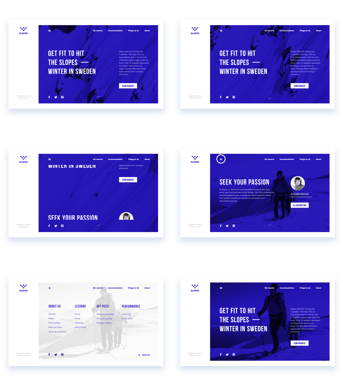
Slopes Website
People Don’t Read. They Hunt.
Decades of eye-tracking research have collapsed a comfortable myth: users don’t read your website. They scan it like predators scanning a landscape—looking for the thing they came for, moving on the moment something irrelevant registers.
Two patterns dominate. The F-pattern emerges on content-heavy pages: users scan the top, then a shorter line below it, then drop down the left side looking for entry points that justify deeper attention. The Z-pattern governs simpler pages: top-left to top-right, diagonal down to bottom-left, then across the bottom.
Neither pattern is flattering to the assumption that users will discover your brilliant supporting copy.
This is actually liberating information if you let it be. It means design is less about decorating a space and more about building a trail. Where do the eyes naturally go first? Is something important there? Where do they go next? Are you guiding them toward the decision you want them to make, or leaving them to wander?
Information hierarchy is a map of human attention, drawn in advance.
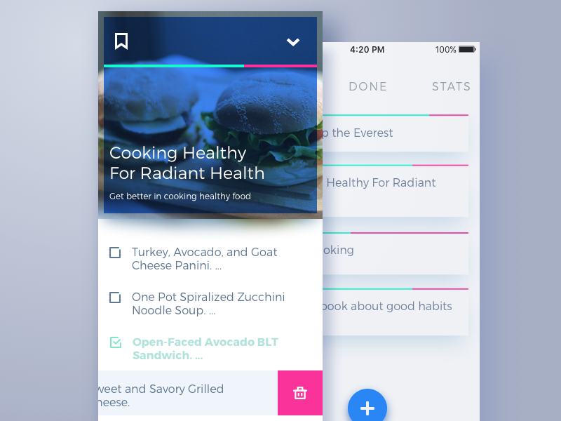
To-do list concept
The Paradox of the Perfect Menu
More is more, right? More options, more freedom. More freedom, more happy users.
Wrong. Spectacularly, measurably wrong.
Psychologist Barry Schwartz called it the Paradox of Choice. Hick’s Law, formulated decades earlier, quantified it: decision time increases logarithmically with the number of options. The real problem is exhaustion. Every unnecessary choice drains a user’s cognitive resources—resources they’re not replenishing, because they’re spending them on your interface.
The menus that have too many items. The onboarding flows that ask twelve questions. The checkout page with six suggested products. Each of these is a small tax on attention. Collected together, they bankrupt the experience.
The discipline of restraint—genuinely hard restraint, the kind that requires removing something you love—is one of the most valuable things a designer can practice. Every option you don’t include is a decision you made on behalf of your user. Do it well, and they’ll feel guided. Do it poorly, and they’ll feel restricted. The difference is understanding what they actually need versus what they might theoretically want.
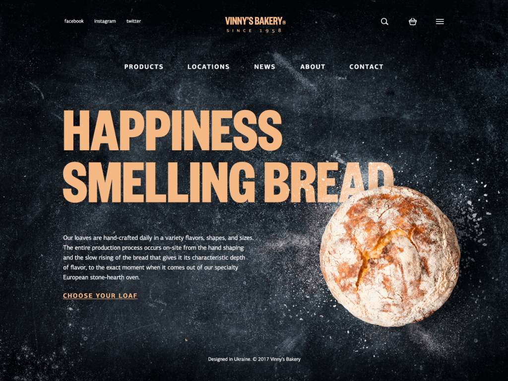
The Therapist in the Room
There’s a reason the best designers often describe their work less as making things beautiful and more as solving human problems. Because that’s exactly what it is.
When you understand how the old brain makes its snap judgments, you stop treating aesthetics as decoration and start treating it as communication. When you understand Gestalt, you stop placing elements randomly and start writing a visual language. When you understand scanning patterns, you stop hoping users will find your content and start building paths that lead them to it. Psychology explains the stakes.
Every interface is a conversation between what was built and how humans actually work. Most interfaces are monologues—designers talking to themselves, building what makes sense to them, hoping users will adapt.
The ones that endure are dialogues. They’re built by designers who did the uncomfortable work of understanding the person on the other end of the screen—not as a user persona, not as a demographic segment, but as a human being with instincts, expectations, and an old brain that makes decisions before the thinking brain even wakes up.
Clean is easy. Human is harder.
That’s why human is worth it.
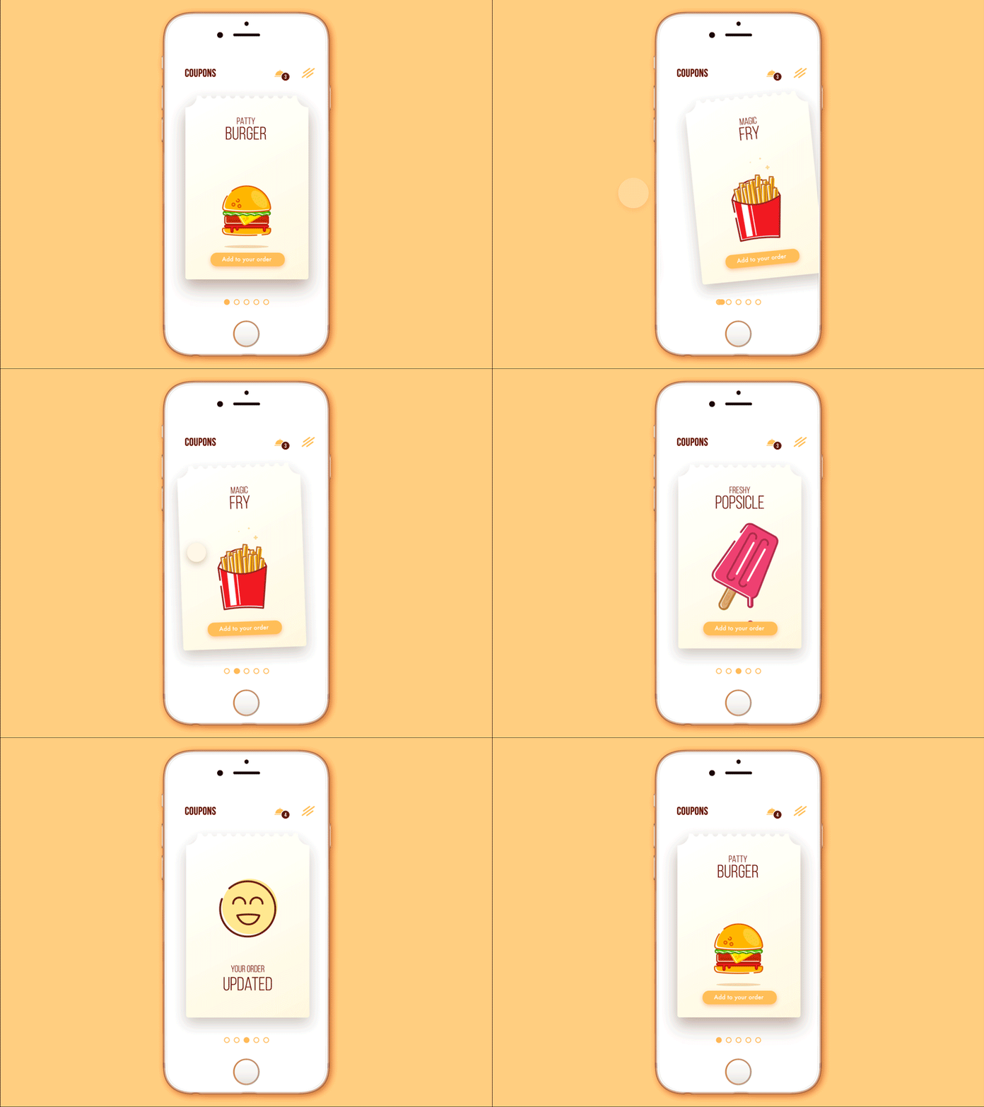
Cafe Coupon App
Recommended Reading
Still scrolling? Check out these articles on all things design:
Gestalt Theory for Efficient UX: Principle of Similarity
Gestalt Theory for UX Design: Principle of Proximity
Color in Design: Influence on User’s Actions
Knock Design in Shape: Psychology of Shapes
UX Design: How to Make Web Interface Scannable
Visual Hierarchy: Effective UI Content Organization


