There’s a particular kind of app that sounds simple until you actually try to build it—the kind where the whole point is to make people want to do something they’ve been putting off for years. NestEgg Health is exactly that kind of app.
At its core, NestEgg Health is a virtual workplace wellness platform designed to bridge the gap between sedentary office life and active daily routines. But call it just a fitness app and you’re missing the point. Think of it more as a motivational ecosystem—a space that nudges regular humans, who spend most of their day sitting, to weave physical activity into their lives.
Our task was to design a digital experience that feels clear, credible, and grounded in real human behavior. The challenge was not just to track stats, but to communicate a sense of collective excitement and practical support for people who aren’t elite athletes. That was the design challenge right there, before we even opened Figma.
The Problem We Had to Communicate
Modern workplace wellness often relies on individual discipline, which is surprisingly inefficient. When people compete solo, tracking their own stats on isolated leaderboards, the energy often feels like personal guilt rather than genuine motivation.
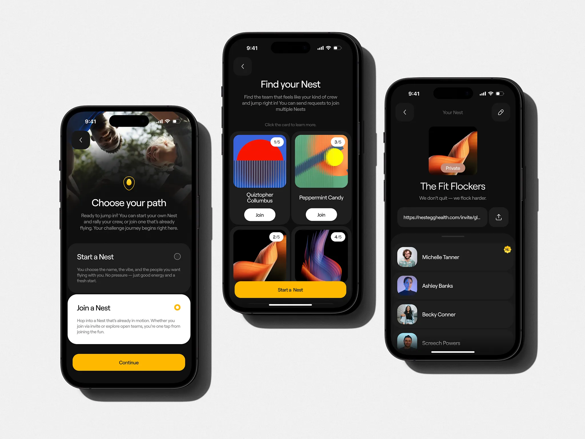
For NestEgg, the challenge was twofold. First, we needed to shift the focus from “solo sprints” to “team sports,” creating a social layer that feels like a shared locker room where people actually want to be. Second, the experience had to solve a common problem in fitness design: how to make a platform fair for everyone. We had to ensure that a person who has never worked out could go head-to-head with a morning runner, rewarding consistency and improvement rather than just raw physical output.
A Narrative Built on Fair Play
Rather than overwhelming users with intense targets from the start, the design structures the journey through personalized goals. When a user joins, a short survey assigns them a level with its own specific points target—meaning everyone, regardless of their baseline, is simply chasing 100% of their own goal.
This narrative structure helped transform complex health tracking into a digestible and encouraging story. Instead of presenting a mountain to climb, the interface introduces manageable steps:
- The Experience: Level progressions are designed so the next target always feels close enough to actually reach.
- The Tone: Pop-ups and social feeds celebrate effort and standout moments, positioning the platform as precise and reliable rather than demanding.
- The Integration: An AI coach feature fits naturally into this support-oriented philosophy, offering personalized help that feels genuine.
Design Decisions & Visual Information
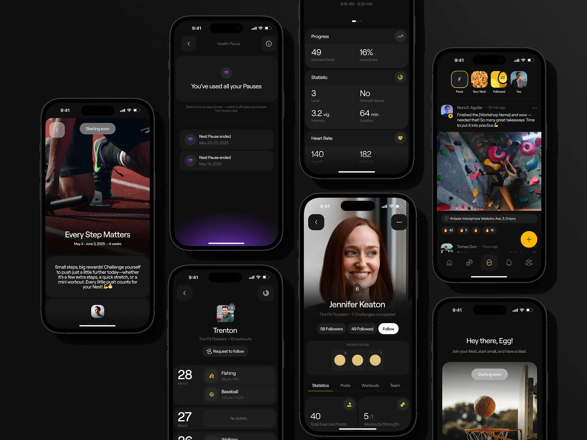
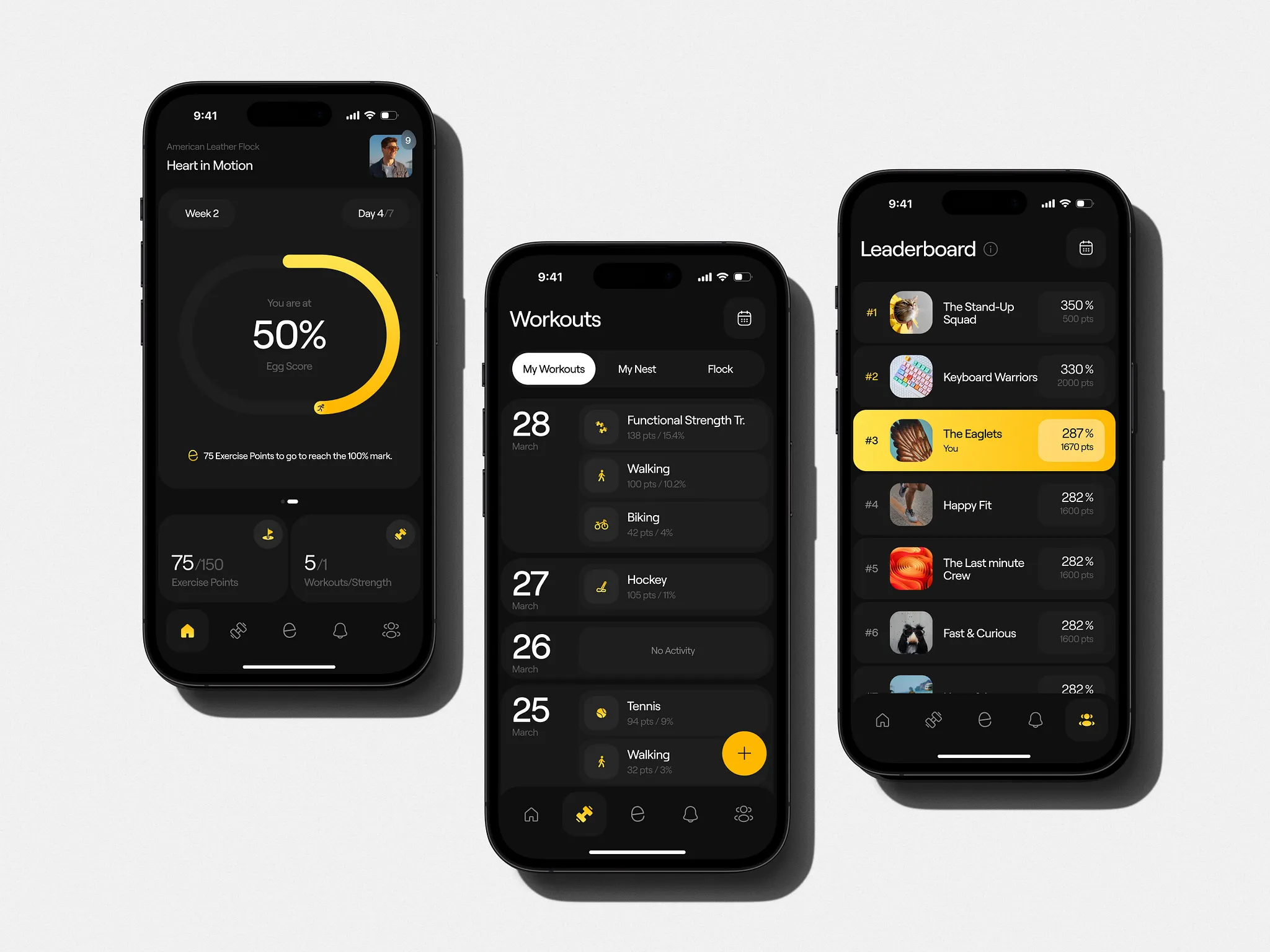
One of the key visual challenges was organizing dense amounts of health data without making the UI feel clinical or overwhelming. We solved this through a high-contrast dark aesthetic paired with a rigorous card-based system.
- Information Architecture: We used big cards to surface the most critical data first—like your personal Nest results, progress charts, and current team standing—eliminating the need for users to hunt through menus.
- Visual Hierarchy: By using the bright yellow accent color exclusively for primary actions and key performance metrics (like the “467% Nest Score”), we created a clear visual path for the user to understand their success instantly.
- Gamified Elements: We leaned into a “system architecture” aesthetic where activity levels and weekly targets are visualized through progress bars and badges, making abstract fitness goals feel like tangible achievements.
- Social & Team UI: Designing “The Nest” (team) experience required a balance of community warmth and competitive clarity. We used rounded avatars and card-based requests to make joining a “Nest” feel as simple as a single tap.
System Architecture and Color Strategy
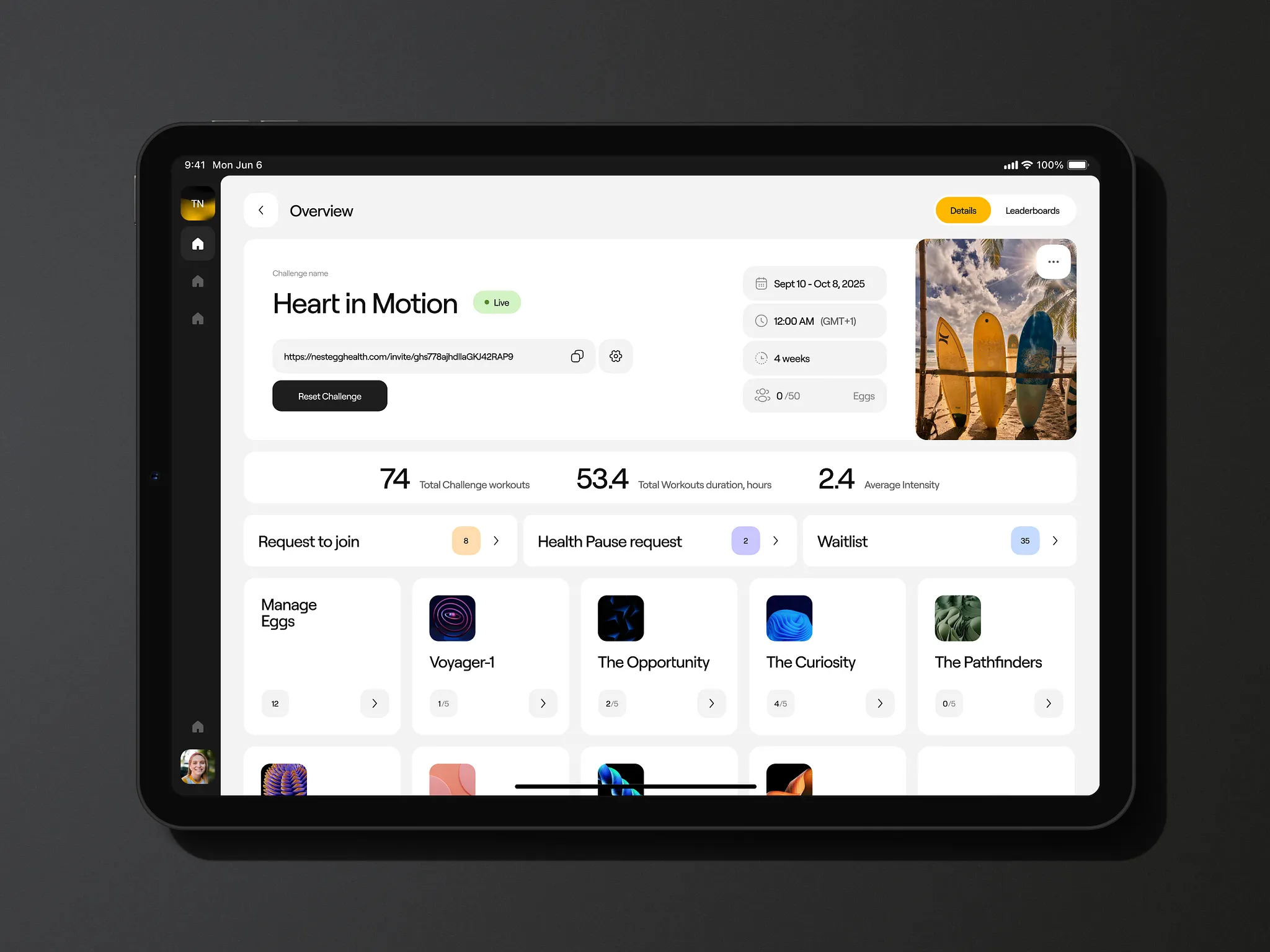
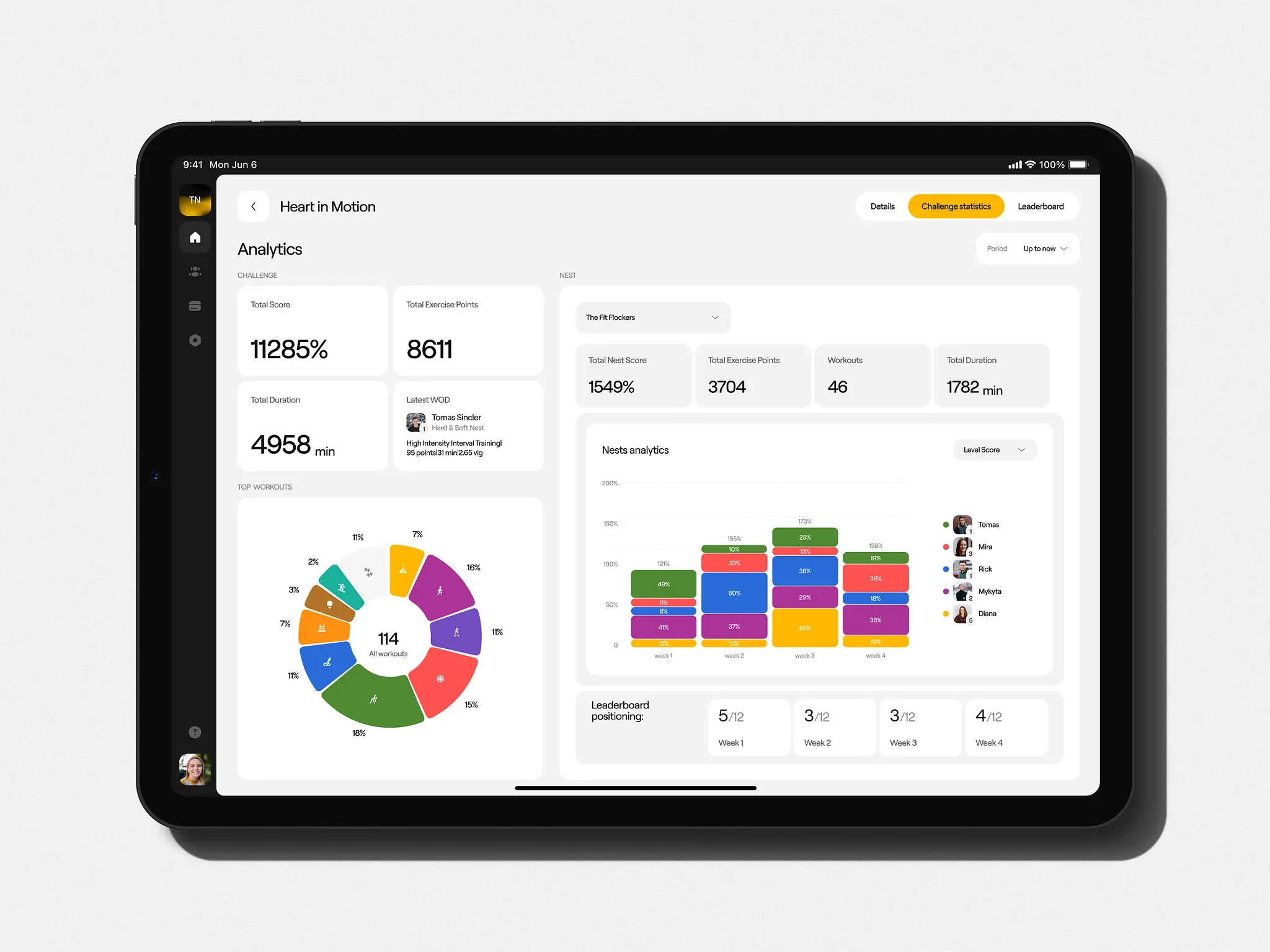
The project involved two connected surfaces: a mobile app for users and a web-based admin dashboard for HR managers. To ensure both felt like they came from the same place, we built a foundation of shared logic and consistent UI patterns.
The visual system was built around a high-energy yellow accent color, refined to carry the energetic and optimistic personality of the brand. A key design decision was the implementation of a full variable system to handle Light and Dark modes properly from the ground up. By using an atomic design approach, switching between themes became a seamless experience that avoided visual discomfort and maintained high contrast and readability.
What This Project Taught Us
NestEgg became an interesting experience sitting at the intersection of motivation, social dynamics, and digital architecture. Several key insights emerged:
- Systemic Foundations: Light and dark mode work best when built into the system from day one, making the final product more cohesive.
- Accessibility as Quality: Constraints like clear hierarchy and generous touch targets are what make an interface feel considered and polished.
- Shared Logic: Designing for different audiences—employees and managers—works best when you build a shared underlying philosophy, not just matching colors.
- Ongoing Collaboration: Staying embedded through two years of development ensured the product reflected design intent, not just design output.
Ultimately, NestEgg reminded us that great design and a good coach have a lot in common: the goal is always to make the next step feel possible. Turns out, designing for motivation is itself a motivating thing to design.
Recommended Reading
Design is a deep rabbit hole—and the best way to go further is to keep reading. Browse our other articles on UX, UI, and the decisions that make digital products work:
Zealous × TAS Case Study: Design Meets Purpose
The Glass Is Half Empty: How Apple’s Boldest Redesign Missed the Point
Drawing Attention: The Real Power of Illustrations in UI Design
Case Study: ABUK—Designing Ukraine’s Leading Audiobook Platform
Designing for Justice: Telling the Story of Jailhouse Lawyers