There are projects you take on for the portfolio. And then there are the ones you take on because they matter. The Alabama Solution was the second kind.
When longtime partner Zealous reached out about building an investigative subdomain for HBO’s documentary The Alabama Solution—a film exposing the systemic causes of inmate deaths inside Alabama’s prison system—we understood immediately that this wasn’t a branding exercise. It was a design problem with moral weight. One that demanded both restraint and ambition, often at the same time.
The Client
Zealous is a creative agency we’ve worked with across multiple campaigns, so the trust was already established. What was new was the subject matter: a full-scale investigative journalism platform built to complement Andrew Jarecki’s documentary, set to premiere on HBO.
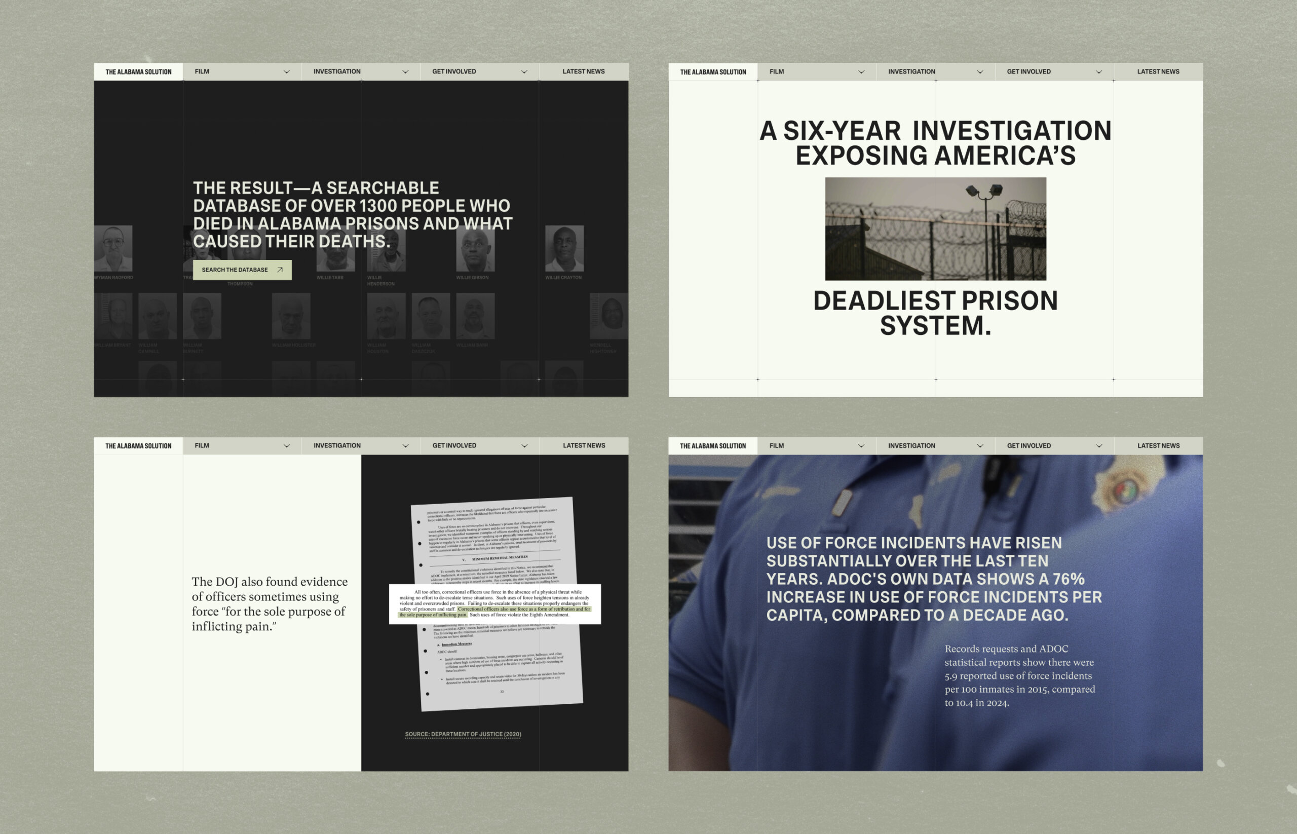
The subdomain needed to function as a standalone destination—a place where audiences could explore the investigation in depth without necessarily watching the film first. That meant handling an extraordinary volume of sensitive material: court records, medical examiner reports, and a private database of more than 1,000 individual cases, each representing a person who died inside the Alabama prison system. We were given access to all of it.
The scope was significant. The timeline—roughly one month—was not.
The Challenge
Designing around mass incarceration deaths is not like designing a product launch. Every aesthetic decision carries implications. Make it too stark and you risk feeling exploitative. Too polished and it reads as institutional. Too experimental and you lose the gravity the subject demands.
Our brief was clear in some respects and deliberately open in others: make it impactful, make it serious, and—because little had been locked down for the primary domain—bring new ideas to the table on style.
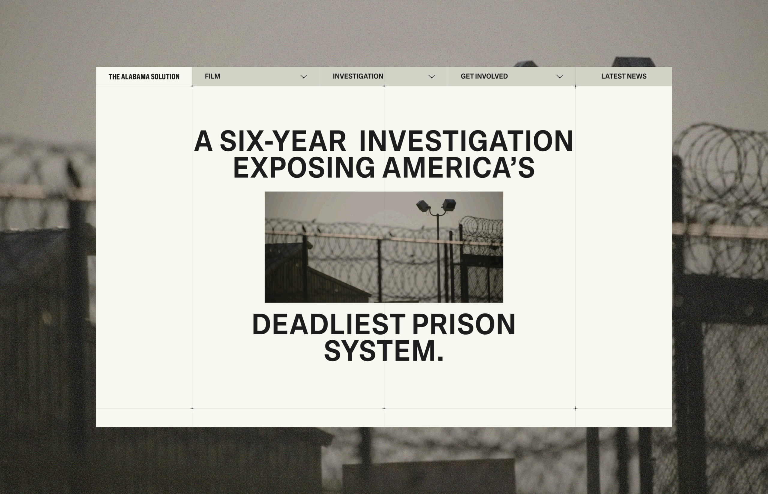
The site needed to house two core experiences: an Overview that mapped the full scope of the investigation, and a series of Findings pages—each dedicated to a specific cause of mortality—built quickly enough to launch in parallel with the film’s premiere.
We started with what we do when the stakes are highest: we ignored the safe path entirely.
First Instincts—and Why They Almost Stayed
Our initial direction was architecturally unconventional. Collaged imagery. Non-linear scrolling that mixed vertical and horizontal movement. Text animations with real personality. A “Death Wall”—a sprawling visual grid giving each of the 1,000+ individuals their own presence on screen—executed with a zoom-out reveal that felt more like a reckoning than a UI pattern.
Zealous’s team loved it. More than that: they found the visual language compelling enough to begin adapting their own primary domain to match our approach. That’s a rare thing—a client so moved by a subdomain’s direction that it reorients the parent project.
Development began before design was fully locked, because the timeline demanded it. Over roughly four weeks, the team built out an intricate first version: scroll-triggered graph animations, hero video sequences that split the title typographically, layered interactions that made the investigation feel alive rather than archived. It was the kind of work that earns quiet satisfaction at the end of a late night.
Then the director saw it—and wanted something different. Simpler. More restrained. A design that wouldn’t risk overshadowing the film or aestheticizing a tragedy that deserved sober treatment.
It’s a direction we understood and respected. The subject matter carries real weight, and meeting a client exactly where they are—even when it means releasing ideas you believed in—is part of the work. We adapted quickly, leaned on the trust we’d built with the Zealous team, and focused our energy on identifying what was worth fighting for within the new constraints.
The design simplified. But it didn’t surrender entirely.
What We Kept—and Why It Matters
There’s a specific discipline in knowing which ideas to fight for when you’re losing ground on others. We held onto what we believed would make the final product feel genuinely authored rather than assembled.
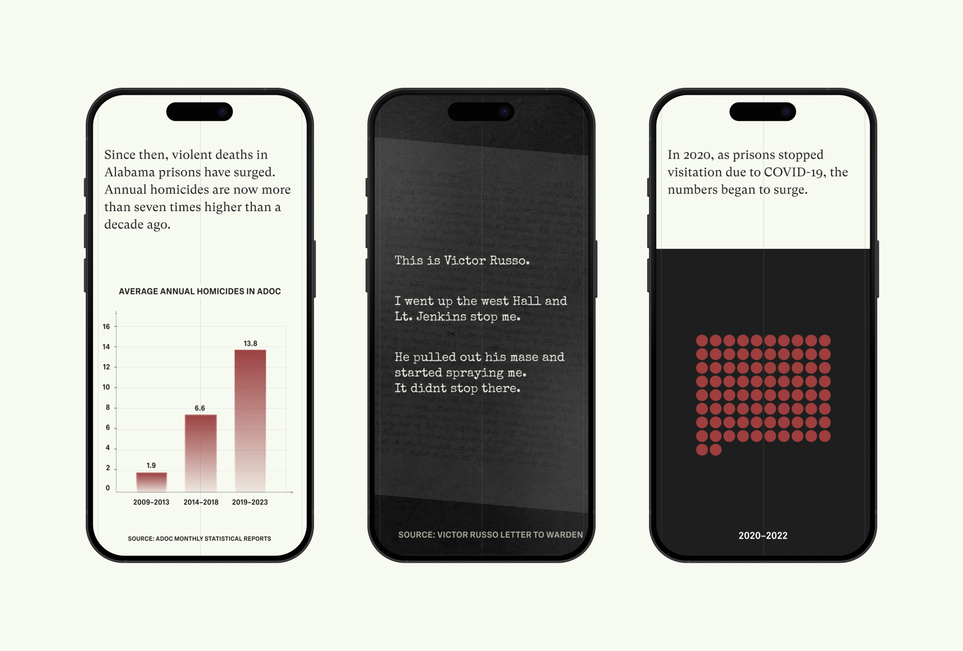
The hero section animation—where video footage splits the headline typographically—survived. So did the zoom-out reveal on the Death Wall, which transforms a single photograph into the full grid of lives lost. The scroll-triggered graph animations on the Findings pages stayed. On the Deaths from Suicide page, an animated dialogue sequence reconstructs a real exchange as the user scrolls—a piece of storytelling that earns its complexity. On Deaths from Officer Violence, fragments of a handwritten letter from an incarcerated person animate into view, preserved in their original hand as requested.
These weren’t decorative decisions. Each one was an argument for treating the audience as capable of holding difficulty without having it simplified away from them.
The four Findings pages—each built in roughly one to two weeks—were designed to feel structurally similar without becoming repetitive. Shared scaffolding accelerated development; deliberate variation in execution kept each one distinct. We also ran an informal design review for a developer on Zealous’s side who was encountering issues with their portion of the build. That kind of collaboration—unplanned, uncompensated in the traditional sense—is something we believe in.
What This Project Taught Us
Some projects change how you think about the work itself.
Designing around real human tragedy demands a different kind of attention—slower, more deliberate, more ethically considered. It sharpens your instincts for what actually matters versus what just looks good in a presentation.
We also learned that simplification isn’t the enemy of good design. The constraint became the creative challenge: when the canvas narrows, you find out which ideas were truly essential. The ones worth protecting reveal themselves quickly—and holding the line on those, with precision and clarity, is its own form of craft.
In Closing
The Alabama Solution launched before the film’s premiere. One Finding went live instead of six—a deliberate scope constraint made under pressure, and the right call given the timeline. The film and the broader investigation received Oscar nominations and recognition across award circuits. The site lives as part of that record.
We didn’t ship everything we built. We rarely do, on projects that matter this much. What we shipped was careful, honest, and built with the kind of attention the subject demanded.
Sometimes that’s enough. Sometimes that’s everything.
Recommended Reading
Enjoyed this one? Make sure you take a look at our other case studies, too:
Malloy Banks Case Study: Clarity Over Compliance
Immediate Case Study: Rethinking Payday
FarmSense Case Study: Fields, Sensors, and System Thinking