
I was watching WWDC 2025 when Apple unveiled Liquid Glass, and I caught myself smiling. The way you do when someone you deeply respect says something you can’t quite believe they said.
I’ve followed Apple’s design thinking closely for most of my career—not obsessively, but the way any designer does when a company keeps producing work worth studying. The restraint, the sequencing, the almost theological commitment to the idea that the best design gets out of the way. So when I saw Liquid Glass—iridescent, refractive, undeniably gorgeous — my first reaction was a question.
Why now?
With Apple, that question always had an answer. And a good one.
The first iPhone did more than popularize multi-touch—it put the internet in your pocket at the exact moment the world was ready to live there. Skeuomorphism—endlessly mocked in retrospect—was actually a masterpiece of onboarding psychology: a notepad that looked like paper, a bookshelf that looked like wood, a calendar with page-turn animations. For an entire generation encountering a smartphone for the first time, the familiar aesthetic lowered the anxiety of the unfamiliar technology. It was empathy, disguised as design.
Then iOS 7 arrived in 2013, and Apple pulled off something harder, convincing a now-mature audience to let go. Retina displays had made skeuomorphism look strange—all that texture and shadow designed to breathe and blur, suddenly rendered in unforgiving clarity. The flat redesign was a precise response to a precise moment. The audience had grown up, the screens had grown up, and the design grew up with them.
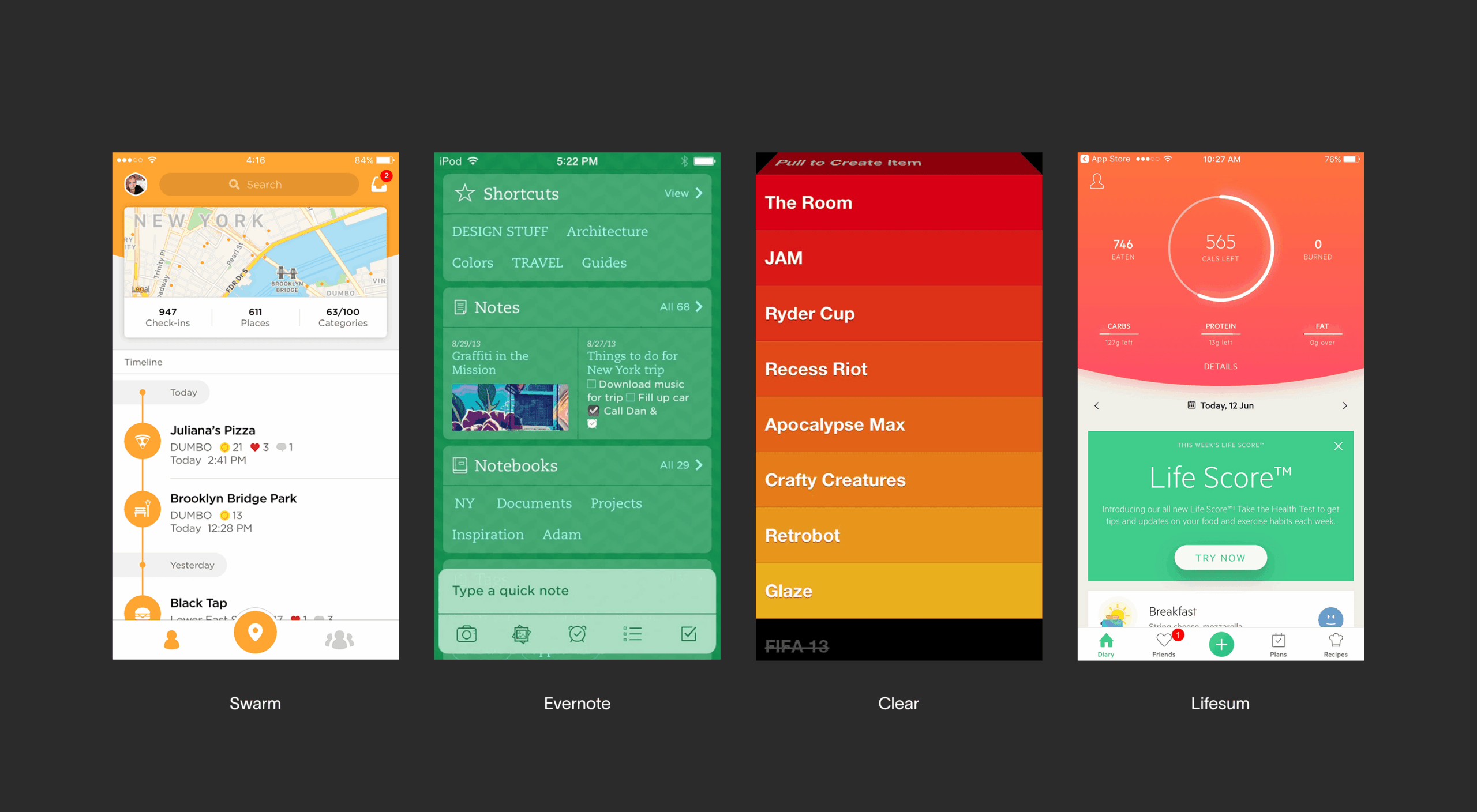
Early flat design interfaces
Every major Apple visual shift had a because. A real one. Liquid Glass, however, has no such answer. The best case I’ve heard for it is that it looks beautiful. And beautiful, for a system used by a billion people to navigate their actual lives, is simply not good enough.
The Uniform Nobody Asked For
iOS 7 was, among other things, an act of liberation. Flat design cleared the canvas. Color, typography, motion, and interaction became the instruments of differentiation. Apps stopped looking like objects and started looking like themselves. For designers, it was the moment we got a seat at the table—brand identity could now live in the functional layer too, besides the decorative one.
Liquid Glass reversed that. Quietly and systematically, it issued a uniform.
When every navigation bar, every button cluster, every card and panel is draped in the same iridescent material, the material becomes the loudest voice in the room. Your brand identity—the color you spent months perfecting, the typographic personality that took years to earn, the interaction character that makes your app feel like yours—all of it gets dressed in Apple’s outfit.
Look at what happened to Crumbl in Apple’s own showcase. That specific, ownable pink—the pink that is the brand—dissolved into the glass. What remained looked like a Crumbl app the way a hotel lobby looks like home: structurally correct, personally absent.
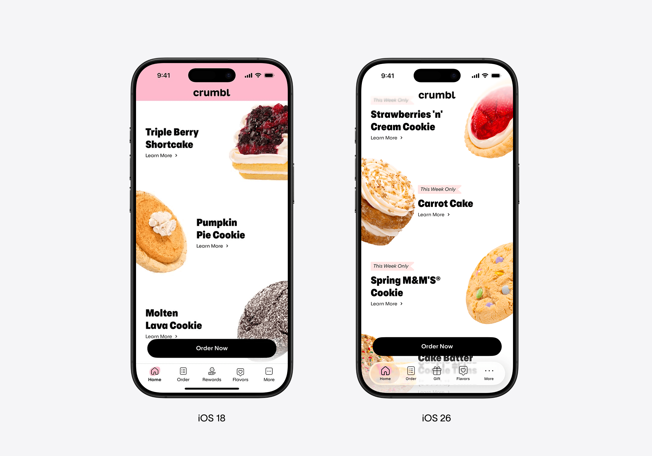
Crumbl’s homescreen, before and after
TikTok’s iconic center button—that particular shape, that particular energy—hasn’t been adapted to Liquid Glass. And I don’t think that’s an oversight. Someone made a decision: our identity is worth more to us than your system coherence. We built something people recognize, and we’re not trading that for the aesthetic of the season.
TikTok’s tabbar
And they’re not alone in that refusal.
The Silence Is the Review
Let’s talk about Dynamic Island. When Apple introduced it in 2022, the developer community moved fast. Within months, apps were using it creatively, expressively, and competitively. Spotify used it for Now Playing, sports apps put live scores in it, navigation apps made it feel like it was always supposed to be there.
Dynamic Island gave developers a new surface. A place that was previously nothing—a hardware compromise, an empty space—suddenly became real estate. It said: here’s something new, do something fun with it. Meanwhile, Liquid Glass takes over the surfaces you already had, and says: here’s how everything looks now.
One is an invitation. The other is a mandate. And the industry, apparently, knows the difference.
As I write this, Netflix hasn’t updated. Neither has Airbnb, Uber, or Reddit. These are companies whose entire business runs through the App Store. Companies with design teams, design systems, and strong design opinions. Companies that understand the political cost of ignoring Apple’s guidelines, and choose to ignore them anyway.
This is a coordinated, unspoken verdict from the people whose judgment actually matters—the companies that built their products on Apple’s platform and are now quietly declining to wear the uniform.
Nielsen Norman Group—the closest thing the UX industry has to a supreme court—published a detailed analysis documenting exactly what’s breaking and why. Translucent controls obscuring content. Tap targets shrunk and crowded. Navigation that collapses unpredictably. A back button that no longer tells you where you came from.
The industry responded in kind. Linear wrote openly about reinterpreting Liquid Glass rather than adopting it, because adoption meant sacrificing clarity. GO Club, App Store Award finalists, built a toggle in their settings letting users switch between the native tab bar and a custom one. Didn’t write a post about it, didn’t say the native version was worse, just gave people an exit.
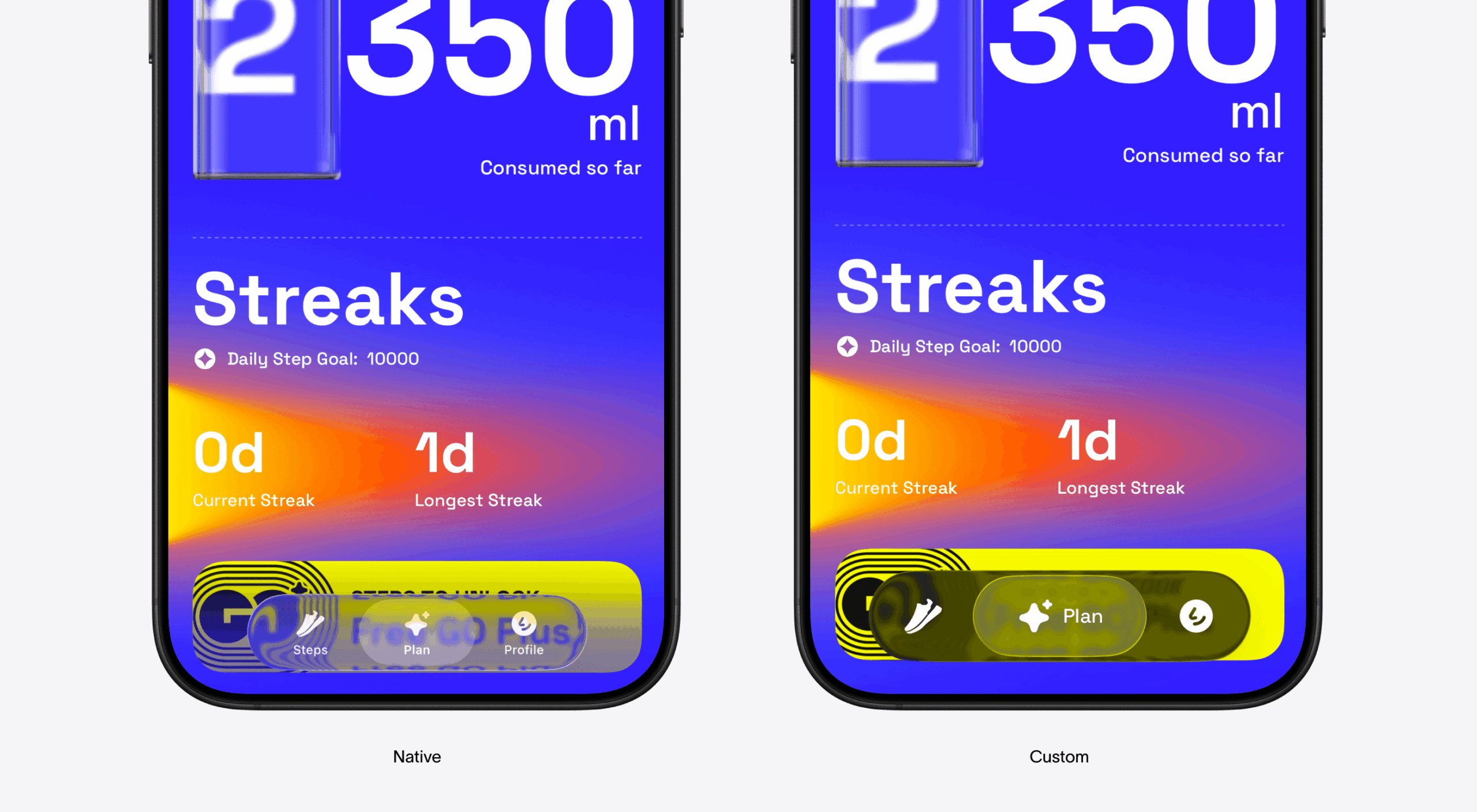
Go Club’s tab bar options
Beautiful Work. Uncertain Vision.
I don’t believe Liquid Glass is the product of bad designers. Apple employs some of the most talented people in the industry, and the technical execution of the material—the refraction, the light physics, the animation behavior—is genuinely extraordinary. This is hard to build and they built it beautifully.
What’s missing is conviction.
The Apple that gave us iOS 7 had a design leader with a point of view so strong it was almost uncomfortable. Jony Ive made decisions that felt inevitable in retrospect because they were rooted in a coherent philosophy, not a response to accumulated pressure. When he left, that philosophical gravity went with him. What fills the vacuum, eventually, is exactly this: ten years of incremental refinement suddenly exploding into something spectacular and directionally uncertain.
Liquid Glass reads less like a vision and more like a release valve. A decade of “we should probably do something big” finally detonating in the most visually impressive way available. The craftsmanship is Apple. The reasoning is not.
What Comes Next
iOS 27 is a few months away, and I’m watching for one thing: not whether Apple doubles down on the material, but whether they give brands room to breathe within it. The difference between a design system and a straitjacket is the degree to which it enables identity rather than replacing it.
The people who designed Liquid Glass aren’t wrong to want something new—ten years of incremental refinement on a single visual language is a long time. The pressure to make a statement was real, and every designer understands the feeling. Sometimes you’ve just been polishing the same surface for so long that you need to break it just to feel like you’re moving somewhere.
But there’s a version of breaking things that opens new doors, and a version that just leaves you with broken things. Dynamic Island was the former—a constraint that became creative permission. Liquid Glass, right now, feels closer to the latter.
The material is beautiful. That makes it even more frustrating. Because beauty without function isn’t design philosophy, but decoration. And Apple, of all companies, used to know the difference.
The brands waiting it out are giving Apple a chance to remember that. They’re not leaving the platform, not publishing open letters. They’re just standing still, holding their identity, watching to see what comes next.
If iOS 27 gives brands that room, the holdouts will move quickly. If it doesn’t, the silence will get louder.
And at some point, a silence that large stops being a critique.
And becomes a verdict.
Recommended Reading
Still thinking about it? Good. We write more about design systems, product logic, and the tiny choices that end up defining entire experiences:
User Experience: Insights Into Consistency in Design
Drawing Attention: The Real Power of Illustrations in UI Design
Case Study: ABUK—Designing Ukraine’s Leading Audiobook Platform
SPYLT Case Study: Delicious by Design