
The first time we saw SPYLT, we weren’t entirely sure what it was—we just knew we wanted in.
A high-protein milk drink with a shot of caffeine, wrapped in a brand that looked like it listened to hyperpop and did Pilates at 7am. It wasn’t trying to explain itself. It just existed—confidently, strangely, and unmistakably aimed at people who get it.
So we listened. Then we started building.
The challenge wasn’t to make a site that shouts. It was to make one that moves like the product—smooth, precise, a little unexpected. A scroll that carries flavor, not just information.
And that’s where the real design work began. Not in the brand assets, not in the brief—but in the decision to tell a story one scroll at a time.

The Brief
SPYLT came in hot, already gunning for the Awwwards Site of the Day. No pressure.
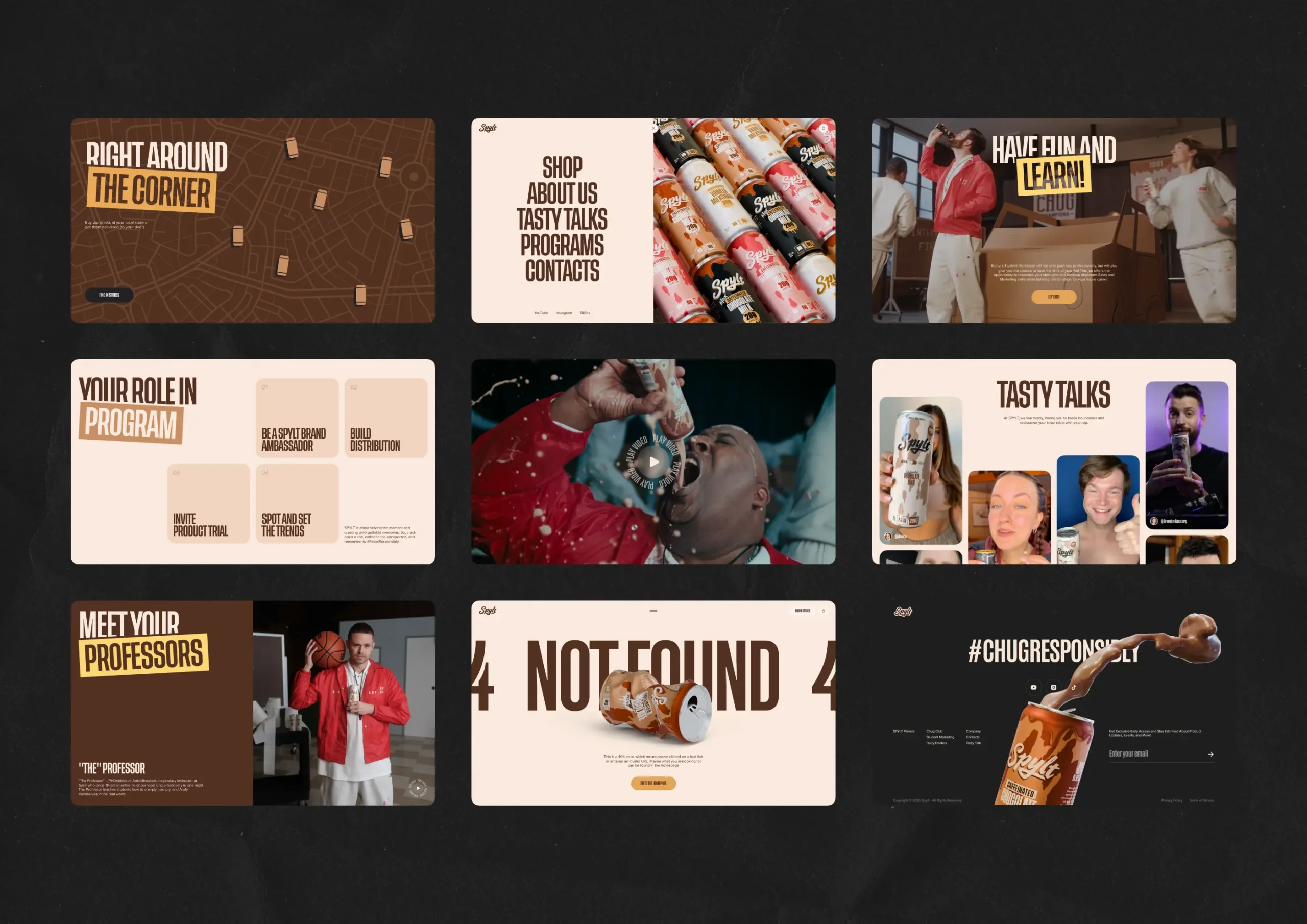
But the project itself didn’t need a reinvention—it needed a container. One that could hold its energy without spilling it. The assets were already on the table: a bold logo, a palette that looked like a fridge shelf (vanilla, chocolate, strawberry, beige), and a gallery of product shots that looked too tasty to scroll past on an empty stomach.
Add to that a series of playful, high-energy promo videos—like SPYLT Academy, a fictional institution where adults reignite their spark through cartoon chaos and caffeinated milk—and you get a brand that feels loud, light, and alive. But beneath all the movement lived something more grounded: a system of forms, flows, and programs—Chug Club, Dairy Dealers, Student Marketing, and yes, SPYLT Academy itself—each designed to grow a real community. The job wasn’t to shout over it. It was to shape it.
The only thing missing was the experience. The flow. The thing that turns stacked ingredients into appetite. So we built it. A scroll-first, mobile-native, fully responsive eCommerce system—one where flavor isn’t a category, it’s a whole event. No rebranding, no distractions, just a fast, deliberate translation of product into motion.
What We Did:
→ Design and develop a scroll-first eCommerce site
→ Make it sell the product and the personality
→ Integrate Amazon Buy with Prime
→ Optimize for mobile and performance
→ Reuse existing assets—no new branding, just bring it to life
Building the Scroll
We wanted SPYLT’s site to feel like you’re drinking it. One continuous pour, no hard stops, no disjointed clicks. Each scroll became a beat—a mini story. Intro. Flavors. Benefits. Video. Reviews. Store locator. Linear, but alive.
The UI/UX team, including Diana Krupa, Vlad Taran, and Anton Morozov, dove in with a Pinterest board full of poster designs and a cracked tab full of site bookmarks. There was no need to reinvent the grid, but we did need to mess with it a little.
The flavor backgrounds did most of the heavy lifting. Full-screen brown for Chocolate Milk, Bright pink for Strawberry Milk, and even beige—we embraced them all.
The taste carousel was where the structure broke character—designed to feel like a swipe through something personal. A tasting menu, with layers and animations. Equal parts delight and information. Tap, scroll, read, crave.
No bells or whistles, only a clear goal: make the site feel like the product—smooth, satisfying, and full of something you didn’t expect to like this much.
The Visual Layer
Every detail had a job. The “Chug a SPYLT” button came with a chocolate drip animation—triggered on hover, subtle but tactile. Microinteractions were everywhere, but they knew when to calm down.
We used the product’s own color palette as a visual navigation tool. You scroll, and the flavor changes. Like a palette cleanser between sections. No popups. No distractions. The scroll is the navigation.
Typography was another star of the show. SPYLT’s “Freaking Delicious” header was a statement. Bold, saturated, confident in its weight. We didn’t edit it down, we let it speak at full volume.
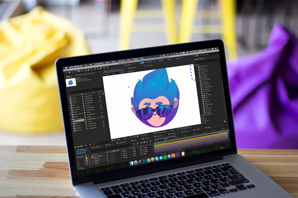
Arthur Avakyan, our graphic designer and illustrator, joined once the main visual system was set. His task was to make the icons feel alive. Stock-y options weren’t cutting it, so he gave them warmth. No one asked him to make the cow icon look so friendly—it just happened. Those are the details most people won’t notice, but no designer forgets.
Motion as Muscle
Scroll-triggered animation sounds simple until you try making it feel like choreography, not a slideshow. For SPYLT, we relied on GSAP to sync motion with scroll position: headlines that scale, sections that shift, and the rhythm that follows your hand, not the other way around.
The hardest challenge was the circular video reveal. What now looks like a smooth, expanding mask was, in reality, a scaling animation layered over a radial mask, precisely tied to scroll speed. Every pixel had to move with purpose.
To preserve transparency across browsers, we rendered in dual formats: WebM for Chrome, HEVC for Safari. That meant separate encodings, separate tests, and a checklist of edge cases that kept getting longer. We handled it—not because it was easy, but because performance isn’t optional.
Customer reviews were animated as flashcards, sliding into view with controlled inertia, creating rhythm without overwhelming the page. All scroll-triggered. All tied to pacing. The goal wasn’t to show off—the design had to breathe.
Motion Designer Andriy Drobovych joined to animate key 3D moments—starting with a series of milk splash simulations, capturing the moment SPYLT bursts open with energy, as if the product itself couldn’t wait to get out. Then came the 404 page, where an empty SPYLT can comes into view, crushed and tossed aside like it just got chugged. A subtle reminder that even dead ends can have flavor.
Ivan Shvindin, our front-end developer, spent hours wrestling with performance constraints. On mobile, scroll-synced motion gets unpredictable fast. So we pushed for modular animation blocks, limited the use of JS-heavy transitions, and offloaded effects to CSS where it made sense.
Animations were tested across screen sizes and interaction models. When in doubt, we benchmarked framerates, preloaded assets, and trimmed every excess byte. Even the “Chug a SPYLT” button’s drip effect—built with a Lottie file tied to hover—had to be vetted for load impact.
Image assets were compressed to WebP, video carefully balanced between size and clarity, and media preloading prioritized based on scroll depth.
In other words: yes, it’s smooth. No, it didn’t come easy.
Seamless by Default
Integrating Buy with Prime came with its own set of constraints—and negotiations, recalls Nick Zhuravlov, who managed the project. The feature brings rules of its own, including a massive default banner stuck to the bottom-left “Add to Cart” button. Visually? It clashed hard with SPYLT’s aesthetic. Functionally? It blocked flow. So we put our best negotiator hats on, went back and forth with the Buy with Prime team, and pushed for a version that respected our design system. And we mostly won. The goal was clear: deliver a fast, familiar checkout flow through Prime, while preserving the integrity of our interface.
Customization options were limited, but instead of compromising, we adapted the product page architecture to incorporate the native Prime elements cleanly. We reworked spacing, layered content intentionally, and made sure the experience felt integrated—not dropped in.
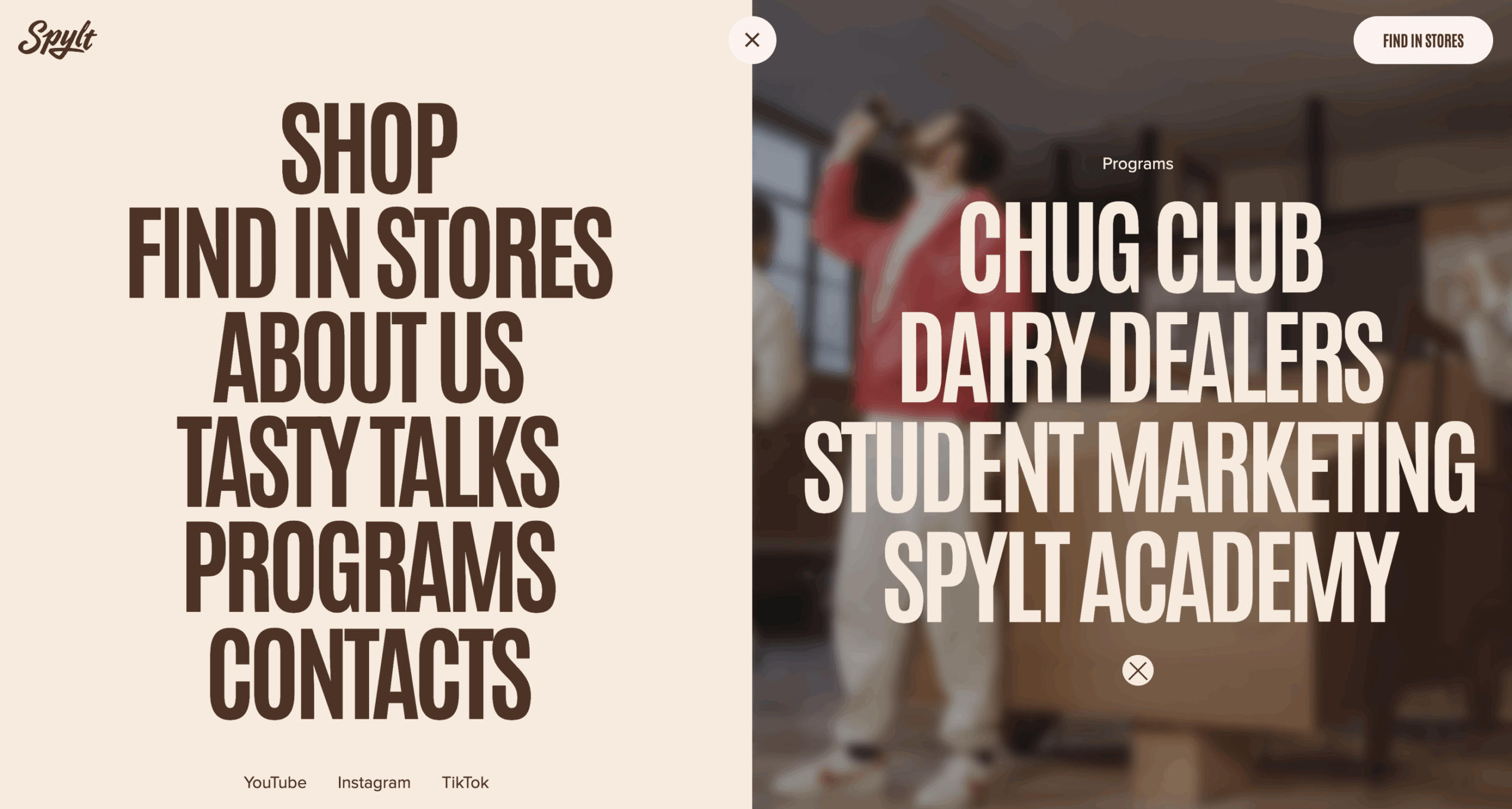
Meanwhile, those community programs came with their own technical needs. We built a scalable form and automation system to support it—first using Webflow’s built-in logic to route submissions and emails, and later moving to Zapier for more control across multiple flows and touchpoints. Whether someone was joining Chug Club or applying as a Student Marketer, the system had to hold.
UX-wise, every state was tested: cart open, cart closed, user halfway to checkout and back again. We watched what happened when someone added a bottle, forgot it, then scrolled back two sections and changed their mind. Same with the forms—we tested dropdowns, inputs, confirmations, misclicks. Whether it was mobile or desktop, slow Wi-Fi or 4% battery, the interface held.
Because if there’s one thing we believe in, it’s this: Elegance isn’t in control. It’s in composition. And even when the tools are locked, the experience doesn’t have to be.
The Launch
SPYLT went live with flavor, function, and scroll to spare—and the web noticed. It got picked up by Awwwards, earning both Site of the Day and E-Commerce Honors. Good Design Award gave it a nod. And the GSAP team featured it as a showcase of what scroll-triggered interaction can really do.
But behind all that, it’s still more than a product site. Yes, it sells something strange and specific—protein milk with caffeine—but it also supports a growing set of community programs. Each with its own logic, flow, and form. From drop surveys for Chug Club to campus activation signups for Student Marketing, every interaction needed to work—and scale. So we made sure it did.
That’s the part we’re proud of. Not the fact that it moves, but how it moves.
Because great digital experiences aren’t about tricks or how many colors are in your palette. They’re about pacing, intuition, and trust in the details—from flavor-coded backgrounds to a button that drips when you hover.
With SPYLT, we didn’t build a site.
We built a pour.
And it flows exactly how we wanted.
Liked This One?
Explore more case studies from the Tubik Studio playground—where product, motion, and design logic meet:
Hyperion Case Study: A Production Powerhouse Reimagined
Case Study: Adam Braun. Creating Personal Website for Entrepreneur
Case Study: UClay. Identity and Packaging Design for Ceramics and Pottery Brand
Case Study: 1260. Wine Brand Packaging Design with Medieval Vibes
Case Study: Paris City Guide. Illustrations and Web Design for Tourism