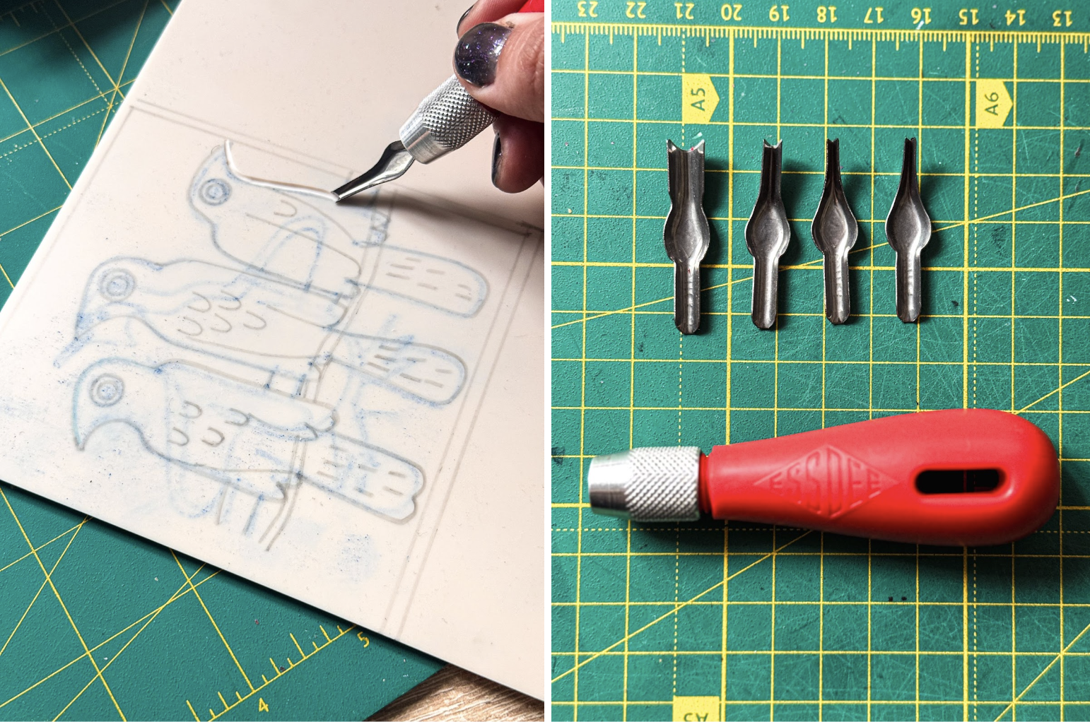
The bird came first.
A loose watercolor sketch from a vintage bird atlas, imperfect on purpose. That’s where linocut starts: with something alive and real. Then, you carve.
Watching the image appear through mistakes, pressure, and ink, I realized this process teaches more than aesthetics. It teaches us intent, constraints, and the value of what’s real over perfect.
And those lessons translate surprisingly well into product design.
Lesson 1. Design with intent
Every mark you make will stay. There’s no ⌘Z in linocut—only you and your decisions. Scary, huh? But also, freeing.
In a world of infinite digital edits, linocut trains your eye to design with your gut, not a color picker. It’s basically a crash course in visual hierarchy. You start asking: what needs to be here? What can I carve away?
Try applying this mindset to your next UI—strip your layout down. If a button’s fighting for attention, ask yourself why it’s yelling. If an element doesn’t guide the eye, maybe it doesn’t belong there at all?
Lesson 2. Embrace Constraints
Vector is easy to love. It’s clean, scalable, and oh-so-safe. For those exact reasons, it’s also easy to forget. When you can do anything, it’s harder to create something that sticks.
The beauty of linocut lies in its limitations, and that’s exactly why it works. It’s about what you mean, not just what you can make with all those cool Figma plugins you have. The result is an aesthetic that feels grounded and human, especially when digitized. Scanned linocuts bring a layer of warmth to landing pages, onboarding flows, and even app illustrations. Suddenly, everything feels less manufactured, more made.
Try this: When building a product illustration or layout, experiment with giving yourself visual constraints—like using only two fonts, one color, or no gradients. That’s how your brain switches from decorating to designing.
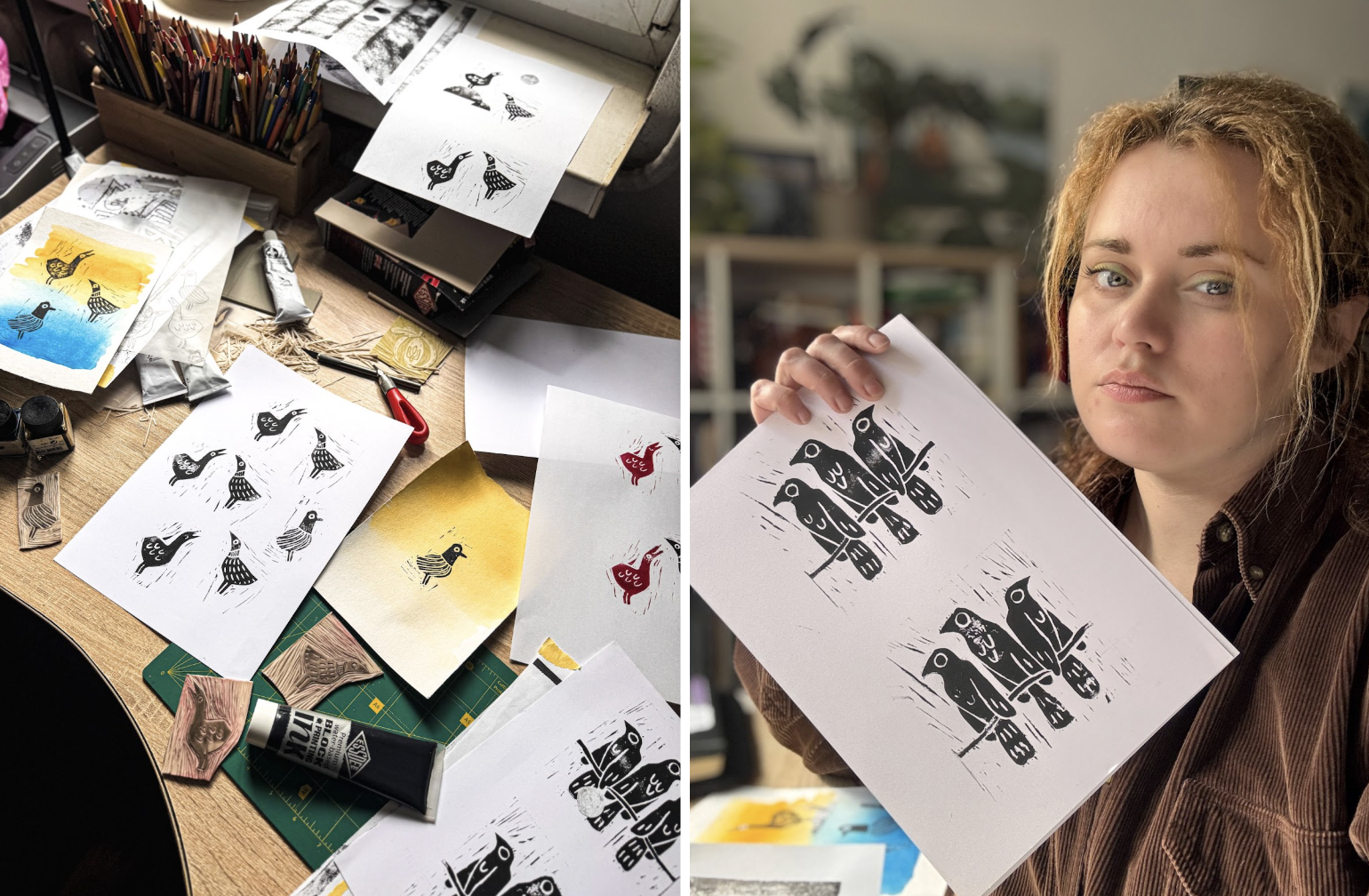
Lesson 3. Real > Perfect
The bird linocut you see here wasn’t made for a gallery wall or an art book. It was made for a website. And that’s what makes it special.
We’re surrounded by visuals that are technically perfect and emotionally empty. Generated in seconds and stripped of process. AI art fills the space, but it rarely leaves a fingerprint. It doesn’t commit, doesn’t care, doesn’t make mistakes worth keeping. The results are polished, yes, but also interchangeable, eerily sterile.
Linocut doesn’t do sterile. It tells a story that makes your digital product feel crafted, not generated. Which gives the authentic, human touch to a digital world that’s starting to feel increasingly anonymous.
So next time you need an illustration, step away from the screen.
Grab a blade. Start carving.