There’s a level of dishonesty in most juice branding. The photography is green and aspirational. The typography whispers “wellness.” The whole thing feels less like a drink and more like a lifestyle correction.
Joossi had a different instinct. Life is already bright—the brand just needed design that remembered that.
When the Tubik team sat down with this project, the brief wasn’t complicated: make people feel something. Not healthy. Not virtuous. Alive. Juice that makes your day better, not your diet more austere. That single emotional truth—liveliness, cheer, the small electricity of a good morning—became the gravitational center around which every design decision orbited.
![]()
The Logo Does Something Clever
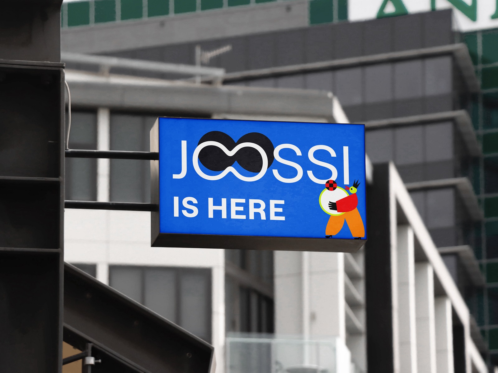
The wordmark is deceptively simple: clean, unpretentious sans-serif, the kind of type that doesn’t make you work. But look at those two O’s. They share a wall. Two letters, one shape—a small sleight of hand that rewards a second glance without demanding one. Recognizable at a billboard’s distance, interesting up close. That’s the ideal logo. It doesn’t shout. It’s just unmistakably itself.
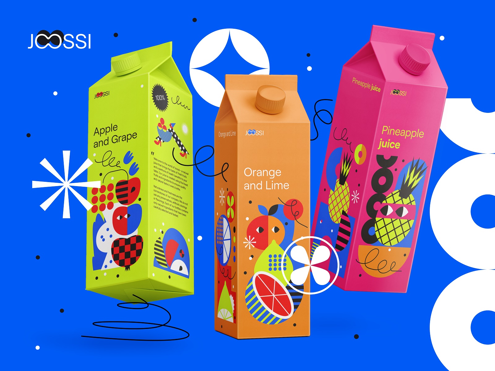
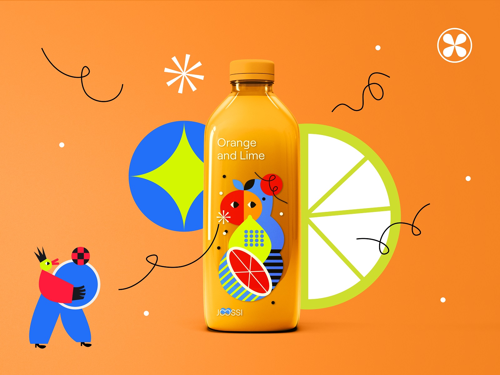
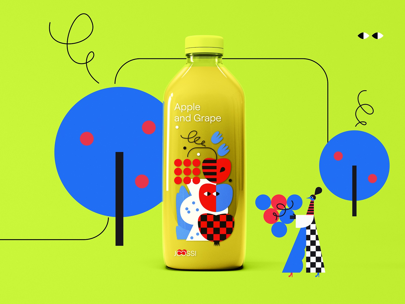
A Universe, Not a Style Guide
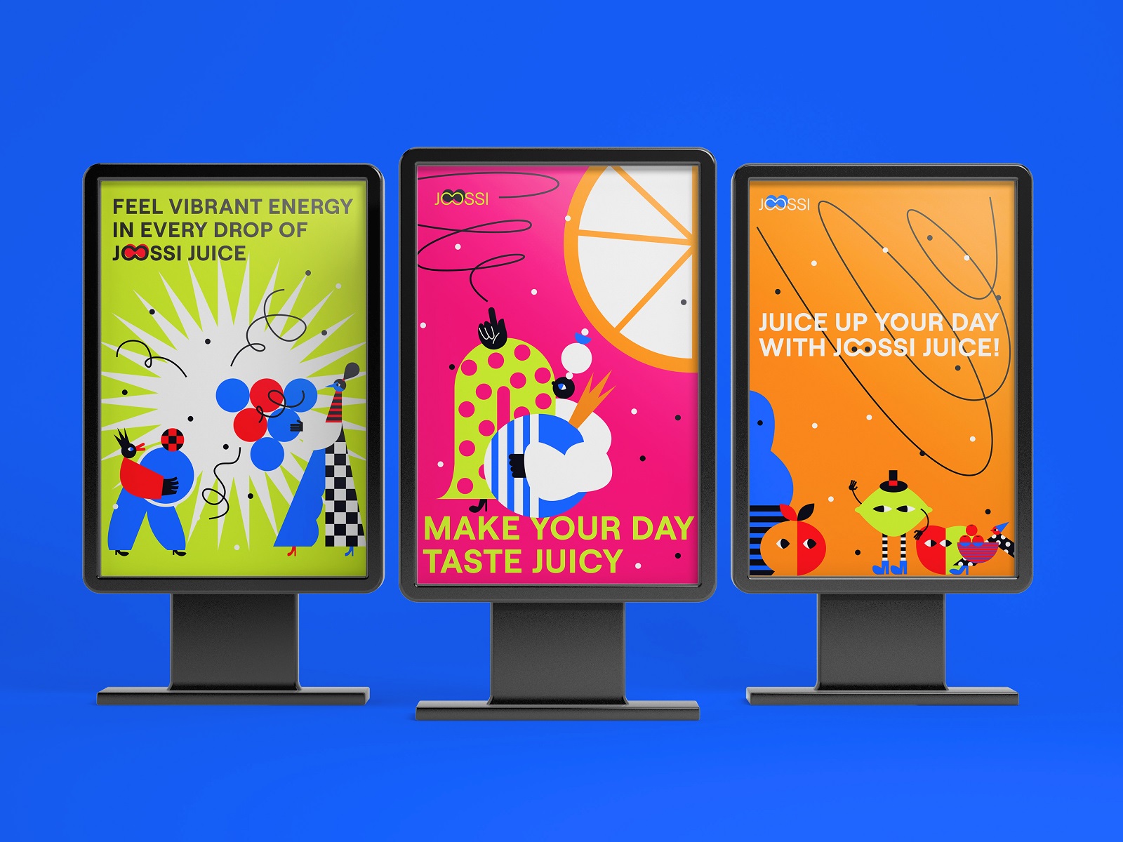
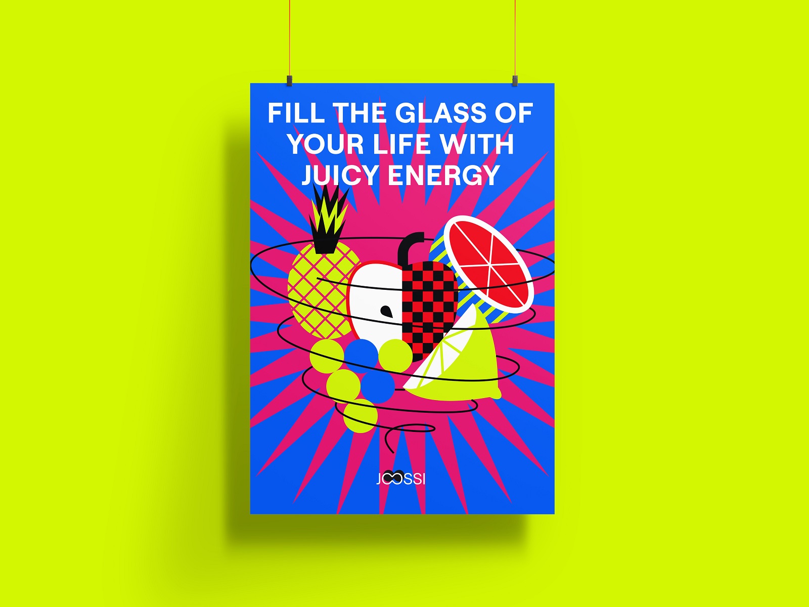
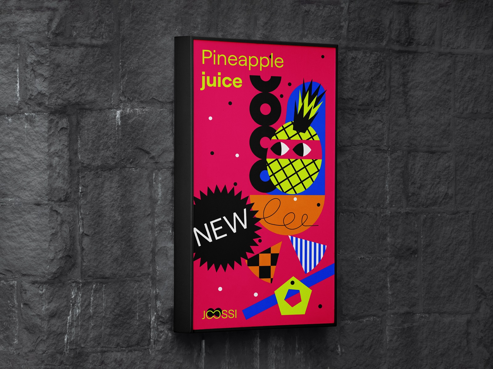
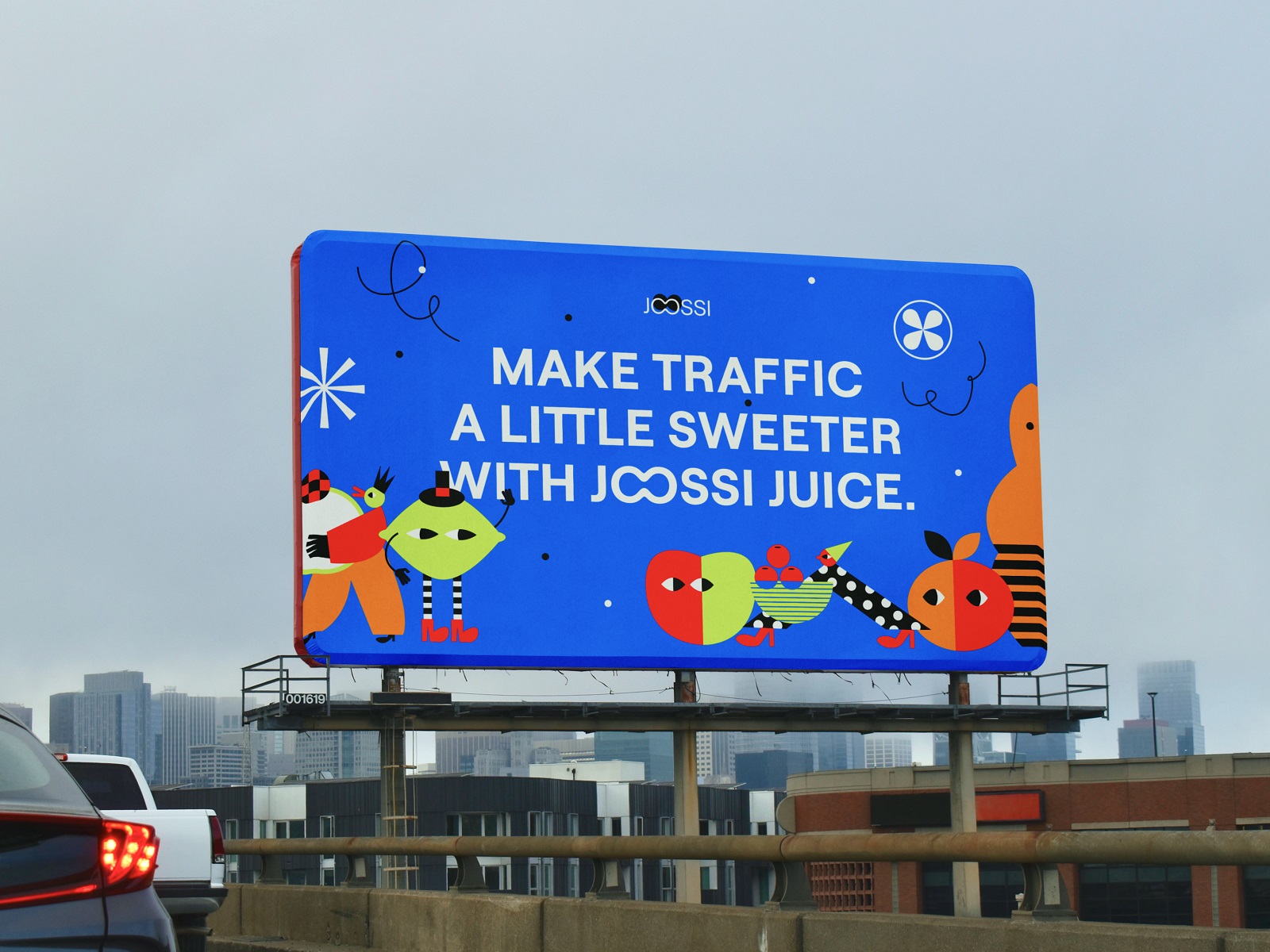
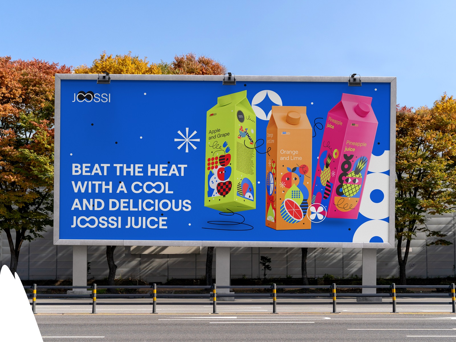
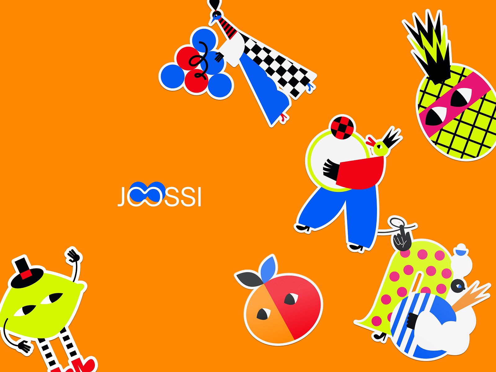
Here’s where the project went somewhere genuinely interesting. Rather than applying illustration as decoration—the visual equivalent of a garnish—designers Roman Chornyi and Yaroslava Yatsuba, under art direction by Sergii Valiukh, built a complete cast of geometric characters. A whole world of funny little shapes with personality.
This matters more than it sounds. When visual identity works as a system, it stops being brand materials and starts being a place. Customers don’t just see a juice carton; they recognize a universe they’ve visited before. On the carton. On the bottle. On the street sign. On the billboard at the bus stop on a Tuesday morning when they needed exactly that kind of thing.
The palette earns its keep too: vibrant, multicolored, drawn directly from the frank honesty of fruit. Not fruit-inspired. Fruit-accurate. Mango orange that means it. Berry purple that commits.
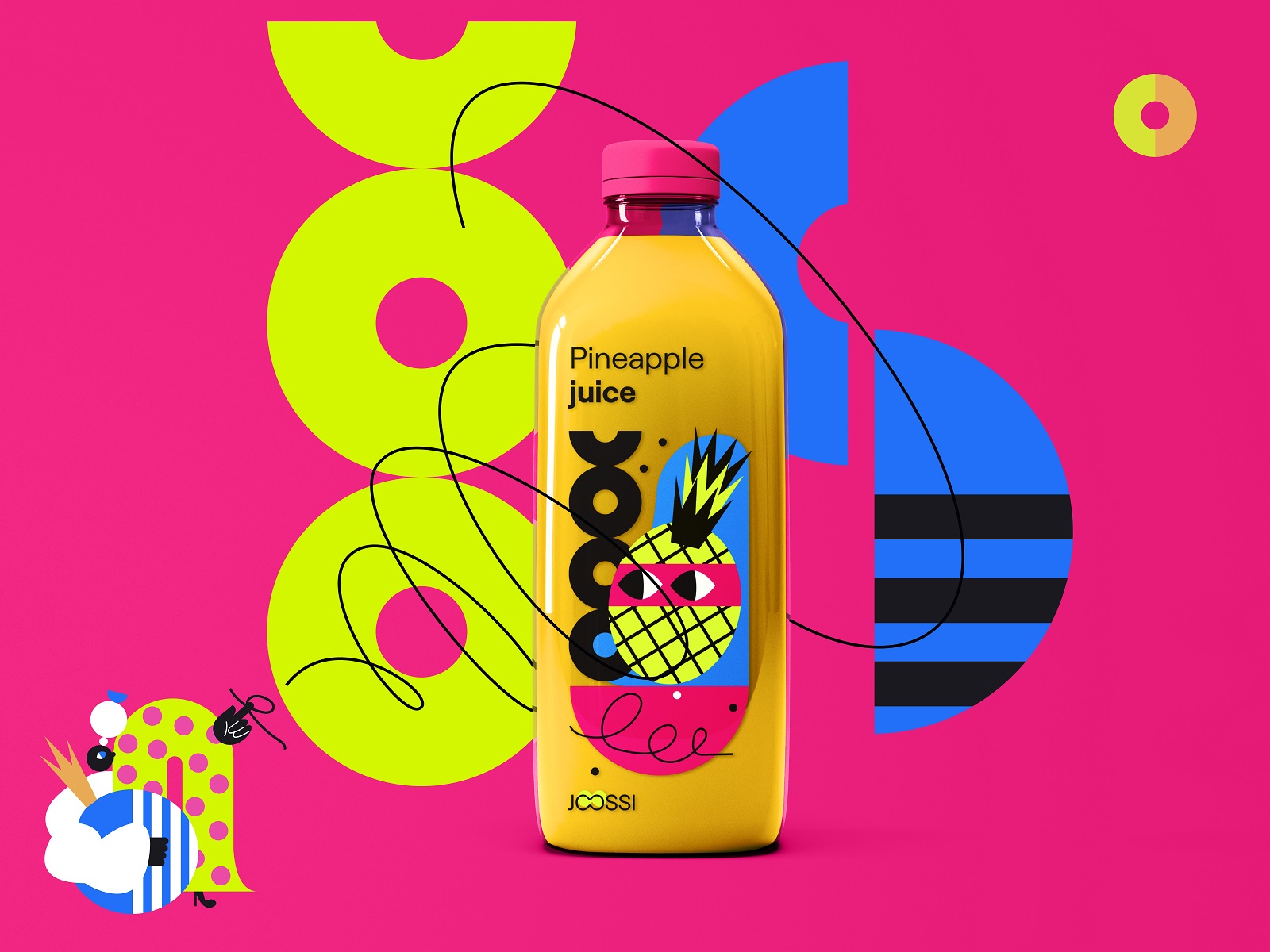
When Everything Extends
The same illustrative logic traveled across the full identity—outdoor advertising, indoor posters, stickers, a landing page template. Not adapted. Extended. There’s an important difference. Adaptation means making things fit. Extension means the system was big enough to stretch and hold its shape.
That’s the quiet ambition of good brand design: build something alive enough to grow.
What This Means for You
If you’re building a brand, the central question isn’t “what should our logo look like.” It’s “what should people feel when they encounter us—at the shelf, on the street, on a screen at 7am.” Design is just the answer made visible.
Joossi wanted to add a little brightness to everyday life. The work had one job: make that true before a single bottle was opened.
We think it does.
More Design Case Studies
Check out other case studies sharing the design solutions and approaches for some of the design projects done by the Tubik team:
Pizzatta. Artistic Pizza Packaging Design
Page Turner. Identity and Packaging Design for Bookstore Chain
Nibble Health. Identity and UX Design for Healthcare Fintech Service
SwitLuv. Theme Packaging Design About Love for Sweets Brand
Fulfill. Illustrations and Web Design for 3PLs Marketplace
Roebuck. Mobile Design and Illustrations for Educational App
Garden Gates. Identity and Packaging Design for Garden Center
8 Bright Packaging Design Projects Employing Illustration Art
Bikker. Identity Design and Illustrations for Biking Service
Kaiten. Identity and Product Design for Food Marketplace
BEGG. Brand Packaging and Web Design for Food Product Ecommerce
FarmSense. Identity and Web Design for Agricultural Technology