Good design is often based on a careful mix of tradition and innovation. And revolutionary inventions are solidly based on the findings by previous generations of professionals. So, whatever domain of creative work you have chosen as your job, it’s important to sometimes stop and look back, listening to wise and experienced voices of people being in that job for years.
Earlier we have already shared numerous expert quotes, tips, video talks, and books worth reviewing to support our readers with useful resources. In particular, you could check the insights into Design Is a Job by Mike Monteiro and Designing for Emotion by Aarron Walter—the books belong to the series A Book Apart for designers offering a diversity of expert tips, case studies, and resources. Today continuing in this way, we are sharing a new set of quotes by Erik Spiekermann, a famous German typographer, designer, and writer, an honorary professor at the University of the Arts Bremen and ArtCenter College of Design. Having passed the long way in graphic design from the 1970s, being an author of books and articles as well as awards winner, he is justly recognized as a guru of typography and avidly shares his experience and expertise. So, here we will save a bunch of 20 useful expert tips for Tubik Quotes Collection — we got them from his blog, his interview for 99U, and other published writings. Join in and let’s look into his thoughts together to know a bit more about the master.
***
I’m very much a word person, so that’s why typography for me is the obvious extension. It just makes my words visible.
Inherent quality is part of absolute quality and without it things will appear shoddy. The users may not know why, but they always sense it.
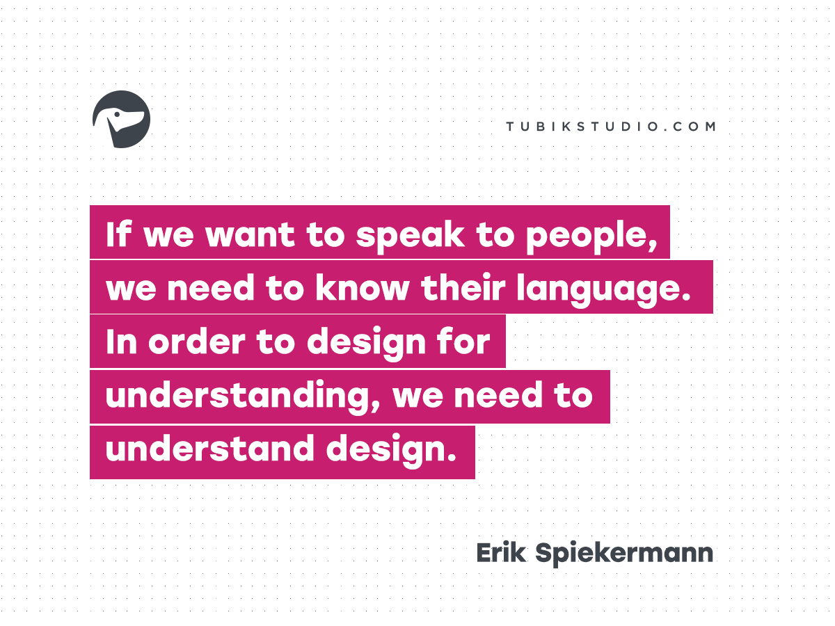
These days, information is a commodity being sold. And designers—including the newly defined subset of information designers and information architects—have a responsible role to play. We are interpreters, not merely translators, between sender and receiver. What we say and how we say it makes a difference. If we want to speak to people, we need to know their language. In order to design for understanding, we need to understand design.
The materials shape your idea.
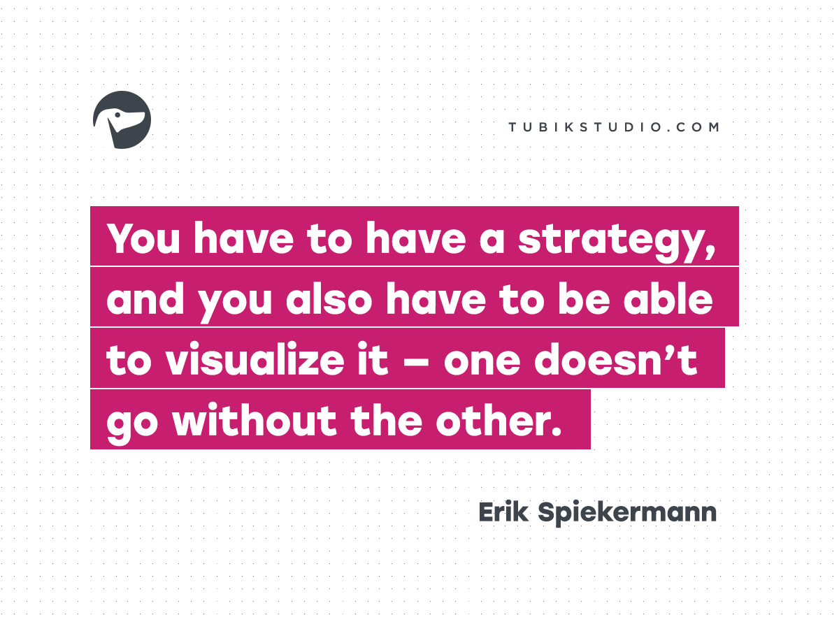
I learned that a brand isn’t a logo. There has to be implementation. You can design anything, but if the rubber doesn’t hit the road, you’ll be remembered as a great strategist but the client won’t call you again. You have to have a strategy, and you also have to be able to visualize it—one doesn’t go without the other.
The attention someone gives to what he or she makes is reflected in the end result, whether it is obvious or not.
I’ve always designed typefaces for specific solutions. In other words, a problem. Everything has always been done for a specific purpose. As a designer, you work for somebody else. That’s not negative. I work for a client, and I solve their problems. I bring my artistic vision to it, my creativity, whatever you want to call it. But essentially, I’m being paid to blow somebody else’s trumpet.
You are what you are seen to be.
The function has to be the brand. If it works well, it has to be branded at the same time.
If a design project is to be considered successful—and success is the true measure of quality—it must not only add an aesthetic dimension, but solve the problem at hand.
I mean, everyone puts their history into their work.
When I do typography, it’s 150 percent effort.
I know a lot of advertising agencies that thrive on overtime because they have a dozen interns who work for free and they spend their weekends doing free pitches. We don’t do free pitches because we don’t have any free time. Our time is valuable, and I’m not giving away ideas to some prospective client. That’s giving away the most valuable resource you have.
Work is gas. Work will fill any given volume.
Clients need to understand that they’ve hired us to do something they are not good at. And that they need to pay us for our knowledge, skills, experience and, yes: attitude.
My advice, now and always, is learn, learn, learn—starting right here.
Contrary to popular belief, designers are not artists. We employ artistic methods to visualize thinking and process, but, unlike artists, we work to solve a client’s problem, not present our own view of the world.
Being a designer is all about attitude. Sure, you have to know your craft, but as we both found out, you can pick most of that up over time if you’re prepared to listen, watch, and learn. Without the right attitude, however, you’ll always be a vendor to some people, a crazy artist to others.
So what’s new? The present generation of UI/UX designers may think that they invented a new way of designing, but we’ve had these issues forever. Trying to fit a lot of text onto the how-to page inside a pharmaceutical package is probably more difficult than doing the same on a screen. There’s no zoom on that paper, so it has to be really well done just for that one version and circumstance. My method? Think. Consider. Sketch. Think again. And look around you. It’s all been done before, albeit with different code.
Inspiration. From real life. I open my eyes and I travel and I look. And I read everything.
Bonus: video talks with Erik Spiekermann on design, typography, and life lessons
Erik Spiekermann: Typomaniac
Erik Spiekermann – Type Is Visible Language
Welcome to check the quotes by Mike Monteiro from “Design Is a Job” and by Aarron Walter from “Designing for Emotion“
Welcome to check issues of Tubik Quotes Collection on branding, usability, user-centered design, and content strategy
Welcome to read or download Tubik Magazine free books on logo design, design for business, and problem-solving web design


