Imagine you’re a parent—a surgeon, a partner at a law firm, or someone who built a company from nothing. You make high-stakes decisions daily, and you make them well. You’ve found a childcare centre that is, by every meaningful measure, exceptional. The educators are certified. The approach is intentional. Your child even asks to go there on weekends.
Then you pull up their website. And something doesn’t add up.
That gap—between the lived reality of The Little Campus and the face it showed the world—is where this project began. When the client came to us, the brief wasn’t just “make it look better.” It was: make it look like what we actually are.
We delivered a fully rebuilt visual identity system, a homepage and supporting pages, custom icon set, enrolment forms, a Book a Tour landing page, and a complete Webflow implementation.
And here’s how we got there.
About the Client
The Little Campus was founded by Carl Mercier and Tami Zuckerman after they struggled to find quality childcare in Toronto for their own daughter. What started as a half-joke—”we should just open our own”—became years of work: location scouting, renovations, and finally, in March 2021, a fully realized private early childhood education centre in Etobicoke, in Toronto’s west end.
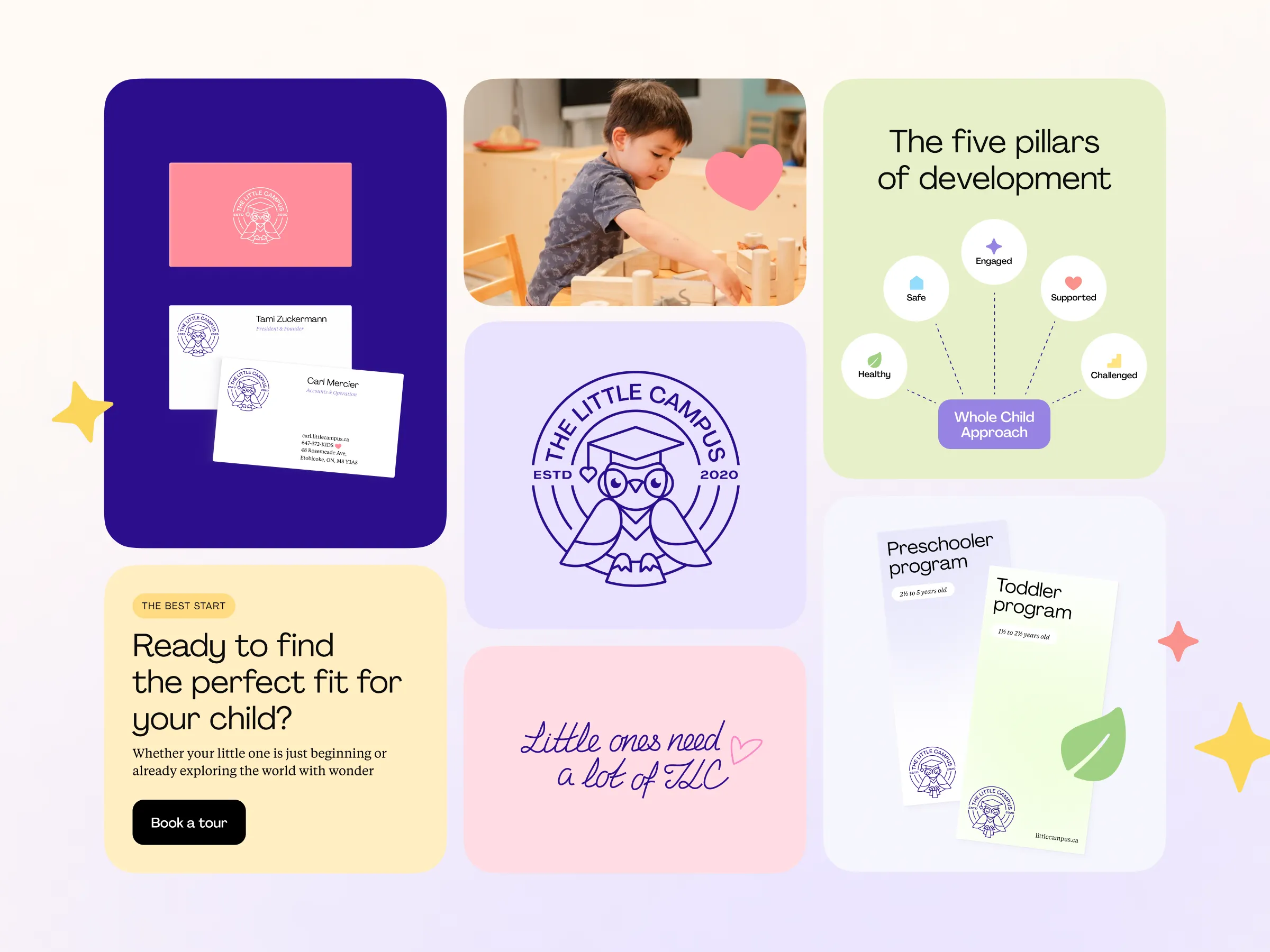
Using the Whole Child Approach as its foundation, TLC’s programs reflect a belief that healthy development rests on three pillars: Mind, Wellness, and Sociability—guided by Ontario’s Ministry of Education pedagogy. Tami, a former teacher herself, leads the educational direction. Carl, who has a programming background and built their original website himself, handles much of the operational and technical side. Between them, they run what their own clients describe as a place that is truly changing the childcare game in Etobicoke—where no detail has been overlooked and the personal touch of the founder is felt throughout.
The centre doesn’t participate in government subsidy programs. It attracts clients on its own terms, through the quality of its service. Its parents are primarily upper-middle to high-income dual-income households—executives, lawyers, doctors, entrepreneurs, and professional athletes—who expect premium treatment in everything they choose. Which meant every design decision would carry weight.
The Challenge
The brand had a problem that’s harder to solve than a bad logo: it had a good logo with real emotional equity, and everything around it had failed to keep up. The owl—wise, curious, confident—was everywhere in the physical space. On the walls, on the kids’ lockers. And it had genuine affection attached to it. The clients weren’t willing to replace it (and honestly, they were right not to), but the system around it had grown without direction.
The color palette existed in theory. When printed in CMYK, the primary blue printed so dark it looked black. At small sizes, the logo’s fine detail collapsed into a smudge. There was no cohesion across touchpoints, no sense that someone had made intentional decisions.
Meanwhile, the website lacked both conversion structure and visual confidence. For a service that parents agonize over choosing—one of the most emotionally loaded decisions in a family’s life—the digital experience wasn’t doing the work it needed to do.
The brief was clear: the logo stays. Build a world worthy of it.
Strategy & Brand Positioning
Here’s the constraint that makes childcare branding genuinely difficult: the audience is split between two failing extremes. Playful childcare brands lean into primary colors and cartoon characters, signaling fun at the cost of credibility. Private school aesthetics go the other direction—cold, institutional, typographically stiff—and lose all warmth. Neither worked for The Little Campus.
The strategy was to find a third space: premium enough for the parents, soft enough for the children. Refined without being cold, expensive-feeling without being intimidating. The brand’s strong and warm character was preserved, but elevated. Our goal was to make it more elegant, more intentional, more confident.
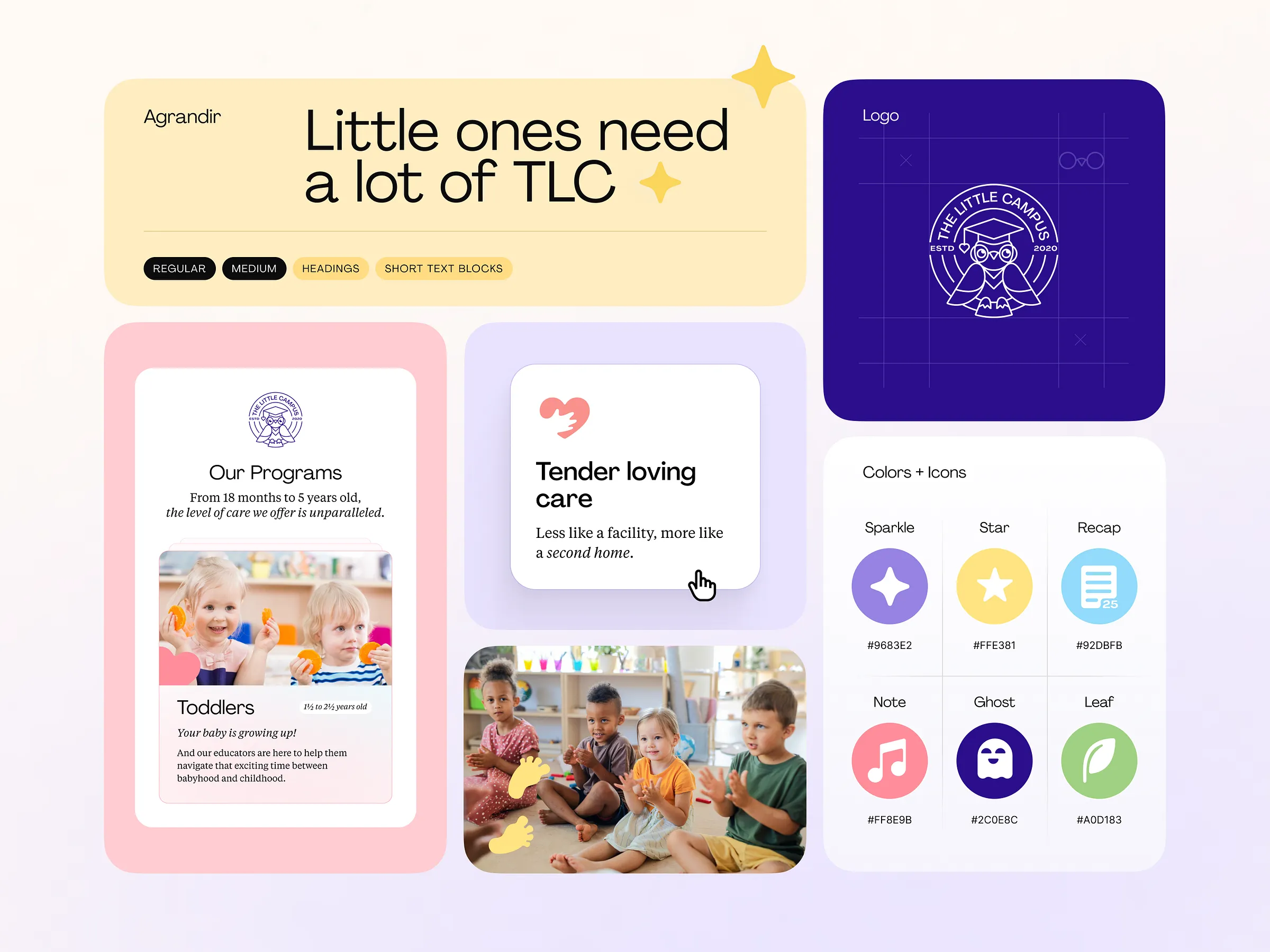
And underneath all of it, always, the message embedded in the acronym itself: TLC. Stands for The Little Campus, but also for Tender Love and Care—that phrase people use when something needs to be handled gently, with full attention, without rushing. Little ones need a lot of TLC. The brand couldn’t tip into cold luxury because the thing we designed around was, ultimately, the care of children. That’s why warmth was never optional.
Visual Identity System
The color palette was built around four emotional states: Yellow for being Challenged, Pink for feeling Supported, Blue for feeling Safe, Green for feeling Healthy. Each color anchors something real in how a child experiences the day. Each comes with a full tint range, pastel-forward in everyday use, grounded by Deep Indigo, Purple, Black, and White. Subtle gradients add depth without heaviness. The palette finally started to work—in print, on screen, at any size.
Typography was chosen for its ability to feel polished without stiffness. Rounded forms echo the logo and the environment—gentle structure, not rigid control. The typographic hierarchy is confident enough to guide a parent through a lot of content without ever feeling like paperwork (they’ve got enough of that already).
The custom icon set was drawn from scratch: consistent stroke weights, rounded corners, designed specifically for the website rather than licensed from a library. A set of photo guidelines was created alongside, so the visual language of the site would hold long after our involvement ended. Because at Tubik, we believe that a design system is only as durable as the content that populates it.
UX/UI Design
High-income parents choosing childcare are not casual browsers. They are evaluating, reading between the lines, looking for proof that this place understands what they care about.
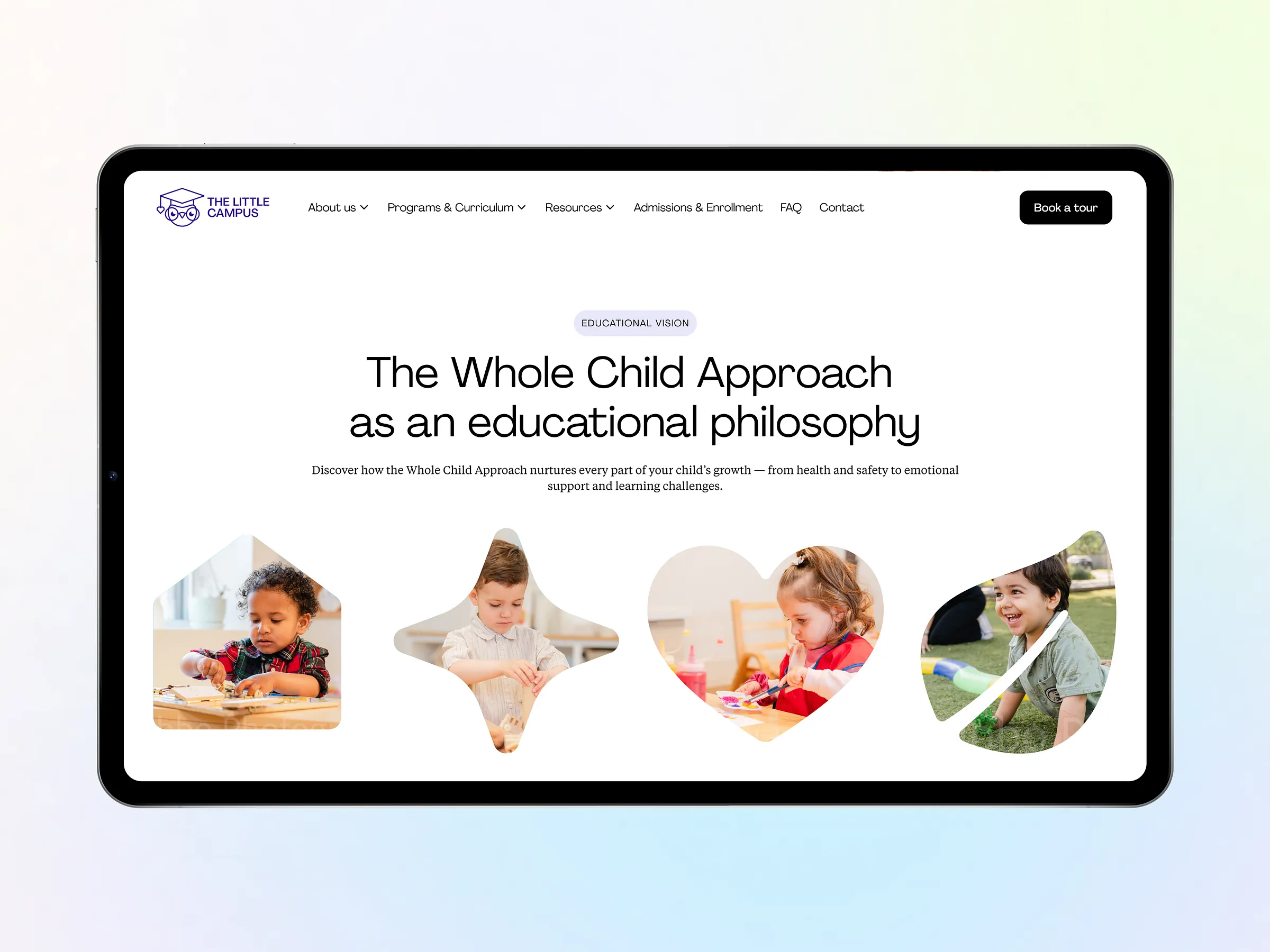
The homepage was structured around that psychology—organized by what a parent needs to hear, in the sequence they need to hear it, to move from interested to convinced to ready to act. Trust, clarity, control: in that order. Soft palette, generous white space, and strong typographic hierarchy deliver the feeling of premium before a single word is read.
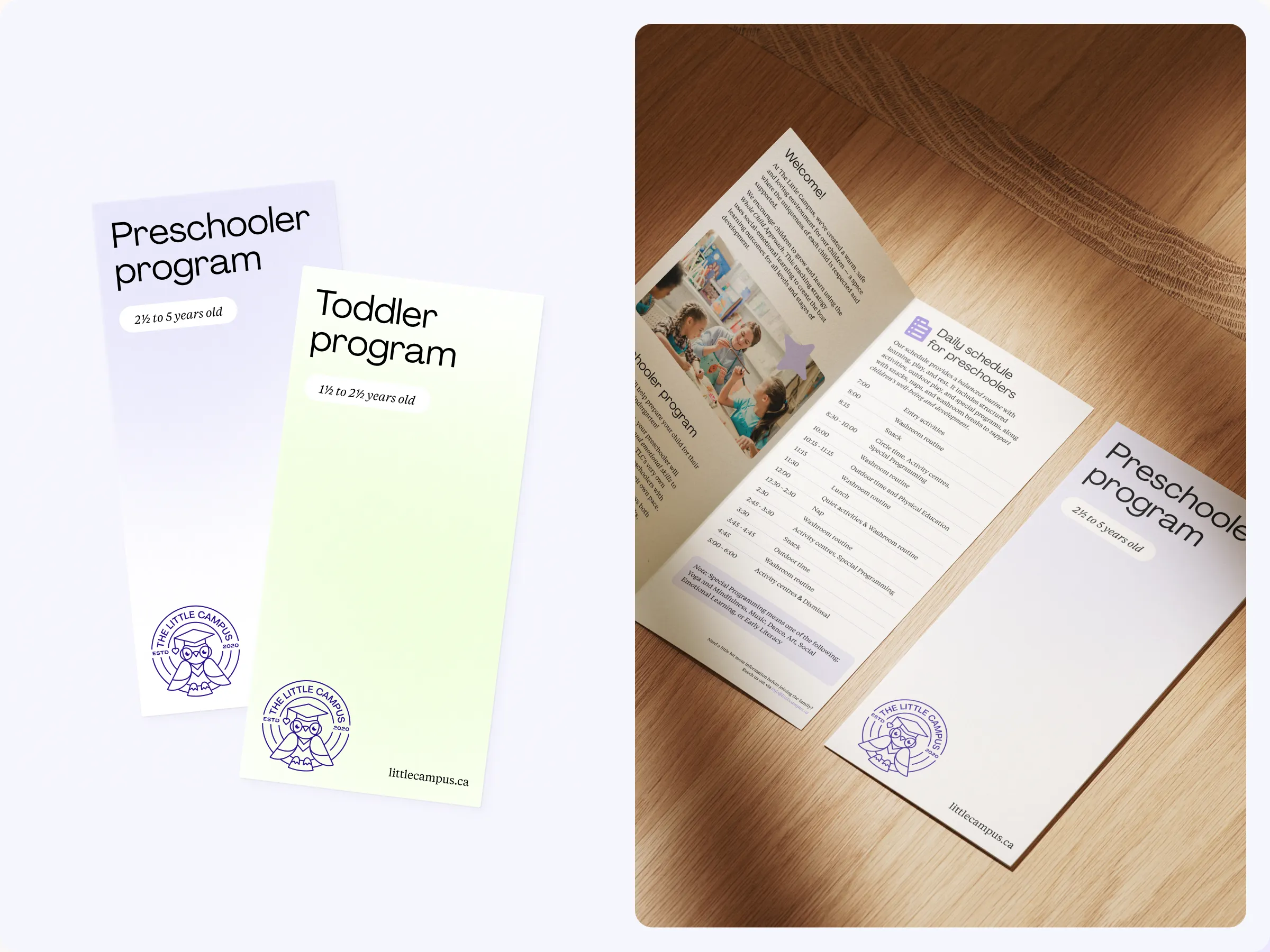
The enrolment forms and Book a Tour landing page were treated as separate conversion problems with different emotional tones. The homepage earns interest; meanwhile, the tour page’s goal is commitment. Every point of friction—unnecessary fields, moments of hesitation, unclear next steps—was treated as a reason someone might leave. The client brought a substantial amount of content that needed to be communicated clearly: program philosophy, operational details, educator credentials. The structure had to carry all of it without ever feeling heavy.
One logo detail deserves its own mention. Rather than choose between the classic logo (detailed, beloved, on every locker in the building) and the simplified version we developed for scalability, we found the better answer: use both. As users scroll the homepage, the classic logo transitions into the simplified form. The brand honoring its past while stepping forward—in a single, silent interaction. We also added a hover animation: the owl turns its head, just slightly, side to side, curious and watchful.
Development & Webflow Implementation
The site was built entirely in Webflow—partly a compromise, since the client has a programming background and had mentioned wanting to move eventually to custom code. That background made the final testing stage exceptionally thorough, too. The client had opinions—specific, detailed, technically grounded ones. That’s not a complaint at all, but exactly the right dynamic for a project where the details matter.
One technical milestone worth noting: this was our first project using CSS clamp() for fluid typography, allowing font sizes to scale continuously between minimum and maximum values without a cascade of breakpoints. The result is a site that feels native at every screen size. The CMS was configured for full client independence—content can be updated, expanded, and managed without returning to the design team.
The system keeps working after we’re gone. That’s the goal.
What This Project Taught Us
The client knew their audience better than almost any brief we’ve received. Detailed persona profiles, archetype descriptions, a clear vision of the gap between reality and perception—that only accelerated the creative work.
And the hardest thing to get right wasn’t the color system or the typography or the scroll animation. It was calibrating the exact distance between warm and premium—two qualities that the market treats as opposing forces. Go too far toward premium and you get the cold marble lobby of a private school brochure: impressive, uninviting, and fundamentally wrong for a place where two-year-olds spend their days. Go too far toward warm and you’re back in primary colors and bubble letters—friendly, forgettable, and nowhere near classy.
The answer was in the details of the system itself. Pastels instead of saturated primaries. Rounded type that carries hierarchy without hardness. Gradients that add depth without drama. An owl that turns its head when you hover—because that’s the kind of thing that makes a parent smile and then, maybe, trust you a little more. Premium, it turns out, is a level of care. And care happened to be exactly what this brand was always about.
The solution was restraint: in whitespace, in palette, in the decision to let the work speak quietly rather than announce itself.
The Little Campus was already exceptional. The brand just needed to catch up.
Recommended Reading
Enjoyed this read? Explore more case studies from Tubik Studio:
Immediate Case Study: Rethinking Payday
Case Study: Manatee Energy. Designing Warmth
Malloy Banks Case Study: Clarity Over Compliance
FarmSense Case Study: Fields, Sensors, and System Thinking
Case Study: ABUK—Designing Ukraine’s Leading Audiobook Platform