

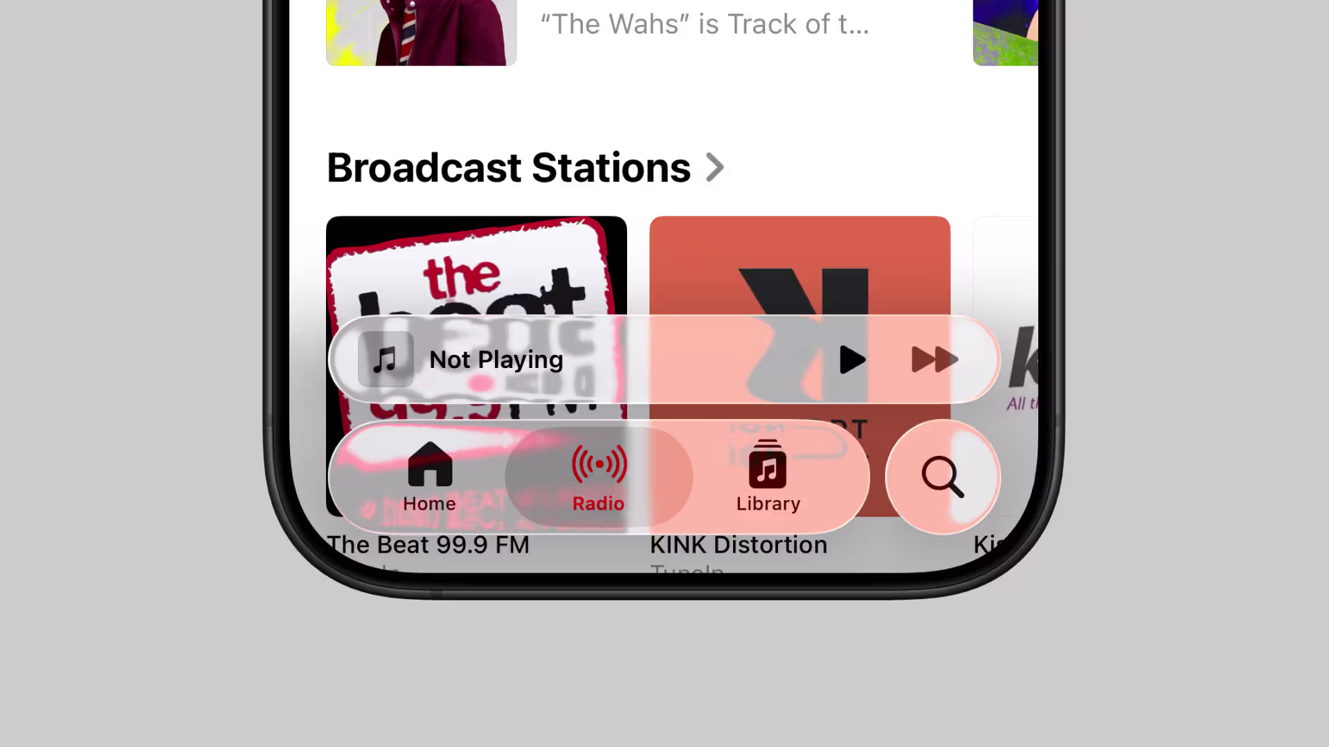
Applying a “raw aesthetic” to system-style diagrams on the Crezco website.
Modern UI design has moved past the era of ornamental genius—but maybe not in the way we hoped. For years, the goal wasn’t beauty. It was relief. Systems that work without asking too much from your brain.
UX became a science of decompression: quick scans over deep reads, adaptive systems over static layouts, autonomy over hand-holding. And somewhere along the way, we buried the brush.
As UX teams zeroed in on product metrics, usability studies, and speed-to-insight, visual design quietly atrophied. Interfaces became grayscale graveyards of safe spacing and polite typography. The craft got leaner. But also, in many places, flatter—creatively and emotionally.
Now the pendulum is swinging back.
We’re seeing flashes of visual audacity again. Interfaces that dare to feel crafted, not templated. Graphic systems that channel personality without sacrificing performance. If the early 2020s were all about the glow-up—neumorphism, maximalism, glassmorphism—then 2026 is about the backbone with flair. Architecture with attitude. Clarity with signature—think motion that explains, typography that breathes, AI that asks before it answers.
The best UI design trends of 2026 aren’t decorative. They’re deliberate. They reinforce trust, reduce ambiguity, and reawaken the designer’s hand in a world of component libraries and auto-layout.
So let’s break down what that looks like—and where we’re heading.
1. Interfaces Designed for AI Collaboration, Not Automation
One of the most important UI design trends of 2026 is a shift away from AI as an all-knowing autopilot, and toward AI as a thoughtful copilot—present, optional, and respectful of human context. We’re finally seeing AI UX design grow up and learn some manners.
Take Google Gemini’s new interface for Chrome. The page in question? A recipe for a humble vanilla cake with berries. Big image, calm fonts, sensible layout. But what happens when the user asks, “How can I make this dairy-free?”
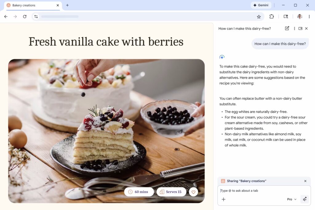
Gemini’s new AI assistant mode.
Cue the Gemini AI. It doesn’t bulldoze the content. It doesn’t swap out ingredients like some overconfident sous-chef with a food intolerance agenda. Instead, a panel gently appears on the side, offering tailored alternatives: swap butter for a plant-based substitute, use cashew or soy sour cream in place of dairy, and pick your favorite non-dairy milk—almond, oat, coconut. Meanwhile, the egg whites get a gold star for being dairy-free by default. It’s like a softly-spoken sous-chef who knows your recipe, your fridge, and your limits—and quietly upgrades the whole thing.
Here’s what this gets right:
- The original content stays untouched. No overwritten text, no disappearing steps. The human-authored recipe holds its ground.
- The AI is reactive, not presumptive. It waits for a question. It doesn’t interrupt the scroll with an “optimized” suggestion.
- The tone is collaborative. The answers offer options, not prescriptions. No “correct” path. Just trade-offs explained clearly.
- The feature is dismissible. Don’t want help? Ignore it. Want more? Ask. You’re in control.
In AI interface design, this is a major upgrade. The assistant lives in the margins, not the main stage. It offers thought partnership, not replacement. And most importantly—it behaves.
This UI trend represents a new architectural principle: AI belongs in the sidebars, overlays, and collapsible panels. It serves best when it augments context, not when it hijacks the flow. In other words, it’s not “I’ve taken care of it for you,” it’s “I’m here if you want to think it through together.”
And that—finally—feels like user-centered AI.
2. Purposeful Motion, Not Decorative Animation
In 2026, motion earns its keep—not by flashing, but by guiding.
We’ve had our fun. Microinteractions that bounce like jelly. Hover states that sparkle like confetti. But somewhere between the 2019 loader spinners and the 2023 parallax insanity, we forgot the point of animation: to communicate state, structure, and system intent.
Emil Kowalski, product designer and part-time mythbuster of UX behavior, highlighted out one of the most counterintuitive—and important—UX design patterns:
“Artificially delaying writes like form submissions can give your users more confidence that their changes went through.”
He backed it with a side-by-side visual: Two identical “Submit” buttons. One changes state instantly—click, green check, done. The other introduces a half-second pause with a subtle “Processing…” state before confirming.
Guess which one people found more believable? Here’s a hint: it’s the one that felt like it actually did something.
This is one of the biggest UX psychology insights of the year: Perceived reliability beats actual speed. In high-frequency workflows—like task managers or search tools—speed still wins. But for critical, infrequent actions (password changes, payments, contact forms), instantaneous confirmation feels suspicious. Like the system didn’t even try.
So designers are now intentionally reintroducing friction:
- Visible loading states
- Micro-delays that acknowledge user input
- Confirmation animations that close the feedback loop
In 2026, the best motion design doesn’t try to be slick. It tries to be believable. And this isn’t just an animation thing. It’s a trust architecture thing. Interfaces today are faster than our brains can validate. That’s not a flex—it’s a liability.
What we’re seeing is a rebalancing act:
- Optimistic UIs made everything feel instant—but at the cost of trust
- Purposeful delay reintroduces a beat, a breath, a moment that says “yep, something happened”
- Psychological feedback is now as important as visual feedback
So if your motion doesn’t serve a purpose—skip it. If it does, let it show its work.
3. Raw Aesthetics: Monospaced Fonts, Grids, Wireframes
It used to be that if your interface looked like a wireframe, someone would ask if the final version was still coming.
In 2026? That’s the point.
One of the most distinctive UI design trends of 2026 is the resurgence of what we might call intentional incompleteness: UI that doesn’t try to decorate data or disguise structure, but instead leans hard into raw, schematic, brutally clear layouts.
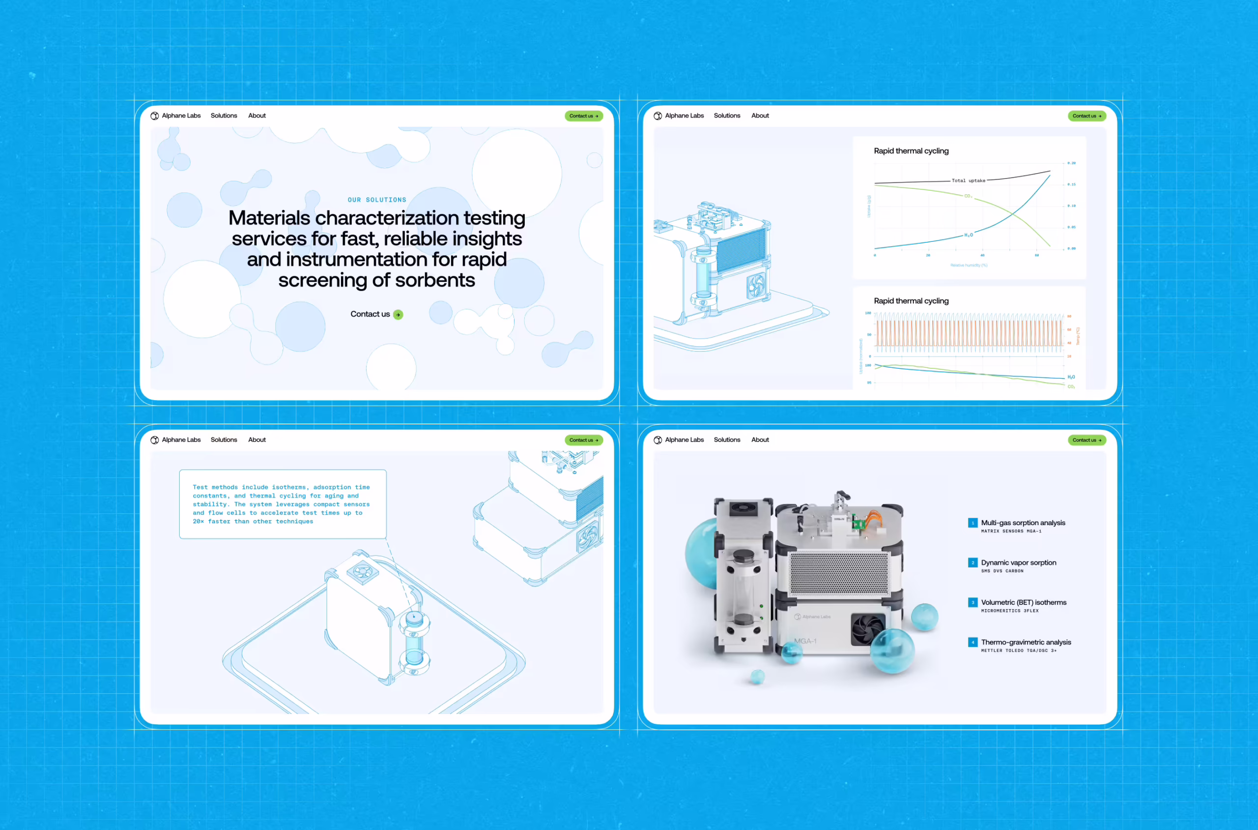
A perfect example? Our recent work with Crezco, a B2B fintech product that moves money between banks and accounting platforms. It’s not supposed to “delight” you. It’s supposed to make sure your £2.6 million doesn’t go missing.
What you see mirrors how payroll actually works: a total amount routed through a central engine, then split into tax payments and individual employee payouts. Logic, uncluttered.
The design is built around that logic:
- A visible grid that structures alignment and flow, not decoration
- Simple, square payment nodes that represent real transactions
- Direct, hard connectors that read as transfers, not animations
- A layout that works like an operational map, not a marketing screen
The result feels closer to a control panel than a homepage—something a finance or ops team can read at a glance. Print it, pin it to a wall, and it still holds together. That’s intentional.
Typography follows suit. Headlines are rendered in elegant serif fonts that lend weight and formality without getting fussy. Paired with ledger-style numerals, the type reads like something from a well-designed tax report—not a pitch deck.
This is structural UI design at its most honest. It’s not “friendly.” It’s trustworthy.
The blueprint-inspired interface design we did for Alphane Labs.
Why does this matter now?
Because we’ve reached visual saturation. Every SaaS dashboard started to look the same—pastel gradients, friendly sans-serif type, pill-shaped toggles, meaningless illustration fluff.
But users—especially professionals—don’t want decoration. They want:
- Legibility
- Clarity
- Signal over noise
And in 2026, UX clarity has aesthetic value. We’re seeing more designers embrace grids as foreground elements, not behind-the-scenes guides. We’re seeing wireframe logic brought into final UIs. And we’re seeing a return to monospaced or mono-inspired type to align visual rhythm with data logic. This isn’t “ugly on purpose.” It’s function-forward design.
4. Inclusive Visuals: Less Entertainment, More Control
If UI design in 2026 has a golden rule, it’s this: you don’t get to assume the user wants what you want. And nowhere is that more obvious than in motion.
Designers love motion. The right animation can signal progress, hint at hierarchy, soften a transition. But left unchecked, it can also feel like a caffeine overdose—especially for users with vestibular disorders, attention differences, or, you know, deadlines.
Which is why one of the most important UI design trends of 2026 isn’t about adding motion—it’s about giving users a way to say “stop.” And it’s already happening on some of the world’s most polished websites.
“Reduce Motion” feature on microsoft.ai website.
This isn’t charity work. This is good interface design. Because motion—like sound, or language, or color—is contextual. When it helps, it helps a lot. But when it hurts, it alienates instantly.
So in 2026, we’re seeing a shift:
- From inescapable animations to user-controlled flow
- From motion-as-decoration to motion-as-choice
- From “trust us, it’s cool” to “you’re in charge”
And no, this doesn’t mean neutering your UI. It means designing with intent. Creating layered motion systems that respect system settings (prefers-reduced-motion), offer visual toggles when appropriate, and provide clear escape hatches for users who want to engage on their terms.
Inclusive design isn’t about lowering ambition, it’s about raising standards. If your interface only works when it’s flashy, it probably doesn’t work.
5. Fluid Typography: REM + clamp(), or How We Finally Stopped Fighting Viewports
Here’s a fun memory: it’s 2019, you’re knee-deep in a design system, and every type decision comes with a media query.
H1 on desktop? 48px.
H1 on mobile? 32px.
Tablet? Oh god, we forgot tablet.
So you ship a whole stack of font-size overrides and call it “responsive.”
And for a while, that passed.
Until users started opening your beautifully breakpointed UI on 11-inch Chromebooks. Or 14-inch tablets. Or ultra-wide monitors resized to mimic a phone. And suddenly, your pixel-perfect typography snapped like dry spaghetti.
Enter fluid typography—the real kind. The 2026 kind. The clamp() kind. Let’s start with the why.
Fixed type scales (even REM-based ones) made sense when screen sizes were predictable. But in today’s multi-device chaos, static steps are clunky. They jump. They break. They leave awkward gaps between your mobile scale and your desktop scale.
VW-based scaling became popular as a fix, but it comes with its own risks—like sending your font size into orbit on ultra-wide screens. Clamp() fixes that.
font-size: clamp(1rem, 2vw + 0.5rem, 2.25rem);
This single line replaces entire folders of font-size logic. It tells the browser: “Here’s the smallest this should be. Here’s the biggest. And here’s a formula to make it grow smoothly in between.”
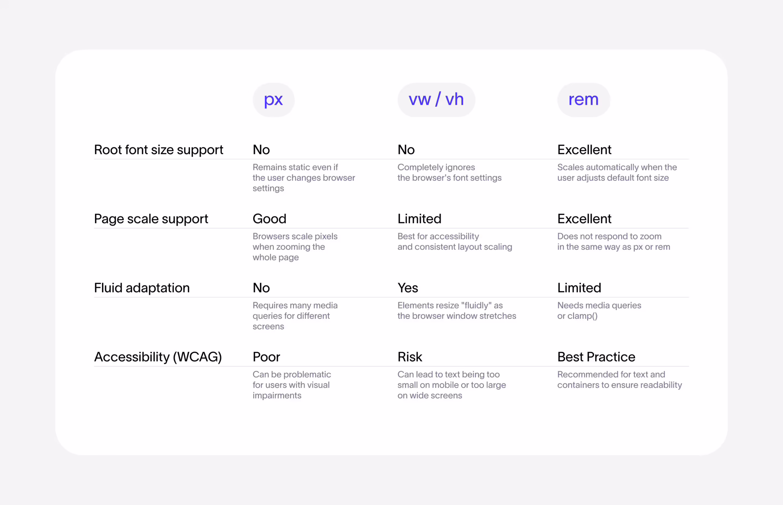
Web development units comparison.
In practice, here’s what you get:
- Typography that scales like a living thing. No abrupt jumps at breakpoints. Just steady, readable transitions.
- Cleaner CSS. Fewer overrides. No need to write two (or five) separate font-size declarations just to satisfy your marketing site and your dashboard at once.
- Better alignment with modern screen behavior. Your user’s “mobile” might be 500px wide. Or 980. There is no “standard” anymore. Clamp lets your type respond accordingly.
The real killer feature is that you can tailor scaling behavior to each font style. Your H1 can shrink dramatically on small screens, while body text stays mostly steady. H2s, captions, display styles—they all get their own unique growth curves.
But here’s the catch: clamp() isn’t intuitive. Ask a designer to calculate a preferred font-size formula with viewport math, and you’ll see trauma behind their eyes.
Which is why most teams now:
- Wrap clamp() logic in Sass mixins or PostCSS plugins
- Predefine min/max breakpoints and font sizes per component
- Auto-generate fluid scales as CSS variables that can be reused across typography tokens
It’s about baking responsiveness into the type system from the start. Fluid typography doesn’t “respond.” It adapts. It flows. And in a UI world that spans phones, foldables, ultrawides, and floating web apps, that’s not a nice-to-have—it’s a survival trait.
6. Crafted, Not Prompted: The New Creative Cred
You can spot it now—tucked into the caption of a Behance post, whispered in the alt text of an Instagram carousel, even embedded directly in the Figma file:
“No AI was used in the making of this.”
What used to be a given is now a flex. After years of increasingly competent generative tools—text-to-image, code-complete, layout synthesis, you name it—we’ve hit a strange cultural inflection point: users can’t tell who made what anymore.
So now, designers are telling them. Loudly.
Because in an industry flooded with Midjourney-flavored compositions and ChatGPT-written UX copy, declaring “I drew this” or “I animated this frame-by-frame” has become a brand statement.
Our hand-built 3D model for Der Baukasten.
What does this mean for UI design in 2026?
- Portfolios are labeling process. Show the journey—screenshots of Figma files, Blender work-in-progress, After Effects timelines.
- Social posts emphasize authorship. “This is hand-coded” or “all illustrations were made from scratch.”
- Clients start asking. Especially in branding, art direction, and motion—“Was this made by you, or by a model?”
And no, this isn’t a Luddite protest. Most designers are still using AI for grunt work: resizing assets, optimizing alt text, generating draft copy. But what they’re signaling is ownership.
Because when everything looks like everything else, the most valuable design currency becomes:
- A recognizable hand
- A specific voice
- A point of view
So whether you’re drawing your own icons, animating in Lottie instead of prompting Sora, or writing microcopy that doesn’t sound like a soulless onboarding bot—say so.
In 2026, crafted UI doesn’t just look different. It feels different. And users notice.
7. Anti-Liquid Glass: When Visual Spectacle Stops Serving the Product
Remember when every UI trend had to shimmer? When “premium” meant translucent layers, glowing highlights, and blur-on-scroll interfaces that felt like iOS on a sugar high?
That era birthed Liquid Glass—Apple’s homage to Aqua, a design language of depth, diffusion, and friendly sheen. But in 2026, the smartest designers aren’t embracing Liquid Glass. They’re dismantling it. Not because gloss is bad. But because when it starts to obscure, distract, or limit, it’s no longer a design language. It’s just noise.
Let’s talk Linear—the product design darling of every startup with a Notion addiction. Their recent “Liquid Glass” post is a whole manifesto.
Linear’s reimagined Liquid Glass tab bar, tuned for clarity over decoration.
The team doesn’t reject Apple’s aesthetic because it’s ugly. They reject it because it’s not flexible enough for their workflow. Apple’s system glass is built to look good across fitness apps, mobile games, finance dashboards, and virtual classrooms—but Linear is building for focused, high-density, high-performance product work. That means:
- Glass has to serve navigation. Not the other way around.
- Depth effects can’t blur legibility. Especially with dense data.
- Design has to scale across themes, breakpoints, and use cases. Not just match iOS’s current version.
So what do they do? They rebuild the glass from scratch.
- Gaussian blur? Check.
- Gradient lighting tied to cursor motion? Check.
- Variable blur at scroll boundaries? Yes, please.
- Signed distance fields, specular highlights, custom shaders? It’s practically industrial design in CSS.
But here’s the kicker: They also leave things out. Most notably, the refractive distortion that Apple’s Liquid Glass loves—because it might look cool, but it actively undermines legibility in dense UIs. That’s the Anti-Liquid Glass philosophy in action: If an effect competes with the content, it dies.
Liquid Glass might shimmer in Apple’s curated demos—but even inside the walled garden, the cracks are real. It flattens difference, homogenizes, and turns every product into a reflection of the same aesthetic ideal—no matter the context, the brand, or the user.
And the moment you try to stretch it—into Android, marketing visuals, accessibility scenarios, or just a product with an actual personality—the seams start to show. The blur breaks, the contrast collapses. The soul goes missing.
There are too many tools. Too many stories. Too much creative range to let a single aesthetic dictate the rules for everyone. Many mature product teams are starting to feel: If your visual language only survives on Apple’s terms, it’s not a design system—it’s a leash.
Anti-Liquid Glass isn’t anti-aesthetic. It’s pro-function, pro-consistency, and pro-independence. It’s the realization that if your interface only looks good on an iPhone 15 Pro at full brightness, maybe it’s not that good of an interface.
The Future of UI Design: Infrastructure Over Interface
If there’s a single thread running through every UI design trend of 2026, it’s this:
It’s still about systems—only now, they remember who they’re built for.
The best interfaces now:
- Anticipate context instead of reacting to clicks
- Adapt fluidly instead of snapping at breakpoints
- Respect attention instead of chasing it
- Reveal logic instead of hiding it under gloss
AI is an assistant, not an architect. Motion earns its place. Typography flows like the rest of the web. Glass stops pretending to be the answer. And most of all, users are in control—because we stopped making assumptions on their behalf.
But relief isn’t enough anymore. People want clarity with character, something unmistakably yours. And in a world of interchangeable components, what makes your interface yours? The answer isn’t more features. It’s taste. And taste requires authorship. A point of view, wired into the product—more than a Figma preset, and beyond a Dribbble trend.
That’s what 2026 rewards: systems that work, but also say something. Interfaces that don’t apologize for having a soul—or being a little opinionated.
Recommended Reading
Want more insight into design that breathes, adapts, and performs? Start here:
6 Essential Elements of a Company Website Design
Big Little Details: 7 Helpful Elements of Web Usability
UX Design: Types of Interactive Content Amplifying Engagement
Negative Space in Design: Tips and Best Practices
5 Basic Types of Images for Web Content
Types of Contrast in User Interface Design
5 Pillars of Effective Landing Page Design
How to Make Web Interface Scannable
The Anatomy of a Web Page: Basic Elements
