Eggs are, by most accounts, the least glamorous product category a design team can be handed. They’ve been around longer than agriculture has a name, they appear on every breakfast table in every country on earth, and the visual language around them—warm yellows, soft whites, pastoral suggestions of hens—has been thoroughly exhausted. So when a liquid egg brand asks you to build packaging and a web presence that stand out in a hyper-competitive food market, the brief arrives with a specific kind of challenge baked in: the product is ancient, intimate, and deeply mundane, and your job is to make people actually want to buy it in a format they’ve never bought it before.
So, here’s what we did.
One Product, One Direction, No Escape Hatch
Most food e-commerce projects come with a natural out: a wide SKU range, seasonal offerings, or category breadth that lets the design team create a system and let variety do the emotional heavy lifting. BEGG offered none of that. A single type of product—liquid eggs—had to carry the full weight of brand identity, customer education, and purchase motivation, all at once, across both physical packaging and digital touchpoints.
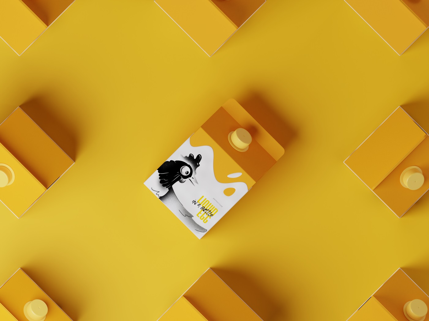
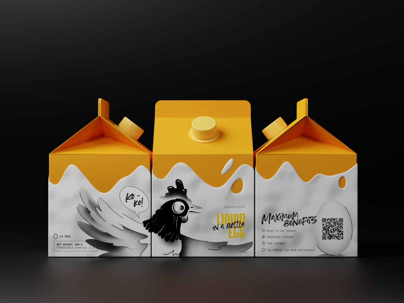
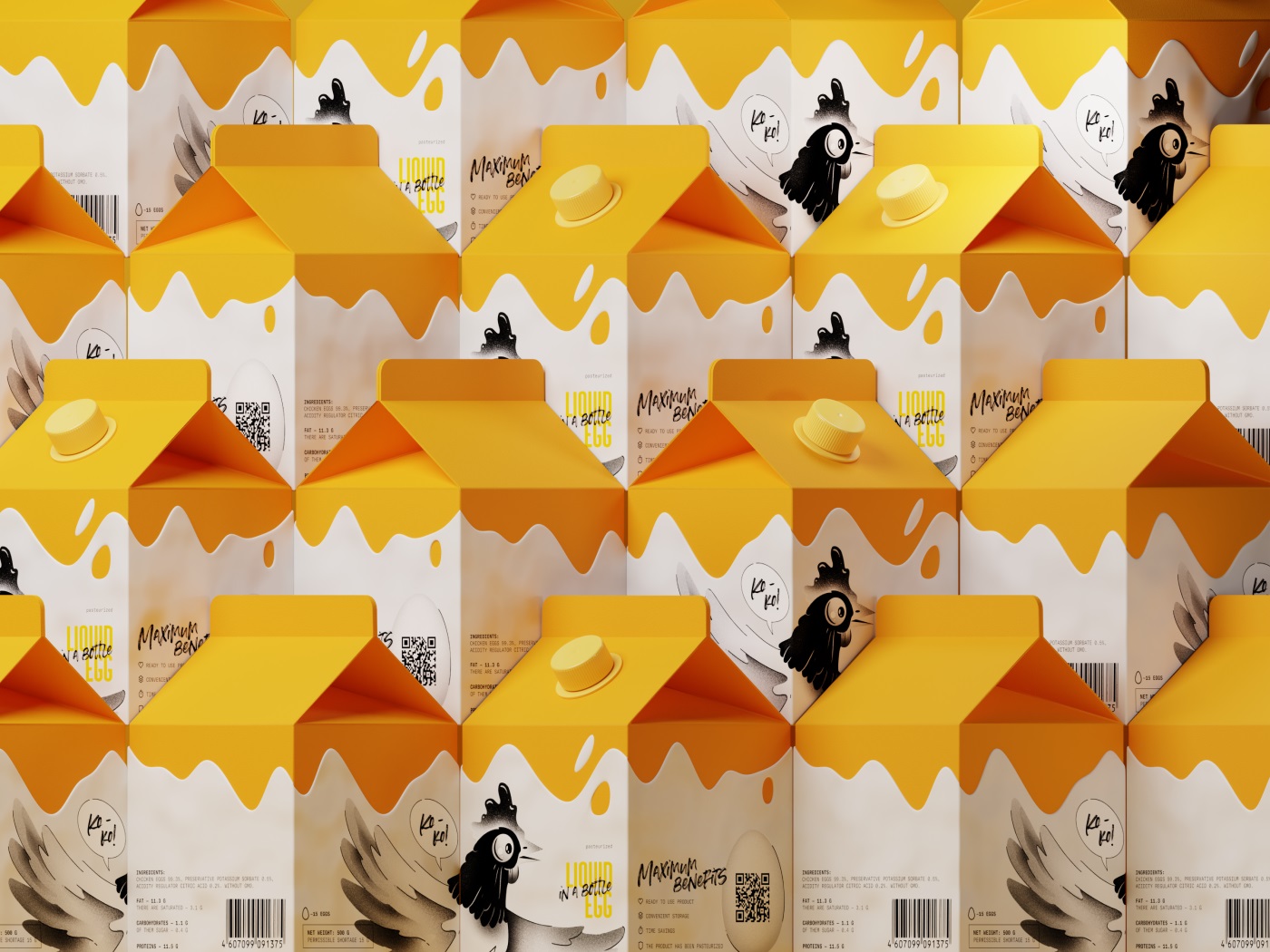
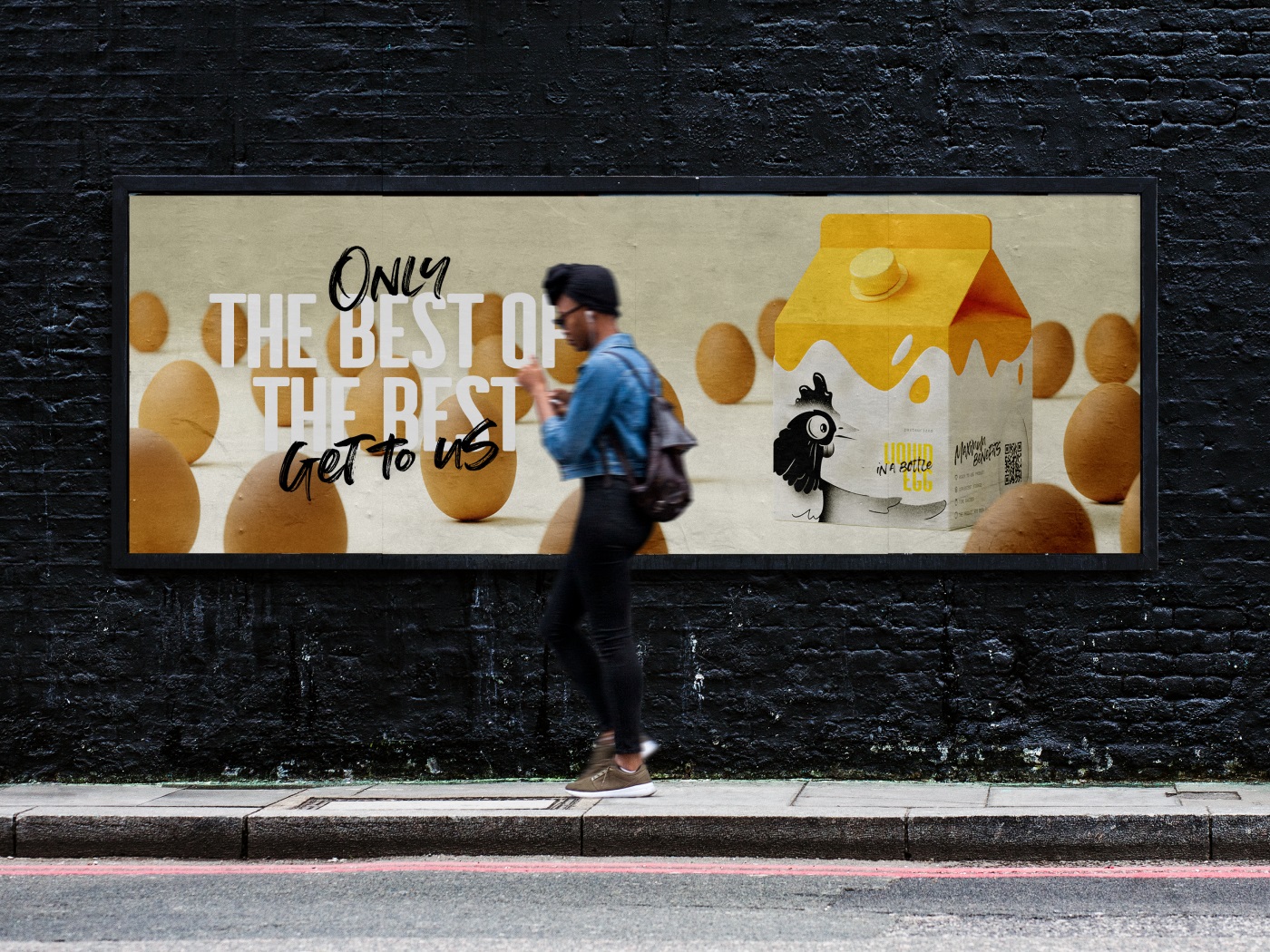
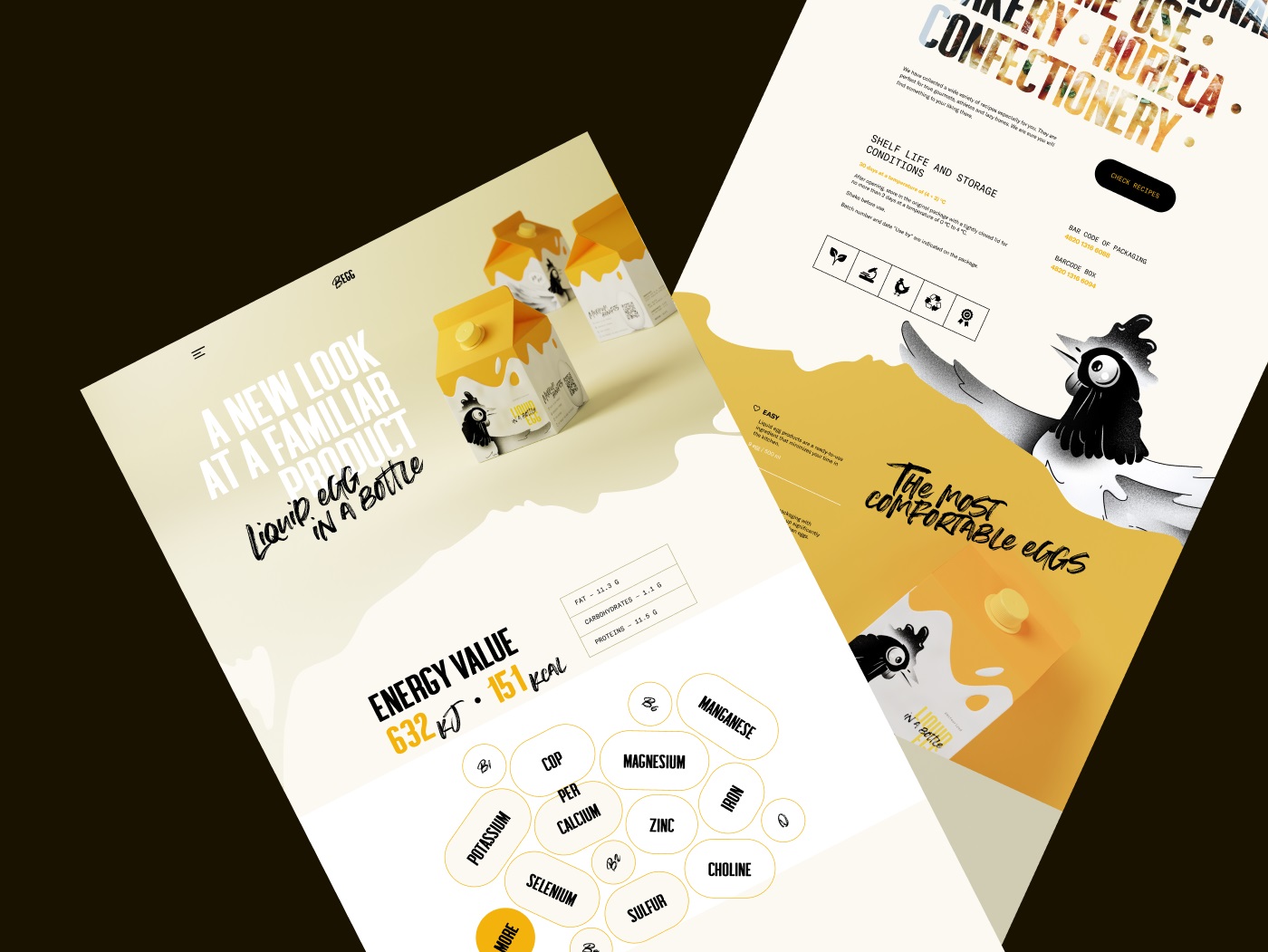
The decision to build the identity around a high-contrast palette of egg yellow, white, and black was not the obvious move, but it was the right one. It sidesteps the muted, earthy naturalism that defines most artisan food packaging and plants a flag instead: confident, graphic, unambiguous. Black grounds the composition and gives the illustration room to breathe. The custom chicken character—drawn rather than photographed, stylized rather than folksy—does the work of category signposting without leaning on pastoral cliché. It’s mascot logic applied with editorial discipline.
Typography followed the same principle. Summer Loving’s hand-lettered variant handles taglines and brand voice; GT America handles information. That split respects the cognitive job each text block is doing and reflects a packaging design philosophy that treats hierarchy as a functional tool, not a decorative afterthought.
The Website as Extended Packaging
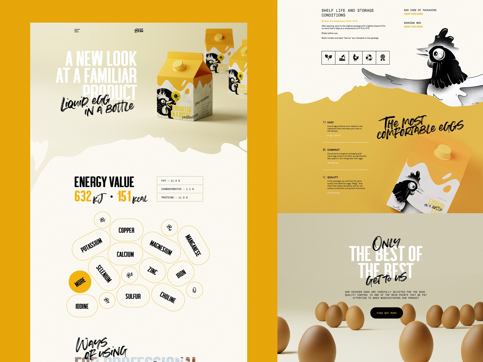
The web design project had one structural constraint that shaped everything else: the physical packaging had already set the visual language, and the website needed to extend it into a medium that behaves entirely differently. Print is static and controlled; web is temporal, interactive, and read in fragments. The design team’s job was continuity without rigidity.
The above-the-fold loading sequence is where the site earns its first impression. A progress counter paired with a blur-to-focus reveal on the hero image treats load time as a designed moment rather than a latency problem—a small UX refinement that shifts the user’s relationship to waiting. The full-screen egg animation that follows sets category context immediately, which matters for a product most users haven’t encountered before. Liquid eggs are not self-explanatory, and the site can’t afford to take comprehension for granted.
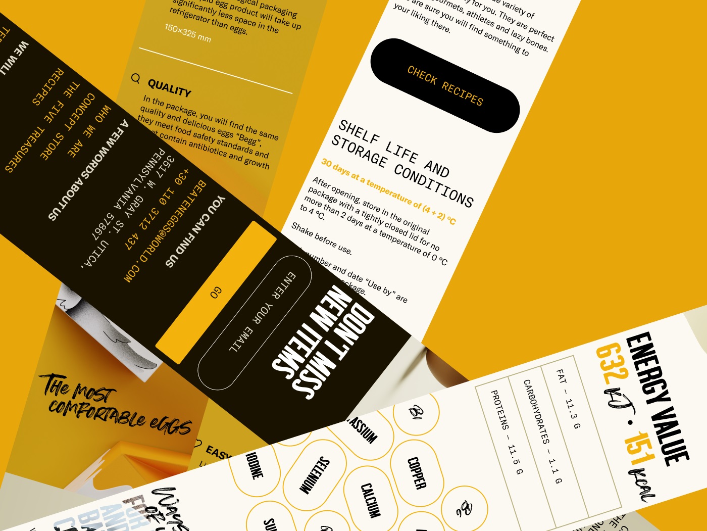
Motion throughout the site is deployed with more restraint than spectacle. The interactive menu—where hovering a product category rotates the packaging image—is a micro-interaction that does real navigational work: it links category names to visual product identity and reinforces brand recognizability in the same gesture. The animated mascot recurs across sections, doing what mascots are supposed to do when used well: building recall without demanding attention.
The recipe section’s underlayer photo effect and the general rhythm of content blocks—infographics, tags, comparison tables, icon sets—reflect a content strategy decision as much as a visual one. Food ecommerce lives or dies on the depth of its product storytelling. Nutritional claims, use cases, and recipe integration aren’t supplementary content; they’re the primary conversion lever for a product that requires behavioral change from the buyer.
Mobile as a Test of Systemic Thinking
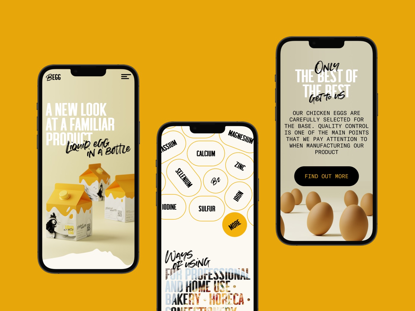
The mobile version of the site is, functionally, a coherence test. Any web design system that relies on spatial drama, full-bleed animation, or hover states to carry its weight will degrade badly on a small screen. The BEGG mobile experience holds together because the underlying visual language—color, type, illustration—is strong enough to work at any scale. Responsive design, done properly, is less about breakpoints and more about having built something that has structural integrity to begin with.
Another interaction point where the motion adds fun and liveliness to the functionality is the interactive menu page: the image of the product packaging turns each time user hovers a particular category.
What This Project Taught Us
Narrow product categories are a gift in disguise. When there’s no variety to lean on, every design decision has to earn its keep on the merits of the single product in front of you—no camouflage, no pivot to the catalog. The constraint that felt like a limitation turned out to be the thing that kept the work focused. BEGG succeeded because the team committed early to a visual identity strong enough to travel: from physical packaging to web hero, from desktop animation to mobile thumbnail. When brand identity is genuinely systemic—not a mood board, but a set of principles that generate consistent decisions across contexts—the work holds together without effort. That’s what consistent brand experience actually means in practice, and it’s harder to build than it sounds.
Recommended Reading
Keep reading, we’ve got more case studies, more design thinking, and more opinions. The archive is deep and mostly harmless:
uMake. Branding and Website for 3D Design Tool
Crezco. Brand Identity and UI/UX Design for Fintech Service
CUBE. Illustration Set for Video Production Company
FarmSense. Identity and Web Design for Agricultural Technology
Real Bitcoin. Creating Website Illustrations
Carricare. Identity and UX Design for Safe Delivery Service
OOP. Brand Identity Design for Online Flea Market
Otozen. Mobile App Design for Safe Driving