Most “mobile UI inspiration” roundups are just screenshots with captions that say “clean” and “intuitive” fifteen times each. So let’s skip that. Here are twelve-ish app concepts from the Tubik studio that are worth stealing ideas from—not because they’re pretty (though they are) but because each one solves a specific, boring, human problem that most app design tutorials never bother mentioning.
Task Apps and the Myth of the To-Do List
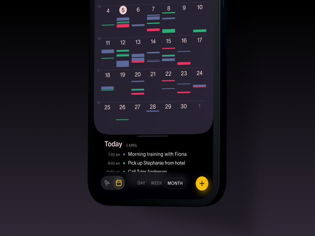
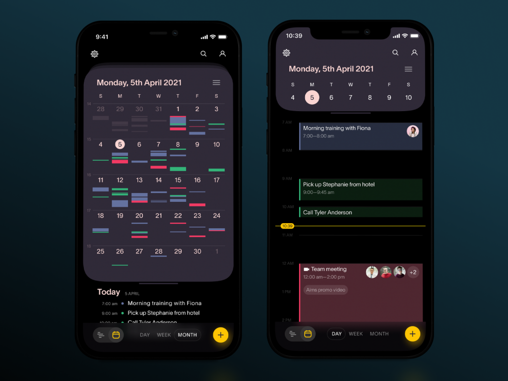
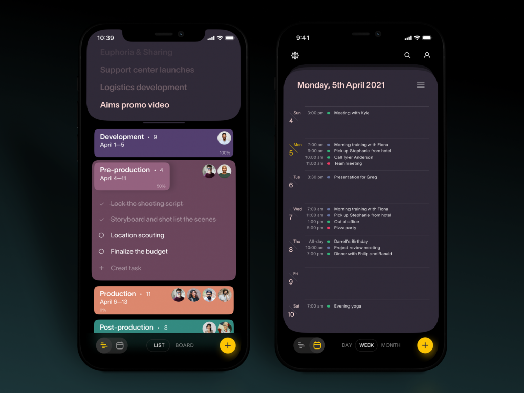
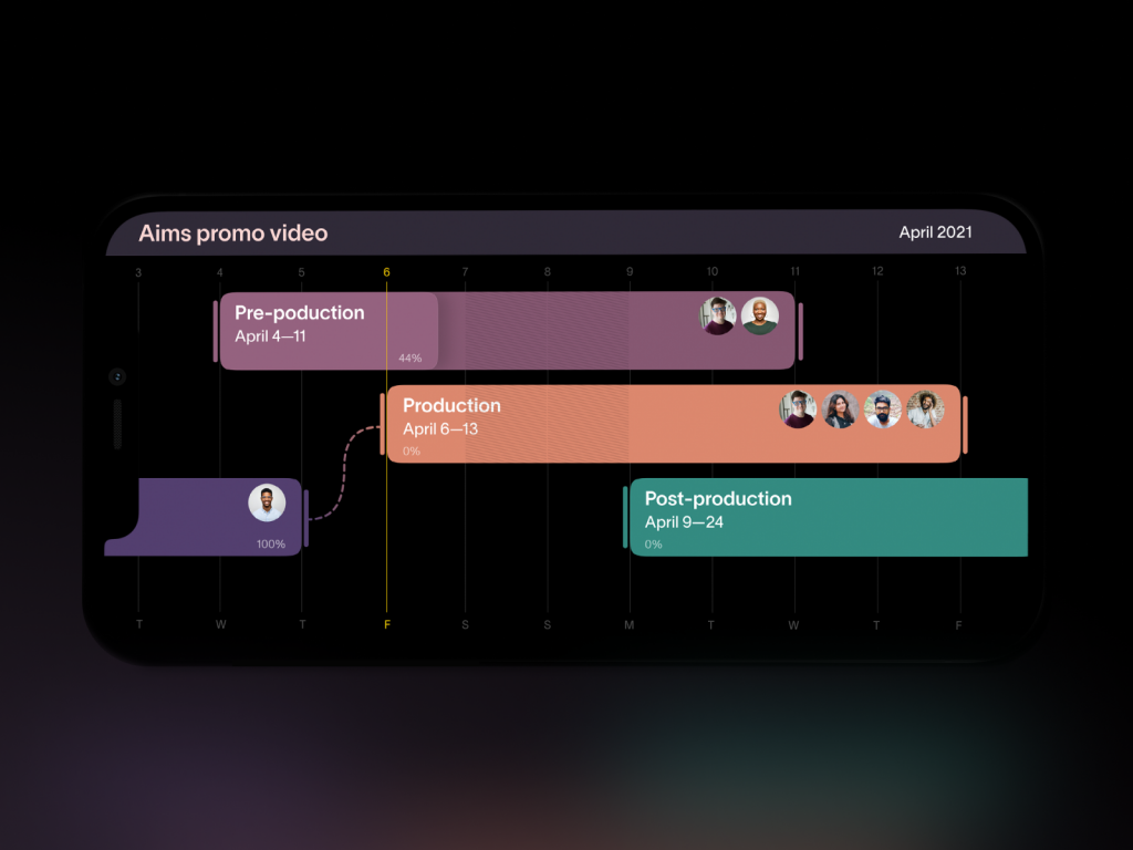
A task manager and a task tracker sound like the same product wearing two different hats. They’re not. One is about planning ahead—multiple calendars, color-coded categories, the whole command-center fantasy. The other is about surviving the day you’re already in. Both concepts here lean into dark UI design, and there’s a real reason beyond mood-setting: a Purdue University study found that dark mode can cut smartphone screen power draw by roughly three to nine percent at typical brightness, and by far more at max brightness on OLED displays. That’s not nothing if your app expects people to check it forty times a day.
The practical takeaway: if you’re designing a habit-tracking or scheduling app, don’t treat dark mode as an aesthetic toggle buried in settings. Make it the default for anyone using OLED hardware, and use color sparingly as a functional signal—one hue per calendar, one accent for “overdue,” nothing decorative. Mobile app UI design lives or dies on restraint, and a task app with twelve accent colors is just loud.
Health Apps Should Show Progress, Not Guilt
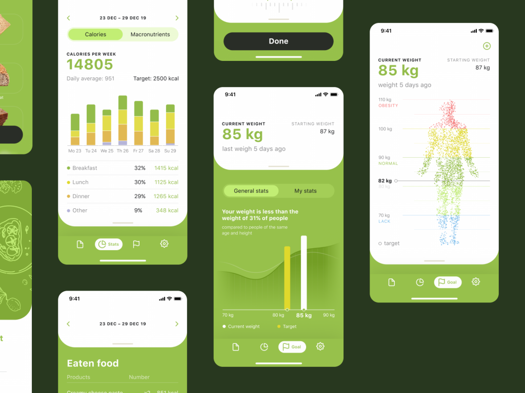
The calorie tracker concept here goes heavy on illustration and a warm green palette, which is a smart color psychology move—green reads as “growth” and “go” in most Western design contexts, which is exactly the emotional register a food-logging app wants, as opposed to, say, red, which reads as failure before you’ve even logged breakfast. The fitness tracker concept takes a different but related approach: it offers both a dark and a light theme, letting the user pick based on when and how they train, since a 6 a.m. gym session and a 9 p.m. wind-down deserve different visual environments.
Here’s the checkable bit: data visualization in health apps genuinely changes behavior. Apple’s own research into Screen Time and Health app engagement, along with independent UX audits, consistently show that simple progress rings and streak counters outperform raw numbers for sustained use. If you’re building a fitness or wellness app, don’t dump a spreadsheet on your user. Give them one clear visual metric per screen—a ring, a bar, a single trend line—and hide the rest behind a tap.
E-commerce Design Is a Math Problem Wearing a Trench Coat
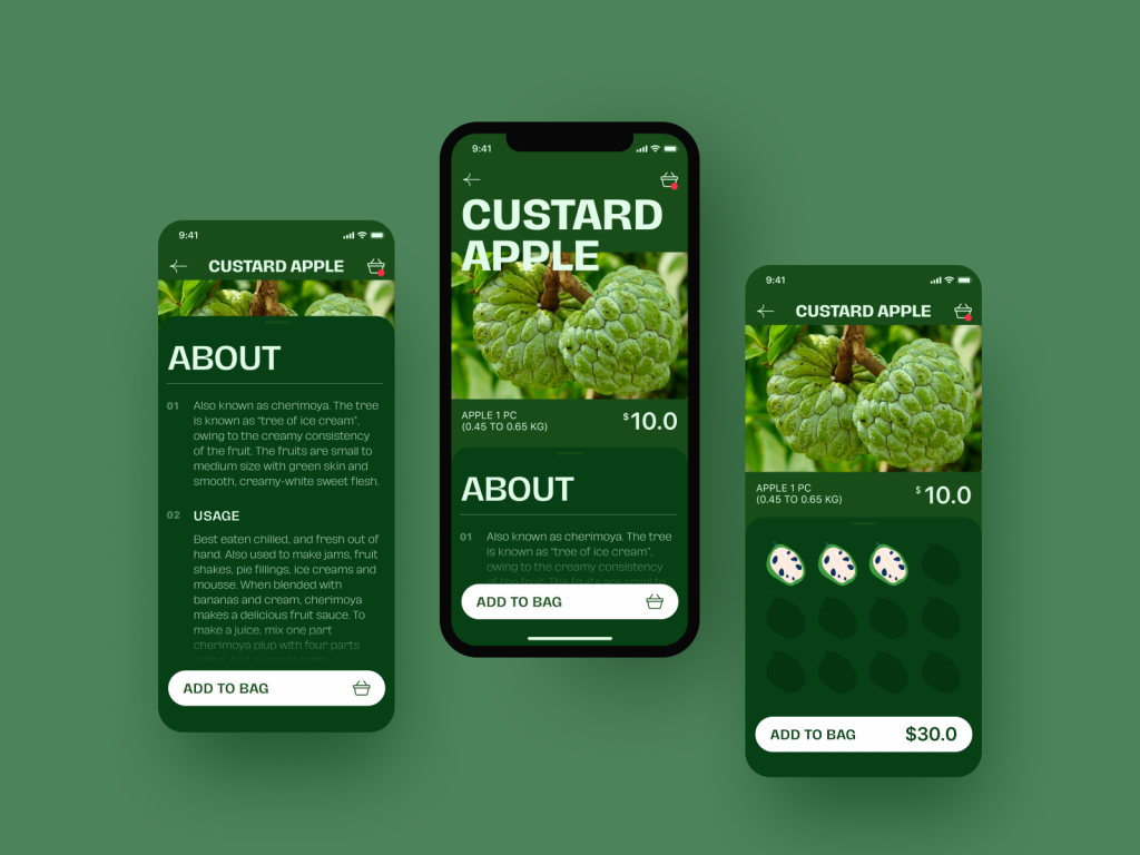
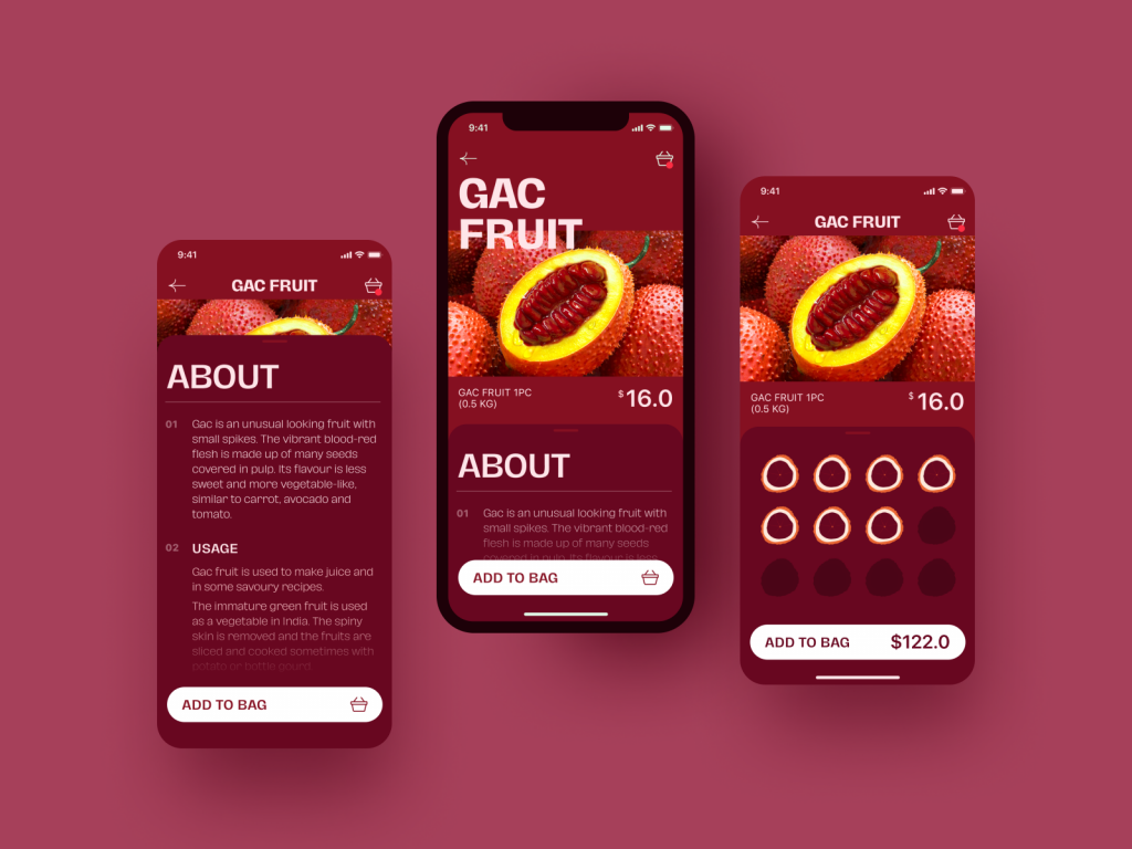
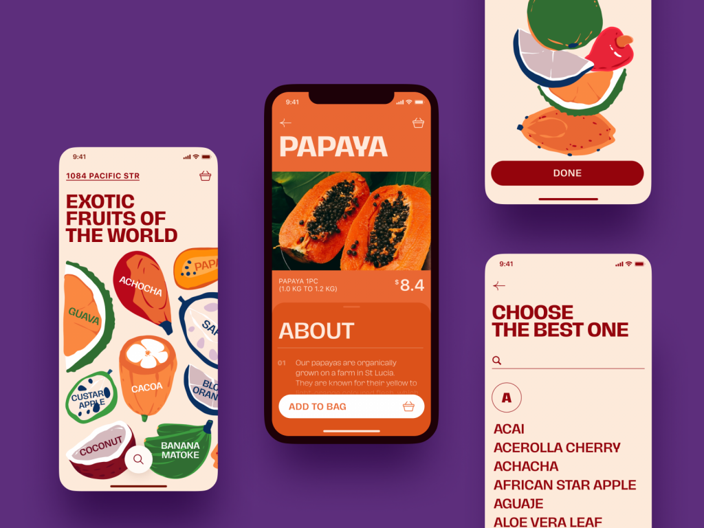
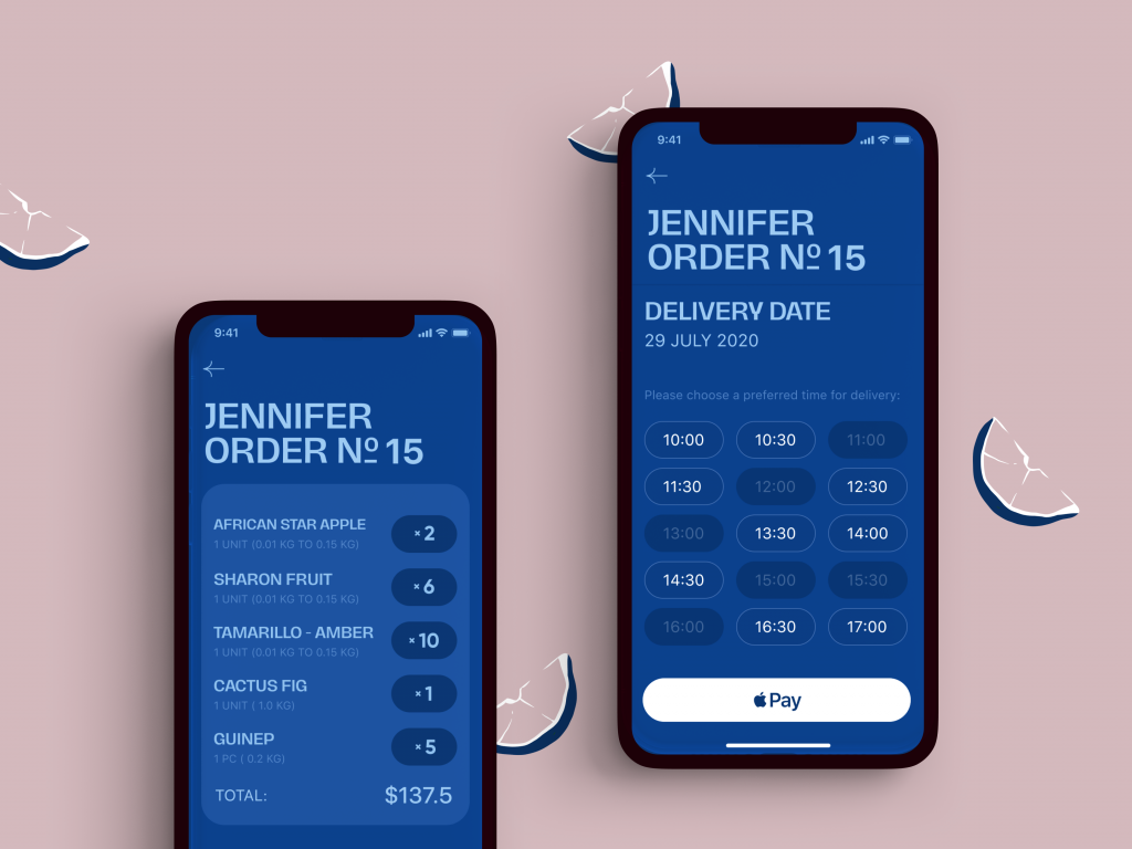
The exotic fruit e-commerce concept is deceptively simple: bright product photography, a quantity selector you can tap without thinking, and a visible cart badge the second something’s added. That last detail matters more than it looks. Baymard Institute’s ongoing e-commerce usability research puts average cart abandonment at around 70 percent industry-wide, and a meaningful chunk of that is attributable to friction, not price—confusing checkout flows, invisible carts, too many steps between “want” and “bought.”
The tip here is almost embarrassingly simple: your cart icon needs to update instantly and visibly, with a number, a color shift, something. If a user has to tap into the cart to confirm they actually added the mango, you’ve already lost a fraction of them. Also worth stealing: letting users adjust quantity directly from a product tile instead of forcing a detail-page visit. Every extra tap is a tiny tax on conversion, and mobile shoppers have historically been the least patient about paying it.
Cloud Storage and the Art of Getting Out of the Way
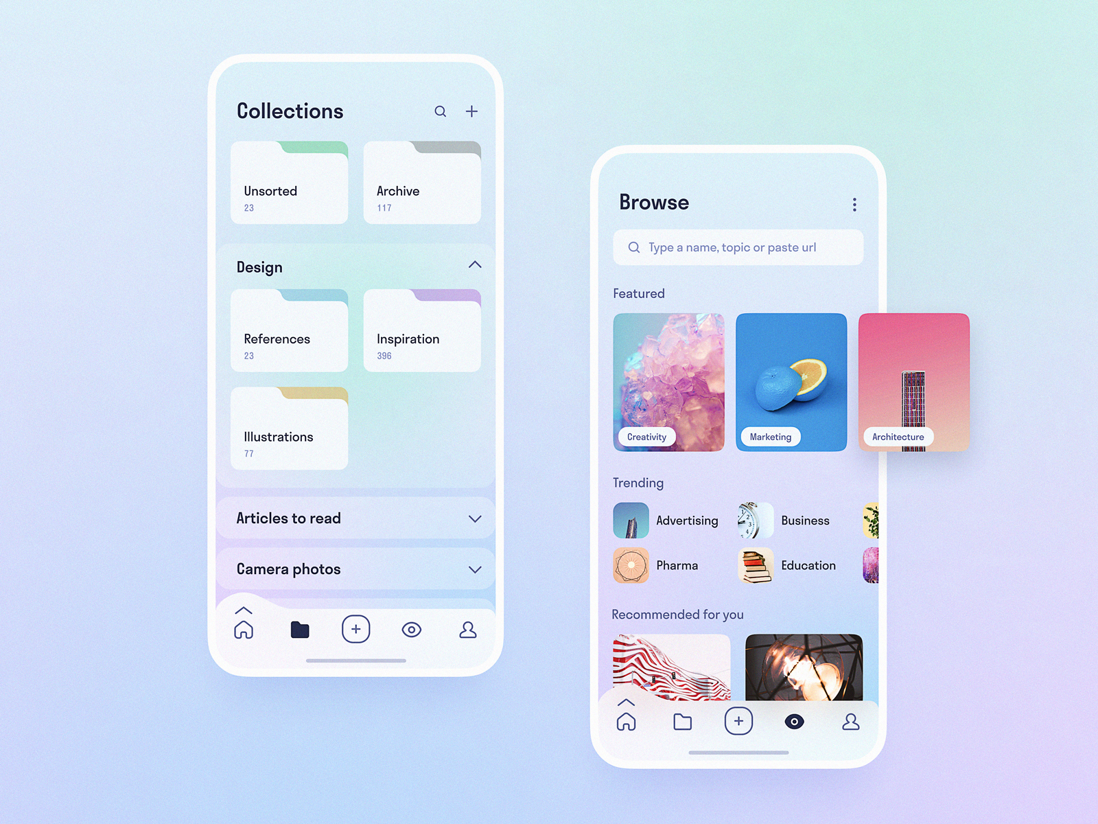
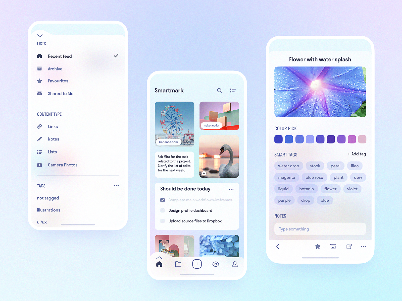
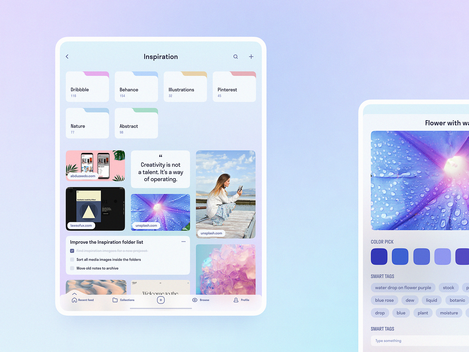
There’s not much glamour in a cloud storage app, and that’s precisely the design lesson. The concept here goes clean and minimal because the content—someone’s files—is the actual product. Google’s own Material Design guidelines set touch targets at a minimum of 48dp, while Apple’s Human Interface Guidelines require 44×44 points, and utility apps like file storage are where that spec actually gets tested, because users are moving fast, often one-handed, often distracted.
Practical move for this week: if you’re auditing an existing app, measure your tap targets against those numbers before you touch color or typography. A beautiful interface with a 32px tap target is a customer service ticket waiting to happen.
Drink Recipes, Quotes, and Gallery Apps: Mood as a Feature
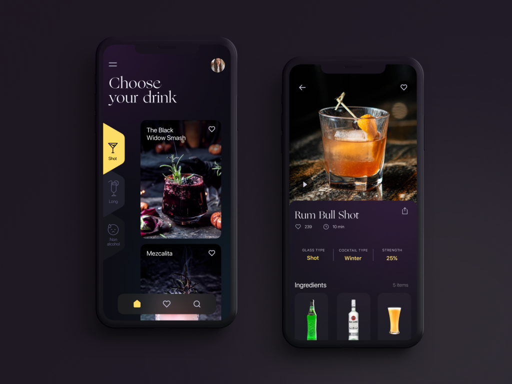
Two very different concepts—a drink recipes app and a minimalist quotes app—share one unifying design move: dark backgrounds used to make content, not chrome, the star. Photography, typography, and artwork all read differently against black than against white, with richer perceived contrast and less visual competition from UI furniture. This isn’t a style preference so much as a physics one—a dark backdrop makes color and light pop harder, which is why photography apps and streaming platforms lean the same direction.
If you’re designing for content-driven browsing—art, recipes, quotes, anything visual-first—resist the instinct to add borders, cards, and drop shadows around everything. Let the content sit directly on the background. Add structure only where navigation genuinely requires it.
Onboarding Is Retention Insurance
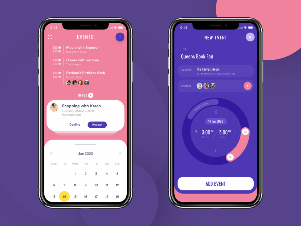
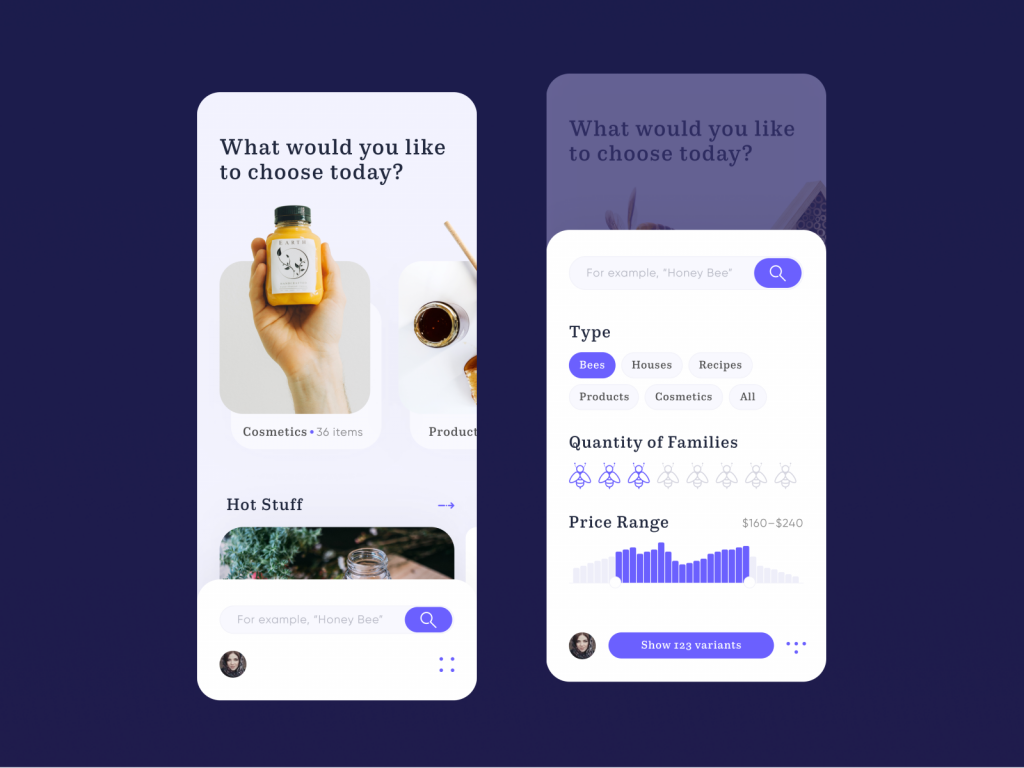
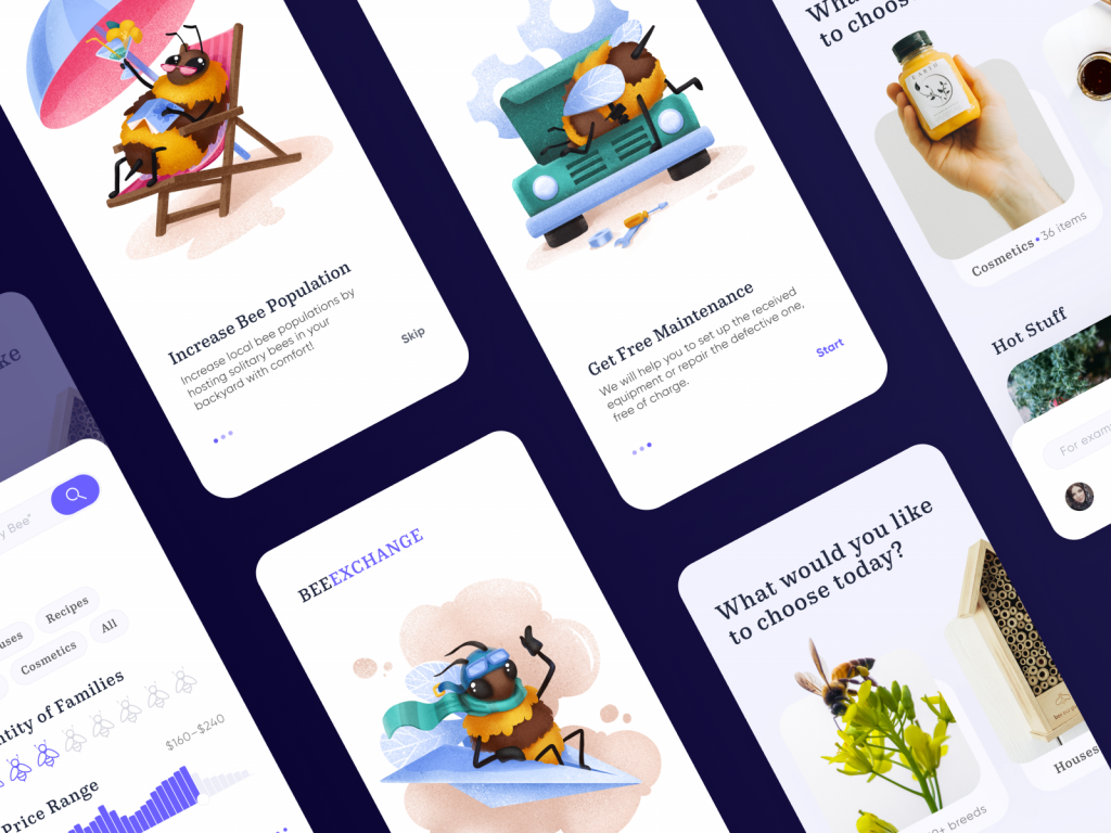
The event app and the bees-and-honey app concept both use custom illustrated onboarding sequences, and it’s tempting to file that under “nice to have.” It shouldn’t be. Recent mobile retention research found that apps with a structured onboarding flow saw roughly 50 percent higher Day-1 retention than apps that dropped users straight into an empty interface. An onboarding screen is a first impression doing the job a salesperson used to do.
This week’s actionable version: audit your first three screens. If a new user can’t tell what the app does and why they should care within those three screens, your onboarding is failing regardless of how charming the illustrations are.
Inventory Apps: Where Data Visualization Earns Its Keep
The bar inventory concept pairs the app with Bluetooth-connected scales—a real hardware category, with products like Partender and BarVision already doing this commercially—so staff get live pour data instead of a manual count at 2 a.m.
The lesson scales down easily: whenever your app‘s core job is “help someone make a fast decision from data,” resist the dashboard urge to show everything at once. Pick the one number that matters most in this moment, put it in the largest type on the screen, and let everything else be secondary.
The Actual Point
None of these concepts are reinventing mobile design. They’re just refusing to skip the boring parts—tap target sizing, cart visibility, onboarding sequencing, color as information rather than decoration. Good app design, it turns out, has less to do with finding a clever new interaction pattern and more to do with not screwing up the fundamentals everyone claims to already know.
Recommended Reading
Liked this one? Good instincts. Our other case studies and think pieces cover the rest of the design world we haven’t ranted about yet:
Design for Sales: 10 Creative UI Designs for Ecommerce
Information Beautified: Media and Editorial Website Designs
UX Design for Traveling: Impressive Web Design Concepts
23 Impressive Web Design Concepts for Various Business Objectives
Save the Planet: Web Designs on Environment and Ecological Issues
App Design Ideas: 7 Nifty Mobile Application Design Projects
Steal the Show: Creative Web Design for Diverse Events
Web Design: 26 Examples of Creative Landing Pages