There’s a moment every online shopper knows. You land on a product page and something happens—or doesn’t. The difference between a page that converts and one that gets closed in two seconds isn’t luck. It’s design. Considered, intentional, sometimes audacious design.
We’ve built a lot of product pages at tubik. Enough to know that the best ones make you feel something about the thing before you’ve touched it, smelled it, worn it, or plugged it in. Below are 17 examples from our work: different industries, different visual languages, one shared ambition—to turn a webpage into the moment a decision gets made.
But first, let’s talk about what a product page actually is. And isn’t.
What a Product Page Really Does
The textbook answer: a product page presents an item, displays its options, shows pricing, and lets users add it to a cart. True. Also wildly incomplete.
Here’s the fuller picture. By the time a user lands on your product page, you’ve already spent—probably—real money getting them there. SEO, paid ads, social content, email campaigns, influencer partnerships. All of that effort funnels to this single page. This is the moment. And a badly designed product page wastes every dollar of it.
A great e-commerce product page design does five things simultaneously: it catches attention, builds trust, communicates value, removes doubt, and makes the next step feel obvious. That’s a lot to ask of a rectangle on a screen. But when it works, it’s remarkable.
The essentials are non-negotiable—product imagery, clear pricing, color and variant selectors, customer reviews, an unmissable CTA. But beyond the checklist lies the real craft: hierarchy, motion, atmosphere, the subtle choreography of where the eye goes and what it feels when it gets there.
Now, the work.
17 Product Page Designs Worth Studying
Neon Signs: When the Page Becomes the Product
Dark backgrounds aren’t just an aesthetic choice here—they’re a strategic one. Neon only makes sense against darkness. The smooth animation and bold typographic treatment are the experience. The design understands that for atmospheric products, the page’s mood is the first thing it sells.
Cosmetics Brand: Restraint as Luxury
Natural palette. Elegant geometry. A horizontal scroll that feels deliberate rather than gimmicky. The split-screen layout on product pages—image on one side, information on the other—creates a visual breathing room that says premium before a single word is read. In beauty e-commerce UX, first impressions are the product.
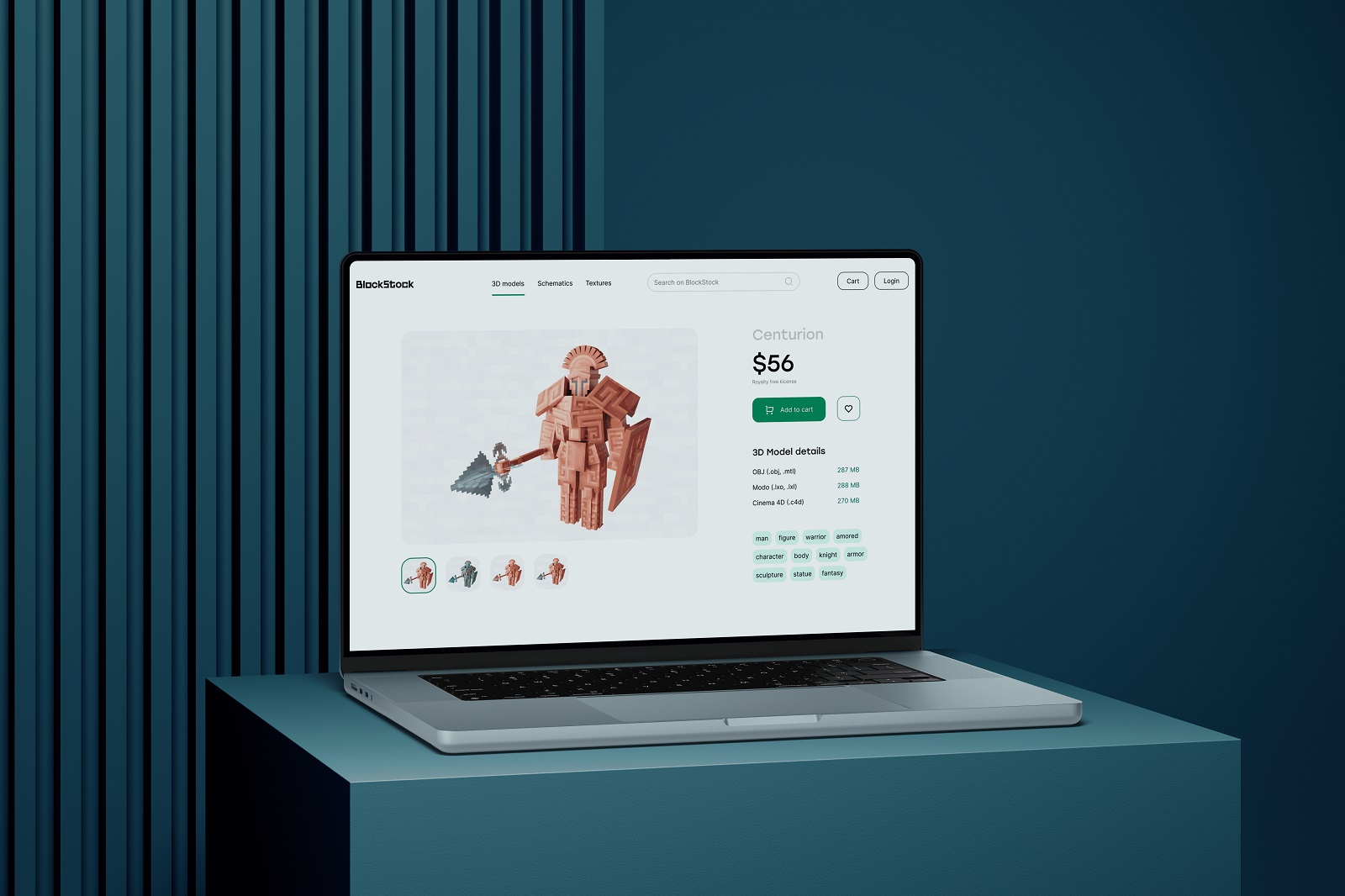
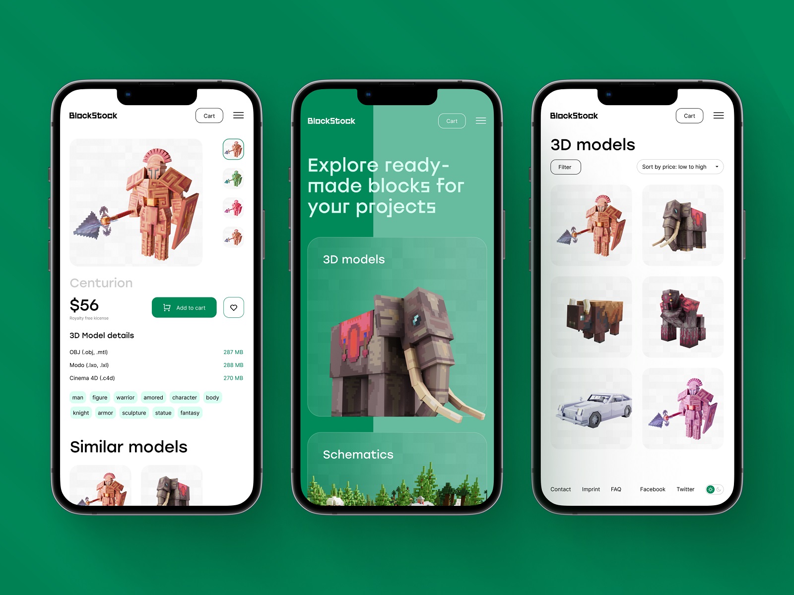
BlockStock (Minecraft Models): Minimalism With Purpose
Minimalism isn’t about removing things. It’s about removing the wrong things. This product page for a 3D asset marketplace is clean, airy, and laser-focused: prominent model preview, clear pricing, variant options, file format details, tags for continued exploration. Nothing more. Nothing unnecessary. It’s a masterclass in information architecture done quietly.
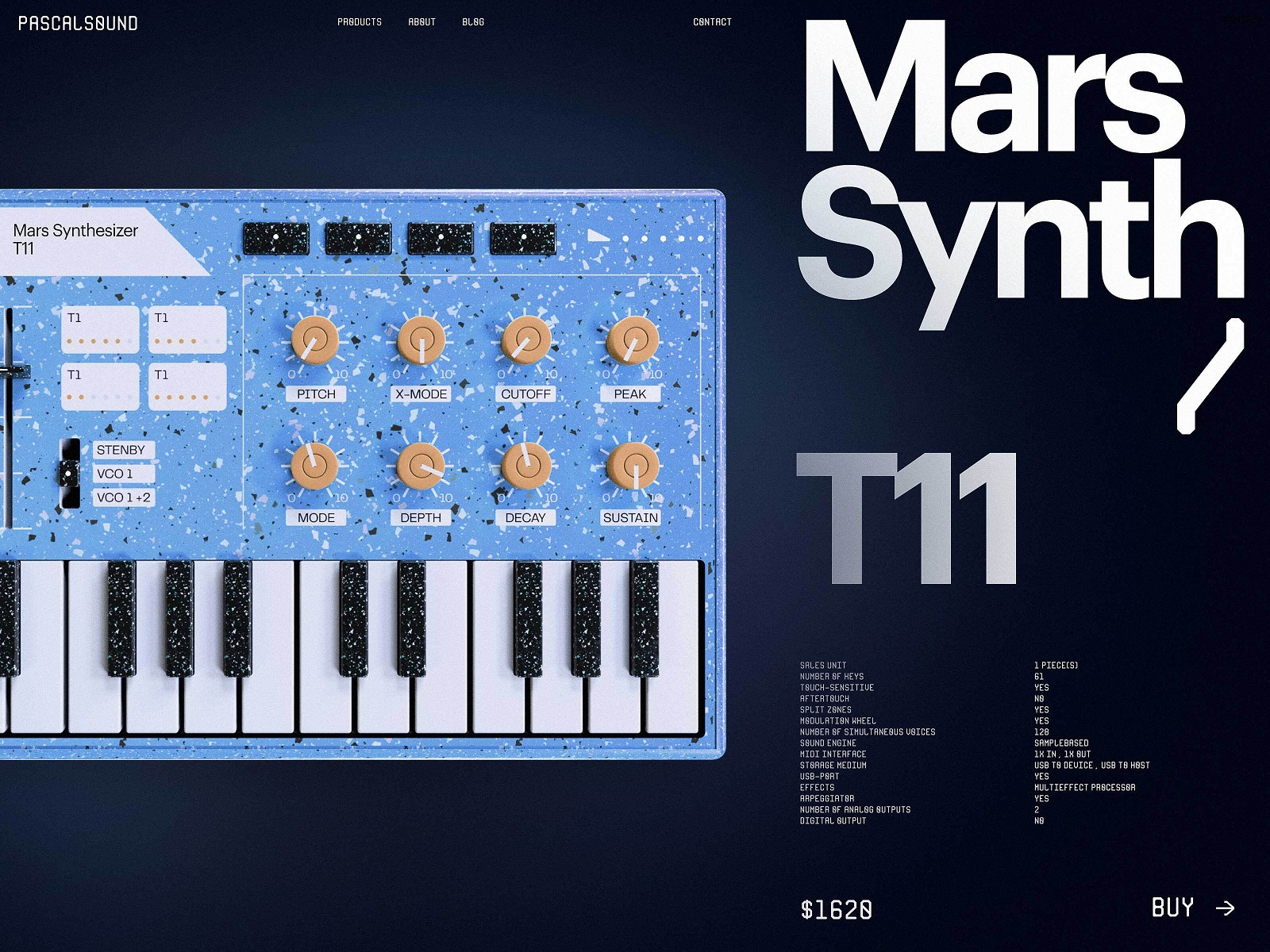
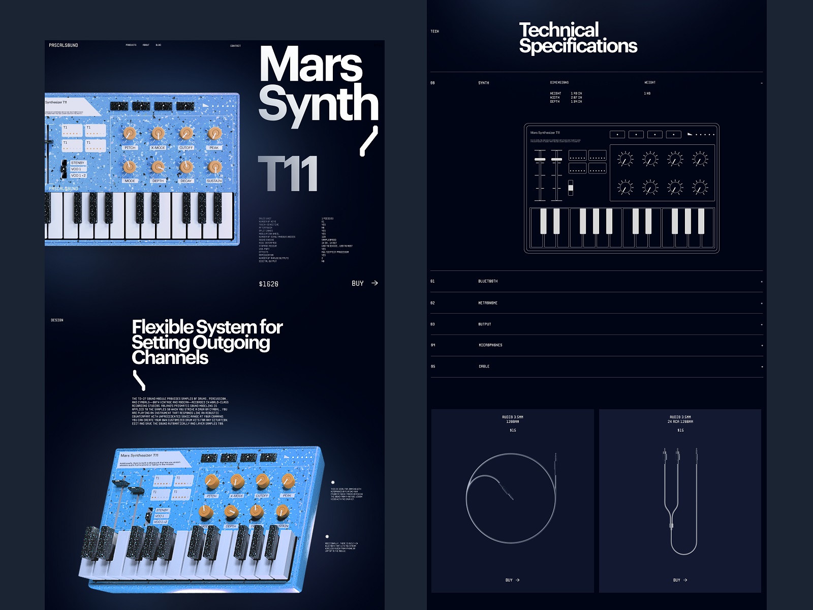
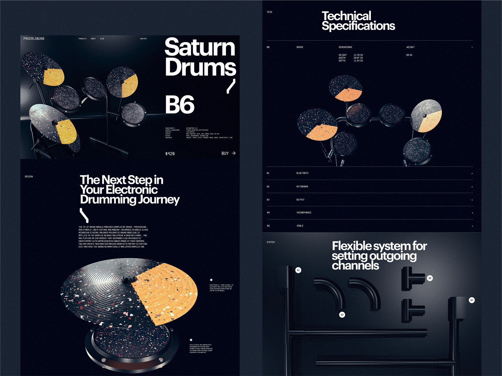
Musical Instruments: Brutalism With Soul
3D product renders on a deep dark background, bold typography that hits like a power chord. The design matches the product’s energy so precisely that the instruments feel alive before you’ve heard a note. Great product page UI design doesn’t describe a product’s character. It embodies it.
Fashion Clothing Brand: Getting Out of the Way
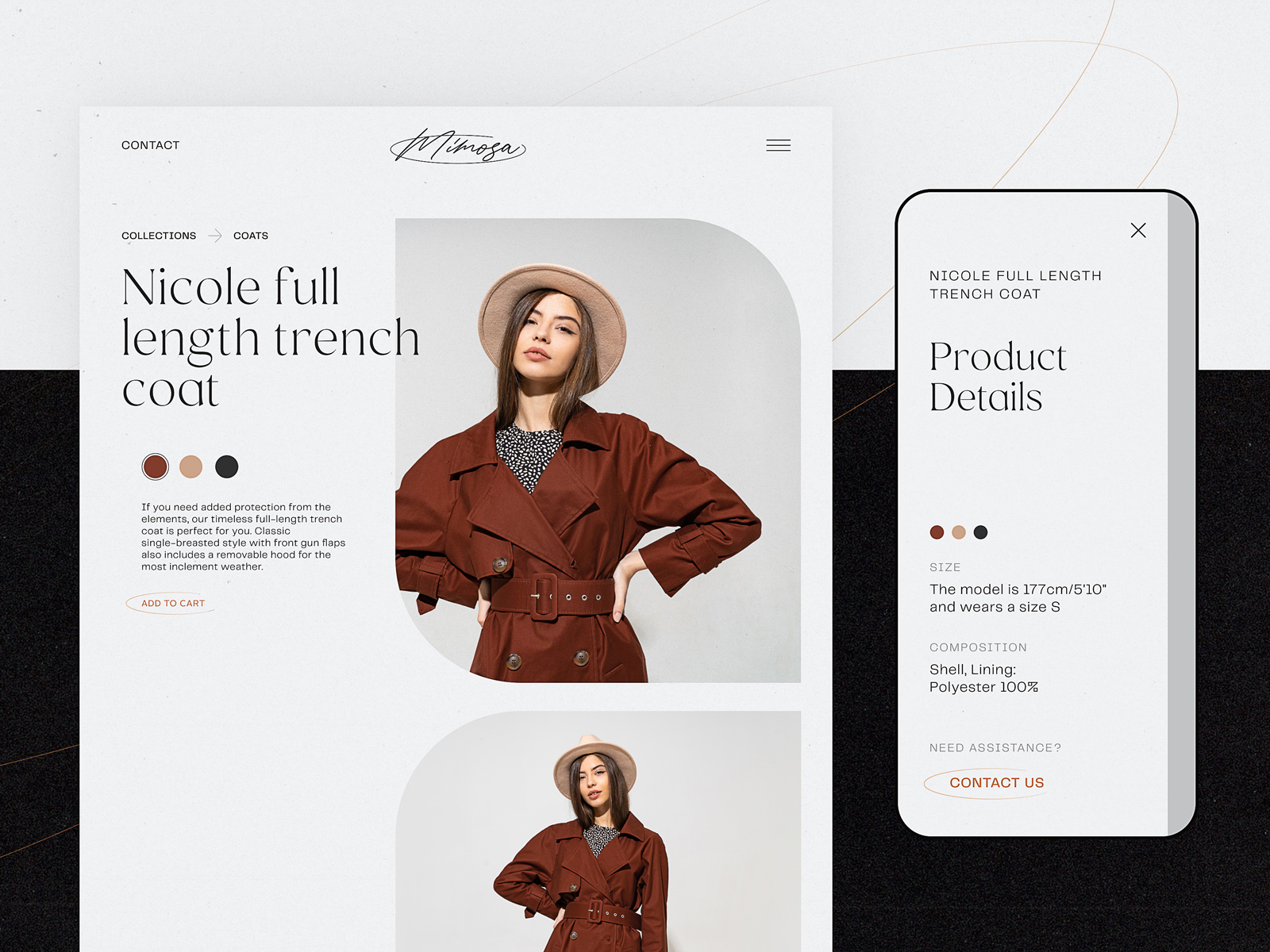
Sometimes the best design decision is to disappear. This fashion e-commerce site uses an almost aggressively minimal layout so that the photography can do exactly what it was hired to do. No competing gradients. No decorative noise. Just beautiful, consistent imagery and the quiet confidence of a brand that knows its product is the story.
Pet Shop: Show, Don’t Tell
Video as a product feature, not an afterthought. Watching a product actually work—in context, in motion—creates emotional conviction that static photography can’t match. For pet products especially, where joy and function are inseparable, video demonstrations aren’t a nice-to-have. They’re the point.
Bennett Tea: Color as Navigation
Here, each product gets its own bold background color, keyed to the packaging. The result is a browsing experience where color itself becomes wayfinding—you remember products not just by name but by mood. The asymmetric text grid, geometric shapes, and sticky header with a cart indicator that changes state when items are added: thoughtful e-commerce UX design at every layer.
Underwear Brand: The Architecture of Desire
Red. Contrast. Elegant typography that knows exactly how much tension to create. Visual dividers guide the eye; directional cues move shoppers toward purchase without them noticing they’ve been guided. Good conversion-focused product page design is invisible. The user just finds themselves reaching for their card.
Yacht Hiring: Sell the Feeling First
Nobody hires a yacht for the horsepower specs. They hire it for what it feels like to be on the water at golden hour. The full-bleed video, the color palette pulled from sea and sky, the interactive yacht visualization—all of it front-loads the fantasy. The functional details come after you’ve already said yes in your heart. Sequencing is everything.
Gardening Shop: Nature’s Logic, Applied to Layout
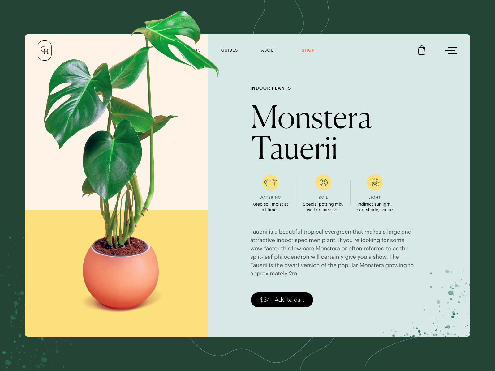
A multicolored pastel background separates the product image zone from the description zone as naturally as a garden bed separates plant species. Infographic-style characteristic markers, a price embedded directly in the buy button. The visual logic is intuitive because it mirrors something real. The best e-commerce web design borrows from the world the product belongs to.
Glasses Shop: The Multi-Angle Promise
Glasses are deeply personal. You need to see them from every angle—on, off, up close, at distance. This product page delivers that without friction: multiple perspectives, extended information in skimmable blocks, price on the buy button to save screen real estate. The design understands that reducing purchase anxiety is a feature, not a flourish.
Fashion Accessories: The Interactive Moment
Here’s the detail that makes this page memorable: animated neckerchief previews that respond to model and pattern selections in real-time. Not a static swatch. An actual, realistic simulation of what you’re buying. When product page interactivity is this considered, it makes the act of choosing genuinely enjoyable.
Zero Waste Products: White Space as a Value Statement
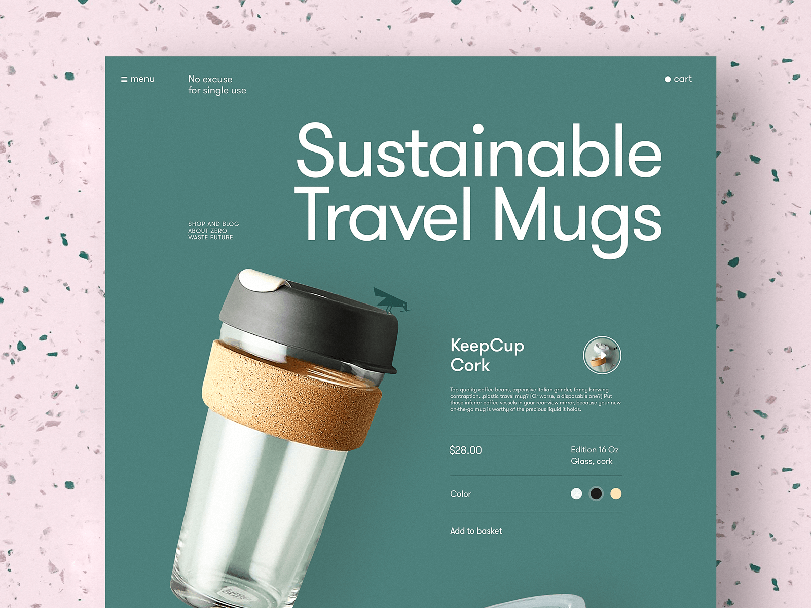
For a brand built on intentionality, a cluttered page would be a contradiction. This design is minimal, readable, and quietly confident—exactly like the brand philosophy it represents. Color selector interactions add play without noise. The design earns trust by practicing what the brand preaches.
GNO Blankets: Transparency as Conversion
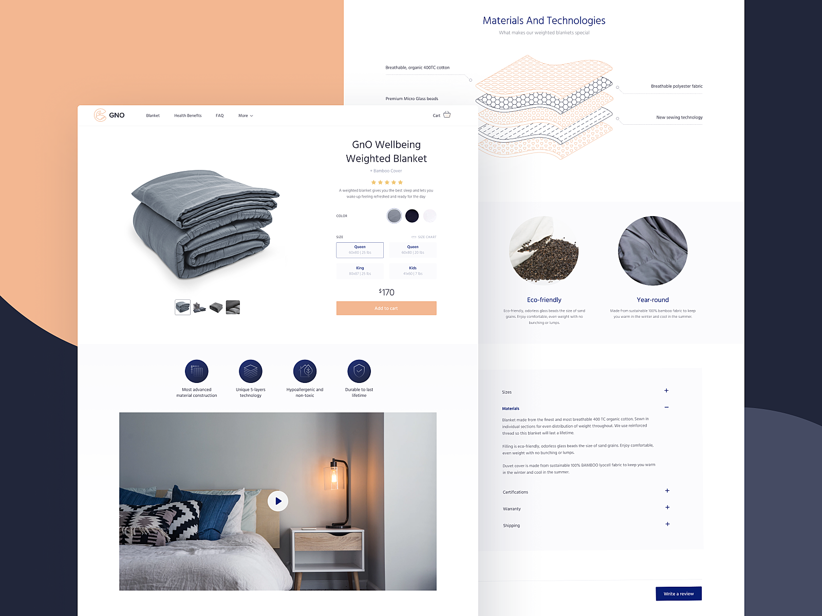
Custom-built layer illustrations walk buyers through exactly what’s inside the blanket. For a product where quality is the entire argument, showing the layers is the proof. Paired with a video presentation and a clean visual hierarchy, this page answers the question “why is this worth the price?” before a customer has to ask it.
Niche Perfumery: Idea Made Visible
A full-screen video background for a perfume product page is an audacious choice. Perfume can’t be demonstrated digitally. So instead, the page creates a world—dark, cinematic, sophisticated—that makes the viewer want to inhabit the brand. The scent is the last thing sold. The feeling is first.
Interior Decor: Functional Minimalism With Range
Different products, consistent logic. A limited, well-balanced color palette lets the products breathe. Prominent imagery. Clear hierarchy. The design system is disciplined enough to work across wildly different items without losing coherence. This is what scalable ecommerce design systems look like in practice.
Insect Shop: The Unexpected Delight
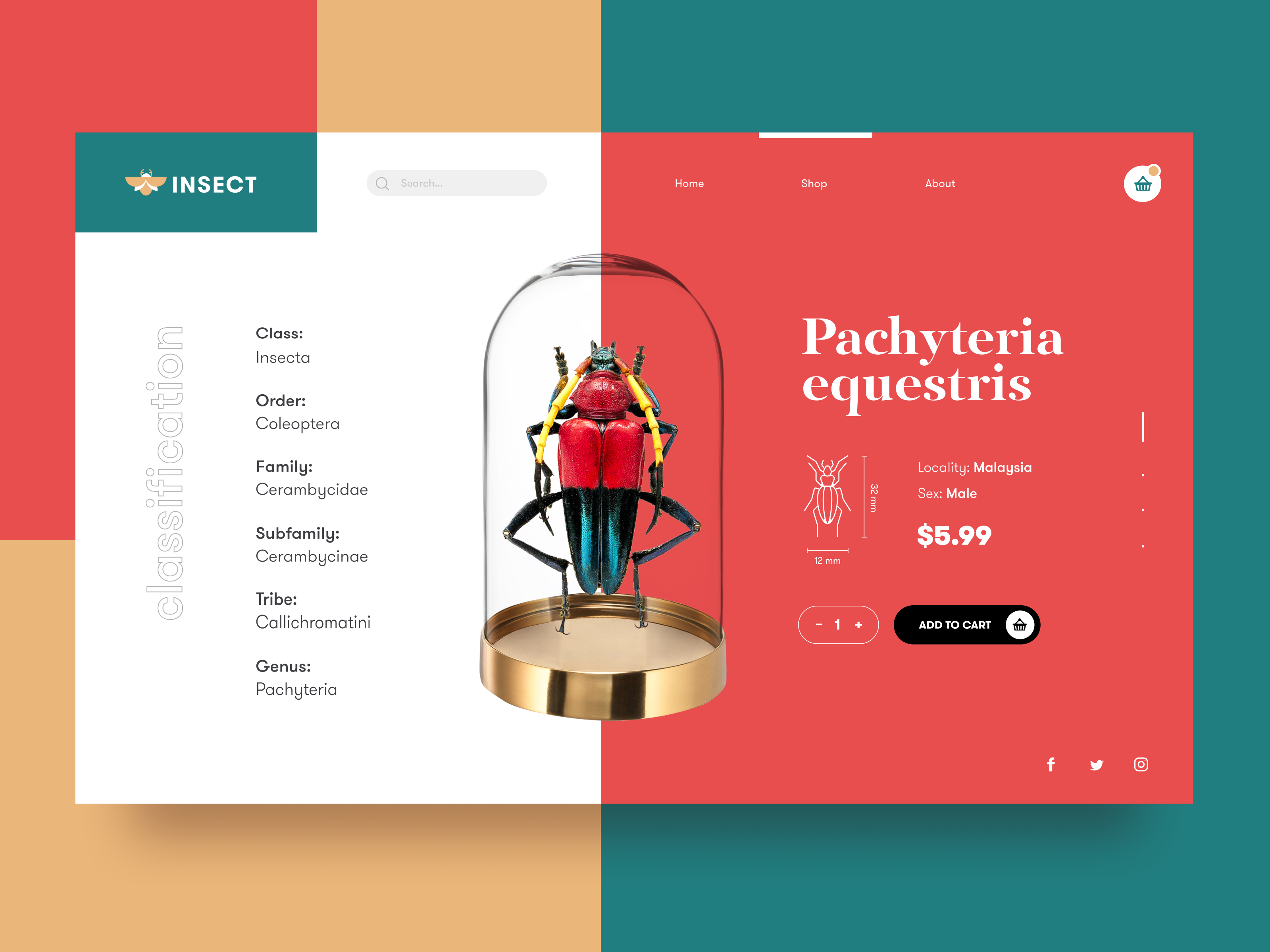
A 3D-rendered insect as the hero image. Size infographics so you know exactly what you’re getting. Information organized symmetrically around the central product model. And the add-to-cart animation? The bug gets captured in a glass jar. Is it necessary? No. Is it unforgettable? Entirely. In a sea of sameness, the moment of surprise is the moment of connection.
The Bottom Line
Seventeen different products, categories, audiences, and visual languages. But look closely and one principle runs through all of them: every design decision serves a user at the edge of a decision.
The dark background on the perfumery page isn’t moody for its own sake—it removes distraction at the moment of consideration. The interactive animation on the accessories page replaces doubt with delight. The video on the pet shop page works as evidence.
Great product page design is empathy with a visual language. It asks: what does this person need to feel confident enough to say yes? Then it answers that question in every pixel.
The pages that convert aren’t always the most decorated. They’re the most considered.
That’s the work.
Recommended Reading
Why stop here? Make sure you check our other articles on all things design:
App Design Ideas: 7 Nifty Mobile Application Design Projects
Information Beautified: Media and Editorial Website Designs
UX Design for Traveling: Impressive Web Design Concepts
22 Impressive Web Design Concepts for Various Business Objectives
Mobile Design: 14 Stylish and User-Friendly App Design Concepts
Design for Sales: 10 Creative UI Designs for Ecommerce
Save the Planet: Web Designs on Environment and Ecological Issues
Steal the Show: Creative Web Design for Diverse Events
Web Design: 26 Examples of Creative Landing Pages