Buttons are among the most popular interactive elements of a user interface. What’s more, they are vital in creating solid interactions and a positive user experience. Today, continuing the set of UI/UX glossary posts, we have collected here the definitions and examples for the widely used types of buttons we daily see on websites and mobile apps.
What Is a Button?
A button is an interactive element that enables to get the expected interactive feedback from the system following a particular command. Basically, a button is a control that allows a user to directly communicate with the digital product and send the necessary commands to achieve a particular goal. For example, it may be the task to send an email, buy a product, download some data or a piece of content, turn on the player, and tons of other possible actions. One of the reasons why buttons are so popular and user-friendly is that they efficiently imitate interaction with the objects in the physical world.
Modern UI buttons are really diverse and can serve plenty of purposes. Typical and frequently used buttons which present an interactive zone are usually clearly marked out for visibility, having a particular geometric shape, and often supported with the copy explaining what action will be fulfilled via this button. Designers have to apply considerable time and effort to create effective and noticeable buttons that are naturally integrated into the general stylistic concept but are contrast enough to stand out in the layout.
Let’s check the types of buttons widely used in mobile and web interfaces.
CTA Button
A call-to-action (CTA) button is an interactive element of a user interface that’s aimed at encouraging a user to take a certain action. This action presents a conversion for a particular page or screen (for example buy, contact, subscribe, etc.), in other words, it turns a passive user into an active one. So, technically it can be any type of button that is supported with a call to action text. What differentiates it from all the other buttons on the page or screen is its engaging nature: it has to catch attention and stimulate users to do the required action.
The home page designed for the uMake website features instantly noticed contrast CTA button echoing the same style in the header and in the hero section.
The yacht hiring website above uses the bright color contrast to make the CTA button instantly noticed and amplifies the effect with the smooth web animation.
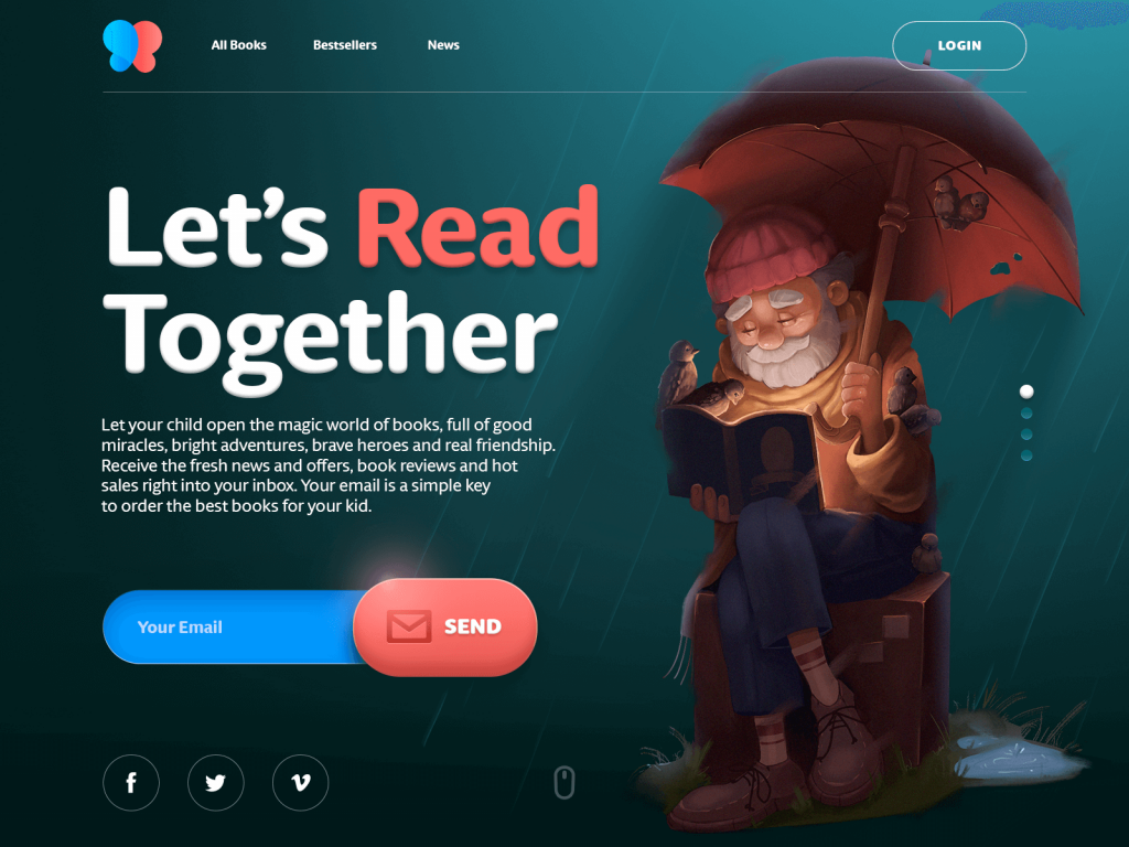
Here’s the home page of an e-commerce website selling books for kids. In the featured slide, there is one core action set as a goal for the page: getting a user to subscribe to the mailing list sharing. So, the button is designed as one of the most noticeable elements of the layout so that the user could instantly see how to do the action as soon as he or she is willing to do it.
Text Button
Here the terminology is transparent: it’s a button presented with a piece of text. It means that the copy isn’t integrated into any shape, filled tab, or anything like that. So, it doesn’t look like a button in our standard understanding of this phenomenon in the physical world. The copy is its only visual presenter. Still, it’s a live control that allows users to interact with an interface. You can also see these buttons marked with color or underlined. Also, used in the website header, text buttons connect a user with the core content sections of the website – and in this case, they aren’t marked anyhow as all (or most) elements in the header zone are interactive by default. Text buttons are usually used to create secondary interactive zones without distracting from the main controls or CTA elements.
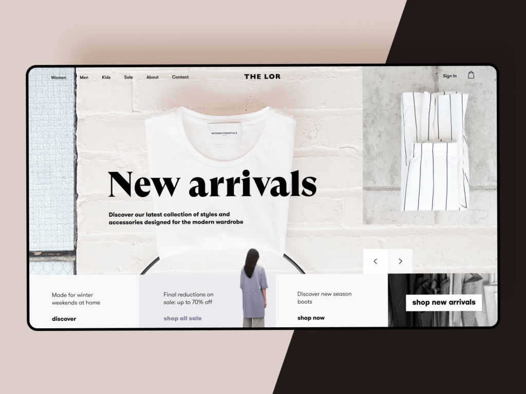
Here’s an elegant website design for a fashion store. As you can see, the interactive part of the layout is based on text buttons. Only the main CTA element is presented as an easily decoded button. All the others feature only copy in both header and tabs for offers. Such an approach supports the general light and minimalistic style of the webpage.
This product page for the e-commerce website selling neon signs features a set of text buttons in the header, marking the actual one with the underline.
One more effective way to use text buttons is various interactive menus, like this one featured on the e-commerce website selling egg products.
Dropdown Button
Dropdown button, when you click it, displays a drop-down list of mutually exclusive items. You can often come across this type in the settings button. When a user chooses one of the options in the list, it’s usually marked as active, for example by color.
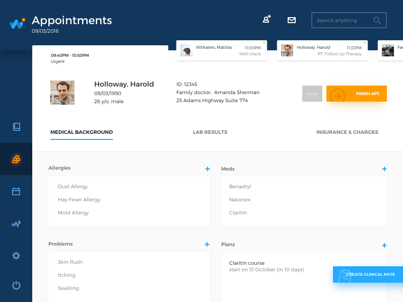
HealthCare app interaction flow shows the buttons opening the lists of details a doctor can add to the particular bill: when the button is clicked, it opens the dropdown list of options. As soon as you choose one, the big button disappears leaving the option chosen and the small plus button in case you want to check the list once again.
Hamburger button
It is the button hiding the menu. When you click or tap it, the menu expands. This kind of menu (and button as well) got such a name due to its form made of three horizontal lines that look like a typical bread-meat-bread hamburger. Today it is a widely used interactive element of web and mobile layouts; still, debates about its pros and cons are still hot.
Active internet surfers visiting diverse websites on a regular basis know by default that this button hides the various categories of website content so this trick does not need additional explanations and prompts. What’s good, hamburger menus free the space making the interface more minimalist and airy; from the point of functionality, it saves a lot of space for other important layout elements. Additional benefits can be mentioned for responsive and adaptive design hiding navigation elements and making the interface look harmonic on different devices.
The arguments against the hamburger menu are based on the fact that this design element can be confusing for people who do not use websites regularly and can get misled by the sign that features a high level of abstraction. It may have a negative influence on navigation and can become the reason for poor user experience. So, the decision about applying the hamburger button should be made after user research and definition of the target audience’s abilities and needs.
Although hamburger menus still belong to controversial issues of modern web and app design, they are used frequently.
Here’s an example of a website using the functionality of a hamburger menu. It allows for hiding the extended menu of options to concentrate the user’s attention on impressive visuals and core information.
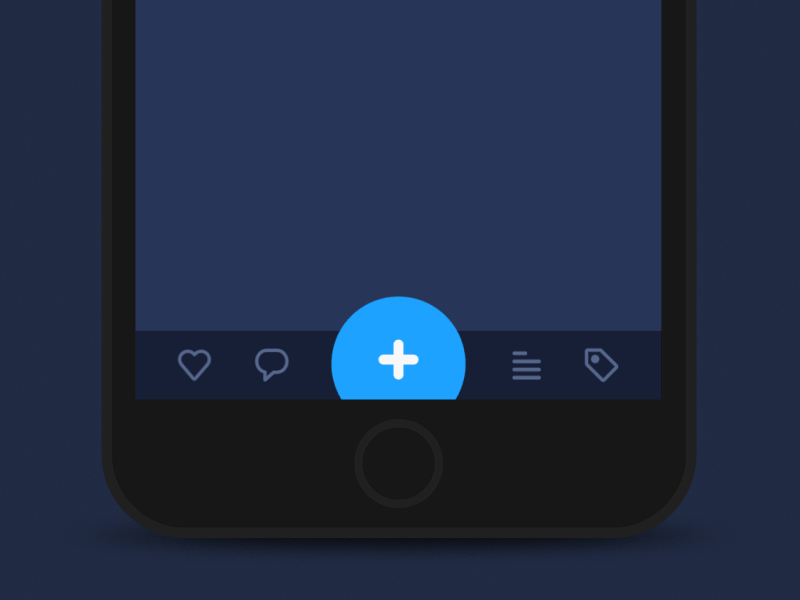
Plus Button
Being clicked or tapped, plus button enables a user to add some new content to the system. Depending on the type of an app, it can be a new post, contact, location, note, item in the list – anything that is a basic action for the digital product. Sometimes, by tapping this button, users are directly transferred to the modal window of creating content, in other cases, there is also a medium stage when they are given additional options to choose from and make adding content more focused.
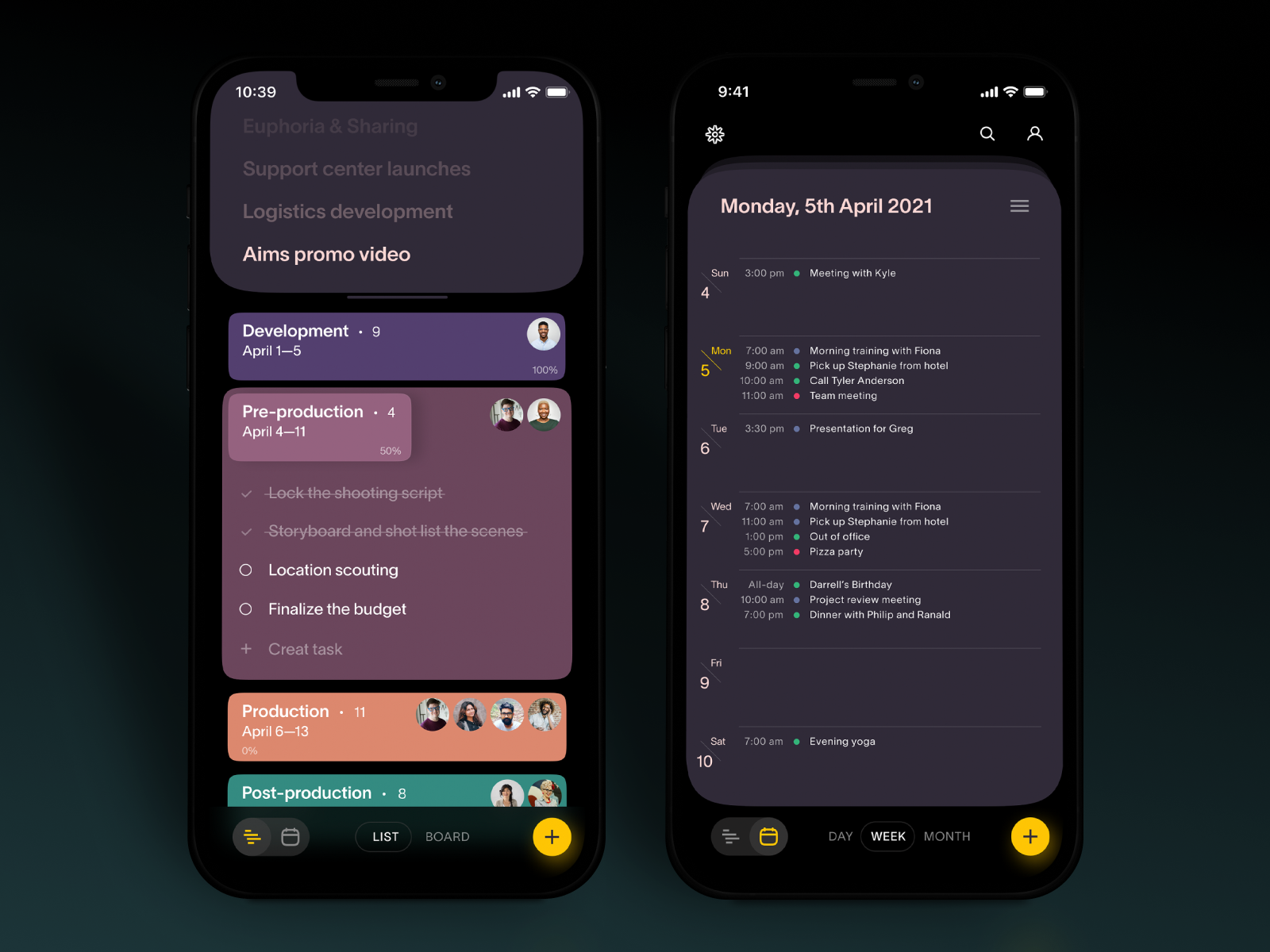
The Task Manager app interface features plus button in the bottom right corner of the screen to make it accessible and easy to use.
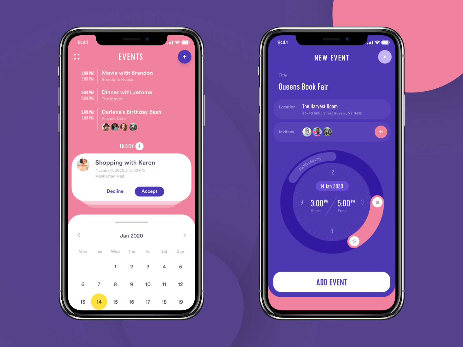
The Event App features the plus button on top of the screen and opens the screen of creating a new event.
Expendable Button
This button opens a variety of options after being clicked or tapped. It is one more way to set the proper flow of interactions without overloading the screen, which is particularly important for mobile interfaces limited in screen space.
Here’s the Travel Planner application: the central interactive element of the tab bar is a plus button allowing a user to add a new trip or a new item to a particular trip. To make the experience simpler, the button is expanded into a set of buttons marking definite types of content, so that the user could make the choice at the start and reach the necessary screen.
Here’s how the expandable button works in the Habit Builder application, allowing the user to create and tune the new habit to track.
In the Finance Management application, the expendable button is on top, integrated into the calendar stripe.
Share Button
With the high popularity of social networks, chatting, and emailing, these buttons simplify the process of connecting an app or website content to a user’s social profile. The button of this type enables a user to share the content or achievement directly to social networking accounts. To make the connection clear, it is presented with icons that feature a brand sign of particular social networks and are easily recognizable. Quite often now, if sharing is not the key action expected from the user on the page, they aren’t marked anyway as buttons (no additional shapes, color marking, underlining, etc.) – you just see the icons, but they are interactive. Such an approach supports minimalism and the effective use of negative space. It also lets users concentrate on the main functionality but always see the signs of quick access to their social profiles.
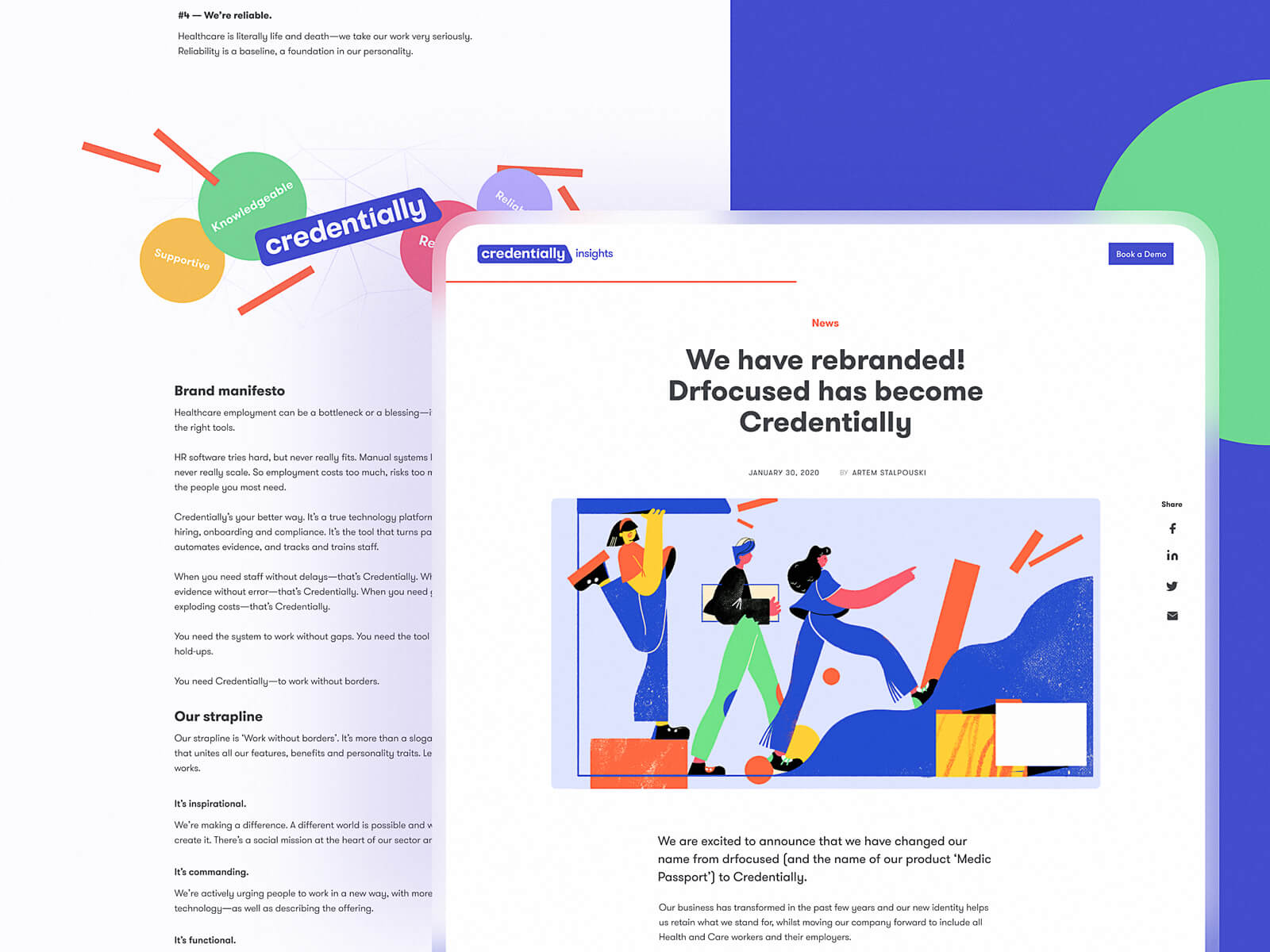
The blog page for the Credentially website features a vertical set of share buttons on the right side of the screen.
Ghost Button
Ghost button is a transparent button that looks empty. That’s why it is also called “empty”, “hollow” or even “naked”. Its visual recognizability as a button is typically provided with a shape bordered by quite a thin line around the button copy. This kind of button helps to set the visual hierarchy in case there are several CTA elements: the core CTA is presented in a filled button while the secondary (still active) is given in a ghost button.
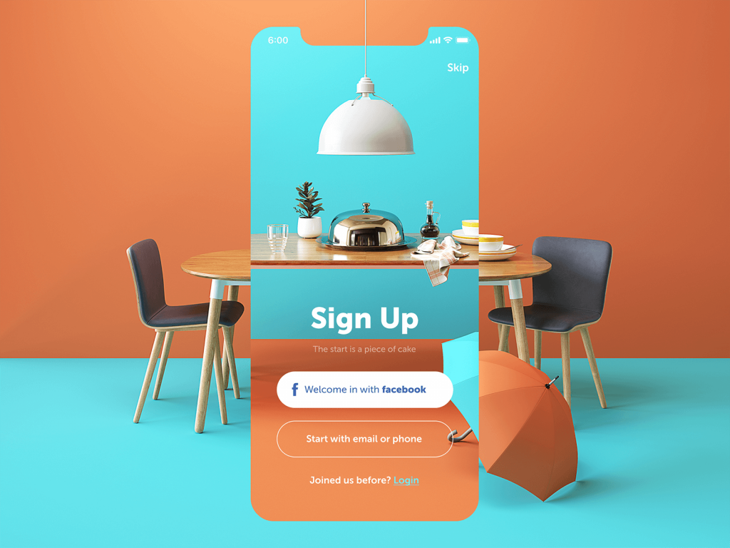
Here’s the sign-up screen for a restaurant app. It features buttons of three different types: the core CTA is presented with the filled button that offers the most popular and easy way to sign up quickly; the ghost button offers access to less popular option; the text button is integrated into the next line as an answer to a question and marked with color. Such an approach helps to build a solid visual hierarchy of the buttons on the screen.
Floating Action Button (FAB)
In Material Design, the floating action button (FAB in short) is the button that presents the primary action on the app screen. Typically, it’s a round icon button elevated above other page content. This button usually gives instant access to essential or popular actions users do with the app. Depending on the design and information architecture of the mobile application, FAB can:
- perform a typical core action (open the screen of a new email, open the screen for adding the photo or video content, search for the needed content in the gallery, etc.)
- show additional actions
- transform into other UI elements.
The position of FAB on the screen is usually determined by the factor of high visibility and may vary according to the general design concept of the app screens. The rule of thumb is to use only one FAB per screen, not more, to avoid loss in concentration.
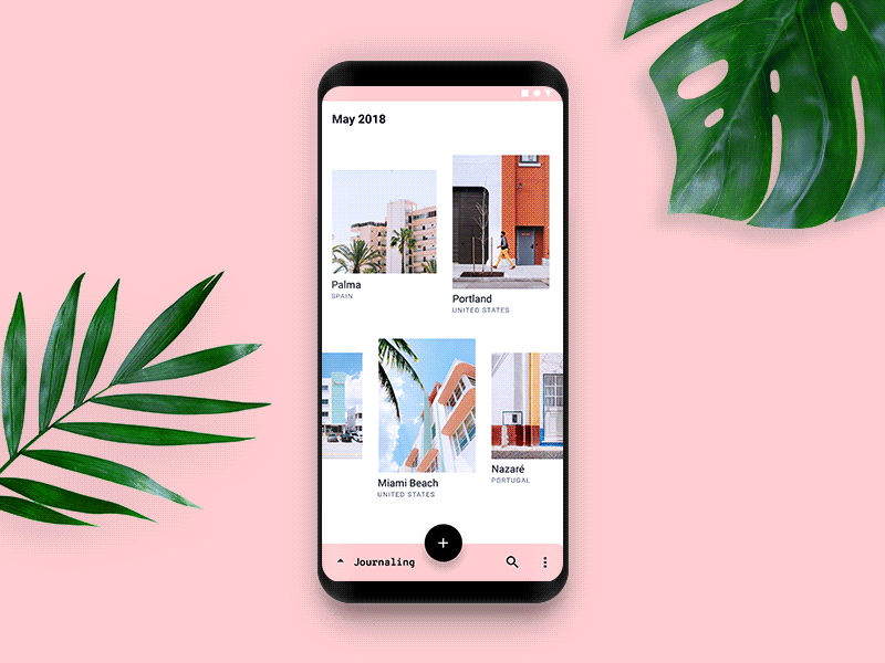
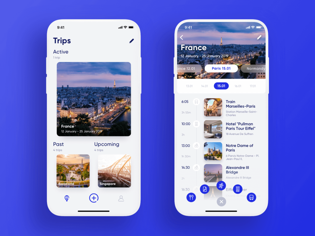
Here’s a flow of interactions for travelers’ diary applying the bottom app bar, overlapping FAB, and woven image list.
Factors of Effective Button Design
Size. Size is one of the core ways to inform users about the importance of a layout element and build the hierarchy of components. An attractive and efficient call-to-action button needs to be big enough to be quickly found but not too big so that the layout structure wasn’t spoiled. Market leaders often provide recommendations on the proper sizes of buttons in their guidelines. For example, Apple says that CTAs in mobile UI should be at least 44Х44 pixels, while Microsoft recommends 34Х26 pixels. If you design for mobile, the requirements to different types of buttons may be quite strict so study the guidelines thoroughly to minimize the risks of app rejection due to poor UI design.
Color. To make some buttons easily noticeable and some secondary, it’s vital to choose a proper color. The thing is that human mood and behavior highly relate to the visual surroundings, and color is one of the most powerful tools in this aspect. It is vital to keep in mind while choosing colors for CTA: buttons and background colors have to contrast well in order to make the button quickly stand out from the other UI components.
Shape. As for CTA buttons, they often look like horizontal rectangles. The reason is that you want to make it clear this button is clickable and interactive, and people are used to perceiving this shape as a button. In addition, it is recommended to design CTAs with rounded corners because they are thought of as they point inside of the button drawing attention to the copy. Sure, this decision is made in case the shape harmonically combines with the general stylistic concept chosen for a webpage or mobile app screen.
Placement. The placement of buttons is crucial to building up a solid visual hierarchy and clear navigation. If they are located in the areas where users’ eyes can’t catch them, other visual aspects such as color and size might not work efficiently. Designers have to learn the most scannable areas and place buttons of the core functionality within the user’s path.
Copy. The powerful button microcopy is usually short but consistent so that it could quickly catch users’ attention. It’s often performed in capital letters to make the copy even more attractive in the layout. Still, that’s not necessary, the decision is made according to the general design concept, typography, and mood of the text message.
Here’s the landing page design for a kindergarten. Let’s review all the buttons used on the page:
- the core CTA button inviting visitors to join is instantly noticeable: the designer used a rounded rectangular filled button of the color that contrasts with the background but sets the visual connection to the animated hero image, the most prominent visual element on the page. The CTA text is given in simple, readable font featuring all capital letters
- the header features 4 text buttons that connect users to the important content sections on the website.
- the left part of the header features the secondary CTA button that is quickly scanned and allows already registered users to enter their accounts.
- the share buttons are placed into round shapes but aren’t given too much color contrast so that to be easily found but not to distract users from the main CTA.
Obviously, there are more types of buttons to discuss and check with UI design examples. So, we will continue the review in our next posts, don’t miss the updates.
Useful Articles
Best Practices for Website Header Design
UI/UX Design Glossary: Navigation Elements
Call for Attention. Powerful CTA Button Design
7 Tips to Enhance Mobile Interactions
Take It Easy: Tips for Effort-Saving User Interfaces
Visual Hierarchy: Effective UI Content Organization
Gestalt Theory for UX Design: Principle of Proximity