Today we would like to tell you about the case of design for designers: check the creative process of our collaboration with uMake, the cool, flexible, and multifunctional service for 3D modeling, design, and visualizing any ideas.
Client and Project
uMake is a digital service that opens the way to make beautiful designs with a library of content and easy-to-use tools. It lets CAD professionals and 3D modeling enthusiasts create immersive 3D content on the go, giving them complete freedom to transform their imagination into a reality. To reach its audience and communicate with it consistently via multiple channels, the product strived for an attractive and efficient identity that would help the uMake brand set solid connections with users and present its problem-solving power.
The story behind uMake, as it often happens, is profoundly human and emotional: the founder, coming from a small town, paved himself a creative life path by having learned Photoshop. And with years, starting uMake, he put that story into the heart of the product, striving to create a product that would fulfill people’s dreams, visions, and ideas by utilizing accessible and easy-to-use design tools.
From tubik side, the creative team for the project included Ernest Asanov, Vlad Radionov, Valeriia Bondarieva, Olya Zakharyan, Ksenia Lashko, Arthur Avakyan, Andrey Drobovich, Kirill Erokhin, Aleksandr Petulko, and Kate Baikova. Also, we collaborated with 3D artists Zhenya Gor and Vikiiing, who created great 3D graphics for the project.
Process
Branding
Talking about the nature of the brand, the creators mentioned that most people find 3D easier to communicate their ideas but find it challenging to learn and create – and that’s where
uMake is very helpful to them. So, the product’s target audience is quite diverse: from students, teachers, and hobbyists with different levels of skills to professionals who use modeling for specific work objectives.
The brand research stage helped uncover one of the crucial factors uniting the diverse representatives of the target audience: the users of uMake value the creative process not less than the result. So, the brand essence of uMake could be formulated the following way:
- uMake is a simple tool that helps users express, create, and foster their imagination
- uMake makes routine tasks fun, easy, and unique
- uMake is built for everyone to visualize their ideas
- uMakes helps enjoy the creative process, be it a hobby or work.
Evolving the app feature-set, it’s crucial to develop a modern and attractive identity that would strengthen the brand’s communication across all touchpoints. For that goal, the identity of uMake as a design tool covering multiple creative objectives was based on various shapes and doodles that actually present a sort of design language across countries and cultures. They are consistently used across all customer experience points, from logo transformation to branded graphics, posters, outdoor advertising, merch, social media communication, and web design.
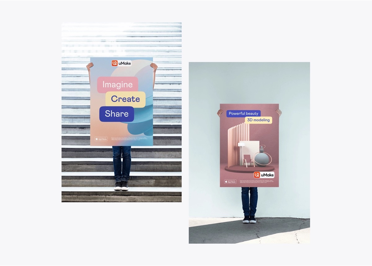
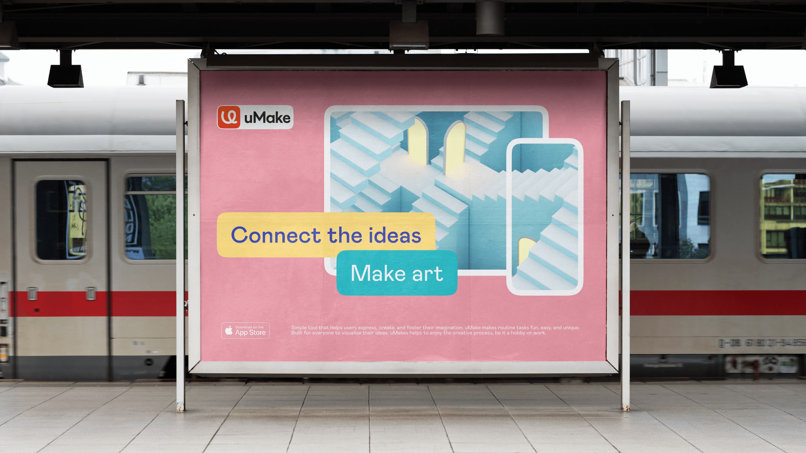
One of the essential pain points to solve from the design perspective was to rethink the product and content presentation approach, which would look balanced and adjustable. Before, the client used content featuring the tablet screen or screenshot with a short text, and due to the tablet proportions, there was no space for the text content to fit into the general composition. That resulted in the visuals that didn’t feel integral and well-performing.
The reconsidered design system uses special tabs looking like stickers that are overlaid on the content, and this way, it keeps the united and balanced composition in which the screenshots do not displace the text. Such an approach opens the way to present content in multiple formats. The outline echoes the tablet format and creates a natural visual border between the graphic object and the environment or background. At the same time, the shape-stickers allow for developing attractive compositions for any content presentation format in various channels.
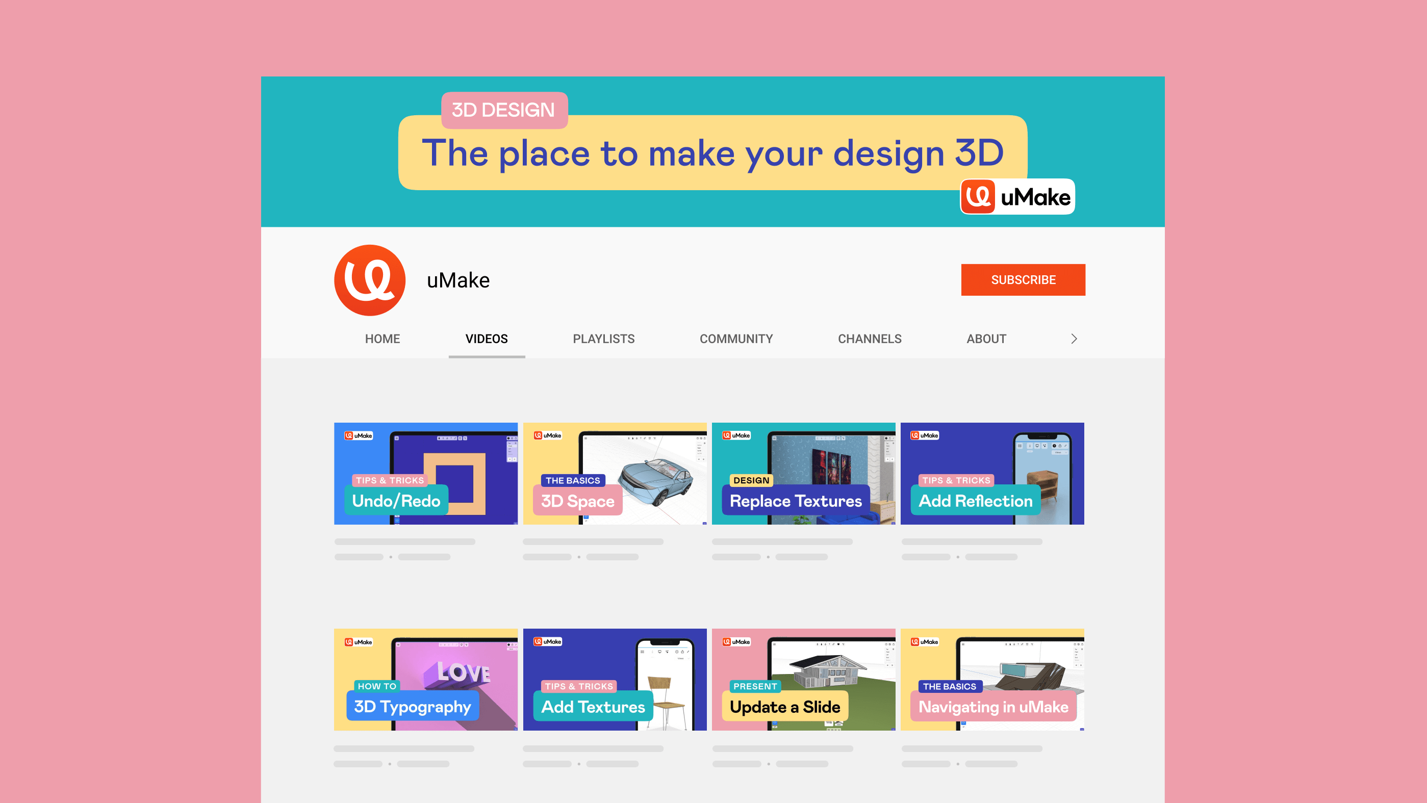
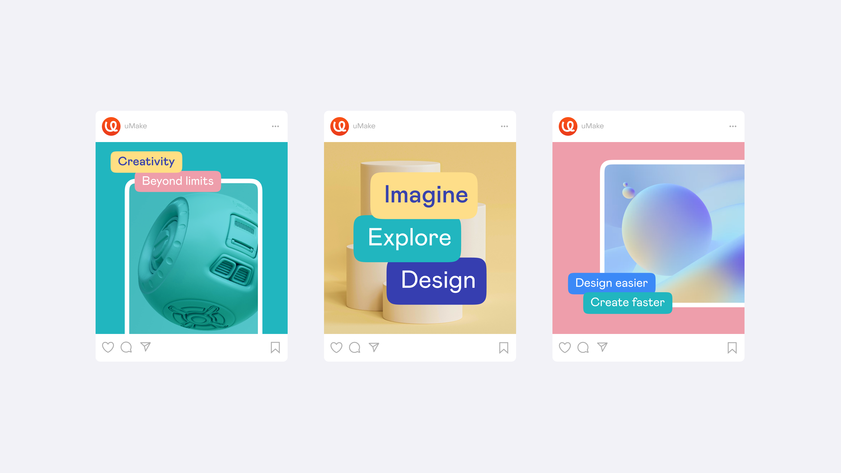
Here’s how the described approach works in social media communication of the brand, for example, the YouTube video channel visuals and posting on social networks. These channels are among the significant touchpoints of the product with the users as uMake shares a lot of educational and supportive content via them, so building the flexible design system that would enhance the presentation and feel solidly and clearly associated with the brand was an important task.
Let’s also take a closer look at the logo transformation: the symbol part of the combination mark turned into a more solid and expressive doodle that is easily decoded as a shape of the U letter, working effectively with a bold and readable typographic part.
Put inside the shape form as one of the core elements of the visual branding concept, the logo got an even more integral and unified look contributing to the high flexibility of the brand sign for marketing goals. The symbol itself can be effectively applied to either rectangular or round shapes depending on the objectives of placement and environment.
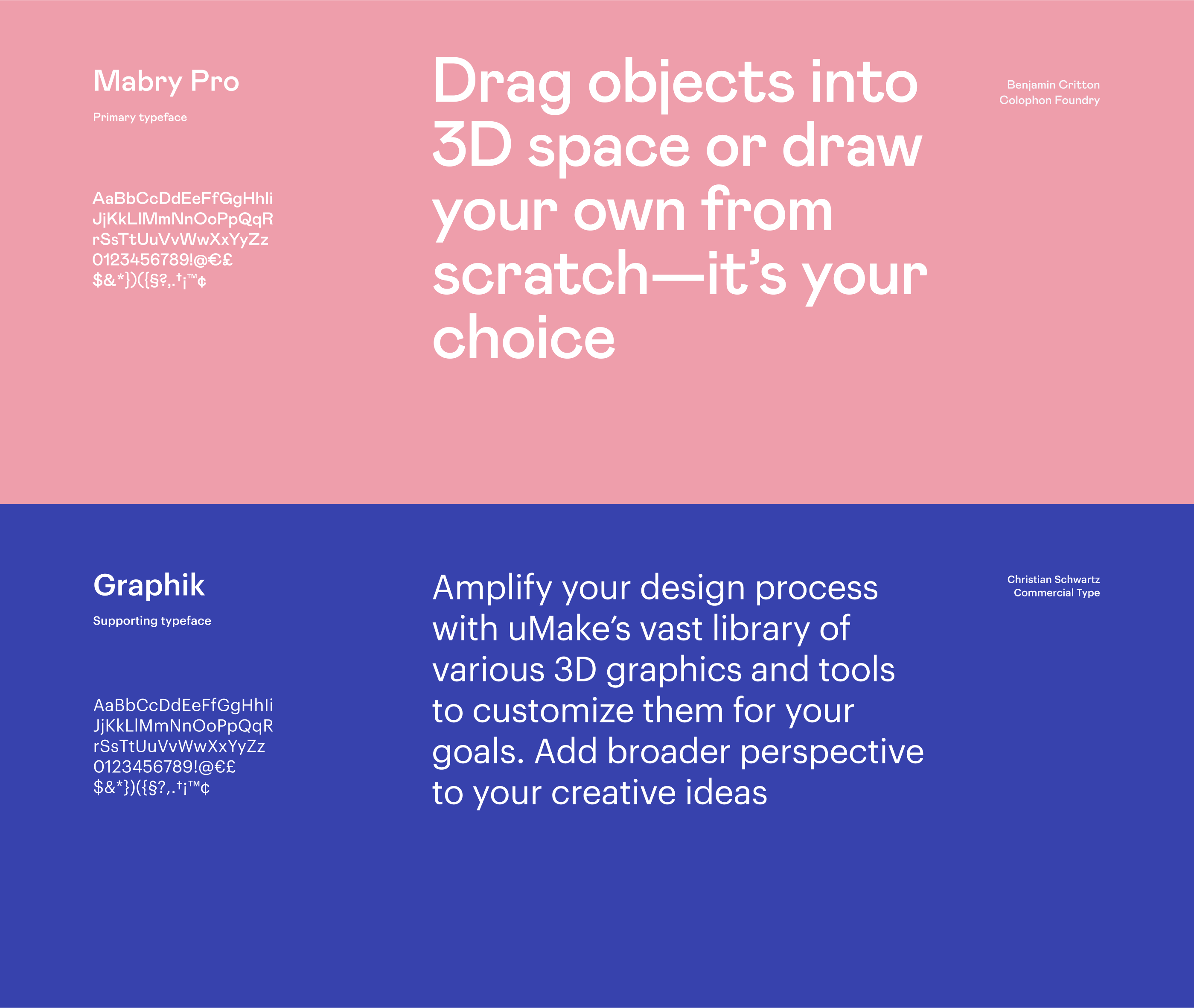
The typography combination choice for the diverse marketing needs was agreed on Mabry Pro as a primary typeface and Graphik as the supporting typeface. Such a combination keeps the perfect balance of readability and originality, robustness and playfulness, that plays well with the mood behind the product and works effectively with the logo design.
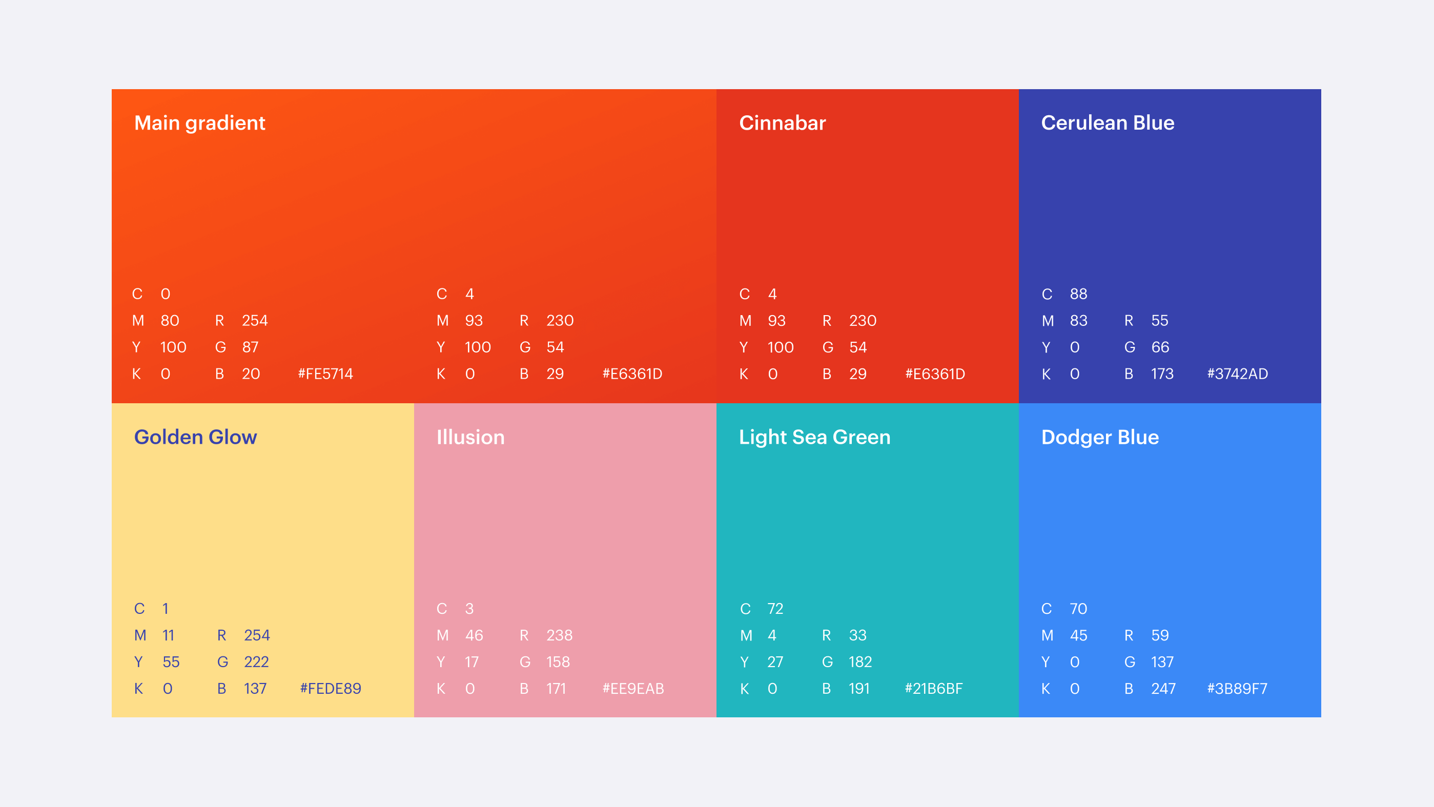
Another vital point for the brand image was the color palette. In the process of developing the visual branding flexible for a variety of environments and corresponding to the mood the brand wanted to share with its users, it got clear that the minimalist, serious, business-like, and tech-oriented style would not appeal to all the defined layers of the target audience as well as will not support the chosen tone of voice for brand communication. Instead, the wide, consistent, and repetitive extended color palette approached thoughtfully will do that job the best way. Here’s a look at the color choice for uMake branding goals.
And here’s how the ideas above develop in some aspects of the visual branding, such as posters and billboards for indoor or outdoor advertising.
Another task on graphic design was a custom icon set using the power of outline minimalism and flexibility for various goals.
![]()
And for sure, for such a product functioning at the crossroads of creative and technological energies, the power of animation couldn’t be missed as a part of the brand’s visual image. Here’s how motion graphics work to strengthen branding in the digital environment, dynamically captivating and echoing the approach of shapes and text labels.
Web Design
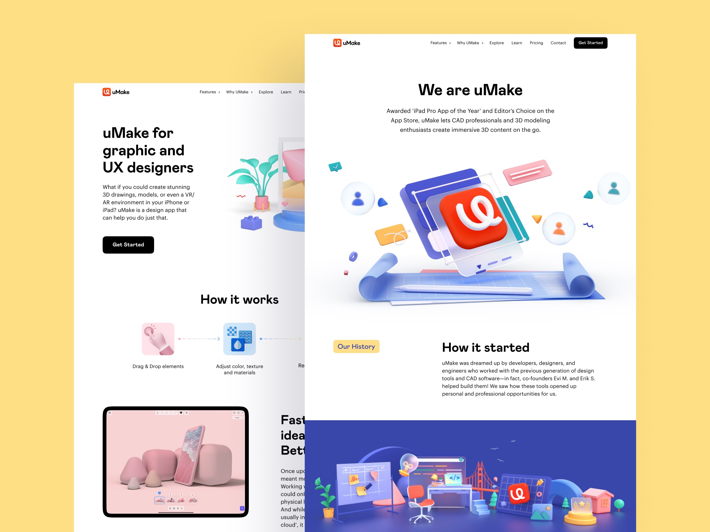
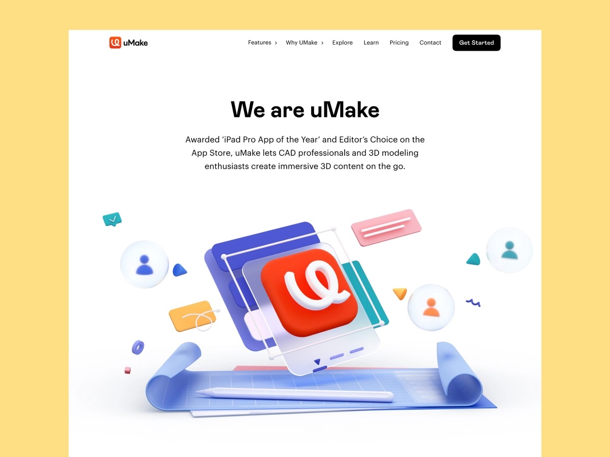
One more essential task was integrating the solid brand presence into a bright and informative website highlighting the benefits of the tools, engaging to try them, and communicating with visitors in a friendly and confident manner. As the presented product helps to manipulate diverse visuals, the main goal was to make the website work as a canvas showing the library of graphics and tools in the best light.
The home page is airy, super easy to scan, friendly, and catchy. The above-the-fold area instantly sets the visual connection to the essence of the product and the playful, emotional background. All the core navigation is found in the header, making an effective logical combination of links and dropdown menus. The CTA button, inviting visitors to try the tools, is consistently featured in the header and under the text block in combination with a secondary button, offering to check the showreel. The text content is concise and informative, employing a solid and skimmable typographic hierarchy. Also, this part of the page features visual hints to the signs of public recognition and awards contributing to the product’s trustworthiness.
Scrolling down the page, the visitors are engaged in the well-organized presentation of the functionality and benefits of the product, divided into clear and digestible logical sections, each supported with graphic or video content for better demonstration and a CTA button to allow diving into action from any point.
The other pages of the website also stick to the described consistent composition and visual hierarchy approach, setting the functional and easy-to-use canvas for the diversity of static and animated media content that presents the core of the tool helping users visualize their ideas.
To make the website look good and work effectively, it was essential to also think out the mobile performance. Here’s a glance at a couple of the screens, keeping up with the general brand style and integrating video and photo content to keep its power on mobile.
Result
As a result of our collaboration, the uMake brand obtained a well-developed and practical design system, easily adjusted for various communication and marketing goals. What’s more, the identity design system doesn’t confront the design assets and tools uMake offer. Instead, it effectively highlights the creative stuff provided by the service, for example, tutorials, tooltips, product demonstrations, and the like, establishing a friendly ecosystem and supporting friendly community spirit.
According to our clients, the website redesign helped in the following:
- Increase engagement by 7.5% with the app content
- Increased installs from Google Search by 11%
- Increased installs from the website by 18%
- Reach expanded visibility in China
New design case studies from our team are coming soon. Stay tuned!
More Design Case Studies
Here’s a set of more case studies sharing the design solutions and approaches for some of the design projects done by the Tubik team.
Crezco. Brand Identity and UI/UX Design for Fintech Service
CUBE. Illustration Set for Video Production Company
FarmSense. Identity and Web Design for Agricultural Technology
Real Bitcoin. Creating Website Illustrations
Carricare. Identity and UX Design for Safe Delivery Service
OOP. Brand Identity Design for Online Flea Market
Otozen. Mobile App Design for Safe Driving
Uplyfe. Identity Design for Health App